

Why Icons Aren't Decoration?
Icons aren't screen decorations, they're the shortest words in an interface. Icons are a vocabulary, not decoration makes the point cleanly: the number of universal symbols a user can reliably recognize without any text is roughly a dozen
On the print floor, this hits home. A magnifying glass means search, a gear means settings, a trash can means delete, a plus means add, an X means close, a house means home, a back arrow means go back, a play triangle means start. These work like common words, they can stand alone
The trouble starts beyond that dozen. Hearts, stars, and bookmarks all look like 'save,' but across platforms they might mean like, flag, or read-later. Share isn't a single symbol either, Apple usually draws a box with an arrow pointing out, Android usually draws three connected dots. If a print operations system tries to squeeze 'Submit for Review,' 'Reject File,' and 'Resend to Prepress' into text-free icons, the interface looks clean, but nobody praises the layout when something goes wrong
Iconography is a design method that uses a set of recognizable graphic symbols to represent functions, states, and actions. In prepress and client portals, its job is to reduce guessing, not to add aesthetic weight
How Should a Prepress System Decide Whether an Icon Can Stand Alone?
The question to ask is whether someone seeing it for the first time can land on the same answer within a few seconds, not whether the designer thinks it looks right
I use a method that's rough but works. Strip the icon of context, show it to a colleague or client for about 5 seconds, ask 'what happens when you press this?' If the answers scatter, add a label. If they converge, then consider dropping the label. This beats arguing in a meeting room for half an hour
Print operations interfaces especially can't skip this step, because many buttons connect directly to cost
・'Delete file' needs the trash can and the label, don't let clients assume they're just removing it from a list
・'Approve proof' shouldn't rely on a checkmark alone, a checkmark can mean done, passed, paid, or read depending on the workflow
・'Re-upload' works with an arrow plus the words 're-upload file', don't leave a spinning arrow for people to guess at
・'Send to prepress check' is too abstract for any universal symbol, just write the words
If your team is reorganizing a quoting portal, client upload page, or internal order-tracking panel, Mai Strategy Knowledge Academy consultants recommend starting by identifying the high-risk buttons, then deciding which icons can go bare and which must stay paired with a label
4 Steps to Building a Transferable Icon Vocabulary?
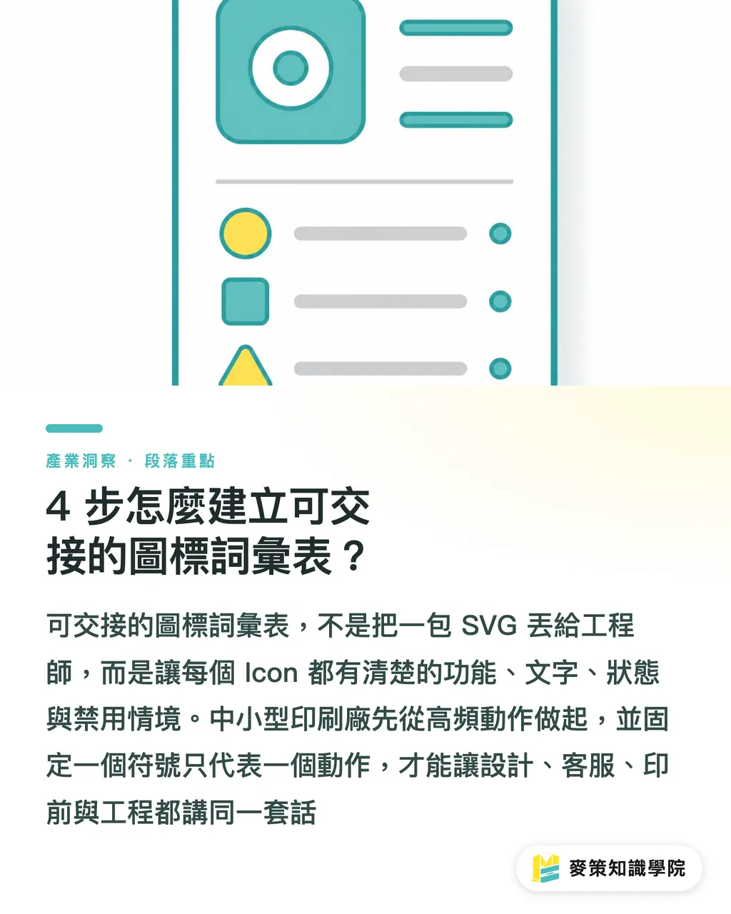
A transferable icon vocabulary pins each icon to a clear entry, function, label, state, and situations where it's disabled, rather than handing engineers a bag of SVGs
For small and mid-sized print shops, 4 steps is plenty. Don't start by building a full design system
・1. List the high-frequency actions: search, add, delete, download, upload, back, approve, reject, quote, pay, track order, start with what gets clicked every day
・2. Flag the standalone candidates: magnifying glass, gear, trash can, plus, X, home, back, play, these are universal enough to consider going bare, but context still matters
・3. Lock one symbol to one action: if a pencil means edit, it means edit everywhere. Don't use the same pencil to mean note on another page
・4. Standardize the visual spec: one icon family, one grid, one stroke weight. Mixing different weights looks like three different typefaces crammed into one catalog
The point isn't to make it fancy, it's to make sure design, customer service, prepress, and engineering are all speaking the same language. The worst thing for a print shop isn't drawing one icon wrong; it's every department thinking they understand it their own way
Why Does This Affect Order Intake and Delivery Times?
Icon semantics affect order intake and delivery because one wrong client choice at the portal can cascade into customer service follow-ups, prepress rejections, reschedules, and renegotiated deadlines
In a typical upload workflow: if a client reads 'delete file' as 'cancel this upload,' they may assume the file is still in draft. If a sales rep sees a status icon but can't tell whether it means 'pending payment' or 'pending review,' they'll make an extra call to confirm. If prepress labels 'approved' and 'sent to press' with similar icons, a job entering the wrong production stage gets messy fast
For print shops, icon design sign-off shouldn't just check whether the screen looks tidy, it should check whether the workflow eliminated one more guess. That's also what I watch for in SaaS and print automation products: the smaller the interface, the more precise the vocabulary needs to be. A single icon on mobile is easier to misread than a line of text on desktop
When connecting a client portal to a high-customization commercial printing workflow, a service context like MINDS needs to break down 'quote, material selection, proofing, approval, press' into clear vocabulary, because every step involves paper stock, finishing, color, and delivery time
Where Should Small and Mid-Sized Print Shops Start?
Small and mid-sized shops don't need to redo the whole interface. Fix the three spots where things go wrong most often: upload, approval, and order tracking
Start with whatever people ask about every day and click wrong every day. Don't rush toward a polished icon library, first clean up the buttons that keep making customer service explain things over and over
・Upload page: download, re-upload, delete, and preview should all use universal icons with labels to prevent clients from mishandling files
・Approval page: approve, reject, note, and request revision need clear text labels, checkmarks and X marks alone shouldn't carry the weight of a workflow step
・Order tracking page: pending quote, pending payment, prepress check in progress, in production, and ready to ship should be driven by status text, with icons as secondary recognition aids
・Back-office toolbar: internal functions used every day can gradually shift to icon-only, but only if onboarding and SOPs all use the same icon vocabulary
Simple rule: any spot where a wrong click causes rework, rejection, rescheduling, or a complaint needs text. Any spot that only affects scan speed can slowly move toward icons
Key Takeaways
・Icons are words in an interface. If the meaning is unstable, don't let them stand alone
・Beyond roughly a dozen universal symbols, most icons need a label to carry the meaning
・Sign-off on prepress system icons should check whether clients made one fewer guess, not whether the screen has fewer words
・One symbol, one action. Otherwise customer service, prepress, and engineering will each translate it their own way
・When an abstract workflow step has no universal icon, plain text is usually the cheapest mistake-prevention design
Further Thinking
For print manufacturing and SaaS teams, the next step isn't drawing more icons, it's building an 'icon vocabulary table': list the high-risk buttons in upload, approval, order tracking, payment, and press submission, then decide one by one whether each icon can stand alone, whether it must have a label, and whether it triggers an irreversible action. That table becomes a design spec, and also becomes customer service scripts, engineering naming conventions, and onboarding training material
Further Reading
FAQ
- What is icon semantics?
- Icon semantics means managing icons as functional vocabulary, each symbol is fixed to a specific action, state, or cue, so users don't have to guess when navigating the interface
- Can a print operations system use icons without any text labels?
- Only highly universal symbols, search, settings, delete, add, close, home, back, play, are candidates for icon-only treatment in familiar contexts. Approval, press submission, rejection, and payment status should still keep text labels
- How do you quickly test whether an icon will be misread?
- Show the icon by itself to a user for about 5 seconds and ask 'what happens when you press this?' If the answers don't match, add a label or switch to text
- Why do icons affect delivery times at a print shop?
- If a client misreads an icon on the upload, approval, or order-tracking page, the result is customer service follow-up, prepress rejection, schedule changes, and renegotiated delivery, all of it lands on the production line as cost
- Where's the highest-impact place for a small print shop to start?
- Start with the upload page, approval page, and order-tracking page. These three spots involve the most file handling, confirmations, and status reading, unclear icon semantics there most quickly turns into rework and back-and-forth
Related articles





The Print × AI weekly
The print and AI know-how designers, brands and enterprises can use before they commit — one email, every week
MINDS Free Tools
AI background removal, brand stamping, and a LINE sticker maker — free design tools, right in your browser, no upload.
MINDS Group
Need actual printing or gifting services?
From premium printing to online ordering and festive gifts — the MINDS Group sister brands take it from here.