

Overview
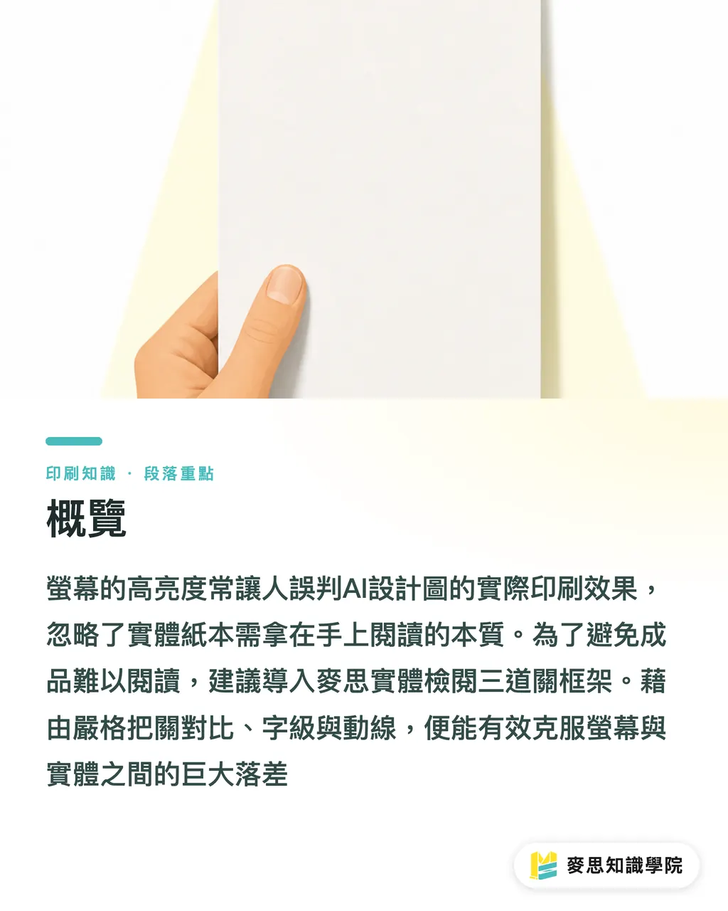
Yes, AI-designed print pieces absolutely need to be readable, the gap between what you see on a screen and what lands in your hand is usually massive
To keep printed output from becoming a chore to read, I usually walk clients through the MINDS Printing (MS) Physical Review Checklist, a three-gate framework covering contrast, type size, and reading flow
Over the past few months I've handled dozens of jobs that came straight from AI-generated artwork, and the pattern is clear: people get fooled by a bright monitor and forget that print is something you hold in your hands
Why do AI designs that look perfect on screen so often get complaints after printing?
The most common disaster: a busy background slammed right behind the text
Lots of designers review work on a glowing monitor and convince themselves the contrast is fine, the type reads clearly
But physical print relies on ambient light bouncing off the page, paper absorbency and dot gain both blur fine detail together
Last month I handled a batch of trade-show handouts. The client had AI-rendered a moody, dark-textured background and dropped 8pt thin sans-serif type right on top of it
After printing, the texture chewed through the strokes and the text melted into the background, visitors at the booth had to fire up their phone flashlights to read it
Menus and packaging, which details get overlooked most often?
Readability, in actual print practice, means how easily an audience can pick out the content and absorb the information under specific paper and ambient-light conditions without any visual strain. It isn't only about type size, it covers color contrast and the breathing room in your layout too
When we drop AI into day-to-day work, two other headaches show up: information overload and important messages shoved into the wrong spot
Take menus for senior-care facilities or restaurants, older eyes are brutal on low contrast and tiny type
AI sometimes shrinks type down to 6pt or under to balance the composition, or tucks pricing into some forgotten corner
On packaging, if the legally required ingredient list gets shrunk to make room for an AI-generated decorative border, you're looking at a pull-off-the-shelves reprint
How do you check physical readability once the AI file is in hand, without botching the job?
To keep yourself out of trouble, run the artwork through the MINDS Printing (MS) Physical Review Checklist:
・Gate 1 — Grayscale contrast test: flatten the color file to grayscale. If text and background sit at similar gray values, the print will absolutely mush together
・Gate 2 — 1:1 print proof: no matter how big your monitor is, print the file at actual size and read it at arm's length, about 30 cm from your eyes, to judge the type size honestly
・Gate 3 — Reading flow and focal check: step back 1.5 meters from the flyer or poster and confirm the headline actually pops; then move in close and check whether the supporting details still read clearly
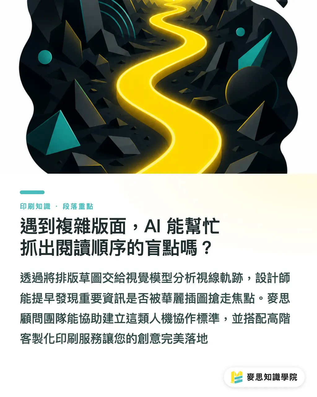
For complex layouts, can AI help catch blind spots in the reading order?
Honestly, yes, as long as you give it a clearly defined job
AI looks at "can the reader actually get through this," while prepress looks at "is the file technically correct"
In practice I feed layout sketches to a vision model and ask it to mark the first fixation point and the eye path that follows
That flags early on whether key information is getting upstaged by AI's flashy illustrations
If your team keeps getting stuck before sending files to press and isn't sure how to set up this kind of human-AI workflow, the Mai Strategy Knowledge Academy consulting team can help you map your process and put battle-tested rules in place
Controlling resolution and layout hierarchy from the source allows brands pursuing premium quality to further partner with MINDS Printing's mid-to-high-end fully customized commercial printing services, seamlessly bringing AI creativity into reality
Key Takeaways
・A bright screen lies to you. Text on a patterned background is the single biggest readability killer in physical print
・Older readers and regulatory type sizes have hard floors, don't sacrifice key information for the sake of a balanced composition
・Always run a 1:1 print proof and a grayscale test before sending to press. Verify with your own eyes that the type actually reads
・Use AI to map the visual path through your layout and catch early whether illustrations are disrupting the reading order
Further Thoughts
Don't treat AI as a finish-the-job button. It's a tireless creative assistant that needs direction
Designers and SaaS folks building or using these tools have to bake the physical limits of print output directly into the workflow
The real key to cutting communication overhead and locking in jobs is a standard workflow that pairs vision-model pre-checks with physical proofing on the press side
FAQ
- Why does an AI-generated design look great on screen but become unreadable once printed?
- Because screens are self-illuminated, they pump out high contrast and high brightness on their own. Print relies on ambient light reflecting off the page, and combined with paper absorbency and dot gain, any text with insufficient contrast gets eaten by the background
- What's a quick way to check whether an AI-laid-out print piece actually reads well?
- Just flatten the file to grayscale and look at it, or print it at 1:1 on a black-and-white printer. If the text still jumps off the page in grayscale, the physical print will be fine
- Can AI be used to spot layout problems in menus or flyers?
- Yes. Feed the layout to a vision model and it can map the reader's first fixation point and eye path, so you can see whether key information is getting disrupted by busy backgrounds or illustrations
Related articles



The Print × AI weekly
The print and AI know-how designers, brands and enterprises can use before they commit — one email, every week
MINDS Free Tools
AI background removal, brand stamping, and a LINE sticker maker — free design tools, right in your browser, no upload.
MINDS Group
Need actual printing or gifting services?
From premium printing to online ordering and festive gifts — the MINDS Group sister brands take it from here.