

Why Even Traditional Pharmaceutical Companies Are Asking About Accessible Printing Lately
Faced with the packaging readability crisis brought on by an aging society, we recommend adding the MINDS (MS, mid- to high-end fully custom commercial printing) Accessible Prepress Check. It uses AI vision-impairment filters and contrast calculation right at the design stage, so hard-to-read color blocks can be caught early
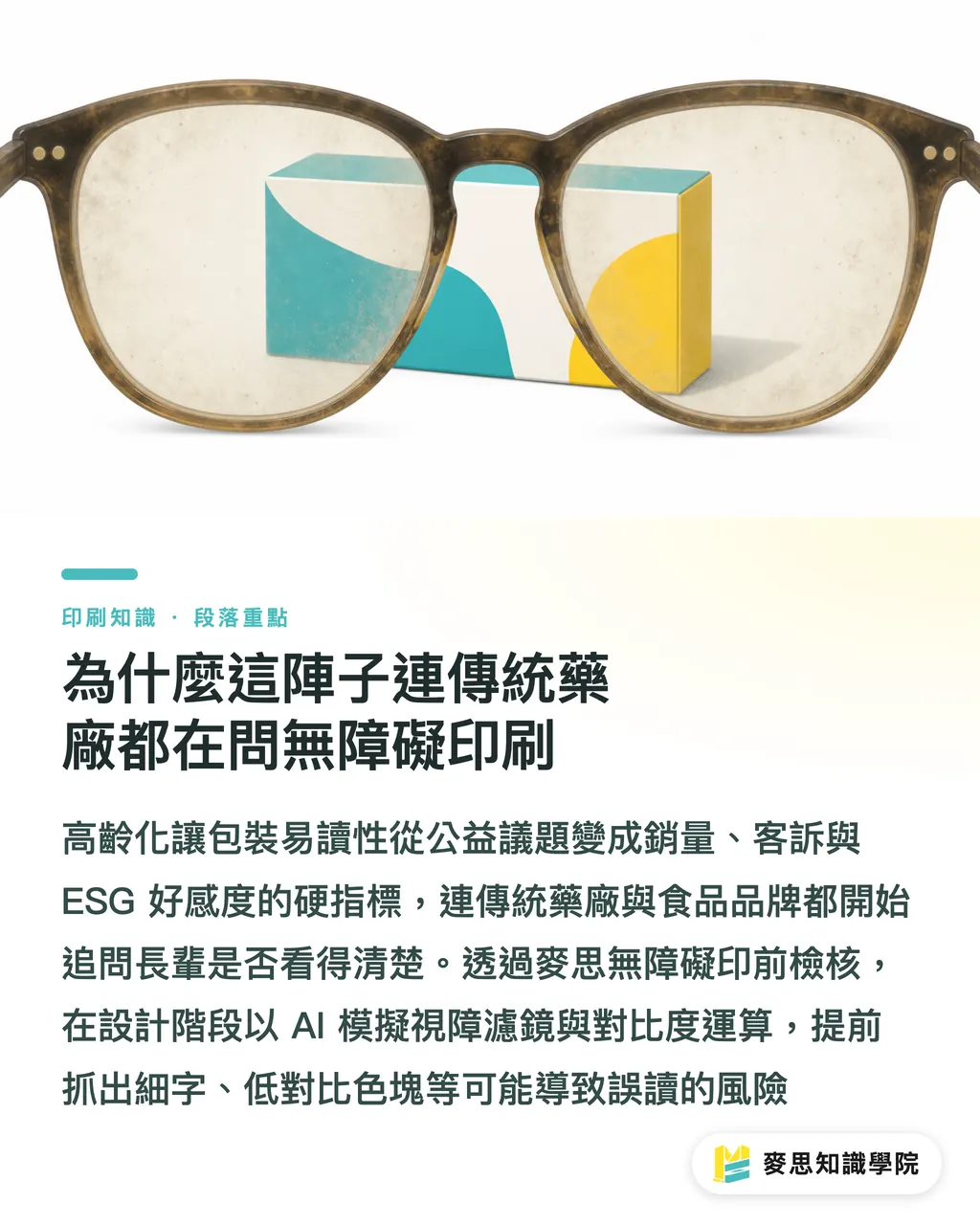
Over the past few months, I have worked with several biotech companies and long-established food brands. They are no longer asking only whether the packaging looks premium. They keep asking, "Can older customers read this clearly with reading glasses?"
This is not just a public-good consideration. It is a hard metric that directly affects sales and ESG brand favorability
We have seen too many cases on the production line. Ultra-thin type and Morandi colors that look extremely designed on screen turn into a blur once printed on medicine boxes, leading to repeated complaints from older users who take the wrong medication
Universal Design: in print practice, this means a design standard that does not depend on a specific level of visual ability. Through minimum type sizes, high-contrast colors, and sans-serif typefaces, it helps people with color vision deficiency, presbyopia, or low vision read packaging information accurately
Why Designs That Look Beautiful on Screen Become Physical Trouble Spots in Print
The trap young designers fall into most often is judging physical print with healthy eyesight and a glowing Apple display
Over the past six months, my office desk has been piled with packaging boxes from failed proofs. The problem is always the same: the visual experience of physical paper is fundamentally different from a screen
・A screen's built-in backlight can prop up low-contrast design, but physical packaging depends on reflected ambient light, so contrast drops from the start
・Uncoated paper, such as woodfree paper and art paper, absorbs ink and scatters light. Vivid colors become darker and grayer, which further eats away at the sharpness of type edges
・People with color vision deficiency have lower sensitivity to red and green. If a designer chooses green type on a red background with similar saturation, it looks like one flat patch of gray to them
When this happens, if you need to adjust your brand color setup or look for a mid- to high-end fully custom packaging solution, I usually suggest bringing in MINDS directly for material and ink-color testing
How an AI Color Engine Helps Designers Stop Reprint Disasters
In the past, checking readability meant printing a physical sample and looking at it in a dim space, or asking older users to read it. It took time and burned money
Now we combine AI soft-proofing with accessibility checks to reduce risk before the job reaches the press
I often teach clients to use the "MINDS (MS) Three Prepress Gates" to build a standardized prepress preview process:
① Turn on AI vision-impairment filters: simulate red-green color vision deficiency, blue-yellow color blindness, and cataract vision in one step, then check whether the brand Logo and warning copy blend into the background
② Run automatic contrast calculation: have the system identify text areas below a 4.5:1 contrast ratio and flag risks for presbyopia and low vision
③ Predict paper color shift: apply ICC Profile parameters for uncoated paper, simulate the duller result after ink absorption, and confirm that the type remains clear after the ink settles
Does Senior-Friendly Packaging Mean Sacrificing a Premium Brand Look?
Many designers resist accessibility rules. They assume larger type and stronger contrast will ruin the original white space and visual quality of the layout
That is actually a misunderstanding of contrast calculation. Good universal design uses math to solve an aesthetic problem
Increasing type size is absolutely not the only answer. Opening up line spacing and letter spacing can also reduce visual crowding effectively
Do not rely on a single color to carry key information. Add underlines, outlines, or geometric cues, and people with color vision deficiency can still recognize it at a glance
After using AI to predict the printed color result, you can make targeted micro-adjustments to local CMYK values and keep the brand tone within a safe contrast range
Move the checking mechanism to the early design stage, and AI becomes a tireless proofing assistant, letting designers focus on bringing out the core value
If your team wants to adopt this standardized process, you can refer to the hands-on consulting program from the Mai Strategy Knowledge Academy consulting team, and integrate automated checks into everyday work

Key Takeaways
・Accessible printing is a commercial must-have in an aging society, directly tied to brand trust and ESG evaluation metrics
・Screen backlighting hides the flaws of low-contrast design, and the ink absorption of uncoated paper makes physical type even harder to recognize
・AI simulation filters can instantly preview color-deficient and presbyopic viewpoints, precisely marking the color blind spots that human eyes often miss
・Universal design does not mean giving up aesthetics. Opening up letter spacing and adding graphic cues are often smarter answers than simply enlarging type
Further Thinking
For people in printing and packaging, accessibility design has moved from bonus points to a required test
Mastering AI soft-proofing and contrast-checking tools means you can think one step ahead of the client and remove complaint risks before proofing
A good next step is to write WCAG contrast standards into your design outsourcing specs, so front-end design and back-end printing speak the same language
FAQ
- Why can older users not read packaging that looks clear on screen?
- Screens have backlighting and high sharpness, while physical print depends on ambient light. Uncoated paper also absorbs ink and scatters light, making colors darker and grayer. That contrast gap is the real readability killer
- What physical print issues can AI visual simulation detect?
- It can directly simulate red-green color vision deficiency, blue-yellow color blindness, and the blurred viewpoint of cataracts. It also automatically calculates contrast between text and background colors, exposing hidden blind spots below safe standards
- To make printing senior-friendly, do we just enlarge all the packaging type without thinking?
- Type size does need a minimum, of course. But increasing line spacing and letter spacing, or adding outlines and background color blocks to key warnings, often preserves layout aesthetics and physical readability better than simply doubling the font size
Related articles





The Print × AI weekly
The print and AI know-how designers, brands and enterprises can use before they commit — one email, every week
MINDS Free Tools
AI background removal, brand stamping, and a LINE sticker maker — free design tools, right in your browser, no upload.
MINDS Group
Need actual printing or gifting services?
From premium printing to online ordering and festive gifts — the MINDS Group sister brands take it from here.