

Overview
The whole point of building an AI brand print style guide is to translate fuzzy visual intent into machine-readable rules packed with CMYK values, type-size limits, banned paper stocks, and explicit layout ratios. I usually walk clients through the Mai Strategy Knowledge Academy's "spec digitization framework" so that the AI's draft copy and layouts land inside a print-safe envelope from the first pass, with only light human touch-ups after that

Why do you need a style guide written for the AI?
Lately my desk has been buried under client AI drafts. The usual story: gorgeous on screen, then the second we hit separation the colors fall outside the CMYK gamut. Brand books written for humans are stuffed with adjectives like "feel energetic" or "stay composed and professional." A style guide written for the AI has to be hard numbers and hard conditions
If you haven't converted your brand colors to Pantone references, CMYK recipes, and ICC profiles, every image the model spits out will be almost-but-not-quite your brand. That is also why a lot of marketing teams feel like AI tools made the loop with designers and print shops even longer, not shorter
How do you translate brand rules into the machine's language?
If you want the AI to behave like a real design assistant, you have to hand it hard boundaries first. I break the company's everyday print specs into four dimensions and load them into the system prompt or the internal knowledge base
・Color, in numbers: list CMYK values for each brand primary, lock down the press condition (coated or uncoated), and set an acceptable color-difference window
・Type and layout limits: set a minimum type size (say, no reverse type under 8pt), a safe margin (at least 3mm bleed), and fixed layout proportions
・Paper preferences and banned stocks: spell out the textures that fit the brand mood, for example, ban optical brighteners, or default proposals to a textured heavy cardstock
・Image style in plain commands: turn "playful" into concrete instructions, like "use high-contrast block divisions, no gradients, no shadow effects."
If your company is gearing up to roll this out, talk to the Mai Strategy Knowledge Academy consulting team. We help audit what you already have and build the rule set that ties design, marketing, and procurement together
The core terms that keep AI brand colors honest
A handful of print-color terms have to be nailed down tightly when you build this guide, otherwise cross-team conversations go sideways fast
・ICC Profile: the color-characterization file defined by the International Color Consortium. It keeps the screen and the press looking at the same color when they trade files back and forth
・Delta E (ΔE): the numeric measure of difference between two colors. In print practice, ΔE under 3 is what most people can't see with the naked eye, which makes it the practical acceptance bar for brand color
・Digital proof: a sample printed on a color-calibrated inkjet printer before the job goes on the press. It's the last line of defense for catching color drift before it becomes physical
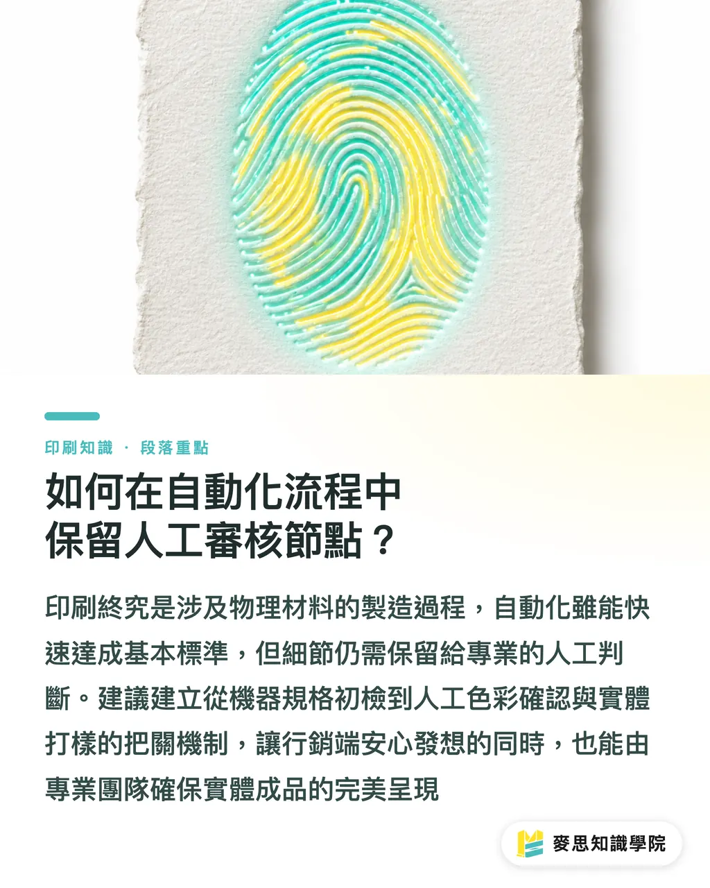
How do you keep human review checkpoints inside an automated flow?
No matter how much compute you throw at it, printing is still a manufacturing process with real materials and real chemistry. The style guide gets the DM or the packaging concept across the pass line; the last mile still needs a human eye
I usually steer clients toward MINDS Print's (MS, mid-to-high-end fully custom commercial printing) three-gate submission review:
・Gate 1 — Spec check: the machine runs a first pass on file size, bleed, and image resolution hitting 300dpi
・Gate 2 — Color conversion: a human confirms the brand spot colors didn't shift weirdly after RGB-to-CMYK conversion, and tweaks curves if they did
・Gate 3 — Physical proof: any high-value or large-run packaging has to be checked against a digital proof and a paper white sample to confirm structure and color rendering
Under that split, marketing can iterate and brainstorm fast, while the print buyers and designers in the back end focus only on the final quality gate. For special techniques or fully custom commercial print jobs, hand them to a specialist team like MINDS Print (MS) so the concept actually survives contact with the press
Key Takeaways
・Machines don't read abstract brand spirit. You have to convert the rules into data: CMYK values, type-size floors, and a paper blacklist
・Before you plug in layout and image tools, lock down your ICC profile and Delta E tolerance, or the brand color will drift
・The style guide exists to handle the 80% of repetitive layout work. Keep the other 20% as a human review checkpoint that confirms the physical proof
・Setting up MINDS Print's (MS) three-gate submission review catches the files that look great on screen but can't actually be printed
Further Thought
Seen from the print-manufacturing side, the next competitive edge isn't who has the newest software, it's who owns the cleanest, most structured library of brand print assets. While your competitors are still re-aligning colors and fonts with their designers every time they send a job out, you're already producing marketing materials that meet print specs on the first pass, and you're spending those saved hours on the creative decisions that actually move the needle
FAQ
- Why do AI-generated images always shift color once they're printed?
- Generative tools default to the RGB gamut, and skipping color management on the way to print CMYK causes serious drift. You have to lock in an ICC profile and run a digital proof to calibrate
- How is a print style guide written for the AI different from a traditional brand book?
- A traditional brand book is written for people and full of abstract mood words. A guide written for the machine is nothing but hard constraints, minimum type size, bleed dimensions, color-difference tolerance, and a paper blacklist
- After rolling out automated design workflows, do you still need a professional print shop?
- Yes. The tools can handle the front-end image generation and rough layout, but the paper physics, the specialty finishing, and the final color inspection still rely on the hands-on experience of a specialist team like MINDS Print
Related articles



The Print × AI weekly
The print and AI know-how designers, brands and enterprises can use before they commit — one email, every week
MINDS Free Tools
AI background removal, brand stamping, and a LINE sticker maker — free design tools, right in your browser, no upload.
MINDS Group
Need actual printing or gifting services?
From premium printing to online ordering and festive gifts — the MINDS Group sister brands take it from here.