

What Is Color Management Actually Managing?
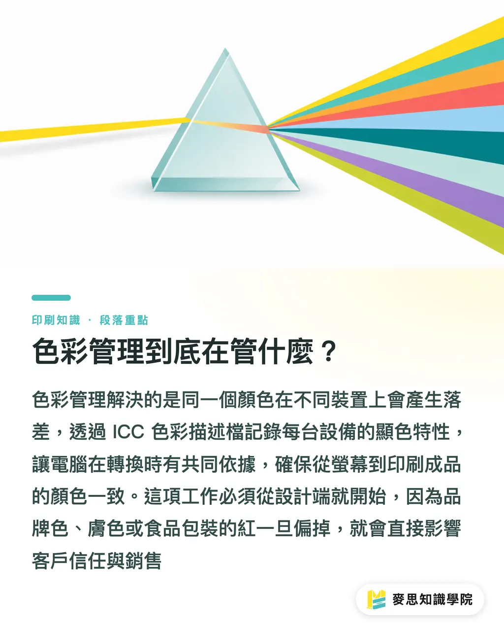
Color management deals with the fact that the exact same color looks different across different devices. Screens use additive RGB color while printing presses use subtractive CMYK. Paper whiteness ranges from warm to cool, and ink formulas vary by press manufacturer. When these variables pile up, colors from the same design file can shift so dramatically across devices that anyone can spot the discrepancy instantly
At the core of this system is translating each device's color profile into an ICC profile (a digital file recording which colors a device can display or print). This tells your computer how red on one device translates to red on another during conversion. Established by the International Color Consortium (ICC) in the 1990s, it has become the standard language of the industry
Why does it matter? Off-key color isn't just an aesthetic issue. Wrong brand colors trigger customer complaints, greenish skin tones lead to rejected jobs, and dull reds on food packaging hurt sales. That is why color management must start at the design phase rather than handing off a problem for the printer to fix later
・Core Goal: Provide a solid baseline for color conversion across RGB, CMYK, screens, and presses
・Key Tools: ICC Profile, standard light box, spectrophotometer (an instrument that measures color via light spectra)
・Best For: Brand packaging, catalogs, photo books, and any color-sensitive print materials
What Should Designers Prepare on Their End?
The first step for designers is setting the right working color space (the range of colors that can be displayed or printed). Monitor calibration should use Adobe RGB or sRGB depending on final print conditions. For output files, work in CMYK with the matching ICC profile, such as FOGRA standards commonly used in Europe or Japan Color standards, rather than defaulting to Illustrator's generic CMYK
The second step is confirming the paper stock and printing method. Coated, uncoated, and kraft papers have different white points, meaning the same CMYK values will yield noticeably different visual results. Digital printing and offset printing also layer ink differently; digital relies on toner or inkjet spraying while offset compresses wet inks. You cannot use a single ICC profile for both
The third step is giving the printer a clear proofing standard. This includes:
・ICC Profile version (specifying whether FOGRA39, Japan Color Coated, or others are used)
・Target paper stock and finish (coated/uncoated/matte/gloss)
・Pantone spot color codes or official Lab values (three-dimensional coordinates in CIELAB color space describing human color perception) for brand colors
・Inspection lighting conditions (D50 standard daylight tubes, a 5000K light source commonly used for proofing)
If this baseline is unclear, the printer is left guessing based on their own equipment and paper stocks, making color shifts almost inevitable
How Do Printers Keep Colors Accurate?
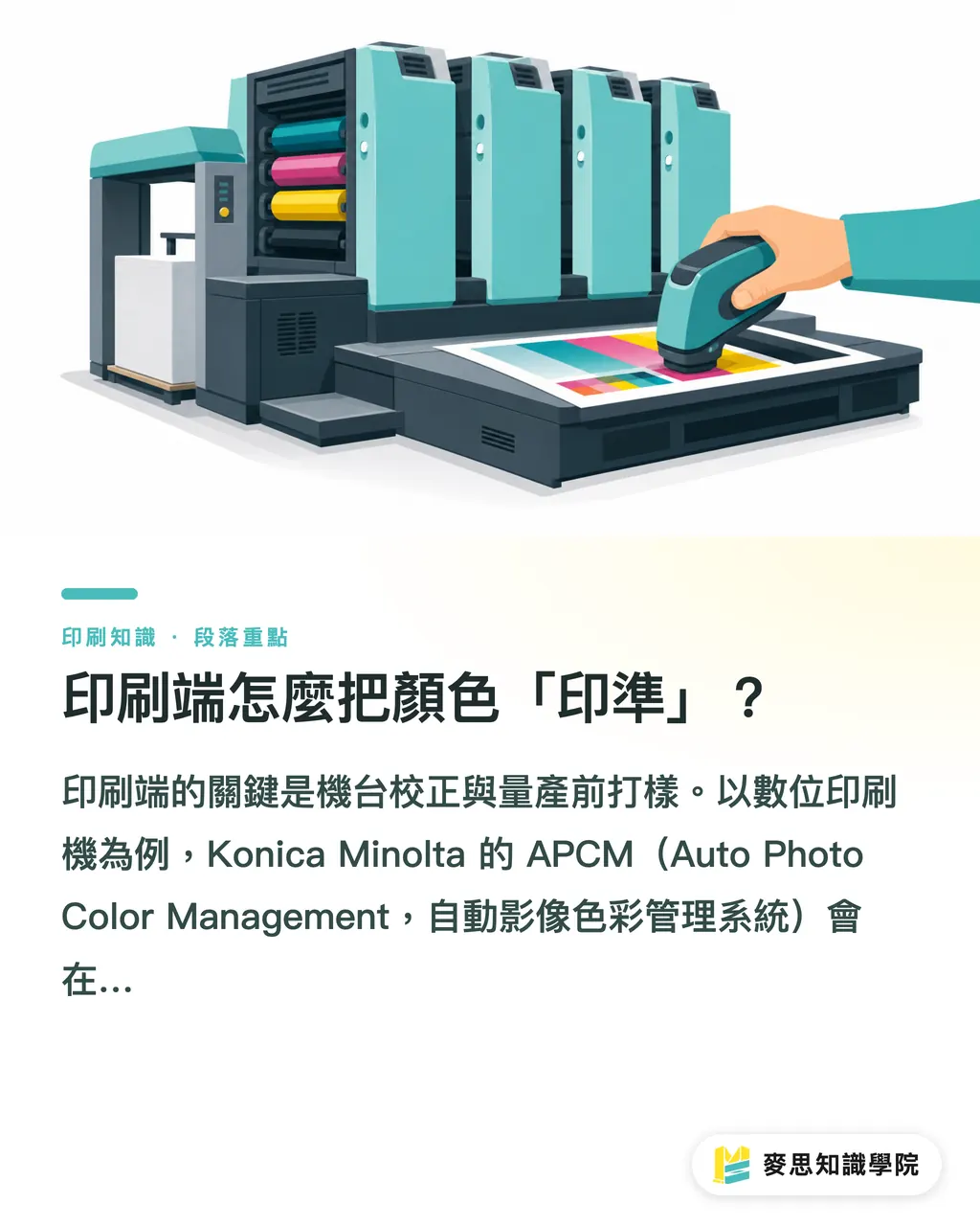
On the printer's end, press calibration and pre-production proofing make or break the job. Take digital presses for instance: Konica Minolta's APCM (Auto Photo Color Management system) runs automated calibration at startup or toner replacement, using built-in spectrophotometers to measure color patches and adjust density and ink trapping curves back to standard. This automated calibration is far more consistent than relying on a master printer's visual inspection, especially for long runs of hundreds of sheets
Traditional offset printing follows a similar but more complex routine: wash down, mount plates, adjust water and ink balance, and calibrate to neutral gray balance (the ratio of CMYK inks required to create a neutral gray) using G7 (an IDEAlliance color calibration method designed to match visual gray across presses) or house standards. After that, pressmen sample and measure sheets every few hundred runs; if color deviation exceeds tolerances (such as ΔE exceeding 2 to 3, where ΔE measures color difference, smaller numbers mean closer colors, and the human eye spots differences above roughly ΔE 1), the press must pause for adjustment
Proofing is another essential step. Proofing presses, digital proofs, and gang-run proofs each come with different error margins. If budget allows, a digital proof made on the exact model as the production press is most accurate. On a tight budget, use at least a gang-run proof to check general tones, but keep in mind that paper stock, ink coverage, and trapping conditions on gang runs may differ from actual production, so it shouldn't be your sole basis for acceptance
What Are the Common Pitfalls in Proofing and Inspection?
Pitfall 1: Comparing colors under inconsistent lighting. Office fluorescent lights lean cool, home LEDs lean warm, and natural window light shifts throughout the day. The exact same print looks completely different under these three light sources. The proper approach is using a standard light box equipped with preset conditions like D50 (standard print daylight simulation), D65 (screen and general viewing daylight simulation), and Illuminant A (warm household tungsten light) to evaluate colors under matched lighting
Pitfall 2: Approving colors based solely on a monitor. Uncalibrated screens, blown-out brightness settings, or dark mode backgrounds all trick designers into misjudging final print results. The fix: calibrate your monitor regularly with a hardware calibrator and align monitor brightness with your color evaluation environment
Pitfall 3: Swapping paper stock mid-stream. If your quote was based on Japanese coated paper but production switches to a Chinese coated stock, differences in whiteness and surface coating will throw off your printed reds and blues. The proper rule: any change in paper requires a fresh proof before running the press
Pitfall 4: Overlooking post-press finishing effects. Gloss lamination, matte lamination, spot UV (UV-cured varnish applied to specific areas), and foil stamping all alter visual color. Gloss film deepens colors, matte film mutes them, and foil areas skip CMYK ink layering entirely. Account for these finishing processes during proofing rather than tacking them on afterward
I have run into every single one of these pitfalls, and each one erodes trust between clients and printers. Setting clear standards and following the workflow strictly pays off far more than trying to patch up mistakes after the fact

Key Takeaways
Color management fundamentally gets different devices speaking the same color language using ICC profiles and standard lighting
Designers must select the correct working color space and output profile, locking down paper stocks and print methods right from the start
Press calibration and pre-production proofing determine final color accuracy, so never skip this step
Always inspect samples inside a standard light box, as screens, paper stocks, and post-press finishes introduce constant variables
Further Considerations
For printers, color management is not an add-on service, it is a basic requirement. Only printers that consistently hold brand colors within ΔE 2 earn long-term contracts from premium brands. Those that cannot are stuck fighting price wars. This marks a divide in industry upgrades, which is why MINDS continues investing in automated calibration and proofing equipment for mid-to-high-end commercial printing. For designers, understanding this workflow helps you avoid 80% of common printing traps. For procurement officers, knowing the right questions to ask puts you back in control during price negotiations
As for budget-conscious business cards, stickers, and event printouts, the online ordering workflow at MINDS comes pre-configured with preset ICC profiles and proofing conditions, so customers get consistent quality without needing to master color management
Further Reading
FAQ
- Is color management mandatory? Do small-run print jobs need it too?
- Yes. Regardless of volume, color shifts still happen. Small-run printing typically relies on digital presses paired with standardized ICC profiles, offering higher automation and a simpler process. As long as specifications are clear, managing color for small runs is actually easier than controlling traditional offset printing
- Can RGB design files be sent directly to print?
- Not recommended. RGB is designed for displays. Converting RGB to CMYK compresses color gamut, causing highly saturated shades like bright red, vivid blue, and neon green to distort easily. Work in CMYK during the design phase, or at least specify an output ICC profile when exporting files
- Are Pantone colors guaranteed to print accurately?
- Not necessarily. Pantone serves as a color language on the design side, but accurate print reproduction depends on ink vendors, press trapping performance, and paper stock characteristics. Fluorescents, metallics, and neons can rarely be recreated via standard CMYK printing and require spot color inks or specialty formulas, which must be confirmed with your printer in advance
- What color difference tolerance counts as acceptable?
- General commercial printing allows a color tolerance of ΔE 2 to 3, while brand colors and highly sensitive print work demand ΔE under 1. Specific limits depend on client acceptance standards. If unspecified, clarify tolerance thresholds before sending files to print rather than arguing at final inspection
- How often should monitor calibration be performed?
- Monthly calibration is recommended, or immediately whenever you move your monitor or change ambient lighting. If your design environment is stable, you can extend the interval to two or three months, but never go longer than six months
Related articles


The Print × AI weekly
The print and AI know-how designers, brands and enterprises can use before they commit — one email, every week
Tool Library
RGB↔CMYK conversion, ΔE color difference and brand color print analysis — free color management tools, computed right in your browser.
MINDS Group
Need actual printing or gifting services?
From premium printing to online ordering and festive gifts — the MINDS Group sister brands take it from here.