

What Exactly Does Printer Colour Management Control?
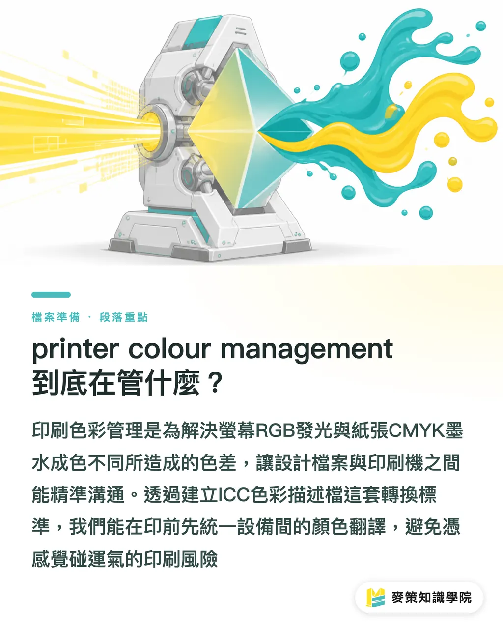
Printer colour management tackles one fundamental problem: the same color looking completely different across different devices. Screens emit additive RGB light, while paper uses subtractive CMYK ink. From design concept to final print run, your artwork passes through cameras, monitors, raster image processors (RIP), and printing presses. Every single piece of equipment has its own distinct way of interpreting color
Without color management, you are just relying on luck. The most common client complaint I hear is: "This doesn't match what I see on my screen!" The issue usually isn't poor craft on the press operator's part. It's that your file and the press don't speak the same language. What we need is a translation standard, which is an ICC profile, to bridge that gap accurately between devices. In my years of balancing production floor realities with client expectations, nailing down exact specs during prepress is far more practical than getting angry over a press sheet after the run starts
Why Is There Still Color Variation Even with a Calibrated Monitor?
Because substrate properties and viewing light introduce too many variables. At MINDS, we handle plenty of high-end custom jobs where designers bring in top-spec Apple displays to proof colors, but overlook paper absorbency and base paper tint
Paper is never pure white. Uncoated stocks (like woodfree or fine art paper) absorb lots of ink, making printed colors sink in and lose saturation. Coated stocks (like gloss or matte art paper) have a smoothed surface that delivers vibrant colors. Even if you apply a standard profile like FOGRA39 or Japan Color 2001 Coated, switching the paper stock completely changes the outcome
Another major culprit is lighting. A print looks completely different under office fluorescent tubes, in natural daylight, or inside a print shop's standardized D50 (5000K color temperature) viewing booth. Without a standardized light source, color evaluation is just people talking past each other
How Can Small Businesses and Designers Protect Themselves?
When facing potential reprint costs that easily run into thousands of dollars, do not leave things to chance. Follow the fundamentals I mapped out in Mai Strategy's Three Checkpoints for Print Submission. This is the exact defense line I emphasize most when guiding online retail clients at Mai Print
1. Calibrate your monitor regularly
Pick up a colorimeter (like a Spyder or i1Display) and run regular calibrations. If budget is tight, at least make sure your monitor's contrast and brightness are in a realistic range (target around 80-120 cd/m²). Never retouch artwork on an overly bright screen or with a blue-light filter turned on
2. Lock in your software color space
When setting up files in Illustrator or InDesign, explicitly set your color mode to CMYK. In Taiwan, general commercial printing most commonly relies on Japan Color 2001 Coated. When exporting your PDF, remember to embed the color profile data so the RIP system doesn't have to guess
3. Treat digital proofing as your baseline
Always review a digital proof before heading into mass production. Today's high-end inkjet proofers can simulate 70% to 80% of actual press performance. Once you receive the proof, check it under standardized lighting or daylight, never under warm lighting in a coffee shop

Custom Run vs. Gang Run: What Is the Difference in Color Management?
Choosing the right production setup keeps your color expectations realistic. These two models work completely differently in terms of color control and cost
・Custom Run: Dedicated printing plates just for your job. The press operator can tweak individual ink keys on the machine to match your proof. You can request precise color matching or even attend an on-site press check. It costs more, but it is the right choice for projects with strict brand color standards
・Gang Run: Multiple clients' files are ganged together onto a single plate. To balance the entire sheet, the press runs at an average ink density, meaning the operator cannot make fine adjustments for individual files. There is typically an acceptable color tolerance of around 10%. This fits everyday marketing collateral where budgets are tight and minor shifts are acceptable
How Can Prepress Preflight Catch Common Traps?
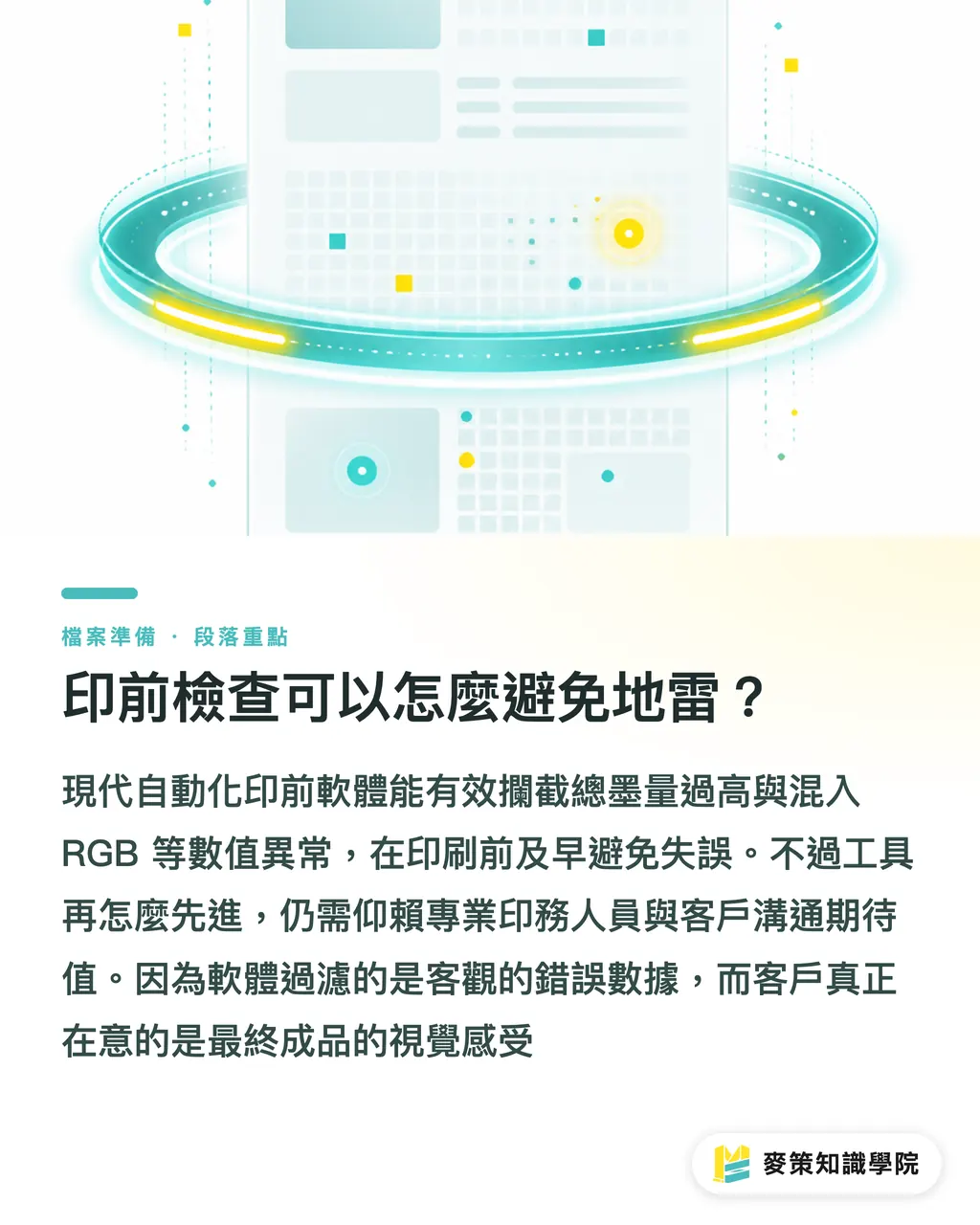
With production automation and AI tools becoming standard in recent years, many basic errors can now be caught right in prepress software. Automated preflight tools can inspect PDFs, flagging RGB assets, excessive total area coverage (TAC above 250% often causes set-off), or warning that spot colors will fall out of gamut on specific paper stocks
This lets prepress staff reject problematic files early and ask clients for fixes, rather than discovering ruined batches after printing. Even with advanced tools, setting ground rules and aligning expectations still requires an experienced print production specialist or consultant. Software flags numerical anomalies, but clients judge the end visual experience
Key Takeaways
Color management is a translation process across devices, not magic performed by a printer
Uncoated and coated papers render color very differently. Factor ink absorbency into your paper selection from day one
Without standardized lighting, color checking is just a waste of time and eyesight for everyone involved
Embedding your ICC profile properly into your PDF is the baseline courtesy and safeguard you provide to your print shop
Further Thoughts
For designers and print buyers, treat printer colour management as a clear communication spec rather than some mysterious art. When working with a new printer for the first time, ask directly about their preferred color profiles and standardized lighting setup. It instantly shows you know your stuff. For SaaS developers and innovators trying to modernize traditional print, the real pain point isn't writing a fancy predictive algorithm. It's translating physical realities, like substrate variations and ink behavior, into UI warnings that designers can actually understand. Whoever reduces that communication friction will win this market
FAQ
- Why does my print look dark even though the file was converted to CMYK?
- Monitors emit light, while ink is an opaque physical substance. Layering CMYK inks naturally reduces brightness. If your design doesn't deliberately compensate with higher contrast and lightness, or if you use heavy total ink coverage, the final print will inevitably look darker than your display
- Should I ask the print shop for their custom ICC profile?
- You can. Established print houses often maintain custom profiles calibrated for their specific presses and standard stocks. In most cases across Taiwan, Japan Color 2001 Coated is the industry standard. Setting that up and embedding it in your file is usually enough to get solid results
- Will a digital proof match the final offset run 100%?
- No. Digital proofs typically run on high-end inkjet printers, whereas mass production uses offset presses with paste inks. Because their color-rendering physics differ, a proof serves to verify color targets and file structure. It can achieve around 90% accuracy, but physical constraints prevent a 100% identical match
- What is Total Area Coverage (TAC), and why does it cause prepress rejection?
- TAC is the combined sum of the Cyan, Magenta, Yellow, and Black percentages. We generally recommend keeping it under 250%, depending on the paper stock and drying conditions. Excessive ink won't absorb properly into the sheet, transferring wet ink onto the back of the next sheet and causing set-off. That makes TAC a top issue prepress teams must catch
Related articles


The Print × AI weekly
The print and AI know-how designers, brands and enterprises can use before they commit — one email, every week
Tool Library
RGB↔CMYK conversion, ΔE color difference and brand color print analysis — free color management tools, computed right in your browser.
MINDS Group
Need actual printing or gifting services?
From premium printing to online ordering and festive gifts — the MINDS Group sister brands take it from here.