

Why can't four-color printing reproduce bright orange and neon pink from the screen?
Screen RGB belongs to a light-emitting additive color gamut, while CMYK is an ink-based subtractive color model. When a design color falls outside the physical coverage of CMYK, four-color halftone dots alone simply cannot produce a neon feel or highly saturated orange and green. At that point, extended gamut 7-color printing or fluorescent spot-color overprint compensation from MINDS Printing is the best way to bring back that vivid look
Extended Gamut Printing: a prepress and printing process that adds orange, green, and violet inks to the traditional CMYK base, greatly expanding the printable color gamut and reproducing high-saturation colors with much higher accuracy
In more than ten years on print production lines, the complaint I hear most often is this: a designer sees a saturated Pantone 286 C royal blue or bright pink on screen, but the printed result turns into a dull, purplish muddy color
That harsh reality comes from the physical difference between two color modes
A screen emits and layers light directly through the RGB primaries, so its gamut is very wide
Printing ink shows color by absorbing light through C, M, Y, and K inks. The more layers you stack, the less light reflects back, and the lower the brightness becomes
Traditional four-color CMYK can cover only about 55% to 60% of the colors in the Pantone color book
High-brightness electric violet, vivid orange, plant green, and fluorescent pink all sit outside the CMYK gamut triangle
When a file is forced from RGB into CMYK, the out-of-gamut conversion algorithm pushes those high-brightness colors back into a muddy range. That is the real reason the image turns dirty
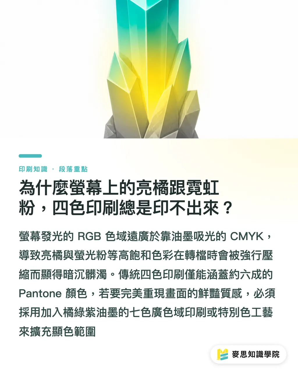
How does extended gamut 7-color printing (OGV) use ink to cover 90% of Pantone spot colors?
The most mature industry solution to limited gamut is Extended Gamut 7-color printing
This process adds three fixed spot-color inks, Orange, Green, and Violet, on top of the traditional C, M, Y, and K four-color base
By mixing 7-color halftone dots, the press can raise Pantone spot-color coverage from around 60% to more than 90%
The answer is harsh
Traditionally, if a package needed an accurate Pantone spot color, the factory had to custom-mix a single pigment ink. Every color change meant washing the ink tray and changing the ink fountain, which made both time and wash-up costs very expensive
Extended gamut 7-color printing keeps seven ink units fixed on press. Without washing down and custom-mixing ink every time, it can accurately reproduce multiple high-saturation spot colors in the same Gang Run layout
For premium brand packaging or corporate identity marks, this can sharply reduce spot-color ink mixing and plate costs while solving the common CMYK problem of prints turning too purple or too dark
Fluorescent spot-color base overprinting: how can designers get a neon feel without blowing the budget?
If your budget is limited and full extended gamut 7-color printing is out of reach, fluorescent spot-color overprint compensation is the highest-value alternative
This process does not simply print text with fluorescent ink alone. Instead, fluorescent ink is used as a base color or compensation layer and overprinted with CMYK halftone dots. The fluorescent pigment absorbs ultraviolet light and emits visible light, lifting the overall brightness and saturation
During prepress preparation and production-line communication, I recommend following the "MINDS Printing (MS, mid-to-high-end fully custom commercial printing) three-gate print submission" standard workflow:
・① Create an independent spot-color channel on the design side: build a separate Spot Color channel in the design software, such as Pantone 806 C fluorescent pink, and set the layers that need brightening or a neon effect to Overprint
・② Run digital soft proofing and gamut comparison before print: use a dedicated ICC Profile to simulate the result on screen, predict the saturation gain after the fluorescent base is overprinted with CMYK halftones, and confirm the print overprint order and screen angles
・③ Control print layers on the production line: the press first prints the fluorescent spot color as the base, then overprints CMYK halftone dots on top, allowing the fluorescent material underneath to shine through the semi-transparent upper ink layers
If your print quantity is small or you need to place an online order quickly, you can also use MINDS Printing to evaluate standardized print specifications and spot-color handling options, reaching an eye-catching neon visual effect within a limited budget
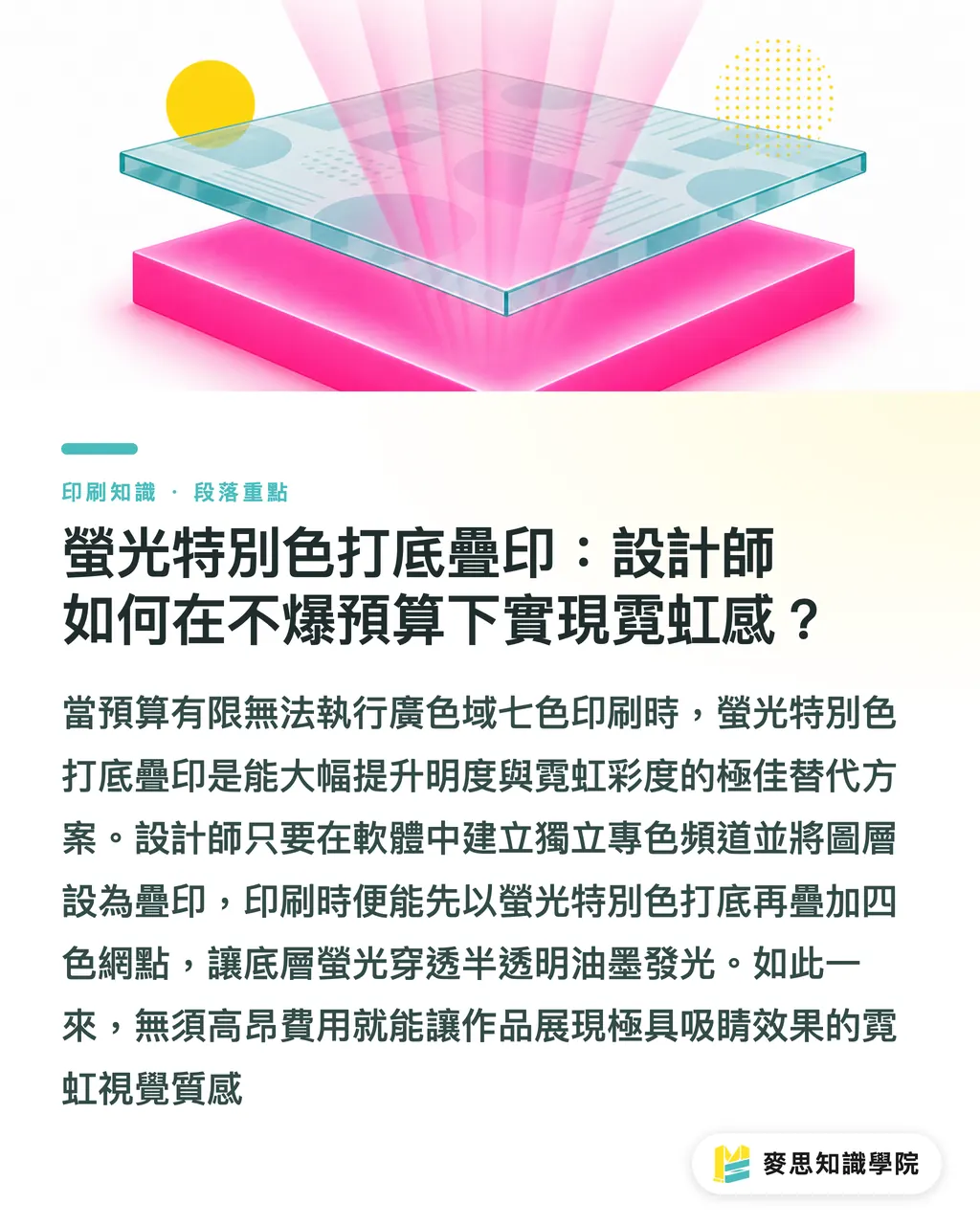
How to choose between traditional four-color, extended gamut, and fluorescent compensation
For different print needs and budget limits, choosing the right process is what balances visual quality and cost control
In practice, you can evaluate the job from these three angles:
・Traditional CMYK four-color printing: the lowest cost and fastest turnaround. Suitable for general promotional publications and photo printing. The downside is that high-saturation orange, green, violet, and neon colors will become seriously darker
・Extended gamut 7-color printing (OGV): reproduces more than 90% of Pantone spot colors. Suitable for premium color box packaging and standard corporate CI printing. It greatly reduces wash-up costs for multiple spot colors
・Fluorescent spot-color overprint compensation: adds only the cost of one spot color. Suitable for edgy brand visuals, party posters, and localized neon glow effects. It gives CMYK overprint layers a brighter, more translucent look
Do not rush to place the order yet
Before deciding on a process, first check whether the file contains extreme colors that CMYK cannot cover. Then combine that with proofing advice from the production team, and you can avoid spending serious money only to end up with colors that still do not pop

Key Takeaways
・Fluorescent effects and bright orange-green tones cannot be produced by CMYK alone. This is the physical limit of subtractive ink printing
・Extended gamut 7-color printing adds orange, green, and violet inks, covering up to 90% of Pantone spot colors
・Fluorescent spot-color base overprinting can give CMYK a neon-like glow at the cost of adding a single spot color
・Setting up spot-color channels and soft proofing before print is the core step for avoiding color mismatch and reprints
Further Thoughts
As brand packaging and commercial printing demand stronger visual impact, designers should no longer be boxed in by the traditional CMYK gamut
During early planning, print buyers and graphic design teams should first define the visual focus of the color. If a large area of corporate brand color needs to be reproduced accurately, extended gamut 7-color printing is the first choice for balancing cost and quality. If the goal is to create a striking neon effect in part of an exhibition brochure or package, fluorescent spot-color base overprinting is an extremely cost-effective tool
Only by building a solid prepress soft-proofing and spot-color communication process can inspiration from the screen be turned cleanly into a physical piece
Further Reading
・Can't get a neon feel from CMYK? Extended gamut 7-color printing and fluorescent spot-color overprint compensation
FAQ
- Why does neon pink on screen turn into a dull dusty pink after RGB is converted to CMYK?
- RGB belongs to a light-emitting optical color gamut, while CMYK belongs to an ink-based subtractive gamut that absorbs light. Fluorescent pink exceeds the physical coverage limit of CMYK halftone dots. During conversion, the out-of-gamut algorithm compresses brightness and saturation, making the color muddy and dark
- What is the difference between extended gamut 7-color printing (OGV) and traditional Pantone spot-color printing?
- Traditional Pantone spot-color printing requires ink to be mixed separately for each specific color, and the ink trays must be cleaned during color changes. That makes it costly and time-consuming. Extended gamut 7-color printing uses fixed CMYK plus orange, green, and violet inks. Through halftone combinations, it can reproduce more than 90% of Pantone spot colors, greatly reducing the cost of printing multiple spot colors
- Will fluorescent spot-color overprint compensation greatly increase printing costs?
- No. Fluorescent overprint compensation usually only adds one fluorescent ink spot-color plate on top of the original CMYK four-color setup. Compared with custom-mixing several spot colors across a full sheet or using special paper, it is a low-cost way to greatly improve visual saturation and the sense of glow
- How should I set up a fluorescent base overprint file in Illustrator?
- Create an independent Spot Color swatch channel in the design software, such as fluorescent pink. Place the fluorescent color area on the proper layer and enable the Overprint setting. During prepress handoff, note the base-printing order for the fluorescent spot color
Related articles



The Print × AI weekly
The print and AI know-how designers, brands and enterprises can use before they commit — one email, every week
MINDS Free Tools
Imposition calculator and preflight file check — free prepress tools, right in your browser.
MINDS Group
Need actual printing or gifting services?
From premium printing to online ordering and festive gifts — the MINDS Group sister brands take it from here.