
Why does paper grain throw off the direction of embossing and debossing?
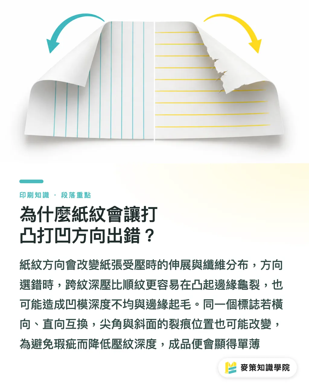
The grain direction changes the path the paper stretches along under pressure. Deep pressure across the grain is more likely to crack at raised edges than pressure along the grain. It can also make the depth of a deboss uneven and leave the edges fuzzy
Paper grain (grain direction) is the main alignment of the paper fibers formed through papermaking and finishing. It affects folding, pressure, stretching, and crack location, so prepress should treat it as a finishing direction
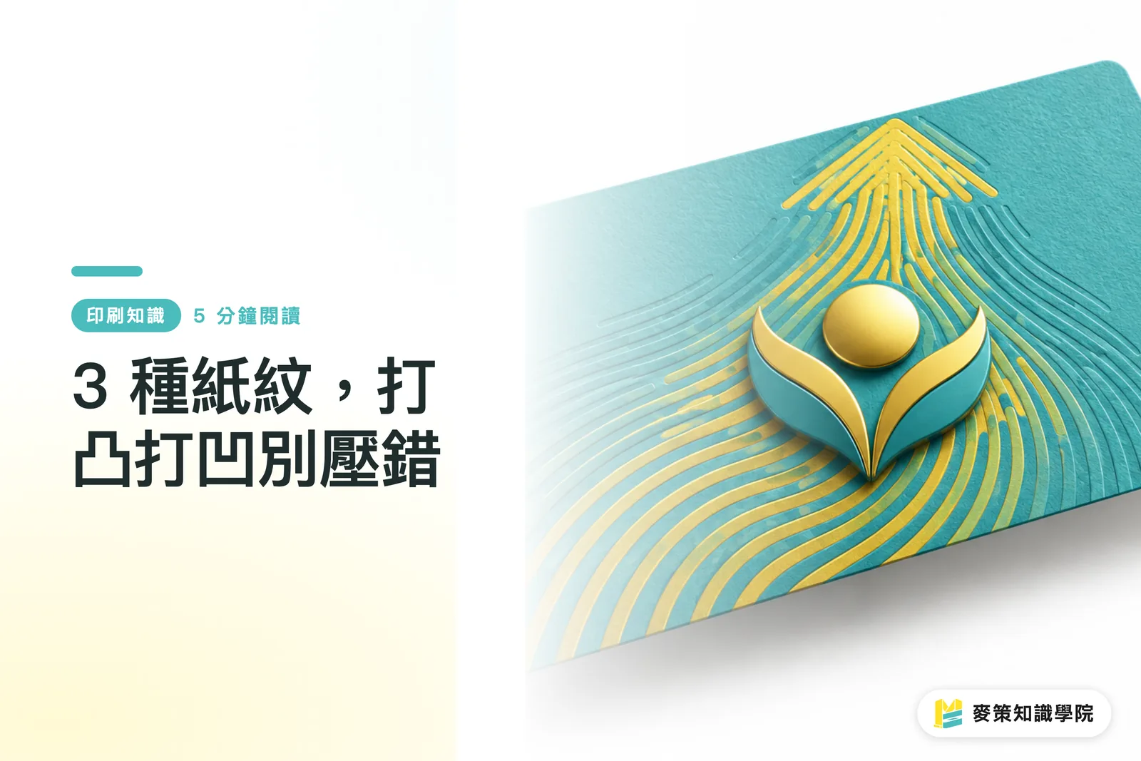
Embossing uses a male/female die to push graphics and text above the sheet. Debossing presses them into the sheet. Both processes require the fibers to redistribute over a short distance
With the same logo, switching the grain from horizontal to vertical can change the depth along the long axis of the emboss and the location of cracks. Sharp corners and slopes that cross the grain fail first. The printer then has to reduce the depth, leaving the finished piece looking flat
The screen won't show it. The paper will
How should you choose among the three paper stocks, and how do matte-coated and linen paper differ?
When choosing among the three stocks, look at the fibers and surface first, then the dimensional effect and level of detail you want
・Matte-coated paper is a short-fiber stock with a smooth surface, so embossing contours are easy to keep crisp. When deep pressure, sharp corners, and fine lines are concentrated together, stay conservative. Edge whitening or cracking will show up early
・Linen paper is a long-fiber stock, and its stretch path is usually wider under pressure. Its existing fabric texture can swallow small type and fine lines. It works well when you want the main graphic to feel substantial, but not when the look depends on hairline-level detail
・Coated paper and fine-art paper cannot be judged by the same yardstick. Coated paper has a smooth surface, so details and sloped surfaces reflect light clearly. Textured fine-art paper can hide small nicks in the base texture, but it can also swallow the outline of a shallow emboss
If the brand needs a crisp logo, start with a smooth paper whose grain can be confirmed. If it needs a tactile paper feel, accept that the base texture will interfere with detail. Whether the grain runs horizontally or vertically, make a small test press. Do not judge by the color in a swatch book alone
Which graphics are most likely to magnify paper-grain problems?
Fine lines, sharp corners, dense small type, and deep slopes magnify grain differences most easily because pressure is concentrated in a small area, leaving the paper too little distance over which to spread the deformation
The most common rejection scenario is a design file that retains only grayscale shadows but contains no actual embossing production data
・Keep the regular artwork in the print layer, and do not mix the dimensional effect into the print file
・Create separate spot-color layers for EMBOSS and DEBOSS, and name them clearly to state the finishing direction
・Create a separate FOIL spot-color layer so the printer can compare the foil position with the embossing position
・Use the visual mockup layer only to show the effect. It cannot replace the male/female die production data
If a logo only works because of an extremely fine outer border, remove the border first and test recognition. When that border also crosses the grain and meets deep pressure and registration error, it is the first thing to turn into a fuzzy edge
When embossing, debossing, and foil stamping are combined, how should registration be handled?
When embossing, debossing, and foil stamping are registered together, lay out the artwork around a standard ±0.2mm registration tolerance. Leave visual breathing room around fine borders and the edges of sloped surfaces
Registration (register) is the degree to which different finishing layers overlap against the same positioning reference. Grain affects embossing depth, while the press and materials can cause small shifts in foil placement
Putting a fine foil border exactly along the outer edge of an embossed slope looks beautiful on screen. In production, a slight shift makes it look like a broken line. A design like this cannot be fully rescued by the finisher's handwork alone
・Keep the main foil area on the flat platform of the emboss. Do not use a fine gold edge as the registration reference
・Put the embossing, foil stamping, and die-cutting on separate spot-color layers, using the same finished-piece positioning and front/back instructions
・Write the finishing sequence clearly in the handoff notes so the printer can verify it against the equipment. Do not send only a shaded effect image
If a business card is the brand's first impression, I would send the paper sample, emboss direction, and foil registration to MINDS for prepress confirmation before deciding whether to proceed with full-batch production
How can you determine grain direction from a swatch book before handoff?
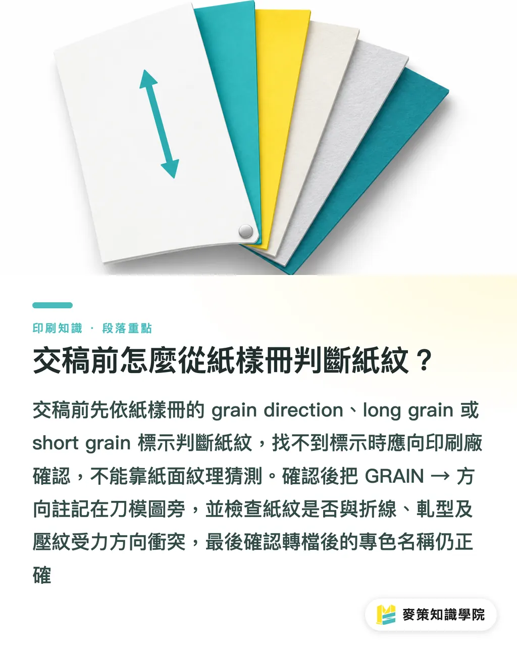
To determine grain from a swatch book, check the markings first, then annotate the layout. If you cannot find grain or an arrow, ask the printer to confirm. Do not guess from surface texture
・In the swatch book, record the grain direction, long grain, or short grain marking, then transfer it to the project notes
・Draw GRAIN → beside the die-cut diagram. Also mark the finished-piece front, DIE-CUT direction, EMBOSS UP/DOWN, and FOIL position
・Check whether the grain, scoring, fold lines, and embossing axis all concentrate the load on the same short edge. If they conflict, confirm the sheet-feed direction and the load direction of the finished piece first
・Before handoff, separate the print, embossing, foil, and visual mockup into layers. Check that the spot-color names are still correct after export
Before handoff, I use Mai Strategy's three-gate handoff check to verify each item, and I put all three fields in the production note. If anything cannot be confirmed, I run a test press first, then move on to full-batch business-card production
If your team wants to build this decision process into the artwork workflow, the Mai Strategy Knowledge Academy consulting team can help organize the swatch, die-cut, and handoff fields
Key takeaways
・Horizontal or vertical grain is not a layout preference. It determines how the paper takes embossing pressure
・With matte-coated paper, guard against cracked edges under deep pressure. With linen paper, guard against the base texture swallowing detail. With coated paper, first check whether marks show on the coated surface
・When embossing, debossing, and foil stamping are registered together, treat the standard ±0.2mm as a tolerance that needs managing at the design stage
・Put GRAIN, DIE-CUT, EMBOSS, and FOIL in the handoff sheet. Then the printer has a chance to catch errors before mass production
Further thoughts
Print production teams can make the grain arrow, die direction, and registration tolerance required fields on quotes and proofing forms. Designers can make their final-artwork templates keep the EMBOSS, DEBOSS, FOIL, and visual mockup layers separate. When introducing AI, start by having the system check whether grain markings, finishing layers, and front/back instructions are missing. Then let prepress staff decide whether the paper is suitable. What SaaS should really collect is traceable production conditions, not a portal that only lets people upload PDFs. As a next step, take one existing business-card file and add the GRAIN and scoring directions. The next handoff will have one fewer step that depends on guesswork
Further reading
・MINDS official website
FAQ
- Does the business-card grain direction have to run along the long edge of the finished piece?
- Not necessarily. It should be determined together by the paper's properties, the embossing axis, the die-cut, and the crease lines. For business cards that need deep embossing or creases, confirm the grain direction before setting the layout
- Which is better for embossing, matte-coated paper or linen paper?
- Matte-coated paper works well for crisp, clean light to medium embossing, but deep embossing needs protection against cracked edges. Linen paper usually has a wider stretch path, but watch out for its fabric texture swallowing small type and fine lines
- Is a ±0.2mm offset between embossing and foil acceptable?
- As a starting point, evaluate standard registration at ±0.2mm. But when a fine border sits against a slope, the visual shift is magnified. Run a test press or proof before mass production
- How should I hand off a file when the swatch book has no grain marking?
- Ask the printer directly for the grain direction. Mark the GRAIN, DIE-CUT, EMBOSS, and FOIL directions on the die-cut diagram. Do not guess from the paper texture
Related articles
The Print × AI weekly
The print and AI know-how designers, brands and enterprises can use before they commit — one email, every week
MINDS Free Tools
Spine width and imposition calculators — skip the manual math, free in your browser.
MINDS Group
Need actual printing or gifting services?
From premium printing to online ordering and festive gifts — the MINDS Group sister brands take it from here.