

Embossing vs. Debossing: What Is the Actual Difference in Feel?
Embossing presses paper between male and female dies to raise the design above the surface. Debossing does the opposite, sinking the graphic into the sheet. Both use matching die sets, differing only in the direction of the press
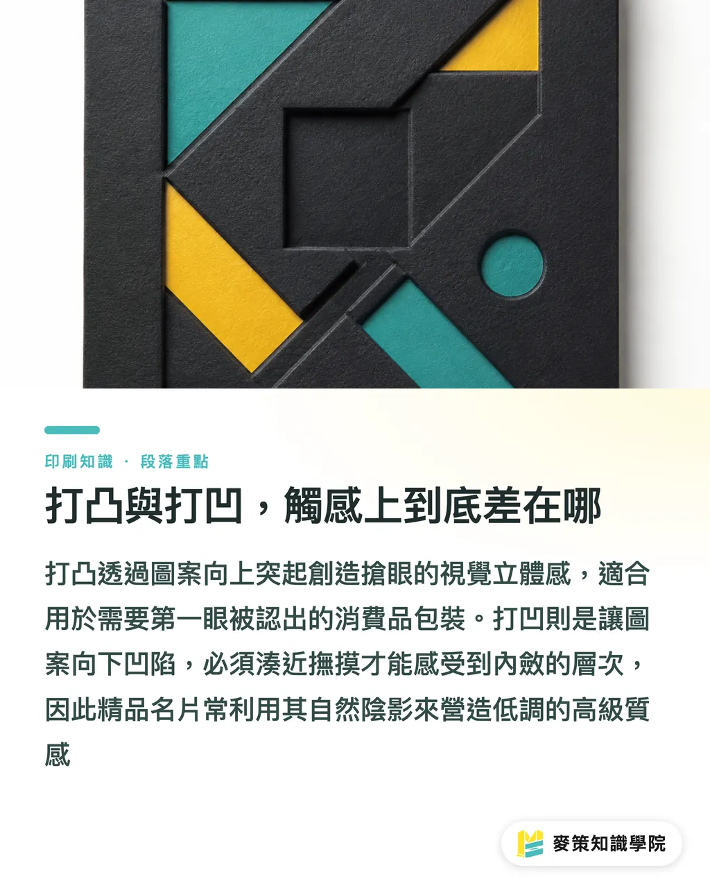
Visually, embossing delivers distinct three-dimensional depth that catches the eye from across the room, making it ideal for brand logos that need instant recognition. Debossing is much more understated. The graphic rests below the surface, inviting people to lean in or run their fingers across it to appreciate the texture, giving off a quiet, premium feel
In the projects I have worked on, luxury business cards and wedding invitations often lean toward debossing on dark stock because the indentations cast natural shadows, creating depth without a drop of ink. On consumer packaging, brands almost always pick embossing to make their logo pop on retail shelves. That is the clearest divide between the two finishes
How to Pick Paper Stock Without Cracking the Edges
Fiber elasticity decides whether your embossing or debossing holds clean or tears right through. That is the golden rule of paper selection
・Coated art paper: The surface coating is brittle and the fibers do not stretch well. Embossing often causes whitening or cracking around sharp corners, so it is best to avoid large areas or intricate designs here
・Fine art paper: Longer fibers and a softer bulk make this the go-to stock for both processes. Specialty stocks like cotton paper and linen cardstock stretch exceptionally well
・Laminated rigid board: The board core is thick, but the mounted face paper is thin. Watch out for delamination along the glue lines when stamping. It handles shallow debossing well, but deep embossing is asking for trouble
When requesting quotes, ask the printer directly, "Have you actually stamped this specific stock before?" Don't just ask if the paper can take an emboss. The first question digs up combinations the mill and printer have tested in real life, while the second usually gets an overly optimistic yes
Boxes and Book Spines: Which Finish Fits 3D Structures?
Embossing and debossing are straightforward on flat business cards or flyers. When you move to dimensional pieces like box walls and book spines, the decision follows a completely different logic
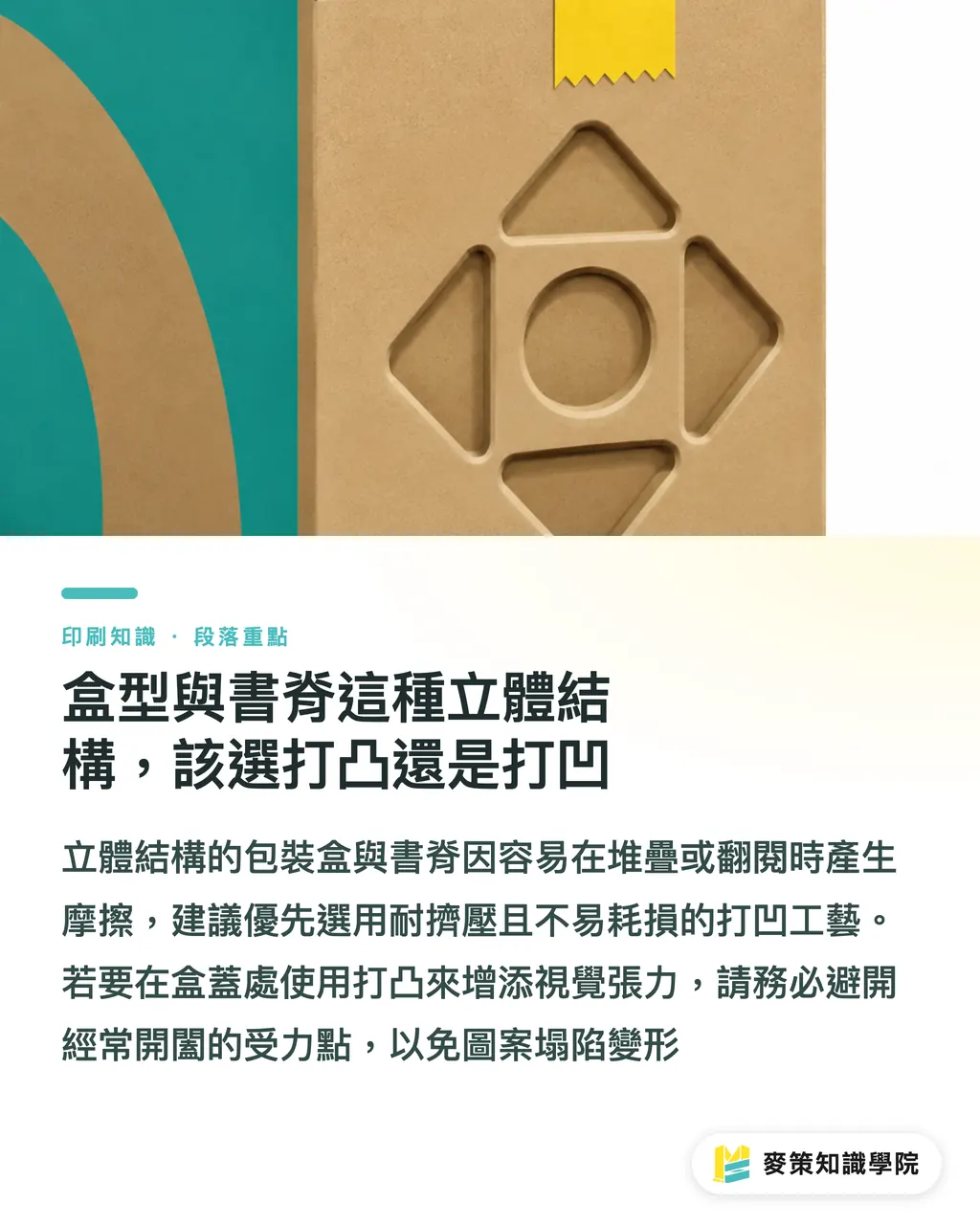
Along box sidewalls or edges, I always recommend debossing over embossing. Raised relief gets squashed or scuffed when boxes are stacked and shipped. A recessed deboss stays protected from external pressure, offering far better durability
When stamping a title or brand mark on a book spine, foil stamping paired with debossing is the standard choice. Constant handling and shelf friction rub down raised embossed edges and chip the foil. A recessed deboss tucks the graphic inward, slowing down wear and tear significantly
For box lids where shoppers look first, embossing delivers the visual punch you want. Just keep the textured area clear of hinge points or friction zones, or the raised graphics will collapse after opening and closing the box a few times
Logos and Full-Coverage Patterns: Design Pitfalls to Dodge Early
Brand logos often feature fine strokes and small lettering. The most common headache with embossing these files is that narrow line weights cannot be etched into the steel die, or they turn into a muddy blur once pressed
Full-coverage patterns across the entire sheet introduce another set of risks. Extensive stamping throws off paper surface tension, which can lead to warping or delamination during downstream mounting and coating. I usually urge clients to run a localized sample test before cutting full-sheet dies. Fixing a bad full-size die costs far more than proofing a small section first
If the logo typography runs lean, thicken the stroke weight before sending files to the die maker. It is the fastest way to protect your tooling budget, and it beats having to rework the artwork after the press run fails
Combining Emboss/Deboss with Foil and Spot UV: How to Sequence the Steps
Most premium packaging relies on multiple finishes rather than a standalone treatment. Pairing embossing or debossing with foil stamping or spot UV is common practice, and getting the order of operations right directly affects final quality and cost
・Foil stamping combined with debossing: Printers typically foil stamp first, then deboss. This pools the metallic sheen inside the impression, making it a favorite for high-end cards and invitations
・Spot UV combined with embossing: Spot UV usually goes on last, sitting directly atop the raised relief to accentuate highlights and reflections. You see this often on retail packaging brand marks
On the cost side, each extra finish requires its own die and another press pass, multiplying the risk of registration drift. When requesting quotes, ask the printer for an itemized breakdown of each pass alongside registration tolerances instead of settling for a lump-sum price. That shows you exactly where the budget goes and gives you room to negotiate or simplify steps. MINDS coordinates this type of multi-pass integration regularly on mid-to-high-end commercial print runs
Procurement Inspection: Quality Benchmarks for Tactile Finishes
When inspecting finished pieces, checking whether the impression showed up is only the bare minimum. Here are the checkpoints I verify on press runs:
・Edge integrity: Look for cracking or fiber whitening around corners and delicate strokes
・Depth consistency: Ensure impression depth stays uniform across the run. Inconsistent depth points to uneven press pressure
・Registration accuracy: If the stamping lines up with printed artwork, make sure the relief aligns cleanly over the ink
・Paper rebound: Check whether impressions bounce back or flatten over time, a common headache with stiff paper fibers
Pull samples from the beginning, middle, and end of the production run instead of relying on the sign-off proof. Press operators give extra care to pre-production samples, but run consistency across mass production is the real test of a printer's skill

Key Takeaways
・Embossing delivers visual impact for logos, while debossing offers durability for spines and box corners
・Coated paper cracks easily while art paper flexes well. Always check whether your printer has run stamping on that specific stock
・Proof full-coverage patterns with a small sample test, and bolster thin logo strokes early to avoid costly retooling
・Request itemized quotes for multi-pass finishing so you can pinpoint the real cost drivers
・Inspect across the full run rather than judging the sign-off proof alone. Registration accuracy and depth consistency prove true production reliability
Final Thoughts
For brand owners, embossing and debossing are not plug-and-play shortcuts to luxury. They are tied directly to paper stock, packaging structure, and finishing order. Bring your printer into the conversation before finalizing artwork so you can evaluate substrates and box mechanics together, rather than discovering unworkable files or budget blowouts after handoff. If your internal team does not handle post-press finishing every day, teaming up early with an experienced print partner saves time and money compared to fixing mistakes on press
FAQ
- Is embossing more expensive than debossing?
- Tooling costs for both are roughly the same. The budget gap comes down to paper stock and finishing combinations. Embossing demands more fiber stretch from the sheet, and pairing it with spot UV generally runs higher in total cost than debossing with standard foil stamping
- What are the risks of full-coverage embossing or debossing?
- Stamping over a large surface area creates uneven sheet tension, which can trigger warping or delamination during later mounting or coating passes. Run a localized test proof before paying for full-sheet tooling
- Should packaging box walls be embossed or debossed?
- Go with debossing for sidewalls and corners. Recessed graphics hold up against compression during shipping, whereas raised embossing tends to get flattened or scuffed in transit and stacking
- What is the proper sequence when combining foil stamping and debossing?
- The standard workflow is to foil stamp first, then deboss. This draws the metallic shine deep into the impression, which is why luxury business cards and wedding stationery use this exact sequence
- What should I look for when inspecting embossed or debossed finished goods?
- Check for cracked or whitened edges, make sure impression depth is uniform across the batch, and verify that the relief registers neatly over any printed artwork. Most importantly, sample throughout the entire production run instead of relying only on the pre-press proof
Related articles



The Print × AI weekly
The print and AI know-how designers, brands and enterprises can use before they commit — one email, every week
MINDS Free Tools
Spine width and imposition calculators — skip the manual math, free in your browser.
MINDS Group
Need actual printing or gifting services?
From premium printing to online ordering and festive gifts — the MINDS Group sister brands take it from here.