
Overview
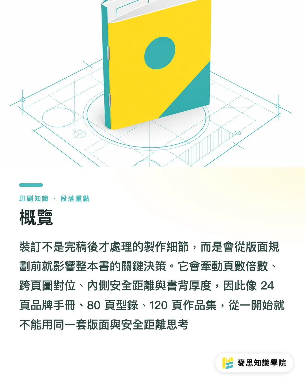
Yes, and the impact starts early. In Mai Strategy Innovation Co., Ltd.'s three-gate print submission process (MS, mid-to-high-end fully customized commercial printing), I put binding before layout planning, not after the file is finished, because binding pulls on page-count multiples, spread-image alignment, inner margins, spine width, lay-flat behavior, and paper weight
Binding method: the way multiple printed sheets are fixed together into a book after printing. Common types are saddle stitch, perfect bound, sewn perfect bound, exposed spine, and hardcover. It decides whether the book can lay flat, whether the spine can carry text, how much visual space the inner pages lose, and how long the finished piece will last under repeated handling
The most common problem I see on the production floor isn't bad design, it's design that asks about binding too late. A 24-page brand book, an 80-page catalog, and a 120-page portfolio start from completely different layout assumptions; you can't apply the same set of bleeds and safe margins to all three
Does binding really affect layout?
Yes. The most direct impact hits six things: page count, spread images, inner margins, spine width, lay-flat quality, and paper choice
・Page count: saddle stitch usually has to be planned in units of 4 pages, because one folded sheet yields 4 pages. If your file comes in at 18 pages, the floor will typically ask for blank pages to fill it out or a content re-layout
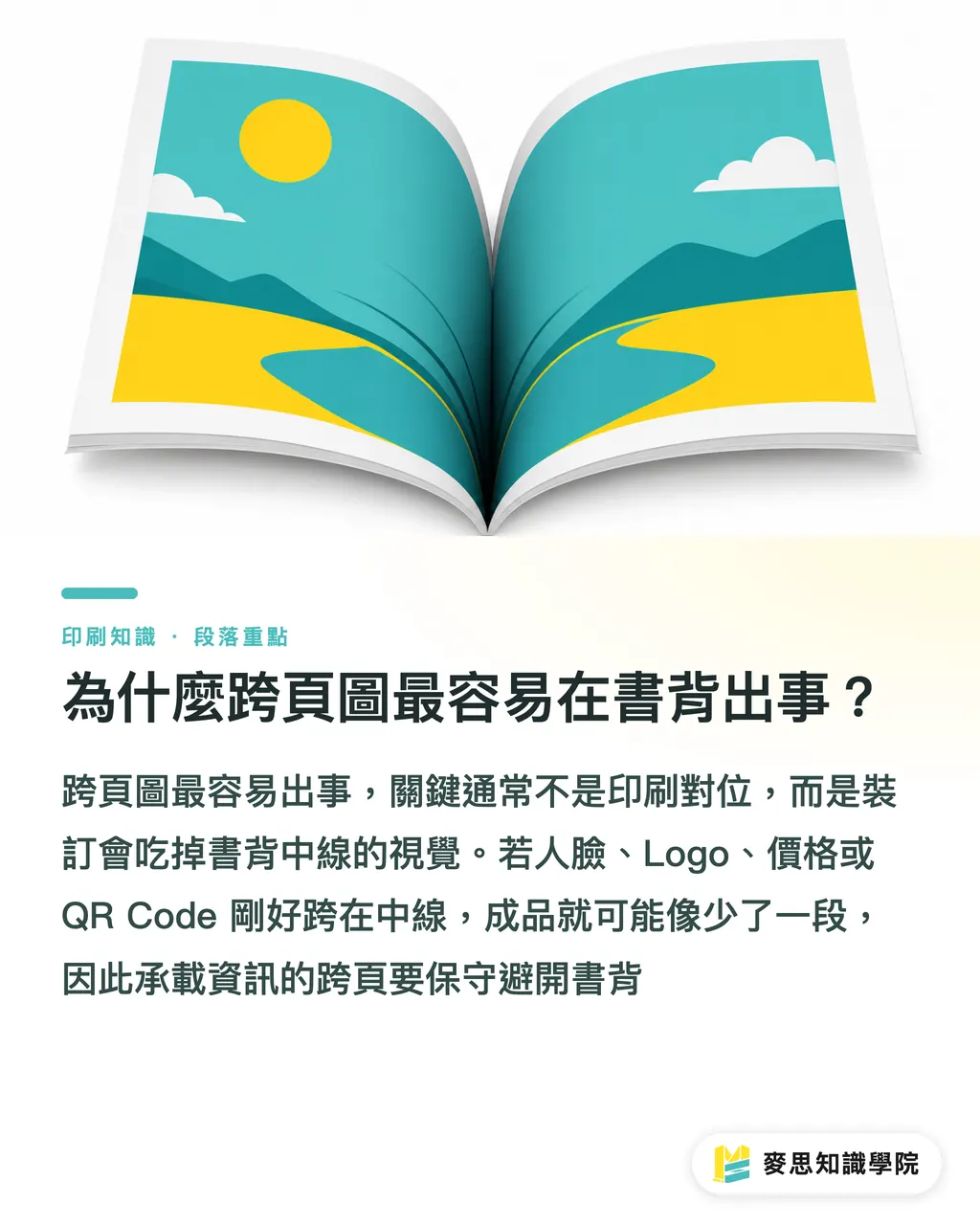
・Spread images: in perfect bound and hardcover books, the area near the spine gets eaten by the reading angle. Faces, logos, and important text shouldn't sit on the center line
・Inner margins: the side of the page closer to the spine needs to be more conservative than the outer side. Especially for perfect-bound catalogs over 80 pages, text too close to the inner edge forces the reader to press the book open with their hand
・Spine width: perfect bound, sewn perfect bound, and hardcover all need a spine calculation. Saddle stitch has no flat spine to print on, so you can't force a title onto the side edge
・Lay-flat quality: content that needs to lay flat for filling in forms, displaying drawings, or showing continuous left-right images can't be judged by how pretty a single-page PDF looks
・Paper choice: thicker paper makes the book stiffer and the spine thicker. The same 64 pages will feel very different on 100gsm versus 190gsm
I usually recommend running the first draft through Mai Strategy Innovation Co., Ltd.'s (MS) three-gate submission process: ① first define use and page count, ② then define binding and paper, ③ only then lock down layout safe margins. Flip these three steps and you often end up re-laying out the whole thing
If the project is a mid-to-high-end corporate catalog, brand book, or portfolio, you can talk to MINDS about binding and paper before the layout even opens up. This isn't about getting an early quote; it's about ruling out design directions that can't be produced or won't open well
Why do spread images break down at the spine most often?
When a spread image breaks down, it's usually not a printing registration issue. It's design ignoring that binding eats the center line visually
With perfect binding, the inner edge of each page enters the fold zone. When the reader opens to the middle pages, the book can spread out a bit; closer to the front and back, the page pull gets more obvious. If a photo spread puts a face, a product detail, or a table column right on the center line, the finished result looks like something's missing
・Saddle stitch spreads: thinner books lay flat more easily, so spread image continuity is better. But with too many pages, inner pages push outward, and the cut creates a noticeable difference between inner and outer page widths
・Perfect bound spreads: work well for catalogs and reports with clear chapters, but key visuals on a spread need to avoid the center line. Especially logos, eyes, prices, and QR codes shouldn't cross the spine
・Sewn perfect bound spreads: easier to handle than standard perfect binding, and more durable. Good for reference-style books with higher page counts that get opened often
・Exposed spine spreads: the strongest lay-flat effect, common in portfolios, photography books, and design presentations. But the bare spine becomes part of the visual language, so the brand tone has to carry it
・Hardcover spreads: the cover carries real weight, good for corporate commemorative books and high-end brand manuals. But endpapers, case, and spine structure all mean layout planning starts earlier than with a softcover
A practical rule of thumb: if a spread carries information, play it safe. If a spread carries mood, the risk is lower
Which binding fits which layout and product type?
No binding is more premium than the others; one binding is just more right for the job this book has to do
・Saddle stitch: suited to thin books around 8 to 64 pages, event handouts, small catalogs. Pros: straightforward cost, can lay flat, usually shorter lead time. Layout note: plan page count in multiples of 4; with too many pages, the middle pages get pushed out
・Perfect bound: suited to product catalogs over 64 pages, annual reports, course materials. Pros: has a spine, good shelf presence. Layout note: widen inner margins, and don't put critical information on a spread
・Sewn perfect bound: suited to reports and brand reference books that get opened a lot, have high page counts, and need a long shelf life. Pros: stronger than standard perfect binding, more stable open-and-close life. Cost and lead time run higher than regular perfect binding
・Exposed spine: suited to portfolios, photography books, design proposals. Pros: lays flat well, spread visuals stay more complete. Layout note: you can go bigger, but the bare spine will shape the overall look
・Hardcover: suited to brand books, corporate commemorative volumes, high-value proposal pieces. Pros: weight and durability. Layout note: confirm cover board, spine, gutter, and inner paper weight early
Looking at the kinds of projects common among Taiwan's small and mid-sized businesses, I'd look at saddle stitch first for a 24-page event handout, perfect bound for a 96-page product catalog, sewn perfect bound for a 120-page-plus reference book that gets opened often, and only seriously consider exposed spine or hardcover for a high-end portfolio
Slow down before you decide
If the use case is a short-term exhibition handout, hardcover is usually overkill. If a salesperson is taking it into a big-deal pitch, a too-thin saddle stitch can't carry the brand's weight. Binding is really about pre-setting the reader's usage scenario
Which specs should be locked down early in design?
Lock down at least 8 specs in the early design phase. Confirm one step later, and you may add a whole round of revisions
・Finished size: A4, A5, B5, square, or other special dimensions. Size affects printing imposition, trim waste, and how the piece feels in the hand
・Estimated page count: work from common ranges first, like 16, 24, 32, 48, 64, 80, 96, 120. That's more stable than laying out everything and only then counting pages
・Binding method: saddle stitch, perfect bound, sewn perfect bound, exposed spine, or hardcover. Pick a direction first, because inner white space and spread-image strategy differ
・Paper weight: inner pages that are too thick make the book stiff; too thin and you risk show-through. Product catalogs and portfolios especially need to weigh ink coverage against handling feel
・Cover material: whether the cover gets a laminate, spot UV, foil stamp, or embossing affects how safe it is to process the spine and fold areas
・Inner margins: text, page numbers, charts, and QR codes shouldn't sit close to the spine. For thick books, start by giving the inner side 3 to 5 mm more white space than the outer side
・Spread rules: mark out early which images can cross the spread and which pieces of information can't. The designer won't step on the line on every page if this is set first
・Spine information: for perfect bound, sewn perfect bound, and hardcover, confirm spine width before placing the title, logo, or issue number. Forcing text onto a too-thin spine ends up looking cheap
The line I dread hearing when I review a file is, "The layout is all set, we just need to figure out the binding." In prepress, that sentence usually means some good-looking visuals have already reached a point where something has to be sacrificed
For commercial printing, if a company has design, procurement, and sales making the call together, you can hand the specs to the Mai Strategy Knowledge Academy consultant team for a pre-submission check. The focus is page count, binding, paper, and prepress risk. You don't need to wait until the whole file is drawn
How can AI and SaaS teams turn binding into a pre-check?
If AI and SaaS teams want to serve the printing industry, don't just build file upload and a quote table. Binding rules should sit inside the layout check
A useful system doesn't need to judge every aesthetic issue from day one. Just catching these 5 categories of hard rules is already valuable
・Page count check: is the saddle stitch page count a multiple of 4, and does the perfect bound page count support a usable spine?
・Margin check: are inner-side text, page numbers, barcodes, and QR codes sitting too close to the binding edge?
・Spread risk check: are faces, logos, prices, and table columns crossing the spine center line?
・Paper and thickness hint: after multiplying page count by paper thickness, flag whether a spine design is needed or a different binding should be used
・Product type suggestion: catalogs, reports, portfolios, and brand books map to different bindings. The system should let the customer pick the use case first, then the technique
For the printer, this kind of check cuts back-and-forth. For the designer, it means knowing the boundaries before drawing the first page. For the SaaS team, binding isn't a dropdown; it's a set of production rules that change the layout
That's enough to start with

Key Takeaways
・Binding affects the layout first, then the finishing; don't decide it after the file is done
・For saddle stitch, start with multiples of 4. For perfect bound, start with inner margins. For hardcover, start with spine and gutter
・Spread images are fine, but critical information shouldn't sit on the spine center line
・Paper thickness changes how the book opens and how wide the spine is; you can't judge by how nice a single sheet looks
・Good prepress puts page count, binding, paper, and use case on the same decision map at the start of design
Further Thought
Print manufacturers, designers, and SaaS teams can treat binding as an upfront spec rather than a downstream finishing step. The next move is concrete: move "binding method" on the quote sheet or upload system forward into the design brief, and require every project to fill in finished size, estimated page count, binding, paper, spread rules, and inner margins before opening the layout. What you cut isn't a field; it's an entire round of rejections and re-layouts later
FAQ
- Does binding affect layout design?
- Yes. Binding affects page-count multiples, spread image placement, inner margins, spine width, lay-flat quality, and paper choice. You need to decide the broad direction early in design
- Why does saddle stitch often need page counts in multiples of 4?
- Saddle stitch forms 4 pages from one folded sheet, so planning usually works in 4-page units. Page counts like 18 typically need blank pages added or content adjusted
- What should I watch out for with perfect-bound spread images?
- In perfect binding, the area near the spine loses visibility because of the reading angle. Faces, logos, prices, QR codes, and table columns shouldn't sit on the spread center line
- Which binding suits a portfolio?
- If a portfolio values spread display and lay-flat effect, consider exposed spine or sewn perfect bound. If weight and shelf life matter more, hardcover works better, but layout and spine need to be planned earlier
- When should a designer confirm the binding method?
- Confirm it before opening the layout. At the same time, lock in finished size, estimated page count, paper weight, spread rules, and inner margins. Confirming after the file is done often forces a full re-layout
Related articles



The Print × AI weekly
The print and AI know-how designers, brands and enterprises can use before they commit — one email, every week
MINDS Free Tools
Spine width and imposition calculators — skip the manual math, free in your browser.
MINDS Group
Need actual printing or gifting services?
From premium printing to online ordering and festive gifts — the MINDS Group sister brands take it from here.