

What's the real reason AI‑generated images feel off when printed?
The most common explanation is "insufficient resolution," but in most of the projects I've handled, that's not the real issue
The actual cause has two layers:
Layer one: the generation stage didn't account for the paper's physical properties
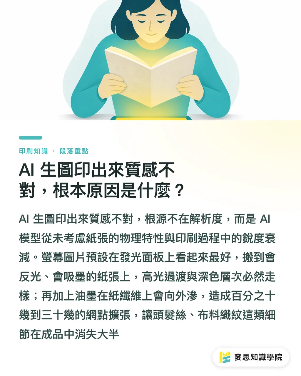
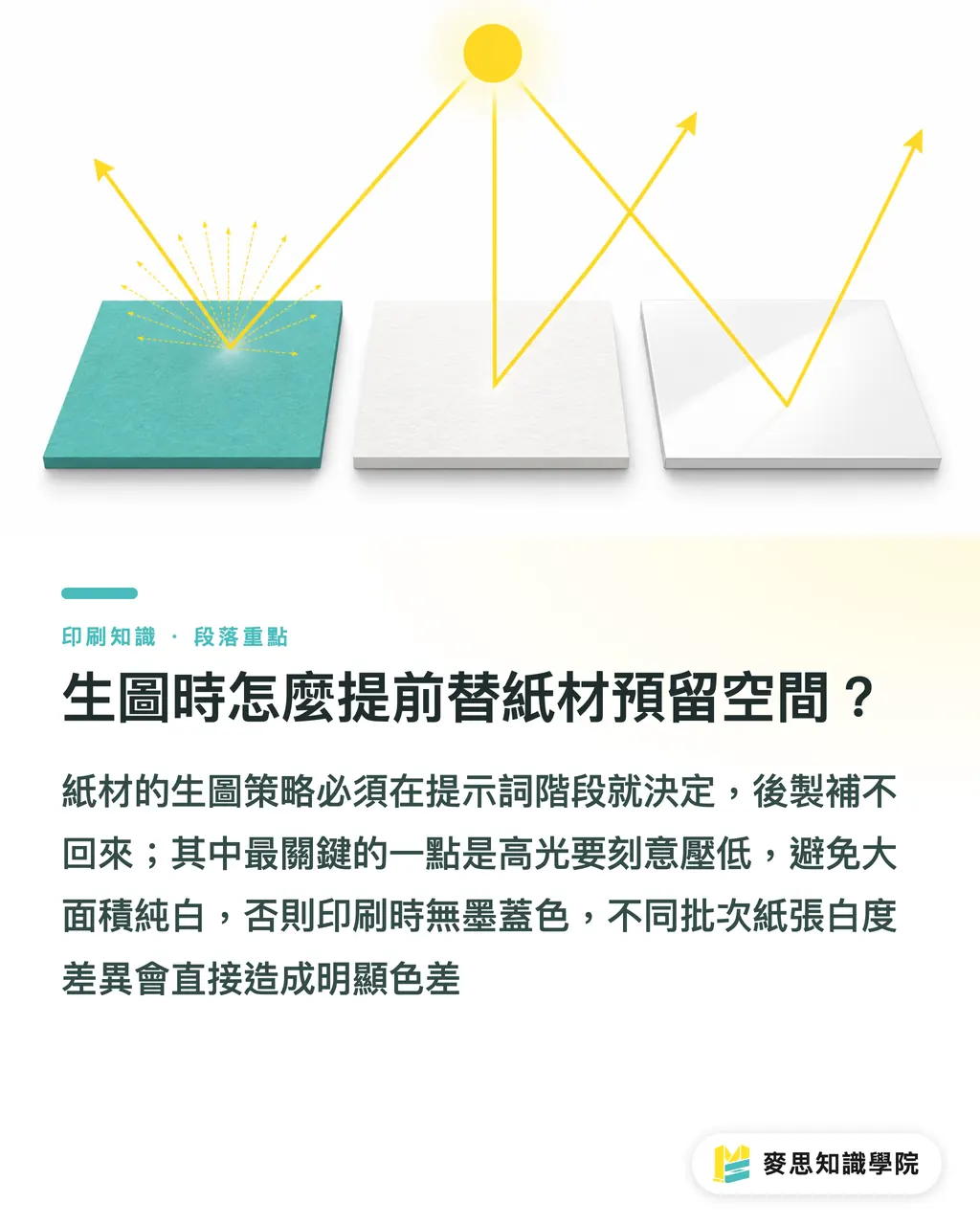
AI image generators are trained almost entirely on screen images, so the model assumes the best look is on a luminous glass panel. Paper doesn't emit light; it reflects, and each paper type reflects differently, coated stock bounces light straight back, matte stock diffuses it, and textured specialty papers can refract light in various directions
The subtle highlight transitions and deep tonal layers that look fine on a screen behave very differently on paper
Layer two: the printing process itself reduces sharpness
In the industry this is called "dot gain." Ink seeps into the paper fibers, expanding the dot area beyond the design. Coated stock typically sees 12‑18% gain; uncoated papers can reach 25‑35%
The impact is two‑fold: details blur, dark areas become darker, and light highlights get compressed. Fine textures in AI images, hair strands, fabric weaves, leather grain, lose about half their detail due to dot gain
Why do different papers produce such varied results?
Four common paper stocks, whose characteristics directly dictate your generation strategy:
・Coated stock: smooth coated surface, strong reflectivity, high color saturation, minimal dot gain. AI images can keep more dark‑area detail, but watch for blown‑out highlights, white that looks layered on screen may print solid white
・Matte stock: coated but mattified, light is scattered, colors appear softer, contrast about 10‑15% lower than on screen. If the AI image already has low contrast, the print can look like it's covered with a veil, this is the most common trap with matte paper
・Semi‑gloss stock: sits between coated and matte, finer feel, good for "textured yet not harsh" designs. Colors are slightly fresher than matte, dot gain a bit higher, so dark text needs extra attention
・Specialty paper: biggest differences. Cotton, recycled, or embossed cardstock has coarse fibers; ink spreads unpredictably, sometimes over 30%. Highly detailed AI images are generally unsuitable for specialty paper unless you deliberately want a rugged feel
How to reserve space for paper characteristics while generating images?
Many assume you can tweak the image after generation, but the prompt stage actually decides everything
The strategy varies by paper:
・Coated stock: you can ask for rich detail and high contrast, but purposefully tone down the brightest highlights to avoid large pure‑white areas. Pure white prints without ink, showing the paper's base color, and batch‑to‑batch white variations become noticeable
・Matte stock: include terms like matte texture, soft light, low contrast, or explicitly request diffused lighting. After generation, boost overall contrast by 10‑15% to compensate for the matte's light‑absorbing effect
・Semi‑gloss stock: similar logic to matte, but you can retain more shadow detail. For fine patterns, ask for crisp edges and avoid excessive scaling before printing
・Specialty paper: the hardest to predict. I recommend doing a proof first or using coarser, texture‑heavy prompts such as grain texture, rough surface, so the image's style matches the paper's roughness instead of fighting it
One more thing: RGB‑to‑CMYK gamut loss is unavoidable. After generation, run a soft proof in Photoshop or Illustrator with the target paper's ICC profile to see actual print colors, then adjust. Don't send to press based on screen intuition
If you're unsure which settings to use, the Mai Strategy Knowledge Academy consulting team can help clarify the paper‑to‑generation matching logic
When purchasing paper, how can you estimate the printed texture?
Designers and buyers often make decisions separately, leading to texture loss: a designer may generate for coated stock, but the buyer switches to matte for cost, and the two don't align
Before buying, consider these questions:
・Is the main visual's color density high? Dark large areas on uncoated paper dry longer and attract dirt more easily
・Does the image contain fine lines or tiny text? Specialty papers can eat away text smaller than 8 pt due to dot gain
・Are there metallic‑sheen elements? The only way to reproduce the common AI‑generated metal look on paper is foil stamping or spot gloss; regular ink can't achieve it
・What post‑processing is planned? A super‑gloss film will cancel a matte paper's dullness; a matte film on coated stock actually enhances texture
・Do the paper weight and printing method match? Thin paper double‑sided full‑bleed can show through; AI images often have large backgrounds, making this a frequent pitfall
Answering these narrows the paper choice to two or three options, making sample comparison straightforward
What key points to check during proofing to confirm texture?
Proofing isn't just about color; it also checks texture
These are the items I always inspect:
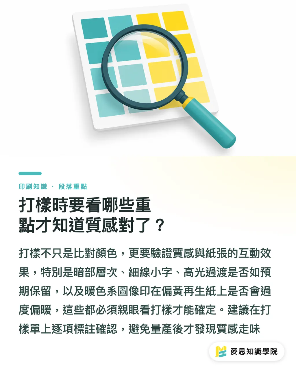
・Dark‑area depth: in the deepest color blocks, can you still see detail? Lost depth means dot gain exceeds acceptable limits
・Fine lines and tiny text: are hair‑thin details still present? Lines under 0.25 mm almost always disappear on specialty paper proofs
・Highlight zones: in AI images, near‑pure‑white transitions, does the print show a gentle gradient or jump straight to white? If it jumps, any paper other than coated stock is problematic for that image
・Color interaction with paper base: especially warm AI images printed on slightly yellow‑toned recycled paper, the overall temperature shifts warmer. You need the proof to decide if that overlay meets your intent
・Surface texture consistency: if the image deliberately mimics a material (leather, metal, watercolor paper), does the printed paper's texture clash with the intended feel?
·MINDS (https://www.mindscmyk.com/) follows these checkpoints as standard when handling commercial print jobs. Clients can request item‑by‑item verification on the proof sheet to avoid discovering issues only after printing
Key Takeaways
・AI generators are trained on screen images and have no concept of paper characteristics; texture mismatch is baked in from the start
・Dot gain is an irreversible physical effect—12‑18% on coated stock, up to 25‑35% on uncoated papers, causing detail to evaporate
・Matte and semi‑gloss papers' dull surfaces eat contrast; you must raise contrast after generation, not after printing
・Paper selection and image generation are a single decision; handling them separately guarantees texture mismatch
・Proofing validates more than color, dark‑area depth, fine‑line survival, and highlight transitions are the true texture indicators
Further Thoughts
Once AI‑generated images enter the workflow, the perceived barrier to printing drops, but the traps multiply. Issues designers once avoided by experience now fall to the AI, which doesn't know them, and users often don't either. I've seen many projects where the AI image looks beautiful on screen, but that beauty belongs to the screen; a different paper creates a different world. I suggest designers keep a paper‑reference log alongside their AI asset library: note which paper each image was printed on, how it performed, and what to tweak next time. After a few projects you'll develop an instinct. Buyers should also pull paper choices into the design discussion early, don't wait for the finished artwork to pick paper; decide the paper first so the generation direction has a physical anchor point
FAQ
- The AI‑generated image has enough resolution, why is the print still blurry?
- Resolution is a factor, but not the only one. The blur mainly comes from dot gain, ink spreads into the paper fibers, thickening edges and erasing texture, especially on specialty and uncoated papers. Raising resolution won't fix that
- How can I avoid dull colors when printing AI images on matte paper?
- Matte coating scatters light, lowering perceived contrast and saturation versus a screen. Compensate by increasing contrast by 10‑15% during generation or post‑processing, and make dark details slightly more visible than you ultimately want. Also run a soft proof with the matte paper's ICC profile before sending to press
- Are specialty papers suitable for AI‑generated images with lots of detail?
- Usually not. Specialty papers have coarse fibers and high ink absorption, leading to unpredictable dot gain that can erase fine details. Choose AI images that already have a rugged, textured style, letting the paper's roughness complement the artwork
- How should I write prompts that are more print‑friendly?
- Key points: request a CMYK‑friendly color mode (avoid screen‑only neon hues); state the output is for print; add paper‑specific descriptors, e.g., matte texture, soft diffused light for matte, sharp details, high contrast for coated. After generation, convert to CMYK and run a soft proof; prompts can't replace pre‑press checks
- Proof colors match, but batch printing shows color shift, what now?
- Common causes are different paper batches (white‑point variations), ink batch changes, or temperature/humidity affecting drying. Record density values during proof, and ask the printer to target those numbers for the run instead of relying solely on visual comparison
Related articles

The Print × AI weekly
The print and AI know-how designers, brands and enterprises can use before they commit — one email, every week
MINDS Free Tools
AI background removal, brand stamping, and a LINE sticker maker — free design tools, right in your browser, no upload.
MINDS Group
Need actual printing or gifting services?
From premium printing to online ordering and festive gifts — the MINDS Group sister brands take it from here.