
Why non-AI designs get called AI slop
When non-AI designs raise eyebrows, it usually comes down to over-relying on stock image compositing, hyper-smooth gradients, and a lack of real physical texture and print marks
The reason is simple
Over the past few months on press lines and client calls, I've seen designers hit with real frustration. They built every detail by hand in Illustrator or Photoshop, only for a client to reject the proposal with a cold 'this looks like cheap AI slop.' Looking closely at these misjudged pieces, skill isn't the problem. The issue is a fake, plastic feel caused by over-polishing
Commercial design leans heavily on stock assets from Microsoft or Adobe Stock. Airbrushing skin textures too smooth or throwing in uniform 3D lighting and loud gradients triggers the public's mental filter for AI images. Under ISO 12647 color standards and real print work, real-world light rarely follows perfect symmetrical curves. Highlights and shadows calculated purely by math might look sleek on a monitor, but on paper, they fall flat and lifeless
Another killer is missing vector nodes and texture details. AI imagery gets called out for ill-logical edge welding and random noise. Some designers compositing photos rely on auto-selection tools to cut edges, leaving them unnaturally sharp or strangely jagged. That edge treatment mirrors AI defects closely, making people suspect AI right away
Prepress: Technical checks performed on design files before printing, including resolution checks, color space conversion, bleed settings, and black channel resets to ensure files meet CTP platemaking and press output standards

How can designers prove originality and hand-crafted effort?
The best way to prove work is real is to keep vector path nodes, draft layers, and layer groups intact in presentation and production files, letting clients see human decision-making at a glance
To shake off the 'AI-like' tag, build a clear chain of proof when handing off files or presenting pitch decks:
・ Keep digital sketches and vector nodes: When drawing in Adobe Illustrator, keep original sketch layers and Anchor Points. Dropping a screenshot of your Bézier curve nodes into pitch slides gives undeniable visual proof that no AI was involved
・ Set up clear layer names and structures: Organized layer structures show professional prepress logic. Separate backgrounds, main raster graphics, vector accents, text, and special finishes onto distinct layers with standard naming. AI generators cannot output file structures like this automatically
・ Note asset license codes and custom element details: If you use commercial stock assets, list license sources and editing logs directly in your delivery notes. Clarifying what was manually cut out and what was drawn by hand builds real business trust
If complex vector prepress or file architecture leaves you stuck, reach out to the Mai Strategy Knowledge Academy Advisory Team. Professional consultants can refine your prepress workflow so your files meet print standards while showing off your original work
Vector Layer: A file format built on geometric anchor points and Bézier curves. It scales infinitely without distortion and offers high adjustability, making it the standard format for print production and proof of original work
How to fix AI files in prepress: The three MINDS Printing (MS) checkpoints
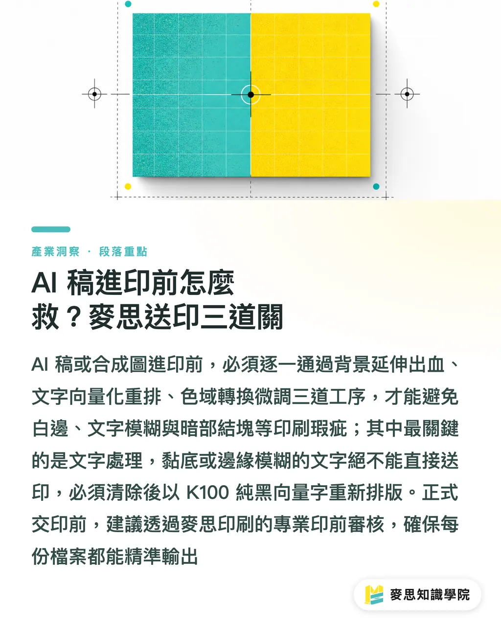
When AI-generated or plastic-looking artwork arrives at prepress, it takes three steps, extending bleed, re-typesetting text, and vector repairs, to meet commercial printing demands
When dealing with client-approved files plagued by plastic vibes or AI flaws, prepress techs and designers can use the three checkpoints from MINDS Printing (MS, mid-to-high-end fully customized commercial printing) to fix things in practice:
・ ① Checkpoint 1: Background extension and bleed settings: Commercial printing requires a 3 mm bleed on all four sides. Many composite files crop edge artwork tight, and stretching them distorts proportions. You need to separate the background manually in Photoshop, extending it with path cloning and spot-stamping to avoid white edges during trimming
・ ② Checkpoint 2: Text separation and re-typesetting: Never send files to print if text bleeds into the background or looks blurry. Prepress must strip out original text with cutout tools and re-typeset it using vector fonts set to pure K100 black, keeping resolution above 300 dpi for crisp, sharp lettering
・ ③ Checkpoint 3: Color space conversion and gradient tuning: Converting raster images from RGB to CMYK often muds up shadows and creates hard steps in light gradients. Adjust output ratios channel by channel with curve tools, then add 1% to 2% subtle noise to break up hyper-smooth plastic sheen and bring back natural ink texture
Here is how printability and work difficulty stack up across different prepress conditions:
・ Raster composite files: Resolution often under 300 dpi, single layer prevents text separation, RGB color space needs manual correction, extremely difficult prepress work
・ Vector print-ready files: Infinite resolution, text and images completely isolated on separate layers, standard CMYK setup, smoothest prepress process
Don't rush to press
Before sending files off for final production, contact MINDS Printing for a prepress file review. Professional CTP direct platemaking and color management will safeguard output quality for every print job
How print proofing becomes your final line of defense against doubts
Physical print proofs turn virtual screen images into tangible products rich in paper texture and ink feel, instantly cutting through AI slop accusations
Backlit RGB monitors magnify plastic vibes because glowing screens make gradients look artificially seamless. Once a design hits real paper, physical interactions between ink and paper fibers bring the work to life in a whole new way
Physical proofs deliver three key advantages:
・ Show off paper fiber and ink layering: Proofing on fine art paper or uncoated stock with subtle texture balances out stiff, over-edited graphics, letting colors settle into natural, quiet ink tones
・ Verify tactile depth in special finishes: Finishing touches like spot debossing, foil stamping, or embossing add tactile depth screens cannot match. Details requiring precise zinc plates and craftsmanship serve as your best weapon to prove design value and manual precision
・ Build client trust in finished print quality: Proofers print samples with real Halftone Dots. When clients feel the paper weight and see crisp text lines and structured halftone dots, doubts about cheap AI slop vanish

Key Takeaways
・ Avoid over-smoothing skin and lighting. Keeping natural optical imperfections removes the plastic feel
・ Keep and show vector anchor points and organized layer structures when presenting pitches or delivering files
・ Apply the three MINDS Printing (MS) prepress checkpoints to fix background bleed, text vectorization, and color spaces before hitting print
・ Use physical print proofs and specialty paper stock to crush AI doubts with real ink and texture
Further Thoughts
As public fatigue and trust issues around AI content grow, print providers and designers face a prime chance to reshape their value. Future design competition will not be about generation speed; it will hang on attention to detail and understanding physical materials. Designers should make prepress knowledge a core skill, factoring halftone dots and paper traits into digital artwork from day one. Printers, meanwhile, must shift from basic OEM suppliers into quality guardians who help turn digital ideas into high-end physical products
Further Reading
FAQ
- What should I do immediately if a client suspects my non-AI design was generated by AI?
- Don't argue with the client right away. Share file screenshots showing your sketches, vector Anchor Points, and layer structures, along with legal license sources for any stock assets, to prove originality
- Why does artwork look crisp on screen but turn into plastic composite slop when printed?
- Monitors emit RGB light that hides over-smoothed flaws, while printing relies on CMYK light-reflecting inks. Without real halftone dots and paper texture, converting to print colors exposes composite marks through shadow muddying and harsh color steps
- Can AI-generated raster files be used directly for commercial packaging print?
- No. AI raster output usually lacks a 3 mm bleed, falls short of 300 dpi resolution, and merges text into backgrounds. Files need vector redrawing and prepress fixes to meet commercial print standards
Related articles




The Print × AI weekly
The print and AI know-how designers, brands and enterprises can use before they commit — one email, every week
MINDS Free Tools
AI background removal, brand stamping, and a LINE sticker maker — free design tools, right in your browser, no upload.
MINDS Group
Need actual printing or gifting services?
From premium printing to online ordering and festive gifts — the MINDS Group sister brands take it from here.