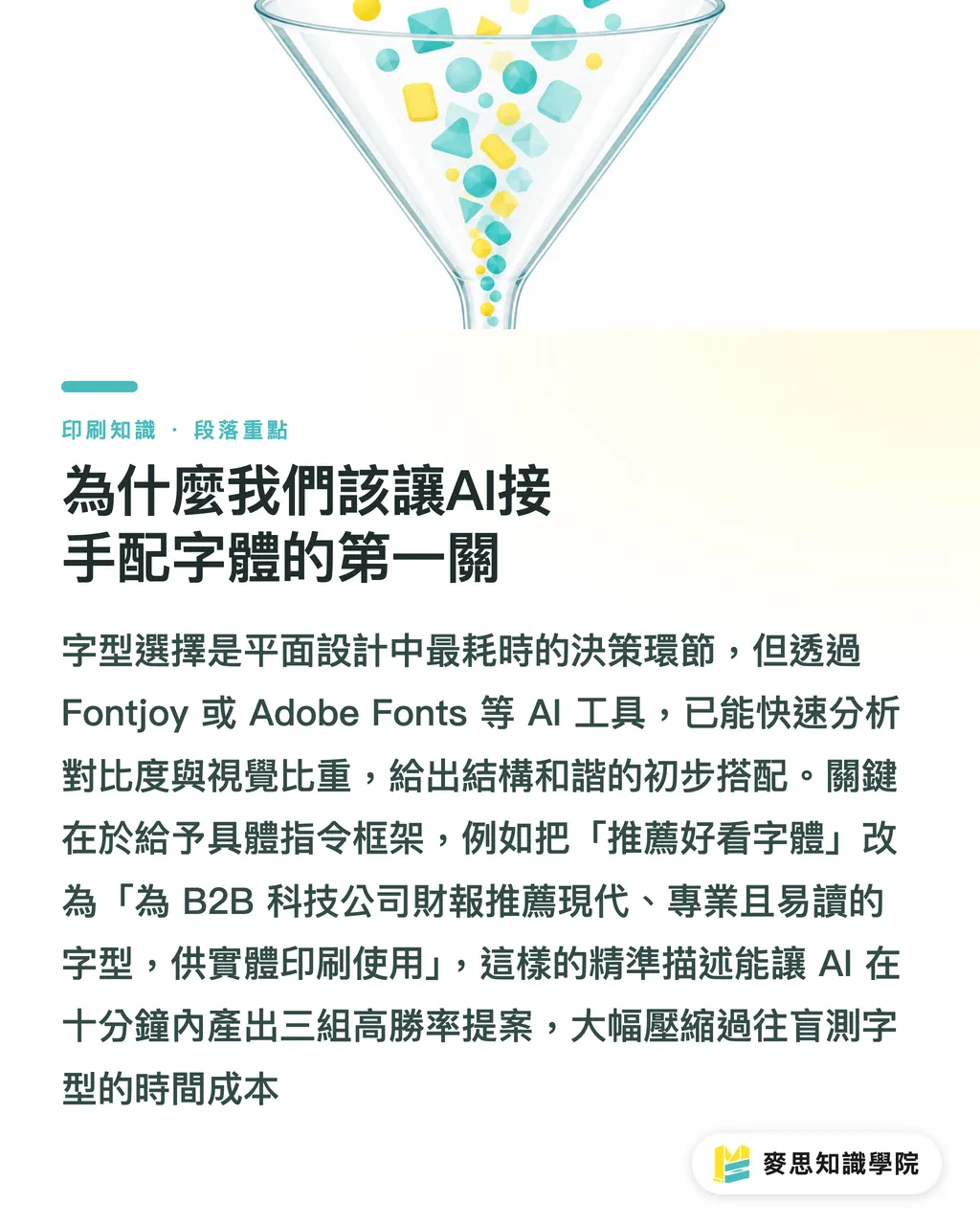
Why We Should Let AI Handle the First Step of Font Pairing
Font selection is frequently the most time-intensive stage in the entire graphic design process
Based on the clients and projects I've worked with recently, using AI as a creative assistant for initial brainstorming can save a massive amount of trial-and-error cost
Tools like Fontjoy or the AI-powered recommendation features in Adobe Fonts can already analyze contrast and visual weight to quickly provide a harmonious base pairing
To get precise recommendations from AI, the key is to provide a clear framework of prompts
When describing your needs, you must specifically define your brand personality, usage scenario, and target audience
・Change "Recommend a nice font" to "Recommend a modern, professional, and highly readable typeface for a B2B technology company's annual report."
・Specify that the final medium is physical print, as this affects recommendations regarding stroke weight and counters
This systematic approach to prompting can compress what used to be hours of blind font testing into under ten minutes, producing three highly viable options
Why Chinese Font Pairing Cannot Simply Copy AI Suggestions
Chinese characters have unique square structures and typesetting logic, meaning results from Latin-centric machine analysis cannot simply be applied directly
Drawing from my experience with thousands of print projects, high-quality Chinese typesetting relies heavily on visual rhythm
Currently, most AI recommendation tools focus on Latin alphabets; applying these directly to Traditional Chinese often results in clashing styles
In practice, the most stable Chinese pairing rule remains the classic "Sans-serif for headings, Serif for body text."
・Sans-serif Headings: Provide strong visual impact and modernity, suitable for quickly conveying core messages
・Serif Body Text: Utilize the characteristics of thin horizontal and thick vertical strokes to create a horizontal flow that guides the eye during long-form reading
Combining this rule with AI's initial screening allows you to quickly find Chinese font combinations that are fresh yet highly readable
Print Practice: The Pitfalls of Reversed Text and Minimum Type Sizes
Stop sending fonts that look clear on your screen directly to the printing plate
Just as AI-generated artwork can suffer from color shifts and loss of detail, the performance of fonts on paper is restricted by physical conditions
The minimum type size for print must be determined by the paper's coating and the printing method
If you are using uncoated, high-absorbency paper like wood-free paper, setting the type size too small or the strokes too thin will cause the ink to bleed, resulting in blurry text
Another common trap for designers is white text on a dark background, known as reversed text
・Never use a delicate Serif font for reversed text: The horizontal strokes of a Serif are extremely thin; during printing, surrounding ink expansion can easily "consume" these fine lines
・Switch to medium-weight Sans-serif or Rounded fonts: Maintaining consistent stroke thickness ensures enough negative space remains on the paper
I usually advise clients that for reversed text on uncoated paper, keeping it above 6pt is the best way to ensure the final output isn't a disaster
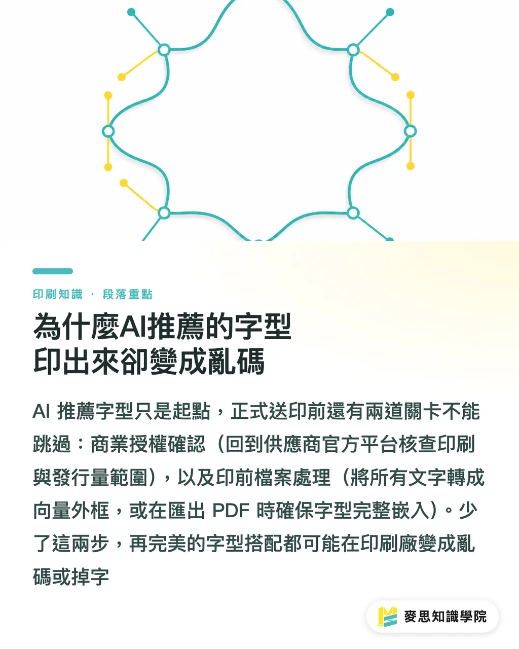
Why Do AI-Recommended Fonts Appear as Gibberish in Print?
Just because an AI tool suggests a perfect font doesn't mean you can legally or successfully use it in print
First is the issue of commercial licensing; AI-recommended font libraries may contain fonts restricted to personal use only
Before use, be sure to visit the vendor's official platform to confirm whether the license covers commercial printing and your intended circulation volume
Second is pre-press file processing, a step most beginners easily overlook
To ensure your design vision is perfectly executed, please perform the following checks before sending files to the print shop
・Be sure to "Convert to Outlines" (Create Outlines) for all text: This converts text properties into vector graphics, completely eliminating the risk of font missing across different computers
・Carefully check for any hidden layers or isolated text nodes that might have been missed
・If the document type is unsuitable for full outlining (e.g., a multi-page brochure), ensure the fonts are fully embedded in the file when exporting to PDF
Key Takeaways
・The value of AI in font pairing lies in accelerating systematic screening at the early stages, not in blindly replacing a designer's typographic intuition
・Chinese typesetting must still return to the visual rhythm of "Sans-serif headings, Serif body" to ensure long-form reading comfort
・Screen clarity is deceptive; the paper coating and printing method ultimately determine the success of minimum type sizes and reversed text
・Consistently converting text to outlines and confirming commercial licenses are your final line of defense in protecting your design work and avoiding pre-press disputes
Further Reflections
For printing and design professionals, integrating AI into the workflow should go beyond image generation. Integrating font recommendation engines into the workflow actually helps establish a standardized logic for font selection. This allows designers to focus their energy on high-value tasks like adjusting kerning, leading, and material matching. If one-stop printing services like SaaS platforms or MINDS could build in AI-driven font recommendations and error-prevention mechanisms (such as alerts for excessively small reversed text) directly into their editors, it could significantly reduce customer complaints and improve final print quality
FAQ
- Can AI-recommended fonts be used directly for commercial printing?
- No. AI only focuses on visual pairing and does not guarantee licensing status. You must visit the original font manufacturer's website to confirm if commercial printing usage is permitted
- Why does my reversed Serif text disappear when printed?
- The horizontal strokes of Serif fonts are too thin. During printing, the expansion of surrounding dark ink can overlap these fine lines. Reversed text should instead use Sans-serif fonts with uniform stroke thickness
- Can Chinese design rely entirely on AI font tools?
- Currently, most AI tools are based on Latin alphabets. For Chinese typography, designers still need to manually oversee the visual rhythm and readability of headings versus body text