

Why Has Pantone 2026 Color of the Year Cloud Dancer Become a Prepress Color-Matching Nightmare?
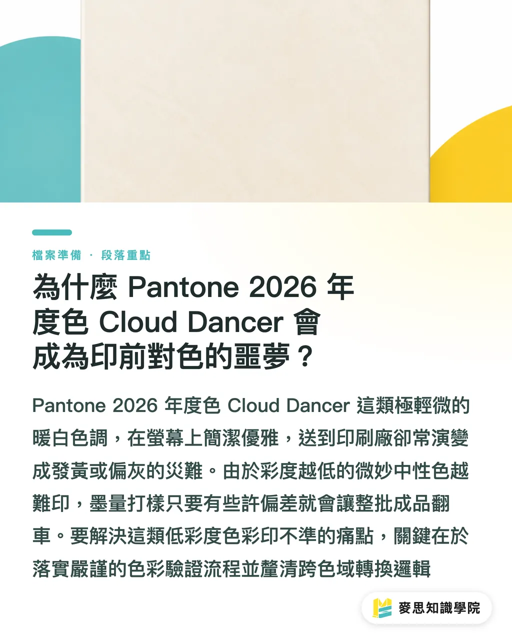
What designers see on screen is a clean, elegant, slightly warm white. Once it reaches the print shop, it often turns into a yellowish or grayish disaster. Wide-gamut digital printing refers to a digital print process that goes beyond the limits of traditional four-color CMYK, combining multi-color toner or inkjet technology to reproduce spot colors and fine color gradations with higher accuracy. The key to solving the 2026 problem of poorly printed "Quiet Luxury" warm whites and earth tones is to follow the MINDS (MS, mid-to-high-end fully customized commercial printing) three-checkpoint prepress color verification process, starting from the source by clarifying how screen RGB, Pantone spot colors, and the color gamut of digital presses are converted
Over the past two months, I have visited several partner production lines, and the biggest topic across the industry has been the shift mentioned in the FESPA 2026 Color Trends Report. Pantone has made a historic choice by naming Pantone 11-4201 "Cloud Dancer," an extremely subtle warm white, as the main color for 2026. At the same time, earth tones such as terracotta, ochre, and cocoa are everywhere. In the past, teams were used to handling highly saturated, flashy colors. Now the challenge has shifted to nuanced neutrals and tiny changes in chroma. In prepress, even a slight ink-volume deviation in proofing can send the entire print run off the rails
Simple enough: the lower the chroma, the harder it is to print
What Is the Core Difference Between Digital Printing and Traditional Offset When Reproducing 2026 Trend Colors?
When handling trend colors, traditional offset and screen printing can use custom-mixed Pantone spot-color inks directly on press. Digital printing, by contrast, relies on fixed press color sets of 4 to 12 colors to simulate separations. That means whether digital printing can accurately reproduce 2026's flowing colors or mist-like textures depends entirely on the equipment's gamut coverage and the precision of ICC Profile conversion
For demanding branded commercial packaging and commercial print work, it is best to send the job directly to the professional production line at MINDS for gamut guidance and spot-color simulation checks. For small runs or short-turnaround promotional materials, Mai Printing can handle fast online ordering and standardized printing
In real production, digital printing must pay attention to the following points when reproducing trend colors:
・Traditional spot-color printing: prints directly with solid custom-mixed inks, giving even coating and no halftone color-mixing error, but small-run production costs are high
・4-color digital printing (CMYK): simulates color through overlapping 4-color dots, which can easily cause tonal breaks or color mismatch when handling very pale warm whites or highly saturated vivid colors
・Wide-gamut digital printing (8-12 colors): adds orange (O), green (G), violet (V), or light inks, covering more than 90% of the Pantone spot-color library
How Can Designers and Prepress Teams Use the "MINDS (MS) Three Prepress Checkpoints" to Reach Zero Color Difference?
Do not rush to blame the print shop
To make Pantone 11-4201 or WGSN's predicted 2027 Luminous Blue land perfectly on physical surfaces, luck is not enough. Design and prepress teams should follow the "MINDS (MS) three prepress checkpoints" when sending files to print:
・① Lock the color space at the file source: define Lab or Lab-to-spot-color matching standards during the design stage, and never rely on visual RGB matching from a screen
・② Choose a print shop with wide-gamut digital equipment: confirm that the press supports extended gamut, and that a spectrophotometer is used regularly to build ICC profiles for output devices
・③ Compare physical proofs under a standard light source: check proofs under standard D50 lighting to avoid metamerism caused by ambient light
For complex brand visual identity standards, teams can also seek practical guidance from the Mai Strategy Knowledge Academy consulting team to build a standardized color system from design through prepress output

What Other Packaging and Design Print Trends Should Not Be Ignored in 2026?
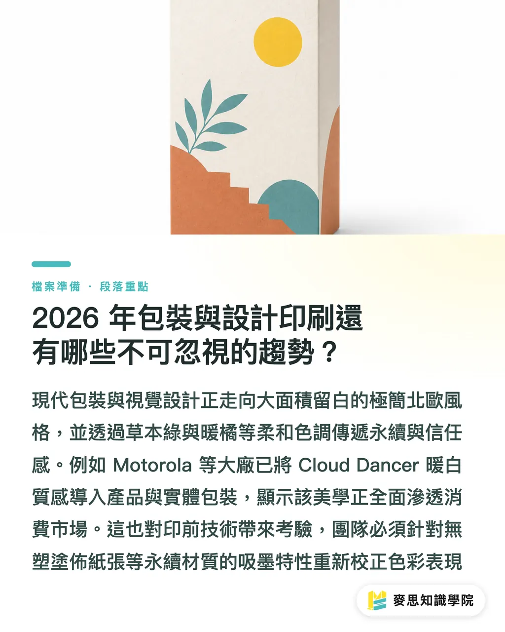
Modern visual design is moving away from the complex motifs of the early 2010s and toward minimalist Scandinavian style, or Scandi style. Large areas of white space paired with small, visually striking accent colors have become mainstream. In packaging design, softer tones such as botanical greens, warm oranges, and pale purples are being used heavily to express sustainability, trust, and emotional connection
The practical takeaways from these design shifts include:
・Large areas of pale color demand extremely high smoothness from digital inkjet printing. Printhead uniformity and transitional gradation are quality indicators
・Major electronics brands such as Motorola have already used Cloud Dancer tones in new mobile phones, showing that warm white textures have fully entered consumer electronics and physical packaging
・Green sustainable materials and plastic-free coated papers have different ink absorption properties, so prepress teams must recalibrate color performance for each paper stock
Key Takeaways
・2026 trend colors are shifting toward low-chroma minimalist warm whites and earth tones. Even tiny ink-volume deviations can create obvious color shifts in print
・Reproducing trend colors in digital printing depends on an 8- to 12-color Extended Gamut, not traditional single spot-color ink mixing
・Before sending files to print, follow the "MINDS (MS) three prepress checkpoints," controlling the full process from Lab-space definition and equipment ICC to proofing under standard D50 light
・Brand design trends are moving toward large areas of white space with highly saturated local accents, placing higher demands on smooth gradation in digital inkjet printing
Further Thoughts
For print shops and designers in Taiwan, the 2026 color trend is not just a visual refresh. It is a full checkup of the prepress color management system. When Pantone chooses a warm white with extremely subtle chroma like Cloud Dancer, the old workshop methods of relying on a master printer's eye to mix ink or laying down heavier ink in offset printing no longer hold up. Print shops that want to take on high-value international brand packaging and commercial print orders must speed up adoption of 8- to 12-color wide-gamut digital printing equipment, while building a shared color language with design teams. Do not rush to replace the machines. First standardize the prepress ICC Profile and physical proof comparison process. That is where small and midsize print shops can stand firm against the color challenges ahead
Further Reading
FAQ
- Why Is Pantone 2026 Trend Color Cloud Dancer So Easy to Print Incorrectly in Digital Printing?
- Because Cloud Dancer (Pantone 11-4201) is an extremely pale, slightly warm white with very low chroma. If a digital press simulates it only through overlapping CMYK dots, even a tiny deviation in yellow or black toner or ink volume can make the print immediately look yellowish, grayish, or muddy
- How Can Digital Printing Accurately Reproduce 2026 Pantone Spot Colors and Highly Saturated Colors?
- Traditional offset uses premixed spot-color inks, while digital printing needs an 8- to 12-color wide-gamut Extended Gamut press. By adding expanded color inks such as orange, green, and violet, together with precise ICC Profile conversion, digital presses can cover more than 90% of the Pantone spot-color library
- How Should Designers Prevent 2026 Trend Colors from Going Wrong in Print?
- Designers should follow the "MINDS (MS) three prepress checkpoints" process: first, define the color space on the design side using Lab or standard Pantone spot colors. Second, require the print shop to provide separation files for wide-gamut digital equipment. Third, always confirm physical print proofs under standard D50 lighting
Related articles


The Print × AI weekly
The print and AI know-how designers, brands and enterprises can use before they commit — one email, every week
Tool Library
RGB↔CMYK conversion, ΔE color difference and brand color print analysis — free color management tools, computed right in your browser.
MINDS Group
Need actual printing or gifting services?
From premium printing to online ordering and festive gifts — the MINDS Group sister brands take it from here.