
What Is Pantone's 2026 Color of the Year?
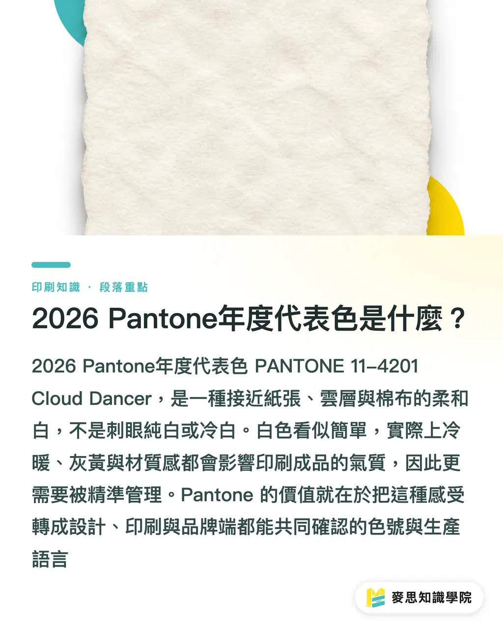
Pantone's 2026 Color of the Year is PANTONE 11-4201 Cloud Dancer. In Chinese, it can be understood as a soft, natural white that does not glare. It is not pure #FFFFFF, and it is not a cold white with a strong clinical feel. It is closer to the kind of breathable white you see in paper, clouds, or cotton fabric
There are 2 facts worth paying attention to this time
・Color name: Cloud Dancer
・Color code: PANTONE 11-4201
From my experience on the print floor, choosing white as Color of the Year is more troublesome than choosing a red or a blue, because most clients think white "doesn't need management." But white can lean cool, warm, gray, or yellow, and the printed result can feel completely different
Pantone is a color standard system used across design, printing, products, and materials. It often turns "I want this color" into a color number, swatch, and production language that designers, printers, and brand teams can all confirm together
Why Isn't Cloud Dancer Just Ordinary White?
The key to Cloud Dancer is not "white," but "soft white." If a designer simply uses #FFFFFF as a background, then sends it to a printer on standard coated paper or woodfree paper, the white you see in the end is usually the paper itself, not the white on the Pantone swatch
There is a very practical difference in print production
・Paper printing: white is often determined by the paper white, and the paper's color temperature changes the overall visual feel
・Transparent materials: white may need white ink as an underbase, and missing one plate can let the background show through
・Dark materials: white may need to be handled with spot white, screen printing, UV, foil stamping, or similar processes
・Digital screens: white is affected by screen brightness, color temperature, and ambient light, so it cannot be matched directly against print
That is why I do not recommend treating Cloud Dancer as something as simple as "fill the background." White may look clean on screen, but in print it can turn grayish or dirty, especially on the 3 formats that reveal problems most easily: business cards, catalog covers, and packaging boxes
How Should Brands Apply the 2026 Color of the Year?
For a brand using Cloud Dancer, the safest approach is to place it in the role of base color, white space, and material feel. Do not rush to use it as a replacement for the original primary brand color
For small and mid-sized businesses, I suggest thinking in 3 layers
・Layer 1: keep the main brand color unchanged. For example, the original red, blue, or green still carries recognition
・Layer 2: use Cloud Dancer as the page background so product photos, headlines, and CTAs are easier to read
・Layer 3: pair it with 1 dark text color and 1 supporting color, so the whole layout does not turn into a white wall with no focal point
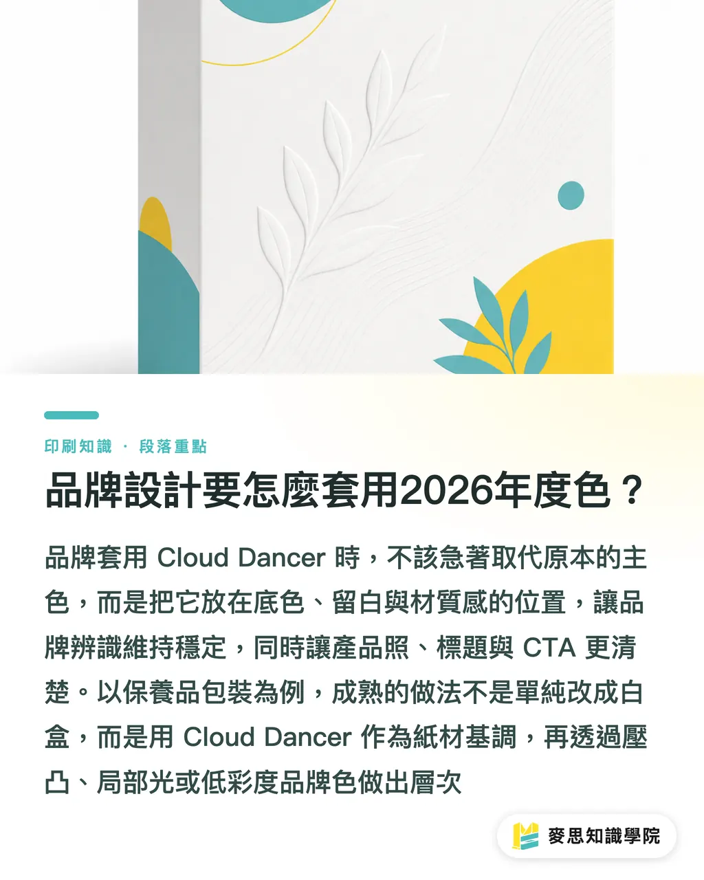
Take skincare packaging, a common case. If the brand wants a clean look, do not just turn the box white. A more mature approach is to make Cloud Dancer the paper's base tone, then build layers with embossing, spot gloss, fine silver foil lines, or a low-saturation brand color
For designers, the point of this year is not to "make things white." It is to make the information hierarchy clear. Once the white area gets large, letter spacing, line height, paper texture, and ink density all come under closer inspection
What Color Differences Matter in Print Proofing?
For a white family color like Cloud Dancer, the biggest mistake is approving only from the screen. MINDS (MS, mid-to-high-end fully custom commercial printing) uses a three-step prepress checkpoint that fits this type of project directly: ① set the paper first, ② set the color specs next, ③ review a physical proof last
・Set the paper first: coated paper, woodfree paper, linen paper, and cotton paper all have different whiteness and tactile qualities, even when they are all "white"
・Set the color specs next: the file should clearly state RGB, CMYK, Pantone, or Lab references. Do not just write "white"
・Review a physical proof last: confirm at least 1 paper sample or proof, especially for packaging, catalog covers, and brand identity pieces. Do not make the call from a PDF screenshot alone
White printing has another old problem: the same design feels soft on warm white paper, cold on blue-white paper, quieter under matte lamination, and affected by glare under glossy lamination
If a brand plans to put Cloud Dancer into its identity system, I would suggest writing the "acceptable range" into the brand guidelines. For example: warm white is acceptable, cyan-tinted white is not. That sentence looks ordinary, but it becomes very useful once production teams need to talk details
How Can AI and SaaS Interfaces Use the Color of the Year?
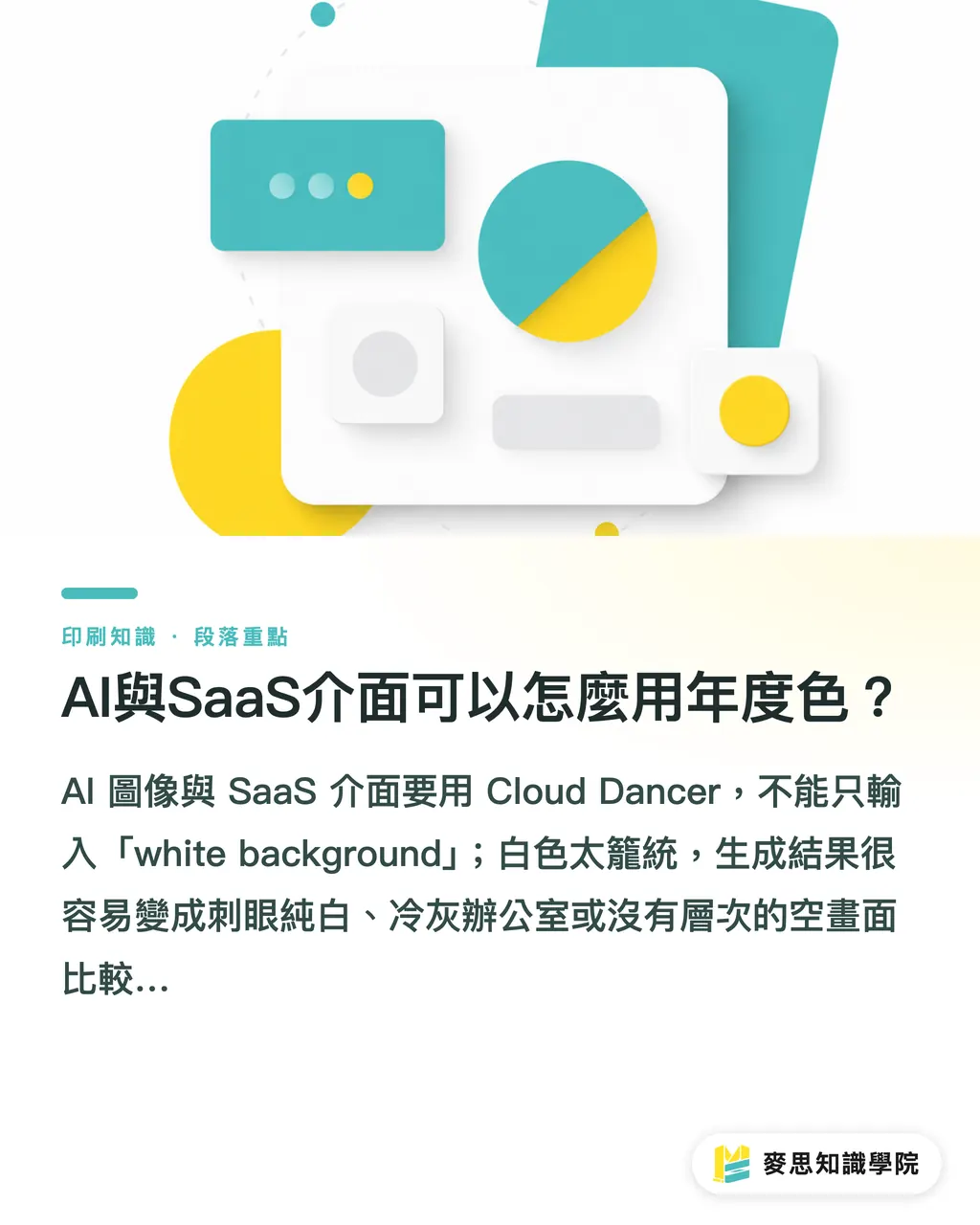
For AI imagery and SaaS interfaces, using Cloud Dancer cannot mean just typing "white background." White is too broad. The generated result can easily become glaring pure white, a cold gray office, or an empty image with no depth
A more controllable way to write it is to describe white through material and light
・AI imagery: use phrases such as soft natural white, warm off-white paper, subtle shadow, and matte surface, and avoid pure white studio background
・SaaS interfaces: put Cloud Dancer into design tokens such as surface, canvas, and panel, instead of pasting the color code everywhere
・Brand assets: the same Color of the Year system should cover social graphics, EDM, presentations, catalogs, and packaging. At minimum, split it into 2 spec sets: digital and print
SaaS teams need to pay special attention to contrast. If light gray text sits on a white background, it can be hard to read on mobile. In practice, I would first require checks for 4 component types: primary text, secondary text, buttons, and input fields
If your brand is organizing its color system, Cloud Dancer can be used as a chance to take inventory. The consulting team at Mai Strategy Knowledge Academy usually helps confirm the primary brand color, supporting colors, paper materials, and output workflow first, then decides which level the Color of the Year should belong to
Key Takeaways
・Pantone's 2026 Color of the Year is PANTONE 11-4201 Cloud Dancer. The point is soft white, not pure white
・White depends heavily on paper and light. If you do not check a physical sample before printing, a premium feel can easily print as dirty gray
・Cloud Dancer works well as a brand base color and white space. It should not replace the original primary color all at once
・For AI imagery and SaaS interfaces, write white into material, light and shadow, and design tokens. Do not just write white
・The real value of a Color of the Year is that it forces a brand to clean up its digital and print color specifications
Further Thoughts
I see Cloud Dancer as a good excuse for brands to organize their color systems in 2026, not as a short-term color swap campaign. On the print manufacturing side, paper, whiteness, proofs, and post-processing need to be stated clearly first. On the design side, white space, contrast, and information hierarchy need to be handled well. For AI and SaaS teams, the Color of the Year needs to become reusable prompt rules and design tokens. If a brand only wants to "follow Pantone," one social post is enough. If it wants color to become a long-term asset, it should start with 1 brand color guideline
Further Reading
FAQ
- What Is Pantone's 2026 Color of the Year?
- Pantone's 2026 Color of the Year is PANTONE 11-4201 Cloud Dancer, a soft, natural white that does not glare. It works well as a brand base color, packaging tone, white space, and interface background
- Can Cloud Dancer Be Replaced Directly with #FFFFFF?
- Not recommended. #FFFFFF is pure white on screen, while Cloud Dancer is closer to a soft natural white. In print, the result also depends on paper, white ink, film materials, and proofing
- Does Brand Design Have to Follow Pantone's 2026 Color of the Year?
- No. A brand's primary color should not change every year with trends. Cloud Dancer is better suited as a supporting base color, layout white space, or seasonal visual language
- What Problems Come Up Most Often When Printing Cloud Dancer?
- The most common issues are inconsistent paper whiteness, white areas turning gray, transparent materials lacking a white ink underbase, and a large gap between the screen file and the physical sample
- How Can Cloud Dancer Be Described in AI Imagery?
- You can use descriptions such as soft natural white, warm off-white paper, matte surface, and subtle shadow, so the AI-generated white carries material and light instead of becoming just a blank background
Related articles




The Print × AI weekly
The print and AI know-how designers, brands and enterprises can use before they commit — one email, every week
MINDS Free Tools
Spine width and imposition calculators — skip the manual math, free in your browser.
MINDS Group
Need actual printing or gifting services?
From premium printing to online ordering and festive gifts — the MINDS Group sister brands take it from here.