
What exactly were Unilever and Ball trying to solve here?
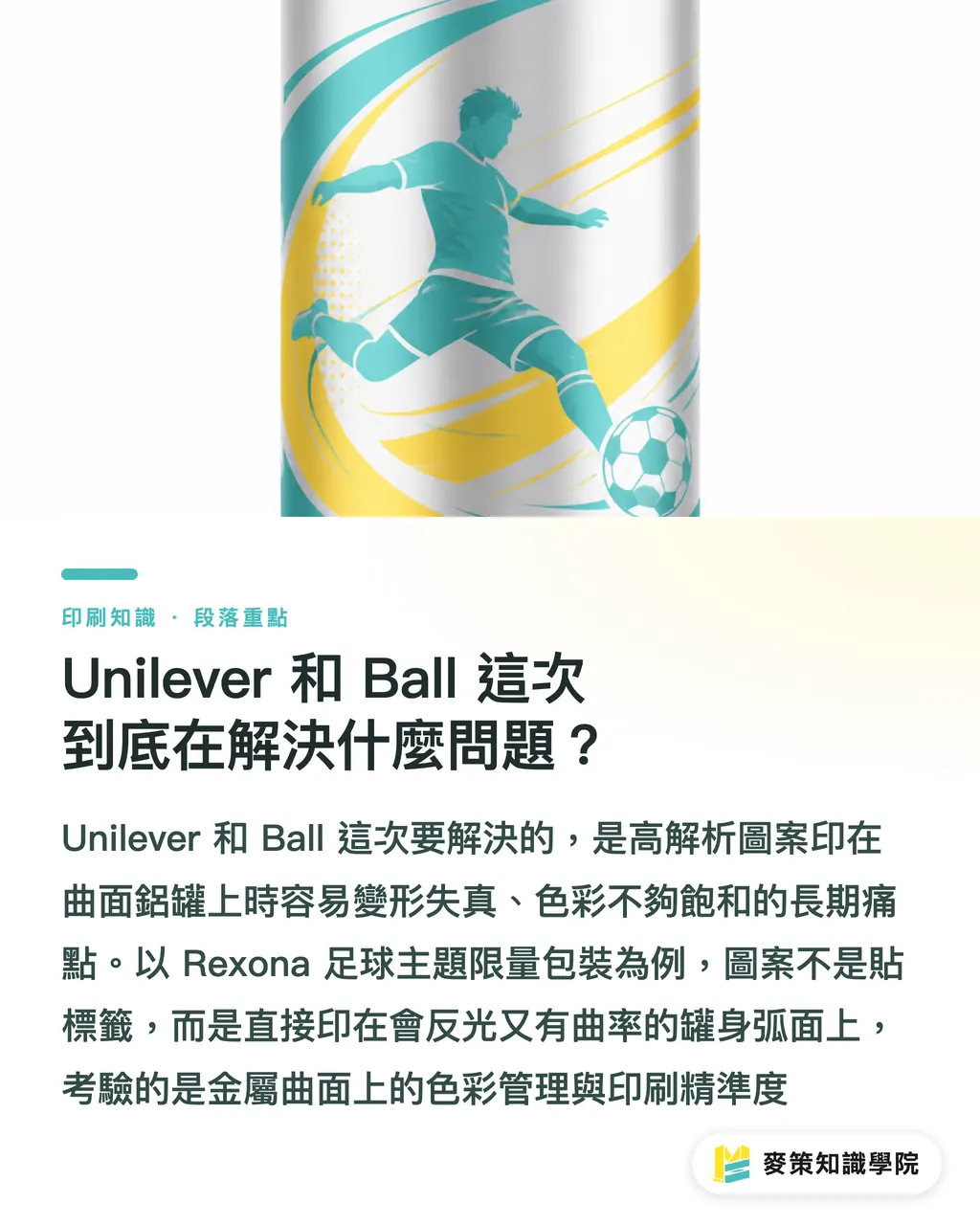
The answer is straightforward: high-resolution imagery on curved aluminum cans has long been held back by geometric distortion and weak color saturation. This collaboration went straight at those two pain points
Unilever designed a football-themed dynamic visual as limited-edition packaging for Rexona deodorant, then brought in canmaking heavyweight Ball to print the artwork directly onto the curved aluminum body. This isn't just slapping a label on, the graphics are printed right onto the curved can wall, following the curvature. The reflective nature of metal, combined with curved geometry, completely breaks the dot and color management logic that flat printing relies on. That's the core of what this technical breakthrough was tackling
Why is direct printing on curved metal so much harder than flat printing?
The difficulty comes down to this: a curved metal surface has no fixed visual reference plane. Every dot sits at a different point on the arc, and each one reads at a different visual density
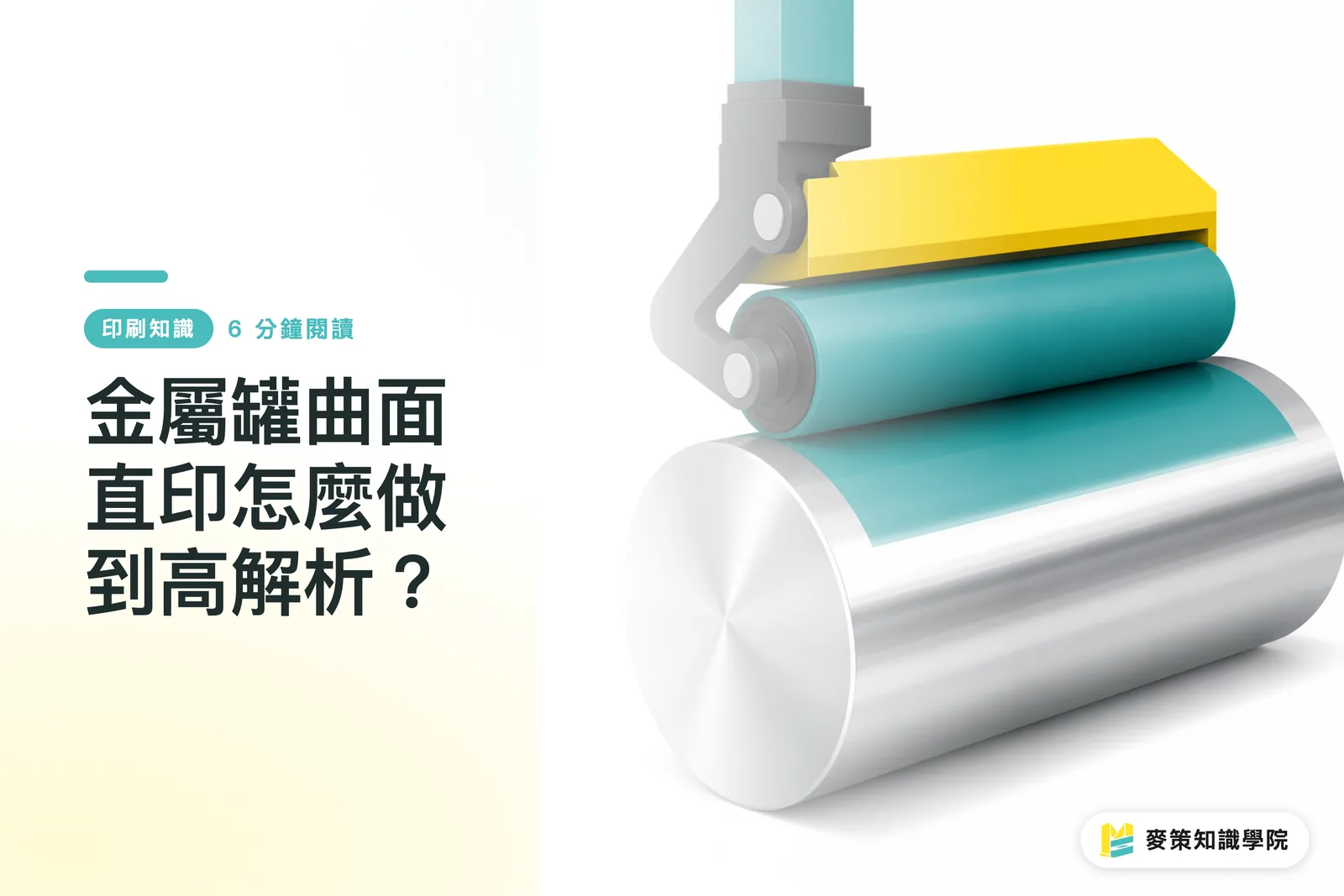
On flat paper or film, you calibrate dot spacing and angle once and the whole sheet inherits it. A metal can is a cylinder, so when the plate cylinder contacts the can wall, contact pressure at the crown and the edges is inherently uneven, a tiny deviation produces banding or mush. On top of that, aluminum reflects more than paper, so ink saturation reads lighter on the curve than on a flat proof. That's the origin of the industry saying "metal prints always look one step darker than the proof." Holding crisp high-res detail and stable color under those conditions means prepress proofing and press calibration have to be tuned against the actual can curvature, not just checked against a flat color chip
How do the special coating and print process hold up the metallic feel?
It comes down to basecoat and print sequence: a uniform basecoat is laid down first to stabilize ink adhesion and color development, then color layers are stacked, then a topcoat seals the artwork and amplifies the metallic look
Aluminum can direct printing usually starts with a white or transparent basecoat that smooths out the aluminum's uneven reflectivity. If this step isn't done right, no amount of stacked color will save it. Only then come the color layers, followed by a protective topcoat that handles both scratch resistance and the gloss hierarchy. The Rexona football limited edition needs dynamic visual energy, which means richer color depth and sharper edges, so the coating formulation and press speed pairing has to be dialed in more carefully than for plain aluminum cans. That's also why they went with Ball, a maker that's been investing in metal packaging for years, instead of just any print shop willing to try
Why are brands willing to invest in this kind of high-difficulty metal printing?
Because the visual punch of limited-edition packaging directly decides how many seconds a product holds a shopper's gaze on the shelf. The three-dimensional feel of a metal can is something film or paper labels struggle to replicate
Daily-use categories like deodorant are brutally competitive, shelves are mostly filled with the same evergreen designs. A limited edition needs real visual differentiation to mean anything. Aluminum cans are recyclable, feel cool to the touch, and carry inherent material credibility. Stack that with football-event buzz and you get a far more memorable package than just swapping colors or fonts. This lines up with a trend I've noticed clearly on the client side over the past year or two: more and more brands refuse to treat metal cans as mere containers. They want to use them as a canvas for storytelling, and whether direct printing can hold fine detail is what decides whether that story actually lands
What can smaller print shops or design studios take away from this?
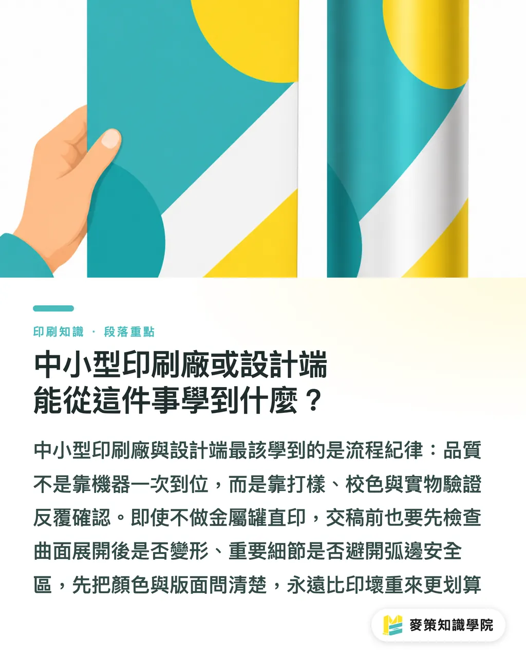
The lesson is process discipline: curved-surface print quality isn't locked in on the first press run. It's earned through repeated cycles of proofing, color matching, and physical-can verification
Most smaller print shops don't run metal-can direct printing equipment, but the upstream logic of artwork prep and color communication is shared. Before handing off files, you should confirm the artwork won't distort when unfolded across the curve, and that key details stay inside the safe zone at the can's edges. For general commercial print jobs going to press, the same file-and-proof discipline matters. That's exactly the loop MINDS Printing repeats with the design side on mid-to-high-end custom jobs, confirm first, print second. For lower-volume online retail print needs, MindSprt's web ordering workflow can also walk you through the color-checking step clearly. Asking first is always cheaper than reprinting a ruined run
Key takeaways
Curved metal direct printing is hard because the arc has no fixed visual reference, dot density shifts with curvature
Basecoat sets the ceiling on color development; stacked colors and topcoat can't rescue an aluminum can with a poorly applied basecoat
The three-dimensional feel of a metal can is a differentiating asset that film and paper labels can't copy
Confirming artwork holds up when unfolded across the curve before file handoff is a check the design side can do right now
Further thinking
If your brand is weighing a limited-edition pack, sort out one thing first: the value of curved direct printing is that "the artwork moves with the container." If you're just forcing a flat design onto a curved surface, you might as well use a label. Designers taking on these jobs should confirm the curved-surface safe zone and color limits with the printer at the proposal stage, not wait until the proof comes back and the details have gone soft. Printers, meanwhile, should keep records of every color conversation with the client. Next time the same SKU needs a reprint, you won't have to start color calibration from scratch
Further reading
FAQ
- How is direct printing on curved metal cans different from standard label printing?
- Direct printing puts the artwork straight onto the curved can wall, so the graphics follow the arc and carry a more dimensional feel. Labels stick a pre-printed piece onto the can, cheaper, but typically less dimensional and refined than direct print
- Why does color shift easily on curved metal surfaces?
- Metal's reflectivity plus the uneven arc of the can means a single dot reads at a different visual density at the crown versus the edge. Ink saturation ends up looking lighter than the flat proof. Basecoat application and repeated color matching are needed to compensate
- What were the key technologies behind Unilever's Rexona limited-edition cans?
- The core is high-resolution printing on curved aluminum cans, supported by a specialized coating and press calibration that overcome geometric distortion and weak color saturation. That's how the football-themed dynamic visual was locked onto the can body
- What should I watch for if a commercial print job involves metal cans or curved packaging?
- Before file handoff, confirm the artwork's fine details hold up when unfolded across the curve, and verify color against the actual container arc during proofing, not just against a flat color chip. That alone can dramatically cut the odds of a ruined reprint
Related articles
The Print × AI weekly
The print and AI know-how designers, brands and enterprises can use before they commit — one email, every week
Tool Library
RGB↔CMYK conversion, ΔE color difference and brand color print analysis — free color management tools, computed right in your browser.
MINDS Group
Need actual printing or gifting services?
From premium printing to online ordering and festive gifts — the MINDS Group sister brands take it from here.