
Overview
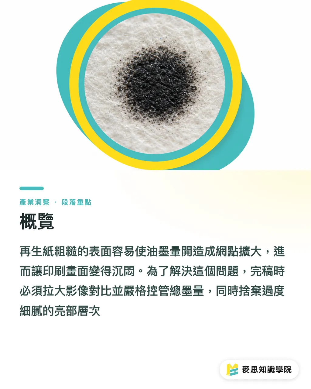
Recycled paper has a rough surface and a grayish-yellow base color. Ink tends to spread after it hits the sheet, causing "dot gain" and making the image look dull
To solve this, we often remind designers at Mai Strategy Knowledge Academy that final artwork needs stronger image contrast, less dependence on delicate highlight detail, and strict control of total ink coverage
Dot gain is the physical effect where halftone dots become larger, darker, and blurrier as ink transfers from the plate to the paper, due to printing pressure or the absorbency of the paper fibers
Why Recycled Paper So Often Prints as a Muddy Blur
In recent client meetings, ESG and sustainable packaging have clearly become hotter topics, and recycled paper has become the first choice for many brands
But many people treat it like coated paper with a yellower color. They send the same file to print, unchanged, and the result is often painful to look at
Recycled paper pulp comes from recovered waste paper. Its surface is not coated, and the fibers are relatively rough
When ink lands on it, it behaves like a drop of water on tissue paper, spreading along the paper fibers. That is the dot gain mentioned earlier
On top of that, the paper itself has a gray-brown base color, which directly eats into the original saturation of the ink
Shadow detail that looks clean and transparent on screen often turns into a flat block of dead black once printed on recycled paper
How to Adjust Final Artwork So the Color Does Not Get Eaten or Shift
Since the paper is hard to handle, the fix has to start with the prepress file
I have led the consulting team at Mai Strategy Knowledge Academy through countless specialty paper projects, and we have boiled the work down to a few hard rules for image processing on recycled paper
・Push image contrast aggressively: since dot gain makes shadows blurrier and highlights darker, final artwork needs more exaggerated contrast than usual, leaving room for the paper to absorb ink
・Give up ultra-fine highlight gradations: weak 1% to 5% dots are almost impossible to print cleanly on rough paper, or they print patchy. For highlights, keep the design focused and clean
・Build the paper base color into your thinking: colors such as pale blue and pinkish purple will look several steps duller as soon as they sit on yellowish recycled paper, so the paper color has to be part of color selection
What If the Ink Is Too Heavy? Lower Ink Coverage and Use Spot Color Solutions
Beyond image adjustment, controlling CMYK values is where the job either survives or fails
Many new designers are used to building saturated dark colors with four-color overprint, but that simply does not work on uncoated paper
Paper can only absorb so much ink. If there is too much, it will not sink in properly, leading to setoff, sticking, or clogged, muddy printing
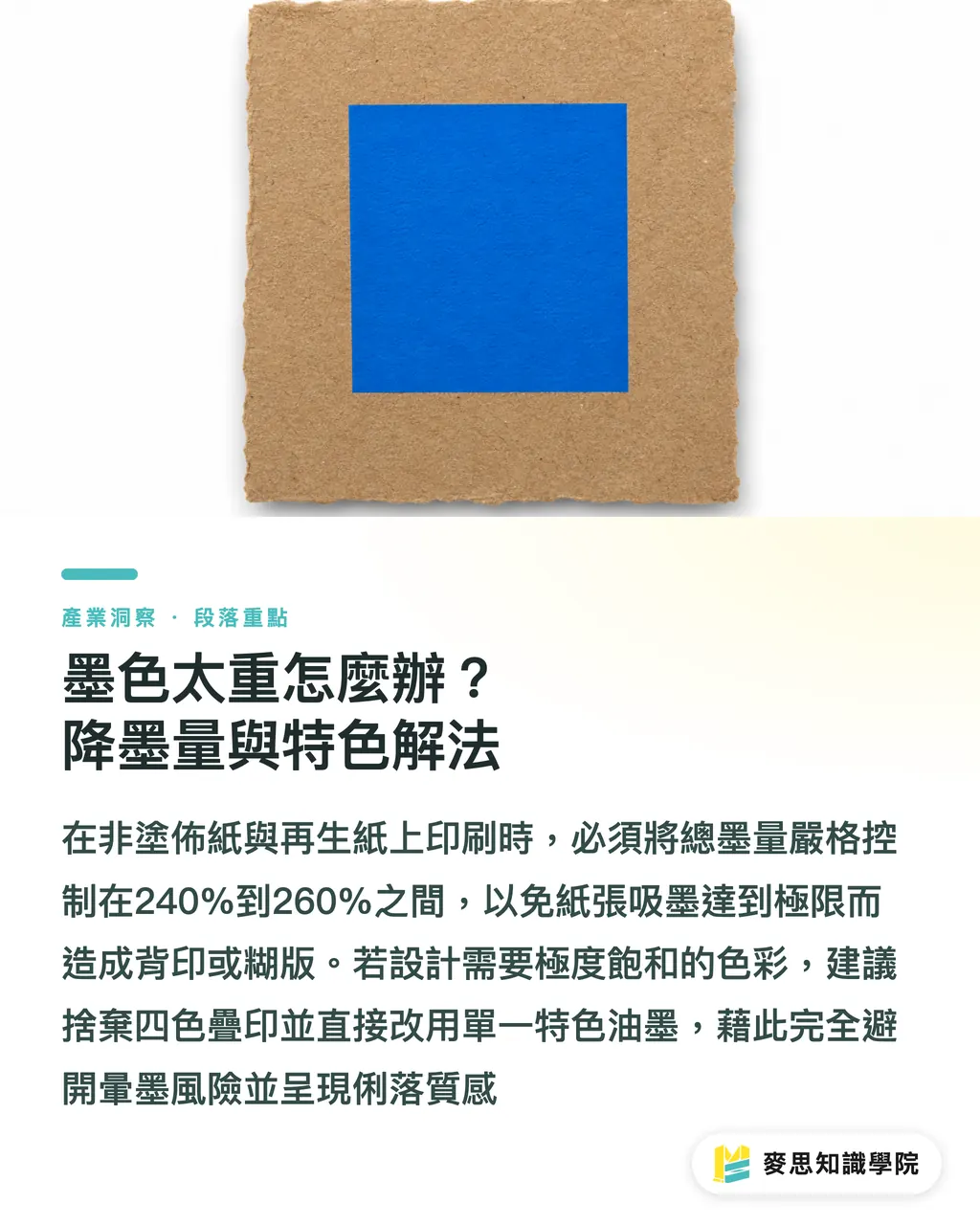
That is why total ink coverage, or TAC, needs a strict limit. For recycled paper, the usual recommendation is to keep total ink coverage between 240% and 260%
Total Area Coverage means the combined percentage of CMYK inks stacked in the same area
Coated paper can go above 300%, but recycled paper and other uncoated stocks need to be kept deliberately lower, or the print can go wrong very quickly
For projects that need extremely saturated color, forcing it through stacked CMYK is asking for trouble. The design strategy has to change
When MINDS handles this kind of mid-to-high-end custom commercial project, it usually recommends two approaches
・Switch to Spot Color: mix a single saturated ink directly and avoid the risk of four-color halftone dots spreading into each other
・Use large color blocks well: replace fragmented image gradients with clear geometric blocks of color. On recycled paper, this can actually create a sharp, vintage texture
Key Takeaways
・Recycled paper has a rough, ink-absorbent surface, so dot gain is unavoidable. Final artwork needs more contrast than it would for standard coated paper
・Give up faint highlight detail below 5% to avoid a patchy, dirty printed result
・Strictly keep CMYK total ink coverage below 260%, or switch directly to spot color printing to maintain color saturation
・Treat the paper's original gray-yellow base as a fifth color, and avoid pinks and pale blues that easily look dirty
Further Thinking
Using recycled paper for sustainable packaging is not just a matter of swapping the sheet. It tests the design and manufacturing team's grasp of physical print behavior
Instead of getting angry in front of the printer while looking at a proof, build the limits of "paper base color" and "dot gain" into the visual strategy from the proposal stage
When AI image generation becomes part of the design workflow, prompts should also avoid tiny fragmented gradients and overly dark scenes from the start, producing a visual base that is already suited to uncoated paper
FAQ
- What is dot gain, and why is it especially severe on recycled paper?
- Dot gain is the effect where ink spreads after landing on paper, making halftone dots larger. Recycled paper is uncoated and has rough fibers, so it absorbs ink strongly and spreads far more than standard coated paper
- What total ink coverage, or TAC, should be used for recycled paper?
- A range of 240% to 260% is recommended. This helps prevent excessive ink from failing to absorb into the paper, causing setoff or a muddy image
- How can I print highly saturated colors on recycled paper?
- Give up four-color CMYK overprint. Use a dedicated spot color instead, or rely on simple large color blocks to create the design impact
Related articles

The Print × AI weekly
The print and AI know-how designers, brands and enterprises can use before they commit — one email, every week
MINDS Free Tools
AI background removal, a LINE sticker maker, spine & imposition calculators — all free, right in your browser, no upload.
MINDS Group
Need actual printing or gifting services?
From premium printing to online ordering and festive gifts — the MINDS Group sister brands take it from here.