

Where should you look first for registration and black overprint?
Check registration and black overprint with the "MINDS (MS, mid-to-high-end fully custom commercial printing) three-step print-file gate": 1. turn on Overprint Preview, 2. inspect separations for K100, white, and Spot Color, 3. export the PDF and check it again in Acrobat
・1. Check Overprint Preview: turn on Overprint Preview in Illustrator, InDesign, or Acrobat, and make sure you are not looking at the normal screen preview
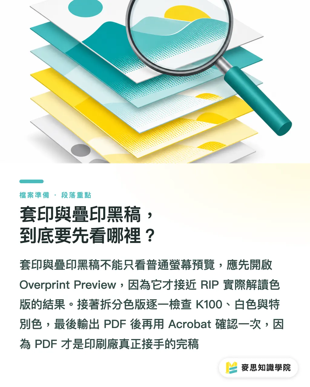
・2. Inspect separations: use Separations or Output Preview to switch C, M, Y, K, and Spot Color off one by one, and see which plate each object actually sits on
・3. Recheck after PDF export: a correct AI file does not mean the PDF is correct. The PDF is the final artwork the printer actually receives
Registration: the state where C, M, Y, K, and spot colors align in the same position. If they shift, you may see ghosting, dirty edges, or white lines
Overprint: the object keeps the plates underneath it, so the upper ink prints directly over the lower ink. It is often used for K100 small text and finishing-plate checks
Knockout: the object first knocks out the plates beneath it, then prints its own color. If the edge is even slightly out of register, paper white or the background color may show through
The files that make prepress people most nervous are often the ones that look perfectly normal on screen, because a normal preview only tells you "an object is visible." Overprint Preview is much closer to how the RIP will read the plates
Why can a white object be visible on screen but disappear in print?
If a white object is C0 M0 Y0 K0 and is also set to Overprint, then in standard CMYK printing it means "there is no ink to print, and the plates underneath are not knocked out." On the finished piece, it may disappear completely
I have seen many rejected files where the whole problem was one Overprint checkbox. The white frame was still visible on screen, but gone on the printed piece. The client thought it was a missed print. Prepress looked at the separations and knew right away: white was overprinting by mistake
Check white objects in 3 places
・White text: especially small text placed on dark backgrounds, photos, or color blocks
・White lines: for example 0.25pt to 0.5pt hairline frames, dividers, and decorative rules
・White logos or icons: vector outlines are often grouped, affected by transparency, or carried into Overprint through old file settings
If white means "white ink," do not handle it as standard CMYK white. Create a clearly named Spot Color, such as White_Ink, and state in the layer or notes: "White ink plate must be retained, not knocked out."
Should black text overprint or knock out?
Small K100 black text is usually better left as overprint, because paper, plates, and machines all have tiny registration shifts. If small text knocks out, a 0.1mm shift at the edge may reveal a white fringe or a line of background color
When I check business cards, catalogs, and packaging instruction text, I put K100 text around 6-8pt near the top of the list. Once this kind of type is set to knockout, rough edges are easy to see with the naked eye, and clients tend to catch them fast
Not every kind of black should overprint. Judge them separately
・K100 small text: in most cases, Overprint can stay. The key is to confirm the text is still dark enough and the background color does not hurt readability
・Large black backgrounds: relying only on K100 overprint is not recommended. Rich Black is usually set based on the paper and printing method, and total ink coverage should be confirmed with the printer
・Four-color black small text: do not use mixed CMYK black for small text. If even one of C, M, Y, or K shifts, the edge of the type will look dirty
・Black graphics placed over photos: this depends on the design intent. Overprint lets the image color affect the black. Knockout keeps the black cleaner
When handing off files, designers should not just write "print black text as is." Clearer notes are "Keep Overprint for K100 small text" or "This black logo must Knockout, do not overprint." The printer will understand it, and prepress is less likely to guess wrong

How should spot colors and finishing plates be marked when they overlap?
Spot colors, foil stamping, embossing, spot UV, and die lines often need to overlap with CMYK artwork on screen. In that case, Overprint is not the problem. The problem is failing to explain the finishing plate clearly
For finishing plates, I ask for at least 3 clues to be left in the file
・1 independent Spot Color: such as FOIL_GOLD, SPOT_UV, or DIECUT. Do not use ordinary CMYK color blocks to pretend they are finishing plates
・1 independent layer: name the layer directly by its finishing purpose, such as "spot UV plate" or "die line."
・1 prepress note: state clearly, "Finishing plate should display as overprint, not output as CMYK" or "This plate is for die-cut reference, not a printing color."
When spot colors and finishing plates overlap, designers need to open Output Preview and check plate by plate. After CMYK is turned off, the finishing plate should still be there. After Spot Color is turned off, the main visual should not have holes where it should not
For standard items such as business cards, stickers, and DM flyers, Mai Printing (MYS) is suited to clearing basic errors first through fixed product specs and a PDF checking flow. For commercial print jobs with multiple spot colors, foil stamping, spot UV, or mixed paper stocks, MINDS (MS) is better suited for confirming finishing plates and overprint notes together before final artwork is released
Why check again after exporting the PDF?
You must check again after exporting the PDF, because transparency, the PDF preset, how spot colors are preserved, and Overprint settings can all change the final separation results during output
I usually do not treat the original design file as the final basis for judgment. The printer receives the PDF, and the client usually signs off on the PDF too, so the Acrobat Output Preview step cannot be skipped
Do at least 4 things when checking the PDF
・Turn on Overprint Preview: confirm whether it differs from the normal preview
・Switch C, M, Y, and K on and off plate by plate: check whether black text is only on the K plate, and whether white objects are truly knocked out
・Switch Spot Color on and off plate by plate: check whether spot colors, white ink, foil stamping, and spot UV are still there
・Zoom in above 400% and inspect the edges: check small text, fine lines, and the area around logos for white fringes, dirty edges, or abnormal knockouts
If a designer is not sure whether an object should keep or cancel overprint, do not make the printer guess. Write a clear handoff note: "This object must keep Overprint" or "This white text must Knockout." One sentence can save one reprint
Key Takeaways
・A normal screen preview only shows appearance. Overprint Preview shows the plate results after overprint is applied
・K100 small text is usually better overprinted. White objects set to overprint by mistake can easily disappear outright
・Spot colors and finishing plates need to be made clear with three things: Spot Color, a separate layer, and prepress notes
・Check again after PDF export, because the printer receives the PDF, not your original design file
・The best final artwork is not the fantasy of a zero-error file. It is a file that does not make prepress guess
Further Thinking
For print manufacturing, design, AI application, and SaaS teams, overprint checking is a good candidate for explicit rules: automatic warnings for white Overprint, prompts to keep K100 small text, risk warnings for four-color small text, and naming plus note requirements for Spot Color finishing plates. When the consulting team at Mai Strategy Knowledge Academy helps improve file workflows, they also turn these rules first into checklists that designers can understand and prepress staff can actually follow
FAQ
- Does black text always need to be set to Overprint?
- Small K100 text is usually best kept as Overprint because it reduces white fringes caused by registration shifts. But four-color black, large black color blocks, and black graphics placed over photos should be judged based on the intended look and printing conditions
- Why do white objects disappear during printing?
- CMYK white is usually C0 M0 Y0 K0, which means no ink. If it is also set to Overprint, the plates underneath will not be knocked out, so the white object may disappear on the finished piece
- Where do I turn on Overprint Preview?
- In Illustrator and InDesign, use Overprint Preview under View. In Acrobat Pro, use Output Preview with Separations to check each plate
- Should spot colors, foil stamping, and spot UV overprint?
- Finishing plates often need Overprint so they can be checked against the main visual, but their purpose must be marked with an independent Spot Color, a clear layer name, and prepress notes
- If the PDF already looks normal, do I still need to check the separations?
- Yes. A normal PDF preview may not simulate Overprint. After output, use Acrobat Output Preview to confirm that black text, white objects, Spot Color, and finishing plates are all on the correct plates
Related articles





The Print × AI weekly
The print and AI know-how designers, brands and enterprises can use before they commit — one email, every week
MINDS Free Tools
Imposition calculator and preflight file check — free prepress tools, right in your browser.
MINDS Group
Need actual printing or gifting services?
From premium printing to online ordering and festive gifts — the MINDS Group sister brands take it from here.