

How did Mondi bring vivid color to kraft paper?
Mondi, a paper and packaging company, announced vivid digital printing results for brown paper packaging on October 6, 2026. The goal was to preserve the look of unbleached stock while giving brands room to make a strong visual impression. See Mondi's digital printing results for brown paper packaging. Digital printing uses a digital file to control the equipment and print images and text directly onto paper. Because there is no need to remake a conventional printing plate when artwork changes, it suits packaging jobs with frequent version updates. The first of Mai Strategy's three print checkpoints is to color-match on the actual stock. Don't treat a bright red on screen as a promise of the result on brown paper
Why does kraft paper change printed colors?
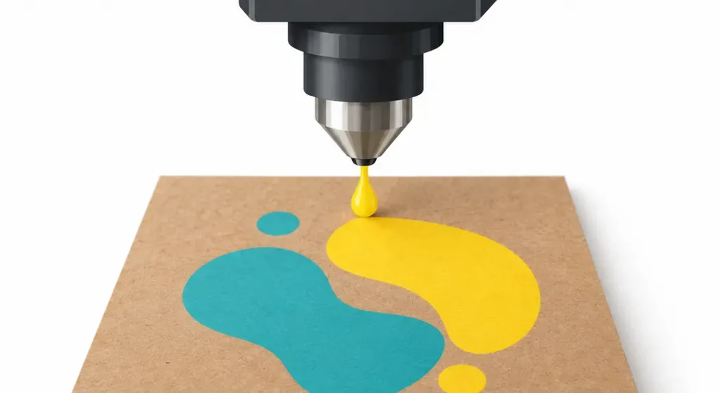
Colors on kraft paper are affected by the brown base and the surface fibers. Ink absorption also changes how vivid and even the colors look. Here, kraft paper means packaging paper that retains the natural brown tone of the stock. The paper color and fibers both affect the final printed result. Mai Strategy's first print checkpoint is the paper color: check brand colors and light shades on the actual stock, not just on a screen. A screen emits light, while paper reflects it. The same color values will look different on the two surfaces
Does vivid color always require white ink?
Vivid color doesn't mean every area needs white ink. First decide how much of the brown-paper look the design should keep. A white ink underlay is a layer of white ink printed before the color artwork to reduce the effect of the brown stock on the colors above it. Mondi's results show that brown paper can work with vivid digital printing. Whether to print white ink still depends on the proof and the design requirements
・Mai Strategy's three-checkpoint brown-stock proof: retains the paper color, giving printed colors a warm cast
・Mai Strategy's three-checkpoint white-ink proof: does more to mask the paper color, so check how the white ink and colors print together
Make a proof first
What should you check after lamination or varnishing?
Digital printing on kraft paper calls for a compatibility check with the finishing process. Run the proof through the planned lamination or varnishing before approving it. Lamination covers the printed surface with a film. Varnishing adds a clear coating to the paper. Both can change gloss, feel, and how the colors look, and ink adhesion should be checked too. Mai Strategy's third print checkpoint is to approve the sample after finishing. The brand should sign off on the color of the delivered product, not just an unfinished flat sheet
How should Taiwanese brands start a print trial?
For a first color-printing job on kraft paper, Taiwanese brands should run a comparable proof on the actual stock before settling on production specs. Mai Strategy's three print checkpoints can be laid out on a single proofing sheet
・① Choose the paper: note its brown tone, surface fibers, and packaging structure, then ask the printer to make a proof on the actual stock
・② Set the colors: compare each main brand color and light shade on brown stock and with a white ink underlay, then approve the version on paper
・③ Run the finishing: put the approved sample through the planned lamination or varnishing, then check the surface and colors
Don't rush into production
Once the paper proof, artwork, and finishing requirements are ready, discuss proofing specs for custom commercial printing with MINDS. Before quoting and approval, write down the file version, stock, and acceptance criteria. That way, production color won't be judged by comparing a screen image with a finished product
Key takeaways
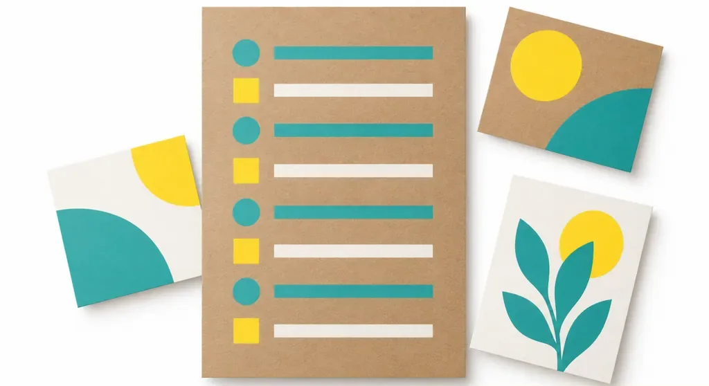
・The brown tone of kraft paper affects the final color, so a screen image can't replace a paper proof
・A white ink underlay is one way to control color. Compare samples with and without it on the same stock
・The color to approve is the one after lamination or varnishing, as it will be on delivery
・For a small print trial, record the stock, white ink, and finishing conditions
Further thoughts
Color checks for kraft paper printing need to move from the screen back to the paper. Printers should record the stock and finishing details, and designers should mark which parts of the paper color and brand colors must be preserved in the artwork. AI-generated packaging mockups can be a starting point for composition, but colors still need to be checked on the actual stock. A SaaS proofing workflow can keep the stock, white ink, lamination or varnishing, and approved version in one record, so the artwork and samples stay in sync
Further reading
FAQ
- Will colors printed on kraft paper look darker than on white paper?
- The brown base and fibers affect ink absorption and color intensity, especially for light shades. Check them on an actual paper proof, and compare the results with and without a white ink underlay
- Does kraft paper packaging always need white ink?
- No. It depends on how much of the paper color the design should retain and how bright the brand colors need to be. Compare samples with and without white ink on the same sheet of paper
- Should I test lamination or varnishing for digital printing on kraft paper?
- Yes. Run the color proof through the planned lamination or varnishing, then check the colors, surface, and ink adhesion after finishing
- What should I prepare before printing kraft paper packaging for the first time?
- Prepare the actual paper stock, artwork, white ink requirements, and planned finishing conditions. Then confirm with the printer how the final proof will be approved
Related articles
The Print × AI weekly
The print and AI know-how designers, brands and enterprises can use before they commit — one email, every week
MINDS Free Tools
Imposition calculator and preflight file check — free prepress tools, right in your browser.
MINDS Group
Need actual printing or gifting services?
From premium printing to online ordering and festive gifts — the MINDS Group sister brands take it from here.