

Overview
Foil stamping, embossing, and debossing can sit on the same gift box, book cover, hang tag, or membership card, but you have to pick one main visual and at most two supporting touches first. MINDS (MS, mid-to-high-end fully custom commercial printing) recommends running the three pre-press checkpoints: ① primary and secondary hierarchy, ② stock and film surface, ③ separate dies and registration, so the three effects don't fight each other on a small area
Foil stamping uses heat and pressure to transfer foil onto the paper for a metallic or specialty sheen. Embossing pushes the paper up from the back so the artwork rises off the surface. Debossing presses from the front so the artwork sinks into the surface. All three are commonly used for logos, textures, and tactile recall
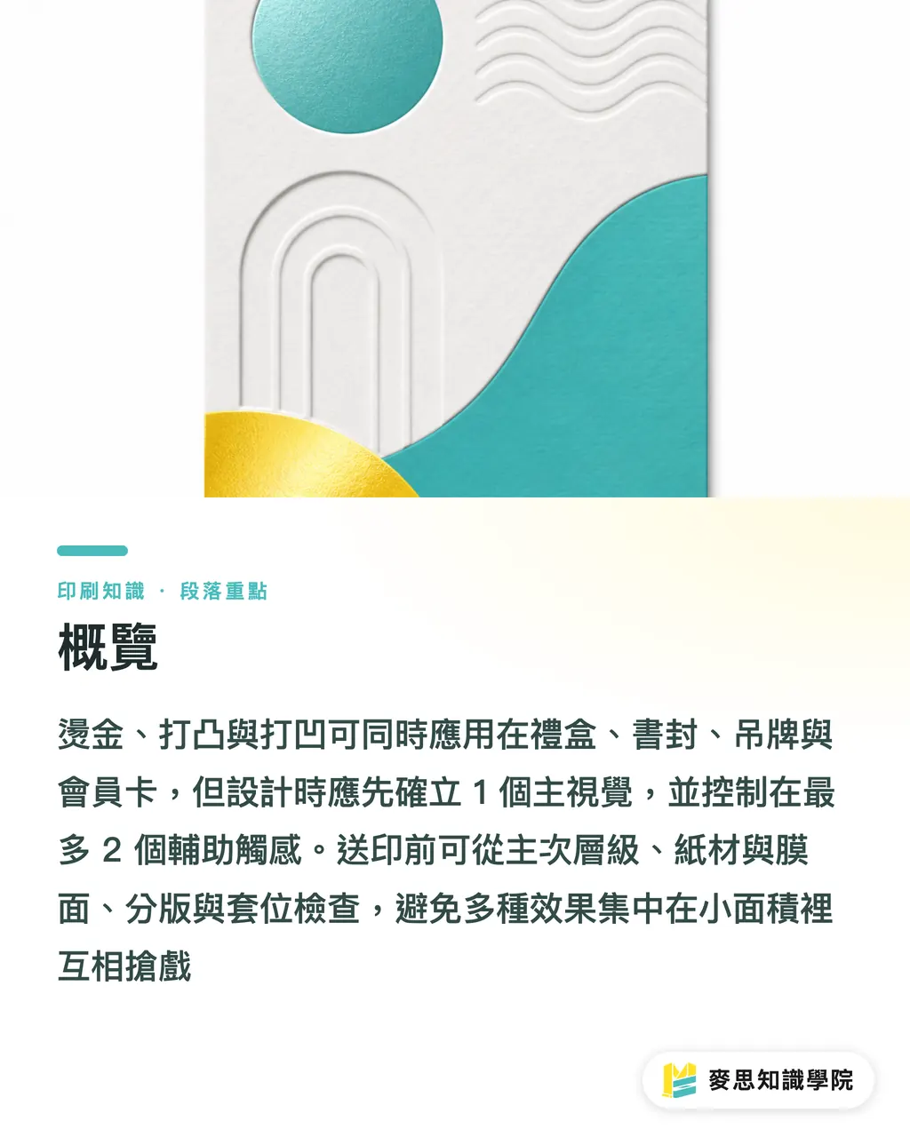
Can foil stamping, embossing, and debossing be done together?
Yes, but I always ask the designer one question first: what should people see first on this piece, and what should they feel second?
Gift boxes, book covers, hang tags, and membership cards can all carry foil stamping, embossing, and debossing at the same time. They just can't all play the lead. Foil stamping catches the light, embossing builds height, debossing adds a pressed-down, settling feel. Stack all three on the same logo, the same small type, or the same fine-line pattern and the usual result on press is messy edges, a registration that looks off, and a tactile experience that turns vague
I usually break the layout into three visual tiers
・Tier 1: the main visual, only one focal point, such as the gift box lid logo, book title, hang tag brand wordmark, or member card headline
・Tier 2: supporting texture, capped at one or two effects, like foil plus emboss on the logo and a deboss only on the background texture
・Tier 3: negative space and the paper itself, leave room for the stock to breathe and don't let finishing cover the whole surface
Simple rule
Premium feel usually isn't about cramming everything in. It's about letting the eye know where to look, and the finger know where to pause
For mid-to-high-end custom commercial work, I'd suggest labeling the main visual, supporting texture, and type information separately before plates go out. If needed, talk through stock, film surface, and finishing order with MINDS first. That saves a lot more trouble than reworking after the run
How should you pair them across gift boxes, book covers, hang tags, and membership cards?
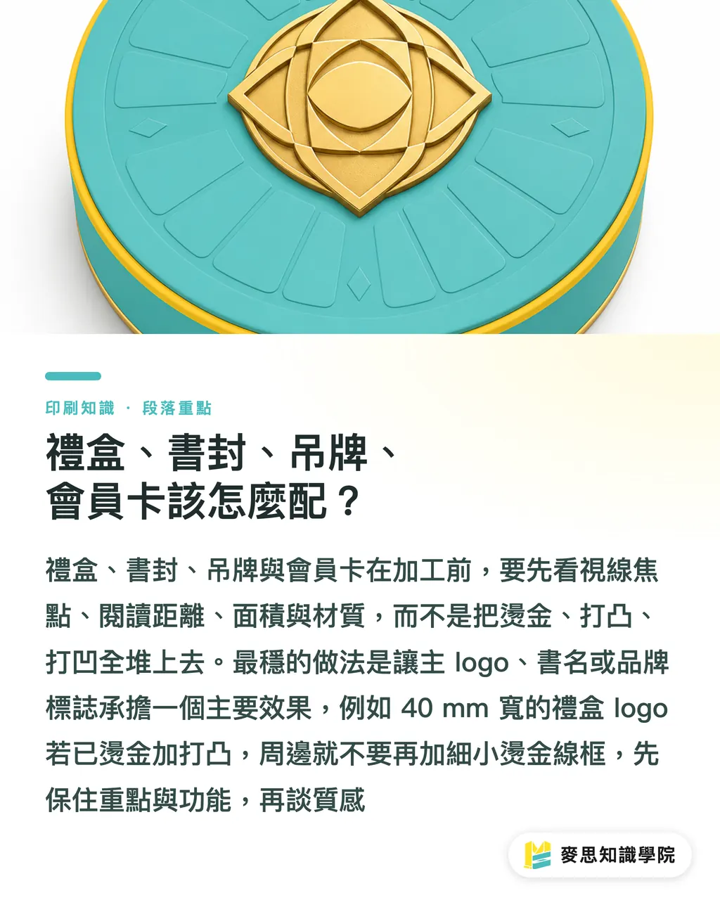
For gift boxes, I save foil stamping for the brand name or emblem, put emboss on the main logo, and let deboss handle large background patterns. The lid is the first thing the eye hits, so if a 40 mm wide logo is getting foil plus emboss, don't crowd a thin foil keyline around it. Under display lighting the lid turns noisy fast
Book covers depend on how far away the reader holds the book. If the title is foil stamped, emboss can follow along the title, but the author name, publisher info, and subtitle shouldn't all get the same treatment. Hardcover cases often have a film laminate or a mounted wrap paper. The film affects how well the foil sticks, and embossing leaves its own stress marks on the paper surface. Both have to be felt and seen on the proof
Hang tags are small so the design has to be tighter. Most tags run 50 mm to 90 mm wide. If the brand type is thin, the foil edges get unstable because the die line is too narrow, and the emboss height won't look as pronounced as the screen preview. The most stable move on a tag is foil on the brand wordmark or logo, and deboss saved for the back info area or base texture
Membership cards need a closer look at the substrate. Paper cards, PVC cards, and laminated heavy cards all react differently. Whether foil stamping, embossing, or debossing will work can't be judged from the visual file alone. Member cards also carry barcodes, QR codes, serial numbers, and signature fields. Don't put those functional zones inside heavy finishing. Scanning and writing will go wrong later
My own judgment goes like this
・Gift box: main logo can take foil plus emboss, background texture gets deboss, focus on the first second the lid opens
・Book cover: title can be foil or foil plus emboss, keep fine info as flat print, readability matters more than showing off
・Hang tag: small area, pick one main effect, brand type in foil, base texture in deboss, don't put pressure around the hang hole
・Member card: protect the functional zones first, foil fits member tier or brand mark, emboss and deboss need to avoid barcodes and QR codes
How do paper thickness and film surface affect the result?
Paper thickness sets the ceiling for how deep emboss and deboss can go, and the film surface decides how well foil sticks and how stable its shine is
Thin paper can take a blind impression but don't expect much height. Press too deep and the back shows visible marks. Heavy card can absorb more pressure and works well for emboss and deboss, but once it gets laminated, filmed, or coated with a specialty finish, foil adhesion has to be re-checked. A pretty art file is useless if the paper won't cooperate. The press isn't Photoshop
Three common film surface problems
・Matte film cuts overall reflection, so foil contrast looks good, but foil adhesion depends on the film material and the stamping temperature
・Gloss film reflects hard on its own and can dilute the foil shine, so the main visual needs more area and better positioning to pull ahead
・Soft-touch film tends to rough up foil edges, so fine lines, small type, and full-bleed blind impressions should be handled conservatively
There's another problem on press that usually gets underestimated: stress marks. A clean front doesn't guarantee a clean back. Especially when the back of tags, cards, or inside of book covers is going to be seen, the back impression can't be treated like it doesn't exist. On a gift box with a mounted wrap, pressure can also affect the flatness of the corners. None of this shows up in a PDF preview
So I put paper testing ahead of design sign-off. Take at least one sheet close to the actual production condition and check the foil brightness, emboss height, deboss edge, and back impression. Then decide whether the main visual needs to shrink, grow, or split across different processes

How do you handle pattern detail and registration?
Foil stamping, embossing, and debossing are three different production logics. The design file has to treat them like three separate dies
Most misregistration isn't the operator's fault. The design file set the tolerance too tight from the start. The foil die has its own heat-shift, the emboss and deboss dies have their own pressure deformation, and the paper itself can shift under heat and pressure. When a foil line runs along the edge of an emboss, or a debossed pattern sits tight against the main logo, any offset of a few tenths of a millimeter gets amplified by the eye
MS three pre-press checkpoints work like this
・①Black artwork split into clear layers: foil die, emboss die, and deboss die each on their own, don't mix finishing effects into the same print color layer
・②Enlarge fine lines and small type: anything below normal reading size, ultra-thin keylines, and dense textures need a reality check from plate-making and finishing on whether they can hold up
・③Allow registration tolerance: foil plus emboss on the same spot needs an acceptable margin, don't design two dies that only work at zero offset
Layer notes should leave no guessing for the printer. PDFs are fine for looking at the main visual, but AI files or editable originals need foil, emboss, and deboss on separate layers with clear names. Black artwork is usually 100% K for the finishing area, no transparency, no gradients, no shadows to fake it. Finishing dies read actual shape, not on-screen effect
For same-spot foil plus emboss, I'd suggest starting with a large logo, thick lines, simple geometry, or clean wordmark. Thin serifs, small Chinese characters, and complex patterns carrying both foil and emboss at once carry a lot more risk. Say so clearly before the proofing cost goes out
What three things should you check on the proof?
Proofing isn't about whether the color looks pretty. Foil, emboss, and deboss proofs need to be touched, looked at on an angle, and checked at the edges
First, tactile. Does the emboss actually have height, does the deboss actually sink in, and does the finger feel a clear rise and fall across the logo or texture. Premium print leans hard on hand feel. Gift boxes and book covers especially get held for three seconds or more. If the touch is too weak, the finishing cost isn't worth it
Second, brightness. Foil reflects differently head-on, at an angle, and under indoor white light. Metallic on matte film and metallic on gloss film don't behave the same way. On the proof, check the piece under light close to the real use setting, like counter lighting, bookstore lighting, or office white light. Don't sign it off after one glance in the proofing room
Third, edge cleanliness. Foil edges fraying, emboss lines breaking the paper, deboss rings leaving unnatural pressure marks. These judge whether the run will hold up better than "it looks shiny." Tags and member cards especially need to be checked at the corners, holes, and card edges because those spots expose pressure problems fastest
Proofing checklist, five points
・Look at the front main visual and confirm the foil, emboss, and deboss tiers aren't competing
・Tilt 45 degrees and check foil brightness, no broken lines, no smudged edges, no weak reflection
・Run a finger across the finishing area and confirm the touch matches the design intent
・Flip it over and check the back impression, confirm the back won't affect reading or appearance
・Cross-reference the layered file for registration and confirm no die has drifted far enough to break the effect
For a team doing a high-value gift box or book cover for the first time, I'd suggest writing the proofing decisions down as a short note, something like "logo foil plus emboss approved, background deboss depth reduced, fine keyline removed." That kind of note is useful for design, procurement, and the printer, and it's easy to hand to the Mai Strategy Knowledge Academy advisor team for follow-up file and process review

Key takeaways
・Foil stamping owns the light, emboss owns the height, deboss owns the tactile depth. Rank the three effects first, then split the dies
・Gift boxes and book covers can take heavier finishing. Hang tags and member cards need protected size, functional zones, and edges
・Paper thickness sets blind impression performance, film surface sets foil stability. Test on paper close to the final product before plates go out
・Same-spot foil plus emboss means treating the foil die and emboss die as two plates that can shift. The design file can't assume zero error
・Proofing checks touch, brightness, edge cleanliness. These three get closer to the real result than any screen preview
Further thinking
For print manufacturing, the core of managing foil, emboss, and deboss is turning "looks good" into die position, pressure, stock, and sequence the press can actually read. For designers, the most useful next step is rewriting finishing as a visual hierarchy chart instead of a decoration list. Lock in the first main effect, then talk about the second. For AI and SaaS teams, the products that actually help aren't the ones that just drop effects onto the canvas. They're the ones that flag layer separation, registration, stock, film surface, and proofing checkpoints, so the design file makes one less trip back from the printer
FAQ
- Can foil stamping, embossing, and debossing all sit on the same logo?
- Yes, but check the logo size, line weight, and paper thickness first. Same-spot foil plus emboss amplifies registration error, so small type, fine lines, and complex patterns should be handled conservatively
- If the gift box has foil plus emboss on the logo, can the background also be debossed?
- Yes. A common setup is foil plus emboss on the main logo and deboss on the background texture. Keep the deboss away from the main visual. Otherwise the pressure marks and reflection start interfering with each other
- Is book cover foil plus emboss or deboss the better fit?
- Strong brand or title type works well in foil or foil plus emboss. Understated textures and local patterns work better in deboss. For hardcover cases with a film laminate or mounted wrap, proof first to confirm adhesion, impression marks, and edges
- How should the design file mark out foil stamping, embossing, and debossing?
- Put foil, emboss, and deboss on separate layers or separate black artworks, with clear names. Don't fake the finishing die with shadows, gradients, or transparency. Plate-making needs clean shape
- How do you judge whether the finishing is done well on a proof?
- Check at least three things: the touch is clear, the foil brightness fits the use setting, and the edges are clean. Also flip to the back and check the pressure marks. Tags, member cards, and the inside of book covers especially can't be skipped
Related articles




The Print × AI weekly
The print and AI know-how designers, brands and enterprises can use before they commit — one email, every week
MINDS Free Tools
Spine width and imposition calculators — skip the manual math, free in your browser.
MINDS Group
Need actual printing or gifting services?
From premium printing to online ordering and festive gifts — the MINDS Group sister brands take it from here.