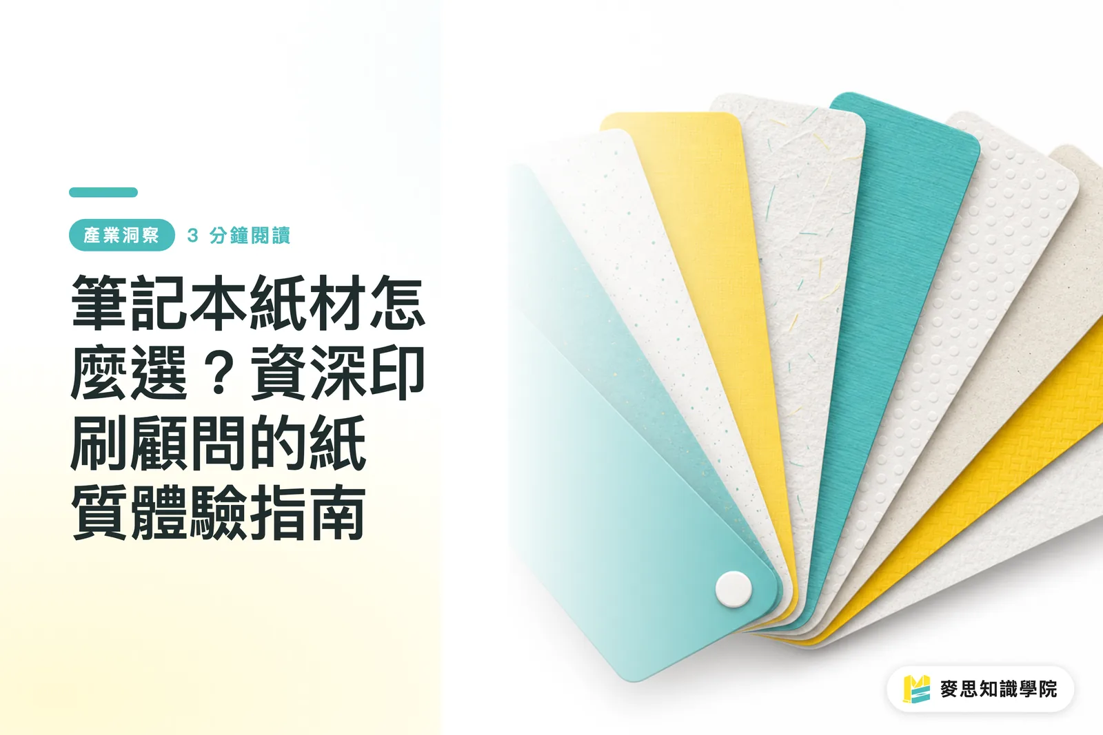
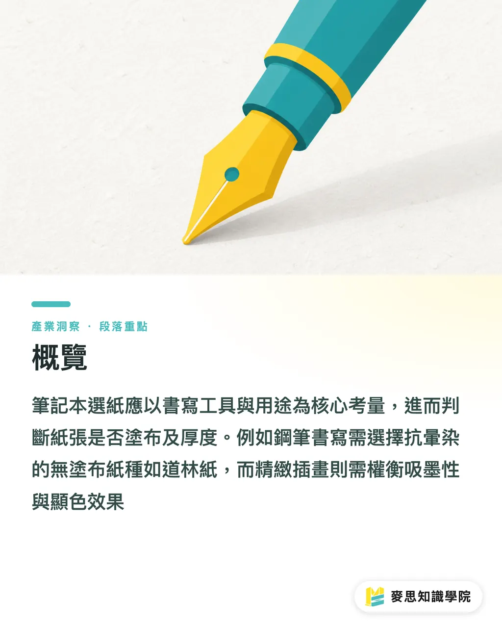
Overview
The core principle of selecting notebook paper is to first clarify the user's writing tools and purpose, and then deduce the appropriate paper type based on "coating" and "paper thickness." Fountain pen users should choose uncoated paper (such as Dowling paper) that resists bleeding. If the notebook needs to showcase exquisite illustrations, one must balance ink absorption with color vibrancy
Why Does Fountain Pen Ink Bleed? The Ink-Absorption Mechanism of Coated vs. Uncoated Paper
Many clients bring high-end catalog paper to print notebook interiors, only to find the ink smudges upon writing. This is due to the "coating layer" on the paper surface. Coated paper (like common glossy or matte art paper) has a layer of pigment on the surface, primarily used to improve smoothness and gloss, allowing ink to sit on the surface for vivid photo reproduction. However, using it for notebook interiors is a disaster: water-based ink cannot be absorbed by the paper fibers and will smear with a simple touch
Uncoated paper is the top choice for notebook interiors. It retains the pores of the paper fibers, offering excellent ink absorption. Based on my experience working in production lines and with clients, 85% of practical notebook interiors utilize 80g to 100g Dowling or offset paper. This ensures a smooth writing experience for water-based pens, fountain pens, and even markers
Does Thickness Equal Quality? Balancing Basis Weight and Flipping Feel
Many designers assume that the thicker the paper, the more premium it feels—a common misconception in printing practice. Paper thickness and weight (usually measured in gsm) directly affect the weight balance and flipping rhythm of the entire notebook. If a 160-page notebook is entirely made of paper heavier than 120g, it will not only be heavy to carry like a brick but also make the spine stiff and difficult to lay flat
I typically recommend an interior weight between 80g and 100g. The cover can be increased to a thickness of 250g to 300g to support the overall structure. For portfolio notebooks requiring full-color illustration printing, uncoated paper can make solid color blocks appear grey. In such cases, I instruct designers to adjust pre-press CMYK curves or switch to lightweight coated paper as a compromise; never blindly increase paper thickness
Which Binding Won't Interfere with Writing? Practical Choices from Saddle Stitching to Exposed Smyth Sewing
Even with the right paper, the wrong binding can make a notebook difficult to use. The ultimate goal of a notebook is to be "easy to write in," and the prerequisite for that is the ability to "lay flat." Many corporate gifts sacrifice quality for cost by choosing standard perfect binding, resulting in a notebook that keeps springing back, which significantly hinders writing
Different scenarios have corresponding optimal binding solutions:
・Saddle Stitching: Suitable for lightweight notebooks under 64 pages; lowest cost and allows for a completely flat lay
・Exposed Smyth Sewing: A method where the spine stitching is visible; it is the absolute choice for thick books over 100 pages, allowing them to lay 180 degrees flat with a sturdy structure
・Wire-O Binding: Offers the highest flipping flexibility, especially suitable for engineering or field personnel who need to fold the notebook back and hold it while standing
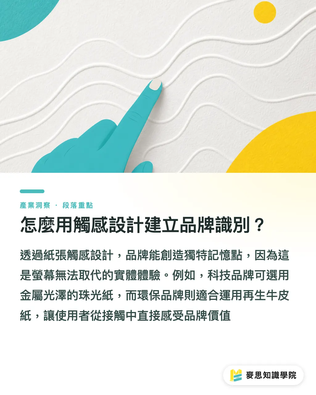
How to Use Tactile Design to Establish Brand Identity?
The tactile sensation of paper is an invisible weapon for building brand memory. Visual design can be replaced by screens, but the friction felt by fingertips against paper texture is an experience unique to physical objects. In integrated projects at MINDS Printing, I often advise clients to translate brand personality into a vocabulary of paper textures
Tech-focused brands can use pearlescent paper with metallic luster for the cover. Brands emphasizing natural sustainability can use recycled kraft paper with impurities or tactile specialty paper, which conveys brand value the moment it is touched. This moves the user more effectively than simply hot-stamping a large logo on the cover
Key Takeaways
・Prioritize writing compatibility for interior pages; uncoated Dowling-style paper that retains fiber pores is the safest foundation
・Paper thickness does not equal quality; an interior weight of 80g to 100g combined with a binding that allows for a 180-degree flat lay is the key to usability
・Coated paper produces vivid colors but is water-resistant, while uncoated paper has good ink absorption but can make photos appear dull; choose based on the core purpose
・The texture and friction of the cover material effectively convey brand personality and are the core value of tactile printing
Extended Reflection
For printing purchasers and designers, a notebook is not just a container for information but a product that the user touches every day. When launching a new project, instead of imagining it from a design on a screen, it is better to ask your printing consultant to provide samples of different paper types. By physically testing writing and flipping, you can digitize this physical feel as part of your brand design specifications, truly achieving a precise alignment between digital design and the physical finished product
FAQ
- Photos appear dull when printed on uncoated paper; is there a way to remedy this?
- During the pre-press stage, you must readjust the CMYK image curves, increase contrast and saturation, or consider switching to a light-coated paper to strike a balance
- I want the notebook to look substantial; can I use thicker paper?
- Interior pages that are too thick will prevent the book from laying flat, severely affecting the writing experience. It is recommended to keep interior pages between 80g and 100g. If you want to increase the feel of bulk, increase the page count or use paper with high bulk-to-weight ratios
- Our notebook is for designers; what kind of binding is best?
- I strongly recommend exposed Smyth sewing. This binding allows the notebook to lay perfectly 180 degrees flat, ensuring that sketches spanning across pages are not obscured by the gutter, making it the top choice for professionals
- I want to apply special processing to the cover; what kind of paper is suitable?
- For embossing or foil stamping, it is recommended to choose art paper or thick cardstock of 250g or more, with longer fibers and good durability. This ensures that the paper will not crack after processing and that the 3D effect is prominent