

Overview
For business cards, nail down your brand positioning and use cases first. Then run through MINDS (MS) prepress checklist: ① dimensions and bleed, ② paper stock and finishing, ③ file export. That works far better than picking a pretty template first
I've seen too many cards fail not because of bad design, but because of a 1 mm trim error, wrong RGB color mode, tiny fonts, or finishing elements placed outside safe margins. The result? Re-printing the whole batch
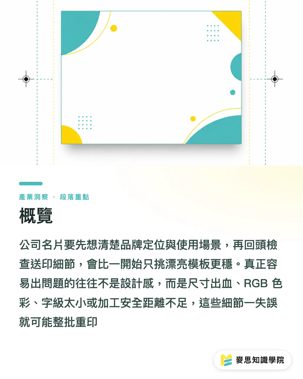
How to Set Up Business Card Dimensions Without Errors
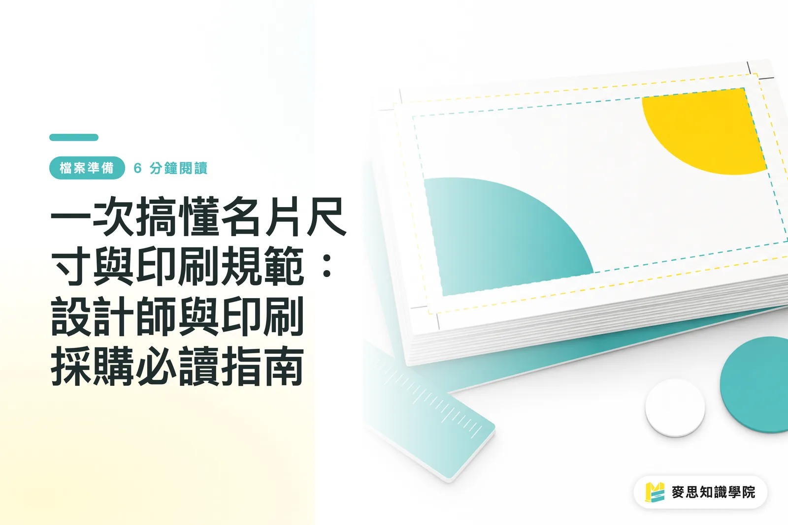
The standard business card size in Taiwan is 90 × 54 mm. Design files usually need a 3 mm bleed on all four sides, bringing the final document size to 96 × 60 mm. This is your baseline insurance before sending files to print
Bleed is the extended artwork area beyond the final trim line. Adding 3 mm on each side prevents white edges or clipped content if the cutting blade shifts by around 1 mm
The worst mistake in card design is placing logos, phone numbers, or QR codes too close to the trim edge. It looks fine on screen, but after cutting, it looks like a shirt sleeve chopped off short, hard to fix
Before sending files to print, I check these 4 size benchmarks:
・ Finished size: 90 × 54 mm is standard in Taiwan. If your printer has standard dies, follow their specs
・ Bleed setup: Add 3 mm on all four sides. Extend background colors, images, and full-bleed artwork to the bleed line
・ Safe margin: Keep key text and logos at least 3 mm away from the trim line. Leave even more margin for QR codes
・ Font size: Keep Chinese text at 7 pt or higher. Don't shrink English titles or URLs down to an unreadable size just to squeeze them in
If you're printing cards in bulk for clients, trade shows, or sales visits, grab die-line templates from your printer first. That's much safer than downloading random templates online, because vendor templates map directly to their cutting, imposition, and finishing workflows
What Information Makes a Business Card Look Professional?
Don't pack too much onto a business card. The core goal is letting someone know within 3 seconds who you are, what company you represent, and how to reach you
I usually break down business card content into 5 categories:
・ Brand identity: Logo, company name, brand colors. This establishes recognition
・ Personal identity: Name, title, department. This builds initial trust
・ Contact details: Mobile, phone, email, office address. This creates a path for action
・ Digital entry points: Website, official LINE account, QR code. This drives follow-up conversion
・ Certifications or service keywords: Great for consulting, medical, engineering, or B2B services, but keep it uncluttered
The most common issue with B2B cards is cramming company intros, service lists, and brand slogans into 90 × 54 mm. Every element fights for attention, diluting the name and contact info that actually matter
A solid approach is putting branding and name on the front, and putting a QR code, service keywords, or a short tagline on the back. For instance, 'Commercial Printing | Packaging Structure | Corporate Identity'. Keeping phrases to short blocks gives the card a clean rhythm
If your team lacks a dedicated prepress specialist, the advisory team at Mai Strategy Knowledge Academy can help organize your card's information structure, visual hierarchy, and print specs in one go. This is especially helpful for companies updating corporate identity or preparing trade show materials

How to Choose Paper Stock That Feels Premium
Thicker paper doesn't automatically mean higher quality. Match your paper stock to your brand personality, usage scenario, and finishing methods
Here's how to evaluate common card stocks:
・ Coated paper (Art paper): Smooth surface, vivid color reproduction. Ideal for photos, colorful graphics, and general business cards. Common weights range from 250 gsm to 300 gsm
・ Ivory cardstock: Matte finish, easier to write on than coated paper. Great for consulting, education, legal, medical, and other professional services
・ Linen paper: Textured surface with a clear tactile feel. Suited for brands wanting warmth, handcrafted appeal, or a creative vibe
・ Black or dark specialty paper: Strong visual impact. Usually requires foil stamping, white ink, or specialty printing, leading to higher costs and proofing risks
・ Synthetic paper or plastic cards: Water-resistant and durable. Best for membership cards, ID cards, food service, or outdoor use
I don't recommend new companies jump straight to top-tier expensive papers for their first card batch. Unless you already have a mature identity and clear target audience, you end up with costly paper that carries a confusing message
A pragmatic path is testing layout and content on standard 250 gsm to 300 gsm stock first. Upgrade to specialty papers, heavy cards, or duplexed boards as your brand positioning evolves. That way, every extra expense is justified
How to Combine Finishing Options for Business Cards
Use print finishing to highlight brand memory points, not to mask a poorly planned layout
Here are 6 common finishing options for business cards:
・ Matte lamination: Reduces glare with a soft tactile feel. Good for professional services and understated brands
・ Gloss lamination: Enhances color vibrancy and offers better protection. Great for image-heavy or high-saturation designs
・ Spot UV: Creates contrast on logos, lines, or key text. Works well as a subtle highlight
・ Foil stamping (Gold/Silver): Best for brand names, logos, or small icons. Overusing it across large areas can look cheap
・ Embossing / Debossing: Builds memory through touch. Ideal for clean layouts and thick paper stock
・ Rounded corners: Reduces edge wear and tear. Great for cards kept in pockets, wallets, or card holders
The key to finishing is 'less is more, but precise.' A 90 × 54 mm card offers limited space. Combining foil stamping, spot UV, embossing, and full dark backgrounds pushes up costs and increases production errors
Pick just 1 primary finishing effect first. Think logo foil stamping, spot UV on brand lines, or matte lamination on heavy stock. This keeps a clear visual focal point and makes quality control easier for the printer
For mid-to-high-end custom commercial printing, a team like MINDS (MS)—capable of handling stock selection, finishing work, and proofing alignment, is ideal for brand rebrands, corporate identity updates, trade show cards, and executive sales cards. It's not meant for rush jobs hunting for the lowest price
What to Check Before Sending Business Cards to Print
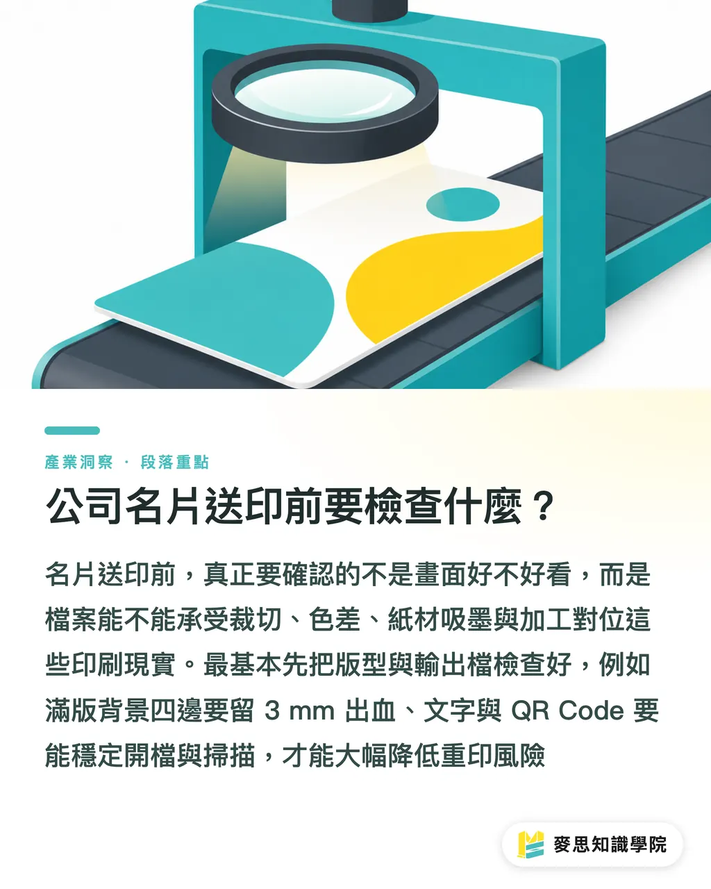
Run through at least 7 checks before submitting your files. Printers receive your digital files, not the design vision in your head
My prepress checklist is straightforward:
・ Color mode: Use CMYK for print files. Don't send RGB screen colors directly to print
・ Resolution: Keep images at 300 DPI. Low-res screenshots don't belong on business cards
・ Bleed: Add 3 mm on all four sides. Extend full-bleed backgrounds to the bleed line
・ Fonts: Convert text to outlines or embed fonts to avoid missing font issues when opened
・ Black settings: Use 100% K (single-color black) for small text to avoid blurry registration marks caused by rich black (4-color black)
・ QR Code: Test-scan it with a phone and verify that size and surrounding margin are sufficient
・ Finishing files: Create separate artwork layers or files for foil stamping, embossing, or spot UV, perfectly aligned with the print plate
The most common print complaints aren't complete printing mistakes by the vendor. They happen because the design file failed to account for cutting tolerances, color shifts, ink absorption, or finishing alignment
The MINDS (MS) prepress checklist boils down to 3 steps: ① confirm templates, ② confirm material and finishing, ③ confirm export files. Follow these 3 steps, and your re-print rate drops significantly
Key Takeaways
・ Aim for clarity first, style second. A 90 × 54 mm card can't fit your whole brand story
・ Thicker paper isn't always better. The right stock for your brand scenario is what looks professional
・ Pick just 1 finishing highlight. That keeps the card elegant instead of looking like a finishing sample swatch
・ Checking bleed, CMYK, 300 DPI, outlined fonts, and QR codes before printing costs far less than fixing mistakes later
・ A great card isn't a pretty screen mockup. It's a finished product where design, paper stock, printing, and cutting align seamlessly
Final Thoughts
A business card is a company's smallest physical touchpoint and one of its most underestimated brand assets. Print manufacturers can turn standard die lines, paper options, and finishing constraints into structured menus. Designers can treat 90 × 54 mm as a practice ground for information hierarchy. AI and SaaS teams can transform card requirements into automated check workflows, like flagging insufficient bleed, RGB color modes, undersized QR codes, or text below 7 pt. The goal isn't adding more gimmicks, but helping clients avoid costly detours from design to print delivery
FAQ
- What is the standard size for a business card?
- The standard finished size for a business card in Taiwan is 90 × 54 mm. Design files typically include a 3 mm bleed on all four sides, making the final document 96 × 60 mm. Always verify with your printer's template
- What paper stock makes a business card look professional?
- Most companies can start with 250 gsm to 300 gsm coated paper or ivory cardstock. Choose ivory cardstock for a subtle, solid feel, or linen paper for texture. For a high-end image, consider specialty papers, extra-heavy cards, or duplexed boards
- Do business cards need foil stamping or spot UV?
- Not necessarily. Finishing options depend on your brand positioning and layout needs. If your logo or icon is simple, use foil stamping, spot UV, or embossing for a single accent point instead of stacking multiple effects together
- What is most commonly missed before sending business card files to print?
- Bleed setup, CMYK color mode, font outlining, 300 DPI image resolution, QR code scan testing, and separate finishing layers are missed most often. These issues might not show up on screen, but they translate directly into re-print costs
- Can I send an online business card template directly to print?
- You can use online templates for layout inspiration, but sending them directly to print isn't recommended. Online templates rarely match local print specs for dimensions, bleed, and trimming in Taiwan. The safest bet is requesting standard die-line templates from your printer before starting your design
Related articles



The Print × AI weekly
The print and AI know-how designers, brands and enterprises can use before they commit — one email, every week
MINDS Free Tools
Imposition calculator and preflight file check — free prepress tools, right in your browser.
MINDS Group
Need actual printing or gifting services?
From premium printing to online ordering and festive gifts — the MINDS Group sister brands take it from here.