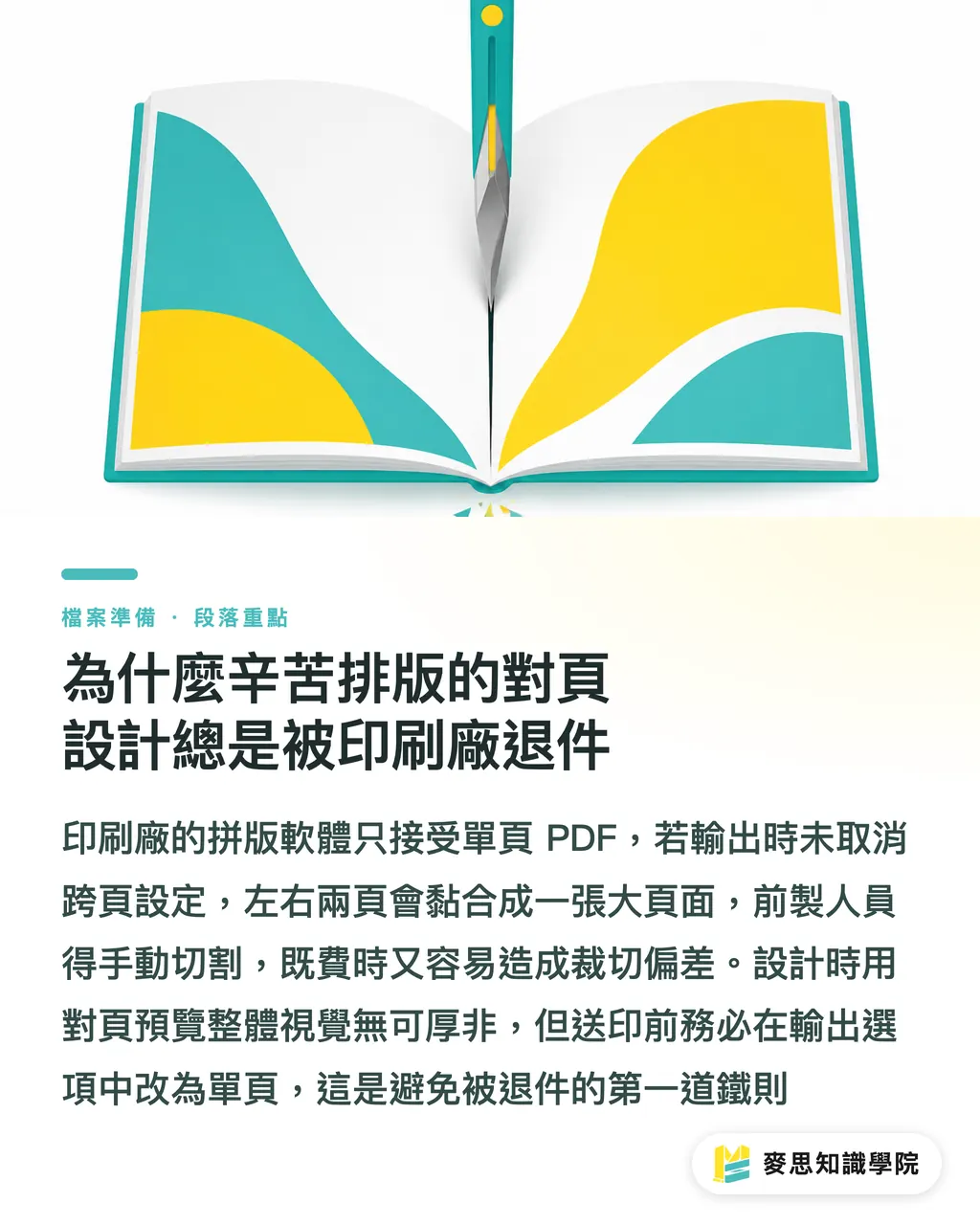
Why do your painstakingly designed spreads always get rejected by the printing house?
While designing in Spreads within InDesign feels intuitive, it is the scenario printing houses dread the most when receiving files
Many designers forget to uncheck 'Spreads' when exporting PDFs, resulting in left and right pages being fused into a single large page
The imposition software at the printing house requires Single Pages files to perform sheet imposition based on the imposition scheme
If you insist on submitting spread files, prepress staff must manually cut the file from the center, which not only prolongs the process but is also highly prone to trimming errors
Remember this iron rule: Use spreads to visualize the overall layout while designing, but absolutely split them into single pages when exporting the PDF for print
What to do about binding margin loss? Fatal traps in perfect binding and saddle stitching
Every month, I encounter clients complaining that the inner content is being 'eaten' by the binding line; this is usually caused by a lack of understanding of the binding structure
For perfect-bound books, a portion of the inner pages will be wrapped in glue within the spine
This means you must increase the margin on the binding side. I strongly recommend reserving at least 10 to 15mm of safety distance; otherwise, readers have to forcefully pry the book open just to see the text near the center
While saddle stitching allows the book to lie flat, creep occurs when the page count is high (e.g., catalogs with over 64 pages)
The innermost sheets are pushed outward due to the paper thickness, and after trimming, the text or graphics near the edges will be cut off
In this case, you must calculate creep compensation in your design software, or shift important text and graphics inward, away from the trim line
Why you shouldn't just guess the cover dimensions
The logic for finalizing cover and back cover files is completely different from inner pages, and the key variable lies in that often-forgotten spine
The spine thickness isn't something to be drawn by feel; it depends on the basis weight of the inner paper stock you choose and the total page count
Whether a book uses 100g woodfree paper or 150g art card makes a world of difference in the calculated spine width
This is why, in a professional workflow, cover dimensions must be precisely calculated by the printing house once the inner pages are confirmed, after which they provide a dieline to the designer
Do not guess the spine width blindly, as this will cause the cover design to shift severely during actual binding
Also, don't forget to handle fonts: ensure they are outlined or correctly embedded to prevent missing characters or broken strokes in your carefully designed cover during output
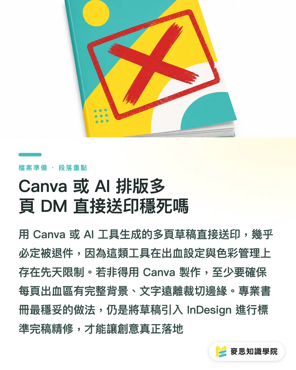
Are Canva or AI-generated multi-page DM files doomed for printing?
Recently, I often see draft files generated by clients using Canva or AI tools being sent directly for printing, and 99% of them are rejected
Canva is indeed intuitive, but it has inherent limitations when handling multi-page booklets and professional printing specifications
For instance, it is prone to color discrepancies and lacks precise control over bleed and binding margins
If you must use Canva to create a multi-page catalog, ensure that the bleed area of every page is filled with the background, and keep text within the safe zone, away from the edges
However, to produce professional-grade booklets, I still recommend transferring your AI-generated inspiration or Canva drafts to InDesign for standard three-stage finalization and refinement to ensure your creative vision translates perfectly
Key Takeaways
・When exporting PDFs for print from InDesign, be sure to disable the 'Spreads' setting; providing single-page files is essential for smooth imposition
・For perfect-bound books, reserve at least 10 to 15mm of safety margin on the binding side to prevent text from being wrapped into the spine
・When saddle stitching books with many pages, calculate creep compensation to prevent important graphics or text at the edges from being trimmed off
・Spine thickness must be precisely calculated based on paper weight and page count. Always request accurate dieline dimensions from the printing house before finalizing your cover design
Extended Thoughts
Design and print should never be two fragmented worlds
As the MINDS team, providing integrated services from prepress to post-production manufacturing, we have seen too many cases discarded due to files failing to meet specifications
Taking binding methods and paper thickness into consideration at the early design stage can save you massive post-production rework costs
No matter how tools evolve, possessing this mindset for finalization—one that considers physical limitations—is the true hard skill to ensure your work lands perfectly
FAQ
- Why is the text on the inner pages of my printed book being eaten by the binding line?
- Because perfect binding uses glue at the spine, which occupies internal space. If you don't reserve a safety margin of at least 10 to 15mm on the binding side during finalization, text loss will occur
- When exporting PDFs from InDesign to the printing house, should I choose single pages or spreads?
- You must choose Single Pages. The printer's imposition software must receive single-page files to perform the subsequent sheet layout process
- How can I accurately estimate the spine width of a book?
- Spine width is determined by multiplying the paper thickness by the page count. The safest practice is to confirm the paper stock and ask the printing house to provide the cover dieline dimensions directly
- What should I pay attention to when creating a saddle-stitched booklet with many pages?
- Pay attention to the 'creep' phenomenon. The inner sheets are pushed outward due to thickness, so important graphics and text near the edges must be shifted inward to avoid being trimmed off
Related articles
- Bleed and Safe Zone: How Much Margin Does Your Print File Actually Need?
- A Complete Guide to Business Card Sizes and Printing Specifications: A Must-Read for Designers and Purchasing Professionals
- Printing Typography: From Font Size and Leading to Knockout Text—Avoiding the Visual Trap Between Screen and Print