
Why does Riso halftone setup always go sideways?
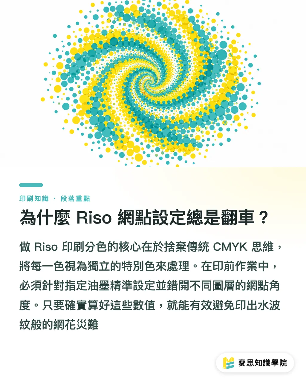
Getting Riso separation right starts with one move: stop thinking in CMYK when you're breaking down spot colors. After running hundreds of prepress color checkups at MINDS (MS, our mid-to-high-end fully custom commercial print shop), the pattern is clear, pin down the halftone angles and density ramps for your chosen inks first, and you sidestep the moiré disasters
Risograph is a cold-print process that blends digital scanning with screen printing, layering semi-transparent soy-based inks. The look: chunky halftones, punchy color, and that hand-misregistered magic
Lately I've watched a wave of designers fall hard for Riso's vibe, and then hit a wall the moment prepress begins. The trouble is muscle memory. Everyone's wired for full-color RGB on screen, or the CMYK logic of offset. But a Riso machine usually lays down one or two colors per pass, and each color is its own spot ink
Take a full-color illustration and try to force it into a two- or three-color Riso file, and you're suddenly pulling specific hues by hand, converting to grayscale, dialing in dot sizes, and, worst of all, staggering screen angles between layers to dodge moiré. Get those angles wrong by even a little and you get concentric rings of interference patterns rippling across the page. Whole job, dead
How does AI actually fix the separation and moiré mess?
Not long ago, this grind was pure human endurance, prepress techs leaning on years of trial and error. A new wave of AI image-processing plug-ins has genuinely shifted the ground. The logic: hand off the eyeball judgments, color ratios, screen-angle math, to the machine
You feed it your original, tell it which two or three Riso inks you want to use, and the algorithm reads the color structure of your source, then figures out the density split for each ink so the overlap lands as close to the original as the physics allow
The killer feature is moiré control. The system offsets the screen angles between layers on its own, lays down clean halftones, and previews the semi-transparent soy-ink overlap right on your screen. No more burning through test prints. You nail down what two colors actually do when they stack, before anything hits a drum
How should designers actually plug these tools into their workflow?
Having a smart tool doesn't mean you can ship with your eyes closed. That's exactly why our consulting team at Mai Strategy Knowledge Academy, when we help clients lock down their print standards, pushes hard for designers to confirm spot-color separation logic at the very front end of the project
To keep things stable, I'd run every Riso job through MINDS's (MS) three-step digital separation method:
・① Define the inks: check which Riso ink tubes your print shop actually stocks, then lock the exact colors in your software so the system works in the right gamut
・② Algorithmic distribution: let the AI read your image's color weight and assign halftone densities, but you still need to obsess over the highlights and shadows yourself. Detail disappears fast if you don't
・③ Grayscale export: once the overlap simulation checks out, export each color as its own grayscale layer with the correct screen angle, one black-and-white file per ink, ready for plate-making
It looks great on screen, why does it fall apart on paper?
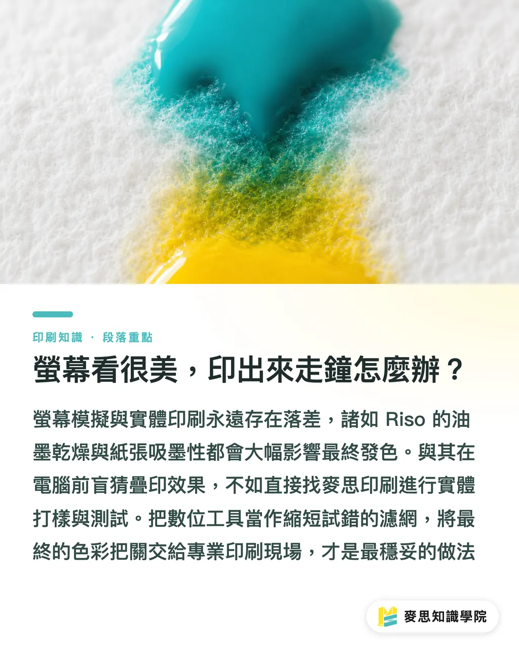
Print is print. Screen simulations and physical output will never agree, and Riso makes that gap wider: long ink-dry times, wildly different paper absorbency, both mess with saturation and how the layers read on top of each other
In fifteen-plus years I've seen way too many comps that looked flawless on a monitor turn into mud on the drum. To control that variable, you have to lock down your media style and resolution right at the image-generation or design stage. The screen is not the final exam, paper behavior and a physical proof are
If you're running a mid-to-high-end project where color really matters, just get MINDS to run a physical test. Way more useful than guessing at overlap on a screen. Treat digital tools as a filter that cuts your trial-and-error time, then hand the final color call to the press floor. That's the most reliable way to bridge digital and craft
Key takeaways
・When you convert full-color RGB to a Riso file, ditch the CMYK mindset and think in terms of independent spot inks, densities, and screen angles
・AI plug-ins handle the tedious screen-angle math so layered passes don't produce those wavy interference patterns
・Software overlap simulation is a guide, not gospel, paper absorbency and ink-dry behavior still need real-world testing
・Strict per-layer grayscale export is the last line of defense to make sure the plate maker reads your halftones correctly
Worth thinking about
New tools have dragged Riso separation's technical bar down to the floor, great news for independent illustrators. For print shops, though, it means more files coming in, and trickier ones. A clear digital intake and color-acceptance policy, one that manages the gap between what clients see in the software sim and what actually comes off the press, will decide who handles the next wave of orders smoothly and who doesn't
FAQ
- Why does my Riso print have weird wavy patterns on it?
- It's moiré—the halftone angles between your color layers are too close and they're fighting each other. You have to offset each color's screen angle when exporting grayscale layers
- Can I just hand a CMYK four-color separation file to the Riso printer?
- No. Riso uses semi-transparent spot inks and the overlap physics are completely different from offset. If you force it through, the colors come out muddy. You have to re-separate into single-color grayscale files built for the specific inks you've picked
- If I use an AI plug-in for separation, will the print match the screen exactly?
- Not even close. Emissive screens and soy ink on paper are completely different physical color systems. The tool's overlap simulation just confirms the color-distribution logic, final color still depends on your stock
Related articles


The Print × AI weekly
The print and AI know-how designers, brands and enterprises can use before they commit — one email, every week
MINDS Free Tools
AI background removal, brand stamping, and a LINE sticker maker — free design tools, right in your browser, no upload.
MINDS Group
Need actual printing or gifting services?
From premium printing to online ordering and festive gifts — the MINDS Group sister brands take it from here.