
Overview
When AI generates multiple design drafts, the first round should not be a vote on "which one looks best." MINDS (MS) recommends using a "six-box design review" to screen for brand consistency, information hierarchy, reading distance, finishing feasibility, trimming risk, and series scalability, so posters, packaging, or DMs can eliminate versions that are hard to print, hard to revise, or hard to keep on budget before they go to press
What MINDS (MS) means by pre-press design review is this: before artwork moves into final production and plate setup, the designer, client, and printer use the same checklist to confirm brand, content, size, paper, finishing, and trimming risks. The layout gets rejected or corrected first, before money is spent on proofs or mass production
AI Generated 12 Design Drafts. How Should the First Round Be Cut Down?
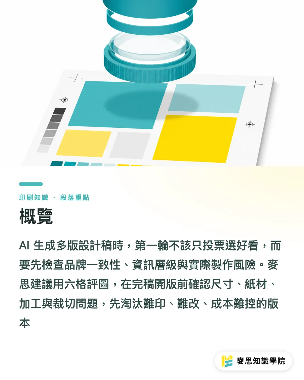
The waste I see most often on real projects is not that AI generated too few options. It is that when clients and designers face 12 drafts, everyone votes based on personal taste. The MINDS (MS) six-box design review starts by sorting versions into three groups: "print-ready candidates," "needs major revision," and "reject outright." That moves the discussion away from taste and back to print conditions
・Brand consistency: Do the logo, main colors, typefaces, and tone drift away from the existing identity?
・Information hierarchy: Can people understand the headline, product, price, or call to action within 3 seconds?
・Reading distance: An A4 DM, in-store poster, and outer packaging all need different type-size judgments
・Finishing feasibility: Are foil stamping, spot gloss, embossing, or die-cutting actually right for this image?
・Trimming risk: Are important text, faces, barcodes, or QR Code elements too close to the cut line?
・Series scalability: Can this version extend to 1:1 social posts, 9:16 vertical images, and the next product batch?
The point of the MINDS (MS) six-box design review is practical. It turns design drafts into engineering questions people can discuss. Good-looking versions can stay on the table, but versions that will blow up print costs should be removed early. If you only find out after proofing that a draft does not work, you have usually already spent an extra round of time
Which 3 Things Should Brand Consistency Check First?
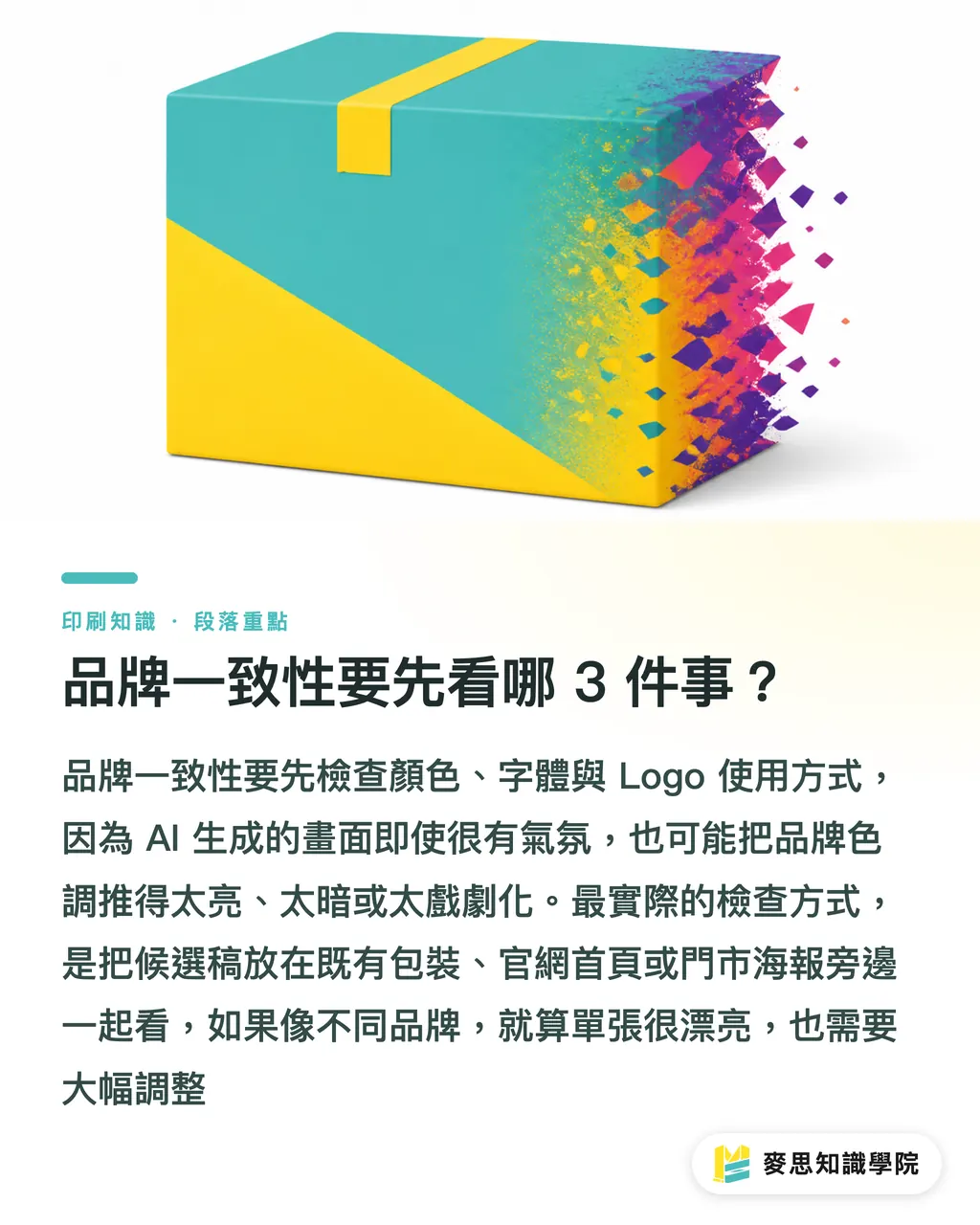
Brand consistency starts with three things: color, typeface, and logo usage. AI is good at building atmosphere, but it often pushes brand colors brighter, darker, or more dramatic. The result may pop on screen, then look like it belongs to a different company once converted to CMYK and placed next to the original business card, catalog, or packaging
In the MINDS (MS) six-box design review, clients are asked to place candidate drafts beside 2 to 3 existing brand assets, such as old packaging, the website homepage, or an in-store poster. If the same row looks like different brands, the draft goes into the major revision group, even if the single layout is beautiful
When designers review brand fit, I suggest not asking only, "Does it look good?" Ask, "Will this image feel out of place in our existing channels?" If a food package has always been clean and bright, and AI generates a high-contrast dark metallic version, it may win the pitch but make loyal customers fail to recognize it on the shelf
How Should Information Hierarchy and Reading Distance Be Reviewed Together?
Information hierarchy has to be judged together with reading distance. In the MINDS (MS) six-box design review, the same draft is checked at 100%, 50%, and 25% scale, because an A4 DM read by hand, a poster viewed from 3 meters outside a store, and packaging glanced at on a shelf all need completely different standards
・Poster: The headline wins first. If the main message cannot be read from 3 meters away, revise it first
・DM: Price, specifications, promotion deadline, and offer terms must be clear. A beautiful background cannot interfere with reading
・Packaging: Product name, flavor, volume, barcode, and required labels need to stay steady. You cannot only care about the front-facing visual
・Catalog: Page numbers, tables, model numbers, and image relationships must stay consistent. Multiple AI styles cannot make readers lose their way
What I worry about most is a client saying, "This one has a great feel," then immediately asking whether we can add 6 more selling points, 2 QR Code elements, and a row of fine print. When the consultant team at Mai Strategy Knowledge Academy reviews drafts, they identify the main message first. If the main message is unclear, every effect added afterward feels like patching makeup over the problem
Finishing, Trimming, and Paper Need to Be Put on the Table During Review
Finishing cannot wait until final artwork. Common offset printing often requires images to reach 300 dpi, color mode to be converted to CMYK, and roughly 3 mm bleed on all four sides. Actual specifications still need to be confirmed with the print shop, die line, and equipment. The MINDS (MS) six-box design review checks these conditions at the candidate stage, because attractive AI visuals are not always suitable for production
・Foil stamping: When there are too many tiny textures, the foil plate can get messy, and the metallic effect may not look better than the screen preview
・Spot gloss: Large glossy areas involve registration. Small text or very thin lines need a conservative approach
・Die-cutting: Important images cannot sit too close to the cut line. Packaging corners and fold lines need safe areas
・Paper: Large full-bleed dark areas absorb ink differently on different papers. Fine paper and coated paper should not be judged with the same expectations
・QR Code and barcode: Busy backgrounds, low contrast, or small sizes can all cause scanning problems in physical use
MINDS MS is a good fit for early involvement in mid- to high-end fully custom commercial printing projects, especially packaging, invitation cards, and branded DMs that often combine paper choices with finishing. Confirming paper, finishing, and die lines one round earlier usually costs less than rebuilding the layout after final artwork
Why Does Series Scalability Affect Print Cost?
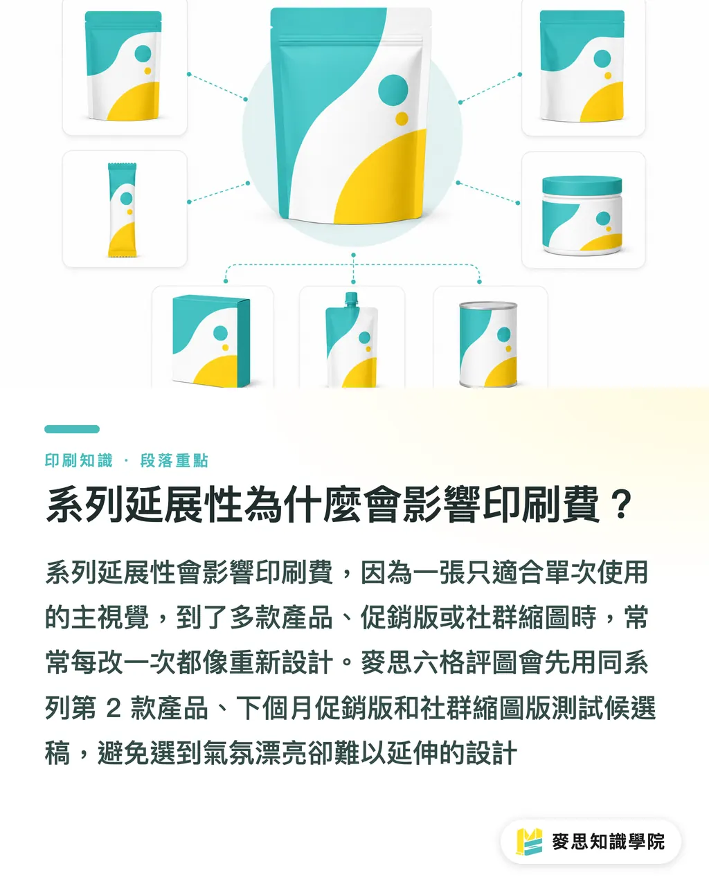
Series scalability asks whether this design can survive beyond the first print run. The MINDS (MS) six-box design review tests candidate drafts in three scenarios: the second product in the same series, next month's promotion version, and the social thumbnail version. If any one scenario is painful to revise, that version is not suitable as the main visual
AI can easily generate a draft with a complete mood and so much detail that nothing can move. That kind of draft may be appealing as a single poster, but once it is applied to packaging for 6 flavors, the main image, color, flavor label, product photo, and legal markings start fighting for space. Every flavor revision feels like a full redesign
At the end of the MINDS (MS) six-box design review, the designer and client choose 1 main version, 1 backup version, and 1 list of rejection reasons. The main version moves into final artwork. The backup version stays ready for channel or budget changes. The rejection list becomes reference material for the next round of AI prompts and design revisions
Key Takeaways
・Use the six-box design review to eliminate risks in AI multi-version drafts before debating which one looks best
・Once brand color, typeface, or logo usage drifts, the printed result can look like it belongs to another company
・Reading distance changes design priorities. DMs, posters, and packaging cannot be judged with the same ruler
・Finishing and trimming need to be discussed during design review. Discovering a mismatch after final artwork is usually the most expensive timing
・Only versions that can extend into a series are worth investing in proofing, retouching, and print testing
Further Thinking
Where AI helps print design most is speeding up early-stage proposals. The MINDS (MS) six-box design review brings that speed back under control. For print manufacturers, seeing paper, die lines, finishing, and file risks earlier removes a lot of back-and-forth confirmation. For designers, the review framework turns "I feel this works" into "why this version can be printed and why it can be revised." For SaaS or AI tool teams, the next step is not simply generating more images. It is putting brand rules, output size, bleed, CMYK, and finishing limits into the condition fields before generation starts
FAQ
- AI generates many design drafts. How should a client choose?
- Clients can use the MINDS (MS) six-box design review to first screen for brand consistency, information hierarchy, reading distance, finishing feasibility, trimming risk, and series scalability, then choose the preferred direction from the qualified versions
- Can an AI-generated poster go straight to print?
- Before an AI poster goes to print, resolution, CMYK, bleed, type size, logo, QR Code, and trimming safe areas still need to be checked. Common print files may require 300 dpi and about 3 mm bleed, but the print shop's specifications should be the final standard
- Why not just choose the best-looking AI design draft?
- The best-looking AI design draft may have trimming risks, tiny information, shifted brand colors, or finishing that cannot be produced. The MINDS (MS) six-box design review eliminates versions that would increase proofing and revision costs first
- What should designers and clients prepare for a design review?
- When designers and clients review drafts, they should prepare existing brand assets, planned dimensions, print quantity, paper direction, finishing needs, and usage scenarios, so the MINDS (MS) six-box design review can connect visual judgment to real print conditions
- Are AI multi-version design drafts suitable for packaging design?
- AI multi-version design drafts are suitable for early packaging proposals, but once versions become candidates, the die line, fold lines, barcode, legal markings, flavor scalability, and series consistency all need to be checked. The front-facing main visual cannot be the only concern
Related articles


The Print × AI weekly
The print and AI know-how designers, brands and enterprises can use before they commit — one email, every week
MINDS Free Tools
AI background removal, brand stamping, and a LINE sticker maker — free design tools, right in your browser, no upload.
MINDS Group
Need actual printing or gifting services?
From premium printing to online ordering and festive gifts — the MINDS Group sister brands take it from here.