

Looks Fine on Screen, Wrong in Print, Where Does the Problem Come From?
Let's start with the conclusion: screens use light-mixing (RGB additive color), and Adobe's transparency engine can calculate multi-layer blending effects in real time. The Drop Shadow or Multiply blend mode you see on your monitor is a 'live calculated result.' Printing, on the other hand, uses ink layering. The prepress workflow must ultimately convert every object into specific instructions: how much C, how much M, how much Y, and how much K to print in each area
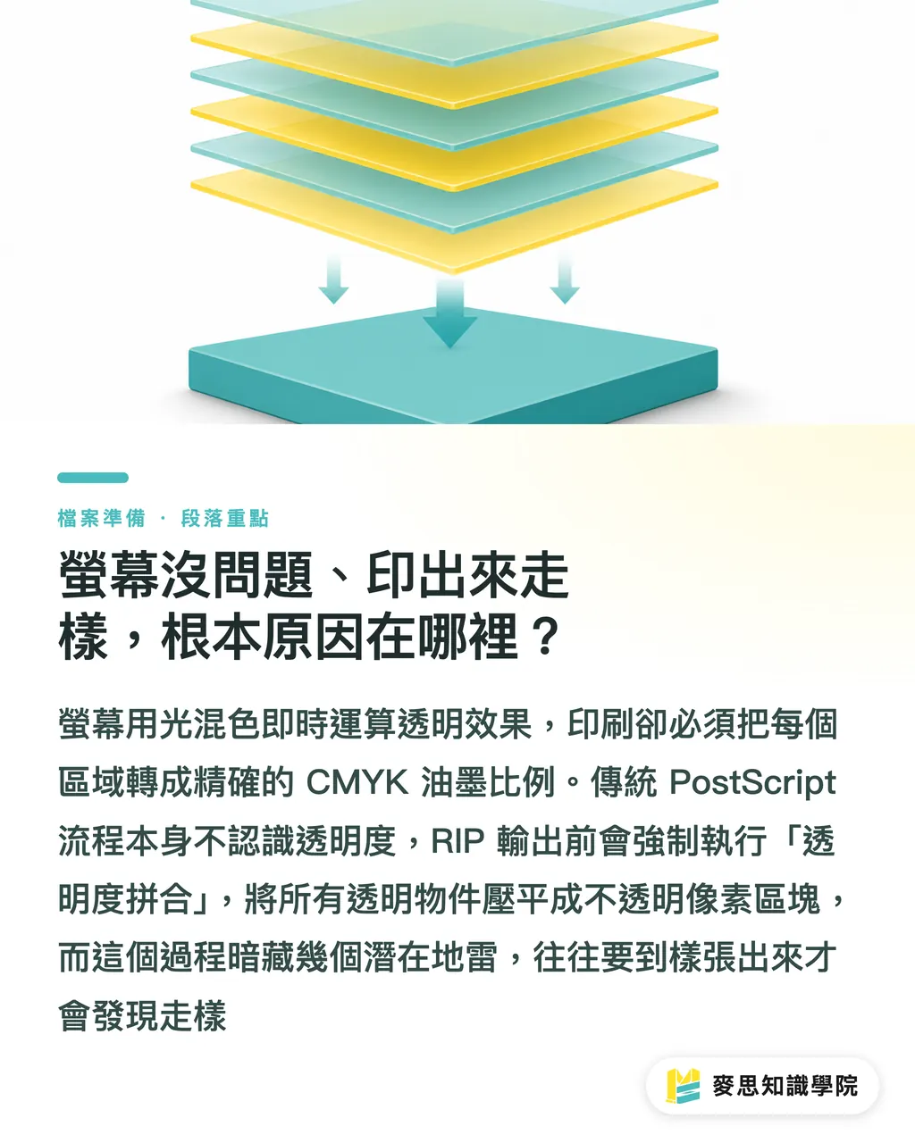
The core problem with traditional PostScript print workflows is that they don't recognize the concept of 'transparency.' PostScript itself has no native transparency support. When a RIP (Raster Image Processor) receives a file containing transparency effects, it must first perform one operation, transparency flattening (Flatten)—which means forcibly converting all transparent objects and their affected areas into solid, opaque pixel regions before handing them off to the press
The flattening process itself isn't inherently problematic, but it has several pitfalls that most designers never notice, until the proof comes back and they're left staring in disbelief
Why Do Shadows Show Jarring White Borders or Jagged Edges?
The principle behind Drop Shadow and Feather is that edge pixels gradually decrease in opacity, creating a smooth transition. That 'gradual decrease' is itself a transparency calculation. When Flatten runs, the software must decide: which area needs to be rasterized? And at what resolution?
The problem most commonly appears in these two situations:
・Transparent objects placed on top of vector text: during flattening, the overlapping area of text and shadow is fully rasterized. The originally crisp vector letterforms in that region become pixels, visible jaggedness or slight blurring is the result, and it's most noticeable with small type
・Flattening resolution set too low: Illustrator's Flatten Transparency dialog has a Rasters/Vectors Balance slider. Many people have never touched the default, and the result is visible banding along feathered edges when printed at high resolution
The white border issue usually comes from the flattened region not extending beyond the background color: the shadow's influence area gets clipped, and after flattening the white of the paper shows through, creating what looks like a white frame around the object
Why Are Colors Completely Off When Blend Modes Overlap with Spot Colors?
Blend modes such as Multiply, Screen, and Overlay are calculated on screen using RGB values. The print color space is CMYK, which introduces one layer of error on conversion; when overlaid on a Spot Color (such as a Pantone swatch), the problems become even more severe
When a RIP processes a situation like 'a Multiply layer sitting on top of Pantone 185,' it must first decide whether to convert the Pantone to a CMYK equivalent. If it doesn't convert, the two colors can't be used together in a blend mode calculation; if it does convert, the visual purity of the Pantone color is lost. This isn't a software bug, it's a fundamental limitation of the color model
I once handled a job where a client used Screen mode to 'blend' a photo into a gold Spot Color background. The effect looked beautiful on screen; what came off the press was a flat, lifeless CMYK overprint that completely destroyed the design concept. The root cause was exactly this: blend modes cannot operate reliably on Spot Colors, and you must manually decide how to handle the overlap before submitting for print
There's another commonly overlooked situation: the file looks fine in Acrobat's preview but comes out wrong after RIP processing. This is because Acrobat's preview engine is Adobe's own, and it interprets transparency more leniently. A print shop's RIP software (such as Harlequin or EFI Fiery) may handle the same file with different logic, especially when PDF versions are mixed or flattening settings are ambiguous

What You Should Do Before Exporting
These steps aren't 'optional'—they're 'mandatory.' They can prevent seventy to eighty percent of print submission disasters
Check whether transparency effects overlap with vector text
・If your design includes drop shadows or glow effects, move the text layer to the top so the transparency effects only affect background or raster layers
・For critical text, consider a layered strategy: apply effects on rasterized layers while keeping the text as vectors
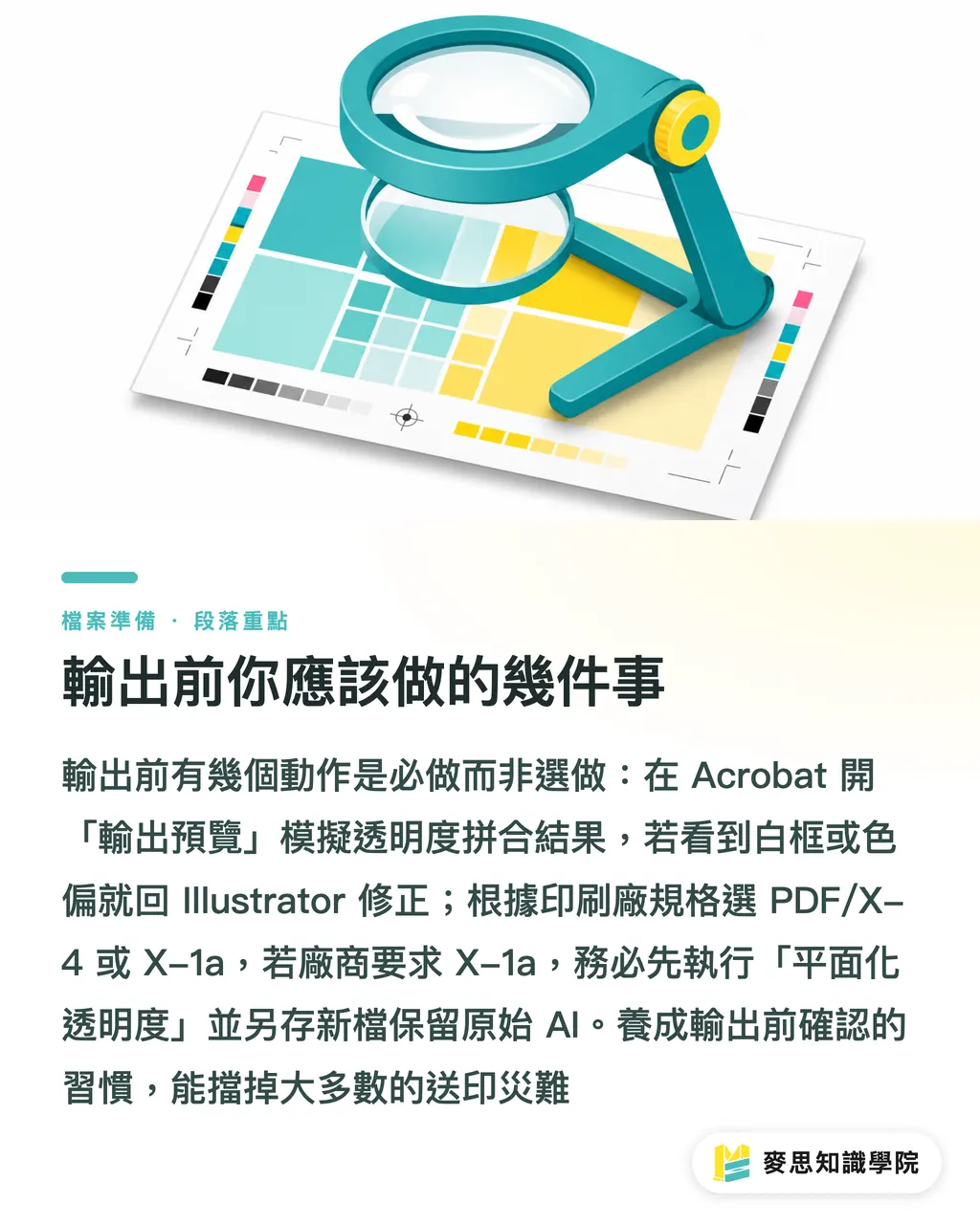
Use Output Preview in Acrobat to simulate flattening results
・After opening the PDF, go to Print Production → Output Preview, and check both Simulate Overprinting and Preview Transparency Flattening
・This lets you see approximately what the RIP will produce before printing. If you see white borders or color shifts at this stage, you know to go back to Illustrator to make adjustments
Choose the correct PDF format as required by your print shop
・PDF/X-4: preserves native transparency and lets the print shop's RIP handle it at output time; suitable for modern digital printing equipment capable of processing X-4
・PDF/X-1a: requires all transparency to be flattened before saving; suitable for traditional offset printing or when a vendor specifically requests this format
If the vendor requires X-1a, run Flatten Transparency in Illustrator first
・Path: Object → Flatten Transparency
・Set the Rasters/Vectors Balance slider to 100 (fully preserve vectors); set rasterization resolution to 300–400 dpi
・Save a separate copy after running this and keep your original AI file, because transparency effects cannot be edited after flattening
If you work with the same print shop on an ongoing basis, it's worth asking them directly what formats and RIP versions they accept. MS Print's sales team typically informs clients of the requirements when confirming proofs, much more efficient than guessing on your own
Handling spot colors and blend modes
・When blend modes overlap with Spot Colors, you must confirm in Illustrator whether to convert the Spot Colors to CMYK
・If the effect must be preserved, convert to CMYK first, then visually readjust on screen before exporting
Key Takeaways
・The root cause of transparency issues is that PostScript does not support native transparency; the Flatten process forces rasterization, which triggers white borders and jagged edges
・Vector text covered by transparent objects is the highest-risk combination, after flattening, the text is partially rasterized, and the damage is nearly impossible to recover
・An Acrobat preview is not the same as a RIP result. The only way to catch discrepancies is to simulate transparency flattening in Output Preview
・Blend modes overlaid on Spot Colors is the classic scenario for catastrophic color failure. You must make a manual decision on how to handle it before submitting for print
・PDF/X-4 preserves design intent better than X-1a, but only if the print shop's RIP supports it, confirm this before submitting
Further Reflections
Based on my long-term observations on both the production floor and the client side, transparency issues keep recurring not because designers lack skill, but because the entire workflow is missing a dedicated prepress review step. Designers finish in Illustrator, save as PDF, and submit, without anyone opening Acrobat's Output Preview to run a simulation in between
For designers, the most direct improvement is to add 'Output Preview simulation' to your print submission checklist and run it every single time, regardless of whether you think you've used transparency. Some transparency is hidden: an imported PSD carrying a mask, or a legacy blend mode buried in an older AI file, things that are invisible inside Illustrator but show up clearly in Acrobat's Output Preview
For print buyers and clients, the key is choosing a vendor who can communicate clearly about format specifications. Asking 'do you accept X-4, or do you need X-1a?' before submitting lets you decide whether to flatten on your end first. If the vendor can't give a clear answer to that question, you're taking on the rejection risk yourself
For platform and SaaS tool providers, this is a valuable point to embed as a smart prompt: detect whether an uploaded PDF contains transparency objects, and immediately notify the user whether the current format is compatible with the selected print specification. This would meaningfully reduce rejection rates and ease customer support pressure
FAQ
- A Drop Shadow shows a white border after printing, is this a settings issue or a print shop issue?
- In most cases it's a design-side issue. The cause is that during transparency flattening, the shadow's influence area gets clipped, exposing the white of the paper and creating a white border. The fix is to ensure rasterization resolution is set high enough in Illustrator's Flatten Transparency settings, or to use Acrobat's Output Preview to check the flattening result in advance
- What's the difference between submitting PDF/X-4 and PDF/X-1a for print?
- PDF/X-4 preserves native transparency and lets the print shop's RIP handle it at output time; PDF/X-1a requires all transparency to be flattened before saving. X-4 retains more design flexibility but requires the print shop's equipment to support it; X-1a has the widest compatibility and suits traditional offset workflows. Confirm with your vendor which format they accept before submitting
- I used Multiply blend mode in Illustrator over a Spot Color (Pantone), and the printed color is completely wrong. What should I do?
- Blend modes such as Multiply require CMYK or RGB values as their calculation basis and cannot operate directly on Spot Colors. The solution is to expand the relevant Spot Color objects in Illustrator and convert them to CMYK equivalents, then re-examine the blended result. If the Spot Color must be retained, remove the blend mode and instead use plain overprinting or adjust the layer order to manually simulate the effect
- The preview in Acrobat looks fine, why does it still come out wrong in print?
- Acrobat's standard preview renders using Adobe's own engine, which handles transparency more leniently. Print shop RIP software (such as Harlequin or Fiery) doesn't follow identical logic and may produce different results with the same file, especially when PDF versions are mixed or flattening settings are ambiguous. To truly simulate what the RIP will produce, you must go to Print Production → Output Preview in Acrobat and check Simulate Overprinting, not rely on the standard page preview
- How do I avoid jagged edges on vector text covered by a drop shadow effect after flattening?
- The core approach is to prevent transparency effects from sitting directly on top of vector text. Move the text layer to the top and apply the shadow effect to a background or raster layer beneath the text. If the effect must visually influence the text, you can rasterize the text first (convert it to a high-resolution image) so that no vector text is clipped during flattening
Related articles


The Print × AI weekly
The print and AI know-how designers, brands and enterprises can use before they commit — one email, every week
MINDS Free Tools
Imposition calculator and preflight file check — free prepress tools, right in your browser.
MINDS Group
Need actual printing or gifting services?
From premium printing to online ordering and festive gifts — the MINDS Group sister brands take it from here.