

Overview
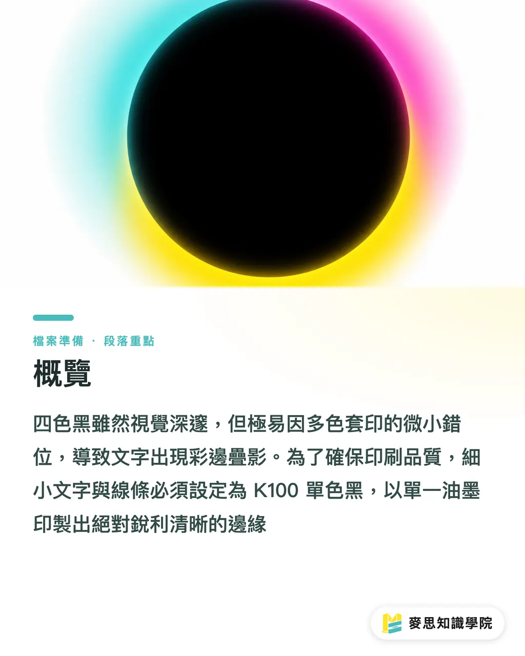
Rich black is a black composed of overlaid CMYK inks, which is highly prone to color fringing at text edges due to minor misalignments during high-speed printing. At MYS Printing, our primary prepress check is to ensure that fine text and lines are set to K100 process black
Rich Black: A deep black printed by mixing cyan, magenta, yellow, and black inks. It looks darker, but because it requires registering multiple printing plates, it easily creates ghosting or color leakage at the edges
Process Black: A color setting printed using only black ink (K=100). It requires no registration with other colors, ensuring that text and fine lines remain perfectly sharp and clear
Why Print Shops Always Warn Against Rich Black for Small Text
Default blacks selected casually in design software are often a mix of all four CMYK values
While the file may look perfect when zoomed in hundreds of times on screen, the physical paper must pass through four different color ink stations at high speed during printing
If the paper stretches or shrinks slightly due to temperature and humidity, or if the machine vibrates by just a fraction of a millimeter, the four colors will fail to align perfectly
This minor registration issue is completely unnoticeable on large color blocks of a poster
However, if applied to body text of 8pt or smaller, or to extremely thin borders, cyan or magenta color fringes will clearly show up around the edges of the font
At first glance, readers will immediately feel that the text is blurry or looks like it has a ghosting effect
What to Do If Process Black Isn't Dark Enough for Large Backgrounds
Some designers notice that large color blocks printed solely with K100 tend to look grayish
This happens because a single layer of black ink is absorbed by the paper, failing to deliver a deep, velvety matte finish
When a rich black background is required, in practice we absolutely never crank all CMYK sliders up to 100
An excessively high total ink limit makes the paper difficult to dry, which can cause set-off disasters (ink transferring to the back of the preceding sheet)
I usually recommend clients add a small percentage of cyan when setting large areas of deep black background
・The safest formula is C30 K100
・This enhances the density and depth of the black while keeping the total ink coverage well within the press's safe limit
If you have extremely high color standards, feel free to consult with MYS Printing's prepress advisors. We will recommend the optimal ink ratio based on the characteristics of different fine paper stocks
How to Check Black Color Values Before Sending Files to Print
Many rejected jobs that require rework happen simply because designers forget to check the default color palette
In particular, vector assets downloaded from stock websites are almost always 100% rich black
The most straightforward way to avoid this trap is to open the "Separations Preview" panel in Illustrator
・Turn off the Cyan, Magenta, and Yellow channels on screen, leaving only the eye icon for the Black channel active
・If the black text disappears or fades on screen, it means those characters are mixed with other color values
For professionals accustomed to online ordering, running this check before submitting files to MYS Printing can save a lot of back-and-forth communication time
Ensuring that plain text is clean process black and that large backgrounds have controlled ink limits will guarantee your design prints flawlessly on the press

Key Takeaways
Always use K100 process black for fine text and thin lines to prevent registration errors and ghosting caused by high-speed printing presses
Do not set CMYK to maximum values for large black backgrounds; instead, use C30 K100 to increase the depth of the black
Be sure to use Illustrator's Separations Preview to check finalized artwork, ensuring text remains fully visible when CMY plates are turned off
Further Thoughts
File preparation is the first line of defense in print production. Rather than assigning blame after a bad print run, it is much better to optimize black values at the source to suit the printing machinery
Developing a habit of checking separations during the design phase not only slashes reprint waste but also builds the foundation for seamless collaboration between professional designers and print shops
FAQ
- Rich black and process black look identical on screen. What's the actual difference?
- Process black only has a K value of 100, whereas rich black is a mix of CMYK values. When printing on press, rich black requires overlapping prints from four plates, making it highly susceptible to registration errors that cause colored fringes
- If I accidentally used rich black for small text, can the print shop fix it for me?
- If professional prepress staff spot this error, they will typically reject the file and notify you. However, if the text has been outlined or is in an image format, the print shop cannot modify it directly; the designer must adjust and resubmit it
- Why are vector assets downloaded from stock websites almost always rich black?
- Most assets are created in the RGB color space. When pasted into a CMYK workspace, the software automatically converts the original black into a four-color mix. Therefore, you must manually change plain text back to K100 before printing
Related articles




The Print × AI weekly
The print and AI know-how designers, brands and enterprises can use before they commit — one email, every week
MINDS Free Tools
Imposition calculator and preflight file check — free prepress tools, right in your browser.
MINDS Group
Need actual printing or gifting services?
From premium printing to online ordering and festive gifts — the MINDS Group sister brands take it from here.