

Overview
To ensure that black on packaging prints beautifully without issues, barcodes and fine text must be set to pure K100 with 'Black Overprint' enabled to prevent registration issues. For large dark backgrounds, 'Rich Black' should be used to increase saturation, but the total ink limit must be controlled to prevent ink setoff
At MINDS (MS, high-end fully customized commercial printing), we process a massive volume of files every day. Our first step is always to use the 'MINDS (MS) Pre-press Three-Gate Check' to catch these easily overlooked black setting blind spots
A design layout on screen has neither weight nor thickness, but printing is a physical process where real ink is applied to paper
Many designers happily submit packaging files featuring large black backgrounds with delicate reversed-out white lines, only to find the finished product has a dull grey background and reddish-blue color halos bleeding around the edges of the fine lines
This is usually not a machine failure, but a wrong black setting at the file's source
Why Fine Text and Barcodes Must Never Use Rich Black
Rich Black is a black color created by layering the four CMYK process inks
When you set fine body text or barcodes to rich black, it means the printing press running at high speeds must perfectly align the cyan, magenta, yellow, and black plates within an extremely small area
The engineering reality is that mechanical operations inevitably involve minor misalignments (commonly known as registration error)
If even a single color shifts by just a fraction of a millimeter, the edges of the black text will show fuzzy color fringes and ghosting
While this only affects readability for general text, it is a disaster for barcodes, causing scanner failures and rendering the entire batch of packaging useless scrap
・Barcodes and QR Codes: Make sure to use C0 M0 Y0 K100
・Small font sizes (usually under 8pt) or thin lines: Must use single-color black K100 only
Why Does Large-Area Black Look Like Dark Grey When Using K100 Alone?
Since K100 is so safe, why not use it for everything? Because printing ink is semi-transparent
Printing a single layer of 100% black ink on white paper looks somewhat like dark grey once light penetrates it, lacking depth and solidness
This is when 'Rich Black' becomes necessary
Laying other ink colors beneath K100 makes the black appear much deeper
In practice, C60 M40 Y40 K100 is a very beautiful standard rich black setting
If you want a cool-tone black, you can increase the proportion of C; for a warm-tone black, raise M and Y
However, a fatal trap lies here: Total Area Coverage
If a designer attempts to achieve the ultimate black by pushing CMYK all to 100 (400% total ink coverage), the paper simply cannot absorb that much ink
The ink won't dry, and when sheets are stacked together, the wet ink will transfer to the back of the sheet above it, a phenomenon known in the industry as 'setoff'
Generally, the total ink coverage limit for uncoated paper is kept within 250%, while coated paper (such as art paper) should try not to exceed 300%

What Problem Does Black Overprint Solve?
Once K100 and rich black are sorted out, there is another commonly overlooked detail called 'Black Overprint'
Imagine this: a K100 black title is placed on an orange (M50 Y100) background
By default, layout software will 'knock out' the orange color underneath the title, allowing the black text to print directly on the white paper
When minor machine misalignment occurs, a tiny white gap will appear between the black text and the orange background, which is called 'gapping'
By selecting 'Black Overprint', the underlying orange will not be knocked out
The press will print the orange background first, and then print the black ink directly on top of it
Since black is the darkest color, it completely covers the background color, meaning even minor machine vibrations will never expose a white edge
How Can Buyers and Designers Self-Check Files Using the 'MINDS (MS) Pre-press Three-Gate Check'?
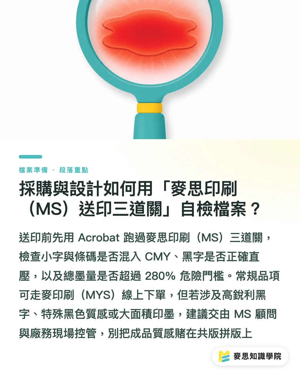
To avoid receiving disastrous finished products, open your PDF file directly in Acrobat before outsourcing and go through our standard verification process:
・Gate 1 - Inspect fine text and barcodes: Open the 'Separations Preview' panel and toggle off the visibility of the black (K) plate. If any ghosting or residual image of the fine text or barcodes remains, it means they contain CMY inks. Send them back for correction immediately
・Gate 2 - Check for overprinting and gapping: Simulating overprint in Acrobat, turn off the black plate. If the area where the K100 black text was turns into a white knocked-out shape, it means overprinting has not been set
・Gate 3 - Check total ink coverage warning zones: Use the 'Total Area Coverage' tool and set the warning threshold to 280%. If large areas of the layout light up with a red warning, you must lower the CMYK values to prevent ink setoff
For standard items, MINDS (MYS) online ordering system is sufficient. However, if you require extremely sharp edges for bold black text, or specify top-tier packaging designed to print with a deep, slightly warm, matte-velvet texture similar to Pantone Black 6C, I highly recommend directly contacting the MINDS (MS) consulting team to handle it as a custom project
Controlling spot colors and managing the drying time for large areas of ink require experienced pressmen monitoring on-site. Don't gamble on gang-run printing
Key Takeaways
・Barcodes and fine text must use C0 M0 Y0 K100 only, avoiding registration issues that lead to color fringing disasters
・Large black backgrounds must use rich black (e.g., C60 M40 Y40 K100) to increase saturation, but the total ink limit must not exceed 300% to avoid setoff
・K100 objects must have 'Black Overprint' enabled to prevent white gaps from showing at the edges during printing misalignment
・Turning off the black plate using Acrobat's Separations Preview before printing is the fastest way to check if files have mistakenly used rich black
Further Thoughts
Today, with the popularity of automated pre-press software, many designers rely on default system conversions. However, printing remains a physical manufacturing industry involving paper pores, ink drying speeds, and mechanical tension
Establishing the correct file setup concepts is not just about pursuing zero color difference between screen and paper; it is also about saving the company tens of thousands of dollars in reprinting costs and wasted packaging materials
When buyers have the capability to analyze file color structures, they can decisively intercept errors during the proofing stage rather than waiting for shipping containers to arrive before arguing over liability with the print shop
FAQ
- Why does my pure black design look like dark grey when printed?
- Because a single layer of 100% black ink printed on paper is semi-transparent, making it look thin and lacking depth once light passes through. Large black areas must have a certain percentage of CMY inks laid beneath K100 (rich black) to achieve a deep, rich appearance
- Can I set all four CMYK values to 100 to get the deepest black?
- Absolutely not. Setting all CMYK values to 100 results in a total ink limit of 400%. The paper cannot absorb this much ink, which will prevent it from drying and cause it to transfer to the back of the preceding sheet (setoff), ruining the entire batch of packaging
- How do I use Acrobat to check if the black settings are correct?
- Open Acrobat's 'Print Production' > 'Output Preview', and uncheck 'Process Black' from the list. If fine text still displays color halos or ghosting on screen, it means they have incorrectly used rich black
- When should I abandon rich black and use a Pantone spot black instead?
- When packaging has strict brand identity requirements or needs a specific texture (such as the slightly warm, matte-velvet deep black of Pantone Black 6C), and the budget allows for custom plates, using spot color inks ensures extremely consistent color every time, eliminating the risk of color shifting from four-color registration
Related articles




The Print × AI weekly
The print and AI know-how designers, brands and enterprises can use before they commit — one email, every week
MINDS Free Tools
Imposition calculator and preflight file check — free prepress tools, right in your browser.
MINDS Group
Need actual printing or gifting services?
From premium printing to online ordering and festive gifts — the MINDS Group sister brands take it from here.