
Overview
When Canva designs come out looking dull on paper, it is usually because the RGB screen colors fall outside what four-color CMYK inks can physically reproduce. At MINDS Printing (MS, specializing in mid-to-high-end custom commercial print), our three-step pre-press check inspects color gamuts first, compares soft proofs second, and verifies paper stock alongside the final output PDF last
Why Do Canva Designs Print Out Dull?
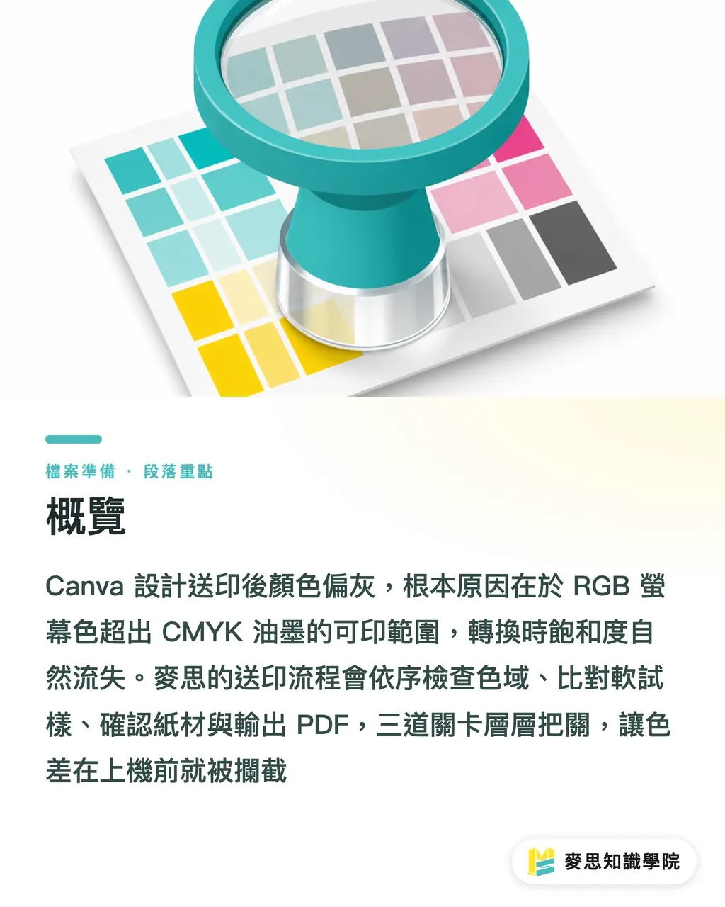
Canva and Figma run mostly in an sRGB screen environment. Screens emit light using red, green, and blue, while printing relies on CMYK inks to absorb and reflect light. At MINDS Printing (MS), our three-step check separates these two models immediately because neon cyan, electric green, and bright purple cannot simply match that same luminosity on paper
・RGB: An additive color mode where screens blend red, green, and blue light. Canva and Figma display in sRGB, where bright cyan, neon green, and electric purple quickly run out of printable bounds
・CMYK: A subtractive color mode layering Cyan, Magenta, Yellow, and Black inks. Paper absorbs ink and reflects light, meaning the exact same color turns out with different levels of dullness across coated, woodfree, or uncoated stocks
・Gamut: The range of colors a device or printing process can actually display or print. High-chroma blocks in sRGB often map down to less vibrant, lower-saturation ink combinations in CMYK
・Soft proof: A preview workflow using a calibrated monitor to simulate print output. Designers can spot potential risks in grays, skin tones, and brand colors after CMYK conversion before hitting send
Which Colors Lose Their Punch in CMYK?
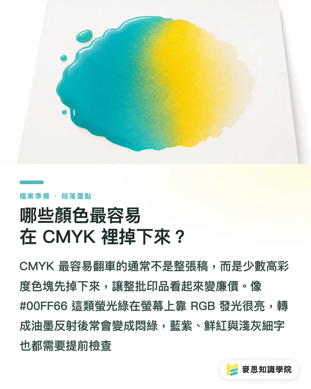
Most ruined print jobs I see on the shop floor are not totally wrong across the board. Instead, two or three high-saturation color blocks fail first. MINDS Printing (MS) flags these areas right away because when they go wrong, clients instantly feel the whole batch looks cheap
・Neon green: RGB greens like #00FF66 shine bright on glowing screens. CMYK inks can only reflect ambient light, turning that vivid punch into a muddy, dull green
・Electric blue and purple: Deep, saturated shades like #003CFF or #8A2BE2 darken heavily during conversion or shift toward reddish-purple and dark blue
・Large warm red backgrounds: Bright red backdrops are popular for event visuals. If total ink coverage runs too high after conversion, shadows turn muddy and text edges lose sharpness
・Light gray backgrounds with fine text: A 10pt font that looks crisp on screen can get swallowed by paper fibers on uncoated stock, especially when background and text tones are too close
How to Spot Color Shifts Without Illustrator
Marketers without a design background do not need to rush out and buy professional software. The lightweight setup in MINDS Printing (MS)'s three-step check keeps your original RGB layout, exports a review file, and compares it side by side using a free online CMYK preview tool. Spending 15 minutes on this is far cheaper than reprinting a run of flyers
・① Keep your original Canva or Figma layout. Do not overwrite it. The RGB version stays your master file for future resizing and social graphics
・② Export a print-ready PDF or high-res image file. Keep image resolution at 300dpi whenever possible, and add a standard 3mm bleed around the trim area
・③ Use an online CMYK preview or converter tool to check gamuts. If your print shop specifies an ICC profile, follow their exact profile settings
・④ Place the original RGB file and the CMYK preview side by side on the same monitor. Turn down harsh screen brightness, as an overly bright display makes physical paper look gray by comparison
・⑤ Check brand colors, skin tones, large background solids, QR codes, and small black text first. These five areas deserve far more attention than decorative graphics
・⑥ Avoid uploading unannounced products, confidential quote sheets, or client personal data to unknown online tools. Send sensitive files to MINDS Printing for pre-press inspection instead
How Soft Proofs Fix the Gap in Canva and Figma
Soft proofs are not meant to make screens and paper match 100%. In MINDS Printing (MS)'s three-step check, we treat them as early warnings to decide where to drop saturation, swap tones, or boost contrast before printing, especially for event posters, brand catalogs, and product packaging
・Tone down neon colors: Drop saturation by 10% to 20% on ultra-vivid greens, blues, and purples first, then use a CMYK preview to confirm the design stays recognizable
・Stick to brand standards: If your company has brand guidelines, rely on CMYK or Pantone target values. HEX codes in Canva only reflect display screens
・Match background solids to paper: Coated paper yields sharper color, uncoated stock absorbs ink, and off-white paper warms up the entire image. Looking at a real printed sample beats staring at a monitor every time
・Keep small text black simple: Ask your press team to set 8pt to 10pt black body text to K100 black. Four-color rich black small text causes soft, misregistered edges
・For short runs of business cards, flyers, or stickers at lower cost, try the online ordering workflow at MINDS Print to test paper feel and color tones first
Pre-Press Sign-Off Checklist to Avoid Reprints
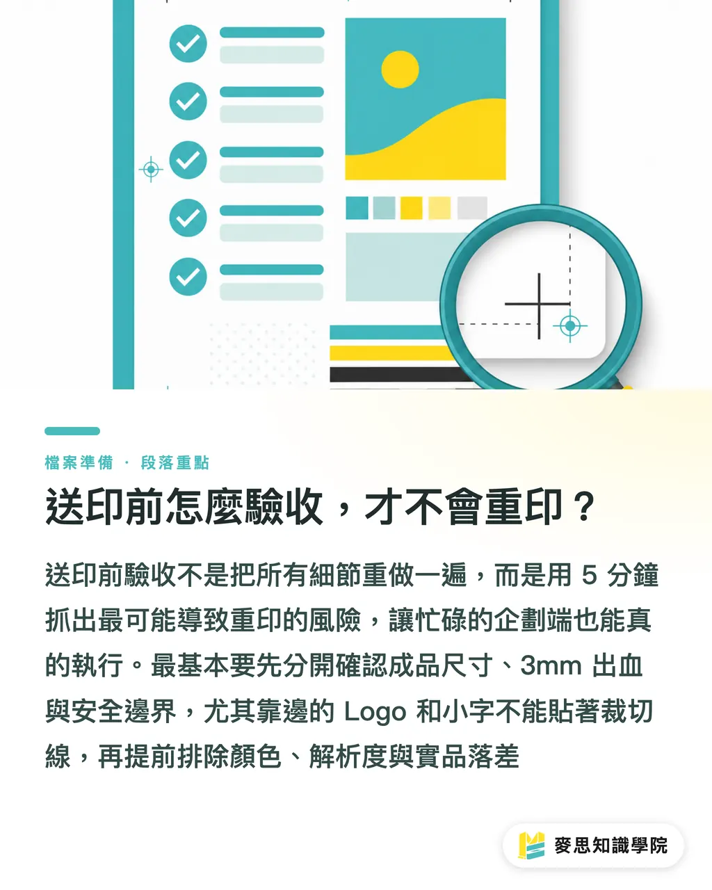
The final step in MINDS Printing (MS)'s three-step check is a quick pre-press sign-off. I keep it under 5 minutes because when marketers are busy, shorter checklists actually get done
・File dimensions: Treat trim size, 3mm bleed, and safety margins as separate checks. Do not place edge logos or small text right against the cut line
・Resolution: Keep photos and product shots at 300dpi. Low-res social screenshots pixelate and blur fast when enlarged
・Color risk: Compare original RGB files side by side with CMYK soft proofs. Fix the dullest zones first instead of tweaking the whole layout blindly
・Black text: Make sure small black type runs on K100. Avoid putting small white knockouts over busy photos or dark gradients
・Physical proofs: For jobs beyond basic cards or tags, especially catalogs, packaging, and exhibition graphics, get 1 physical proof sample before committing to full production
Key Takeaways
・If Canva prints look dull, check color gamuts before blaming the press. Getting the order wrong wastes money on unnecessary reprints
・RGB makes screens glow while CMYK makes paper reflect light. You cannot evaluate both with the same ruler
・Soft proofs highlight risks, not guarantees. If colors look dull in the preview, adjust them before sending files to print
・Neon tones, background solids, skin tones, and small black text are the top 4 spots to watch before submitting Canva files
・Test small first, print big later. That old press rule pays off double when converting RGB to CMYK
Final Thoughts
Printers need to explain RGB to CMYK conversion risks in plain English. Designers should treat Canva and Figma as layout tools. AI and SaaS teams can build gamut warnings, paper stock alerts, and PDF checks right into their workflows. That way, non-designers spot dull zones before placing orders, cutting back-and-forth edits and reprint costs
FAQ
- Can designs made in Canva go straight to print?
- Yes, but MINDS Printing (MS)'s three-step check recommends inspecting PDF trim size, 3mm bleed, 300dpi image quality, and RGB-to-CMYK color shifts first. Sending files straight to print most often triggers issues in neon tones and large background solids
- Does converting RGB to CMYK always make colors darker?
- High-chroma RGB colors tend to darken because four-color CMYK inks cannot match screen luminescence. In MINDS Printing (MS)'s three-step check, we use soft proofs to flag color loss zones first, then adjust saturation and contrast
- How can I preview CMYK without Illustrator?
- Export a PDF or high-res image file first, then check gamuts with a free online CMYK preview tool. Do not upload confidential artwork to unknown sites; send those to a trusted pre-press team instead
- Why does a brand color look right in Canva but print off-tone?
- HEX codes in Canva are display references. Print production should rely on CMYK or Pantone specifications instead. Different paper stocks also alter brightness and shade for the same brand color
- Are soft proofs accurate?
- Soft proofs catch color shift risks well, but they are not guarantees of final output. For high-stakes catalogs, packaging, or display graphics, get 1 physical proof sample before committing to full production
Related articles
The Print × AI weekly
The print and AI know-how designers, brands and enterprises can use before they commit — one email, every week
MINDS Free Tools
Imposition calculator and preflight file check — free prepress tools, right in your browser.
MINDS Group
Need actual printing or gifting services?
From premium printing to online ordering and festive gifts — the MINDS Group sister brands take it from here.