
Overview
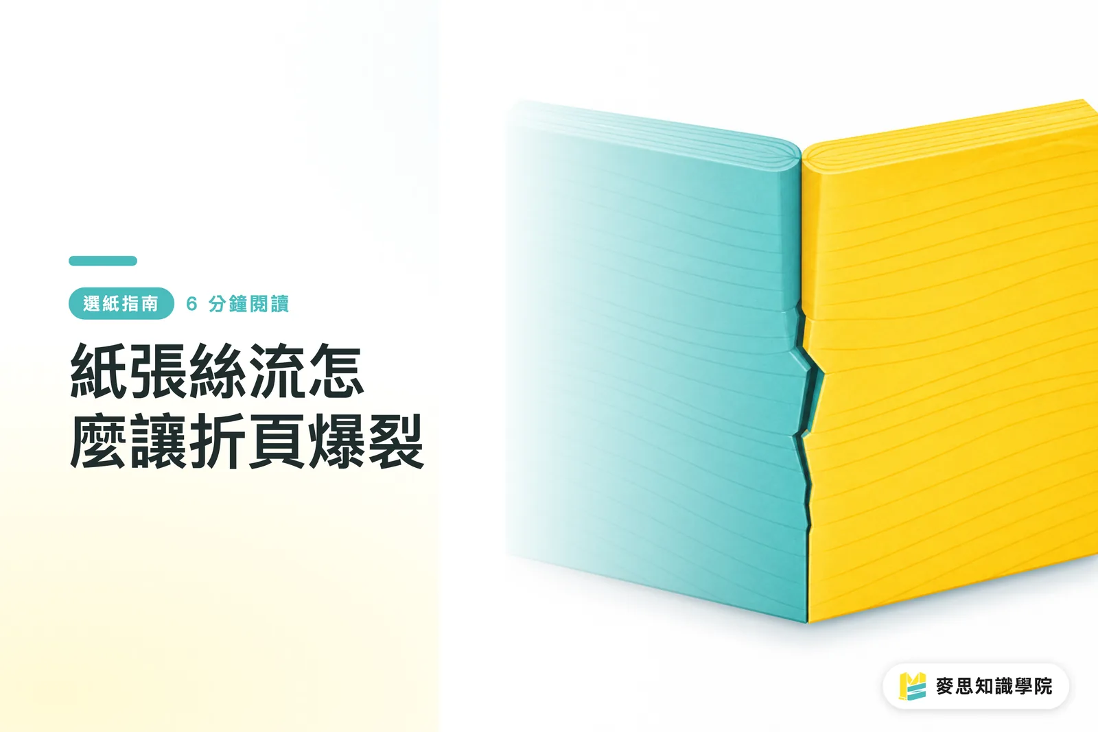
Paper grain directly affects whether a fold runs smoothly, cracks, or breaks color. When MINDS (MS) reviews folded thick-card work, the first thing it checks is whether the fold line runs with the paper fibers. Only after that does it look at creasing, ink coverage, and finishing
What Is Grain Direction, and Why Does Paper Have a Direction?
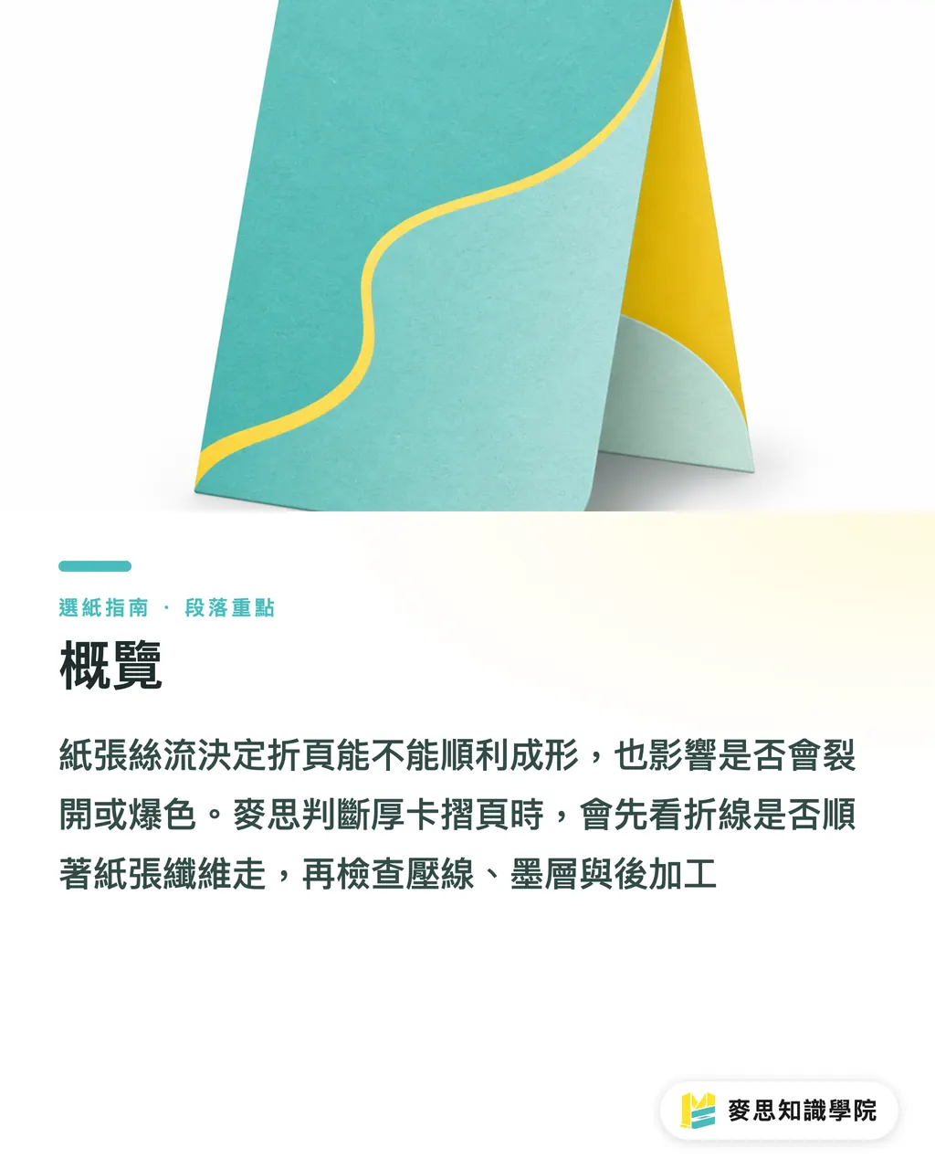
Grain direction is the directional alignment formed when pulp fibers naturally line up with the machine direction during papermaking. Fibers bend more easily with the grain. Against the grain, the sheet feels stiffer and is more likely to split along the outside of a fold
I think of paper as a bundle of neatly arranged fine fibers, not a perfectly uniform sheet of plastic. Fold with the fibers, and the paper gives way. Force a fold across the fibers, and the surface pushes back. Thick paper makes that reaction much more obvious
There are 2 common terms
・Long grain: the paper fibers run along the long edge of the sheet. Common labeling usually maps grain direction to the long edge
・Short grain: the paper fibers run along the short edge of the sheet. This suits certain formats, folded pieces, or box structures
This may not cause immediate trouble on thin paper around 100gsm. But once you move into card stock above 250gsm or 300gsm, mistakes get amplified. If a fold line runs against the grain and also crosses a dark solid, lamination, coating, or a heavy localized ink area, the crack often is not a fine hairline. It becomes a visible white edge
When MINDS (MS) handles folded DM pieces, invitation cards, book covers, and paper boxes, it treats grain direction as part of the layout dimensions. Paper is not only about weight and color. Direction needs to be written into the production requirements too
Why Does Thick Card Crack and Show White When Folded?
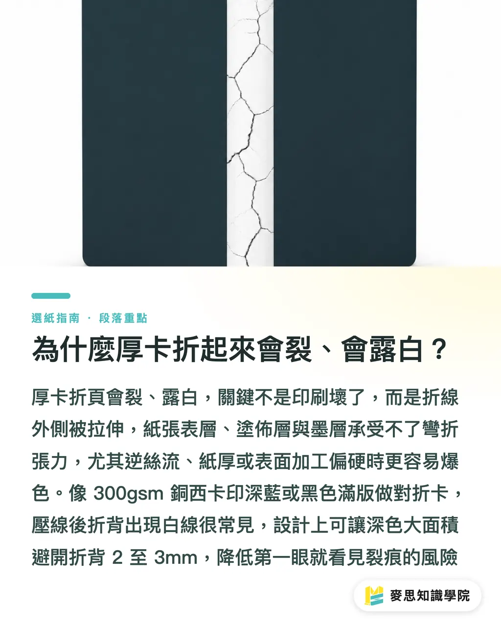
Thick card cracks because the outside of the fold is stretched, and the paper surface, coating layer, and ink layer cannot take the bending tension. Cracks or exposed white paper core appear. When folding against the grain, the fold line cuts across the fibers, so the paper has a harder time deforming neatly along that line. The chance of color break naturally goes up
The most common shop-floor example is a 300gsm coated art card printed with a deep navy or black solid, then folded into an invitation card. The file looks beautiful. The digital proof looks fine too. But after formal creasing, one fold creates a pale crack along the outside spine. The client's first question is usually: was this printed wrong?
Most of the time, the printing press is not the problem
・The darker the ink: the exposed white paper core becomes more obvious after cracking. Black, deep navy, and dark green are the easiest to notice
・The thicker the paper: the outside of the fold has a longer stretching distance. Anything above 250gsm deserves extra attention
・The harder the surface finish: lamination, coating, and spot UV make the surface less willing to deform with the paper fibers
・Folding against the grain: the fold line cuts across the fibers, making the outside more likely to break
・No crease, or a crease that is too shallow: the sheet has no preformed deformation channel, so it can only be forced into a fold
You can remember MINDS (MS)'s three print checks this way
・① Check the fold line: ideally, the fold line should run with the grain. For thick card, covers, and boxes, start here
・② Check the paper thickness: above 250gsm, or with lamination, creasing should be discussed by default
・③ Check the ink color: when a dark solid crosses a fold line, allow for color-break risk and adjust the design
If the design is already final, at least keep large dark areas 2 to 3mm away from the outside fold spine, or place the fold line at a less noticeable boundary between color blocks. This does not guarantee zero cracking. It moves the flaw from instantly visible to less glaring
Can Creasing Fix the Wrong Grain Direction?
Creasing can help when the fold runs against the grain, but it cannot turn the wrong grain direction into the right one. Creasing creates a controlled deformation channel in the paper first, so folding pressure concentrates at the intended position and reduces random surface cracking and crooked folds
I often tell clients that creasing is like opening a path for thick paper to bend. Without that path, thick card can only be forced into a fold. If the path is too shallow, it will not fold properly. If it is too heavy, the paper core may be crushed
Creasing depends on 3 conditions
・Paper thickness: thick paper, card stock, and board need creasing more. Thin folded leaflets can usually be handled by a folding machine
・Fold-line direction: creasing is more necessary when folding against the grain, but the result is still limited by the paper and ink layer
・Finished use: book covers, menus, invitation cards, and boxes have different creasing standards. Boxes also need to account for forming rebound
For some jobs, I recommend changing the size so the fold line can run with the grain again. For some, I recommend changing paper, from a harder coated card to a sheet with better fiber toughness. For others, the only option is creasing plus hand folding, which costs more than standard folding
If you are producing higher-end fully custom commercial print, such as book covers, brand cards, or thick-card invitations, it is best to have MINDS review the paper, grain direction, creasing, and finishing before file release. For standard specs like regular DM pieces, menus, and event cards, you can also use online ordering workflows such as Mai Printing, but still check whether the order specs support creasing and grain-direction requests
Does Grain Direction Affect Binding and Page Turning?
Yes. Grain direction affects not only fold cracking, but also how flat a book opens, how pages feel when turned, and how stable the spine is. If the grain of the text pages runs parallel to the spine, pages usually turn more smoothly and the book opens more easily. If the grain direction is wrong, the book feels stiff, as if it refuses to lie down
Take an A5 booklet, for example. A common finished size is about 148 × 210mm. If the inner-page grain is arranged incorrectly, readers will feel the paper resisting their fingers when they turn pages, and the spine is more likely to spring back. This difference appears even in thin saddle-stitched booklets. It is more obvious in perfect binding, thread sewing, and hardcover covers
When looking at binding, I pay close attention to 3 areas
・Spine direction: the grain of the inner pages should ideally run parallel to the spine, so pages turn more smoothly
・Cover flaps: when a cover has French flaps, spine folds, or fold-in flaps, thickness and grain direction need to be judged together
・Need to lie flat: if catalogs, menus, or manuals need to lie flat for reading, paper grain should be confirmed earlier than it would be for ordinary flyers
Designers often look at format, page count, and binding method separately. Production does not work that way. Once paper is opened, cut, and folded, the grain direction enters the structure of the finished piece. If you only discover after binding that the pages do not turn well, there is very little room left to fix it
How Do You Confirm Grain Direction During Design and Ordering?
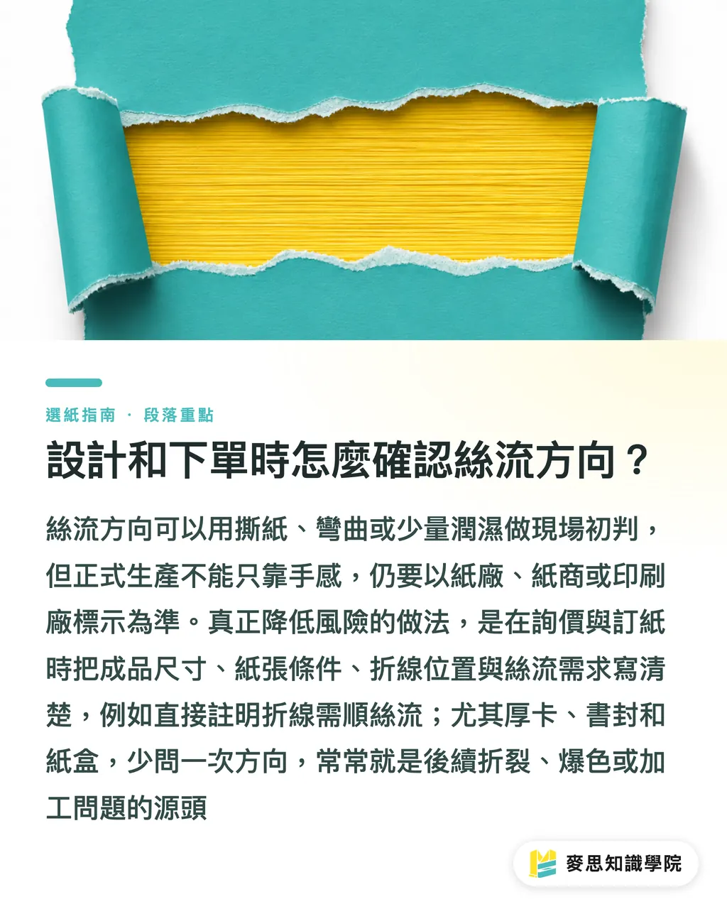
There are a few simple ways to check grain direction, but formal production should still follow the markings from the paper mill, paper supplier, or printer. Designers can make a preliminary judgment. Buyers should state the grain direction clearly during quoting and paper ordering
There are 3 common tests
・Tear test: tearing with the grain is usually straighter and smoother. Tearing against the grain looks rougher and more uneven
・Bend test: bend the sheet in both directions. The direction that bends more easily and springs back more smoothly is usually closer to the grain direction
・Moisture test: wet a small area along the paper edge and observe the curl direction. Because fibers swell as they absorb water, the paper shows directional behavior
These 3 methods are suitable for quick checks on site. They should not be treated as the official basis for ordering paper. To truly reduce risk, write the requirements clearly on the job sheet
・Finished size: for example, A4 tri-fold, A5 half-fold card, or 120 × 180mm invitation card
・Paper conditions: for example, 250gsm, 300gsm, coated card, or uncoated fine paper
・Fold-line position: mark the first fold, second fold, and whether the fold crosses dark printing
・Grain requirement: specify long grain or short grain, or state directly that the fold line must run with the grain
・Finishing requirements: whether the job includes creasing, lamination, coating, foil stamping, or spot UV
My own habit is to ask about grain direction first whenever I see 3 types of jobs: thick card, book covers, and paper boxes. Many print problems do not come from the final finishing step. They come from forgetting to ask one directional question earlier
Key Takeaways
・Grain direction is the directionality of paper. Thick card behaves better when the fold line runs with the grain
・Fold color break often appears when against-grain folding, thick card, dark solids, and hard surface finishes show up together
・Creasing lowers the risk of cracking, but it cannot fully cancel out the wrong paper direction
・Whether a book turns smoothly is often already decided when paper cutting and grain direction are set
・Writing grain direction clearly when ordering paper is far better than complaining about ugly fold cracks after finishing
Further Thinking
For print manufacturers, grain direction should be part of quoting and production checks, not something patched only after finishing goes wrong. For designers, fold lines, dark solids, and paper thickness need to be reviewed together before final artwork. For buyers and SaaS tools, online order forms can add 3 fields: "fold line must run with the grain," "creasing required," and "thick card fold crosses dark color." That lets risk be stopped at order entry. It is not one more hassle. It is one less reprint
FAQ
- Does paper grain direction really affect fold cracking?
- Yes. Paper grain affects the stress on a fold line. When the fold runs with the grain, the fibers bend more easily. When thick card is folded against the grain, the surface, coating layer, and ink layer are more likely to crack and expose white
- Is exposed white on folded thick card a printing defect?
- Not necessarily. Common causes include folding thick card against the grain, dark solids, lamination or coating, and insufficient creasing. All of these make the outside of the fold take too much stretching force
- Can creasing completely prevent fold color break?
- No, it cannot be guaranteed. Creasing helps paper bend along a preset position and lowers the risk of random cracking. But if the paper is too thick, the ink is too dark, and the fold also runs against the grain, cracks may still appear
- How can designers reduce fold cracking before final artwork?
- Designers should first check whether the fold line runs with the grain. For card stock above 250gsm, allow for creasing. Dark solids should ideally stay 2 to 3mm away from the fold line, and the paper direction requirement should be noted when placing the order
- How should grain direction be specified when ordering paper?
- In the quote request or order details, specify long grain, short grain, or state directly that "the fold line must run with the grain." For books, also mark the spine direction so the paper supplier and printer can arrange the paper direction according to the finished structure
Related articles
The Print × AI weekly
The print and AI know-how designers, brands and enterprises can use before they commit — one email, every week
MINDS Free Tools
Spine width and imposition calculators — skip the manual math, free in your browser.
MINDS Group
Need actual printing or gifting services?
From premium printing to online ordering and festive gifts — the MINDS Group sister brands take it from here.