
Overview
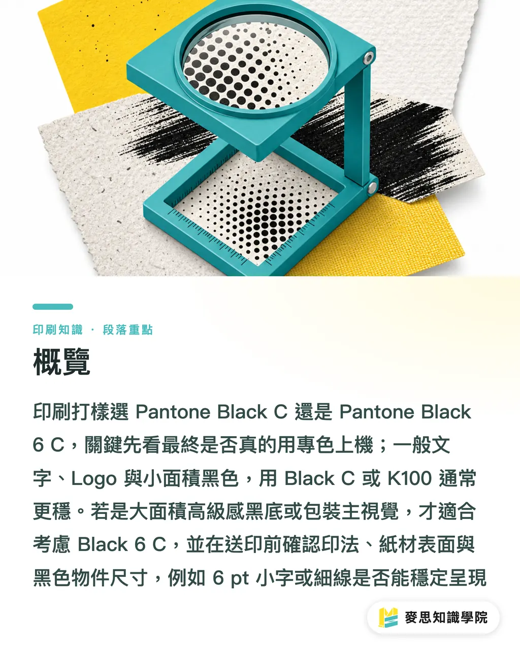
When choosing Pantone Black C or Pantone Black 6 C for print proofing, first check whether the final job will actually run with a spot color. For normal text, logos, and small black areas, Black C or K100 is usually more stable. Black 6 C is worth considering only for large premium-looking black backgrounds, packaging hero visuals, and similar use cases
Before MINDS (MS, mid- to high-end fully custom commercial printing) sends a job to press, its three-step print check starts with 3 things:
・Final print method: spot color, CMYK printing, or digital printing
・Paper surface: Coated, Uncoated, laminated, or specialty paper
・Black element size: 6 pt text, fine lines, logos, or large background areas
What Is the Difference Between Pantone Black C and Black 6 C?
Pantone Black C: a spot black in Pantone Solid Coated. The C stands for Coated, mainly used for color matching on coated paper. It is a physical ink and paper result, not just a CMYK number
Pantone Black 6 C: a deeper, cooler black in the Pantone black series, with a blue-black feel. It is often used for packaging, covers, and premium black backgrounds. It also needs to be judged with a physical swatch
When I judge these two blacks on the print floor, I usually look at 1 thing first: does the client want a black that is stable and controllable, or a black that feels visually heavier?
・Black C: visually closer to a standard spot black, suitable for brand wording, lines, icons, and small black elements
・Black 6 C: visually deeper, often with a slightly cool black or blue-black feel, suitable for black-background packaging, covers, and premium DM pieces
・The 6 in 6 C is the Pantone black series number, and C means Coated. It does not mean 6 color plates, and it does not mean it is printed 6 more times than Black C
The Pantone black series has more than 1 black. Black, Black 2, Black 3, Black 4, Black 5, Black 6, and Black 7 all differ in warmth, density, and how they sit on paper. They may look close on screen, but the differences show up when you place the physical swatches side by side
Which Black Should You Choose for Print Proofing?
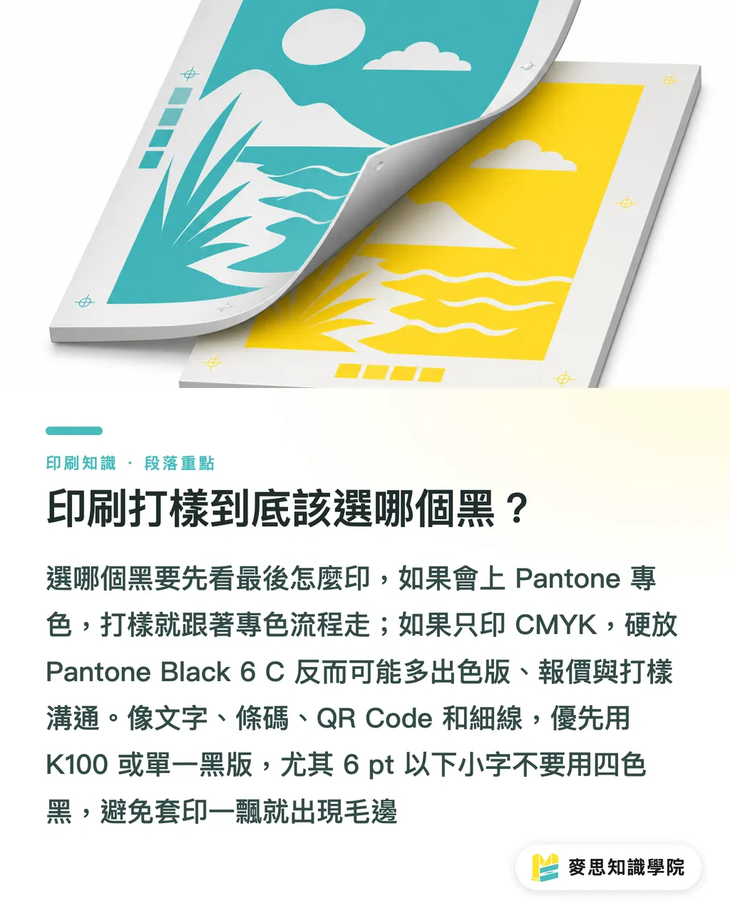
If the final job will truly run with a Pantone spot color, the proof should follow the final print method. If the final job is only CMYK, placing Pantone Black 6 C in the design file may send prepress, estimating, and proofing on an unnecessary detour
This is how I judge it:
・Text, barcodes, QR Code, fine lines: use K100 or a single black plate first. Do not use rich black for small type below 6 pt. If registration shifts even a little, the edges will look fuzzy
・Logo or brand standard color: if the brand guideline says Pantone Black C, follow the swatch and Spot Color setting. Do not convert it to CMYK on your own
・Large black background: for art paper, matte coated paper, or packaging boxes that need a deeper black, consider Pantone Black 6 C or the rich black formula recommended by the printer
・Digital printing only: first ask whether the machine can simulate Pantone consistently. Many digital proofs show a CMYK simulation, not that actual spot ink
・CMYK plus 1 Pantone spot color: output becomes 5 plates. Pricing, plate cost, and press setup will all differ from 4-color printing
I have seen plenty of cases where a designer only wanted the black background to look darker and casually changed the object to Pantone Black 6 C. Once the printer opened the separations, there was an extra Spot plate. That is not an aesthetic issue. It means the production instructions were not clear
Why Do Blacks Look the Same on Screen but So Different in Proofs?
On screen, black is often understood as RGB #000000. In print, black goes through ink film thickness, paper absorption, surface reflection, and drying time. These 4 things can give the same black very different personalities
Coated paper has a more closed surface, so the ink stays more on top and the black looks denser. Uncoated paper fibers absorb ink more noticeably. The same black can look grayer and softer, so Pantone C and U swatches should not be mixed when judging color
The problem with Black 6 C often appears during color conversion. When design software converts Pantone Black 6 C to CMYK, the numbers vary with color settings, ICC profile, and color library version. There is no single CMYK formula that is guaranteed to be correct at every print shop
In common commercial printing in Taiwan, total ink coverage on art paper is often controlled around 300%, then adjusted for different papers, inks, and drying conditions. If Pantone Black 6 C is converted into an overly heavy rich black, setoff, slow drying, and dirty trimmed edges can all show up together
How Should the File Be Set Up to Avoid Printing the Wrong Black?
File setup should first divide black into 4 categories. Text, lines, logos, and backgrounds should not all be handled with the same black
・Text and fine lines: use K100. Avoid stacking C, M, Y, and K on small type
・Brand logo: if the client specifies Pantone Black C or Pantone Black 6 C, set it as a Spot Color and keep the correct color name
・Large black background: first ask the printer for the recommended rich black formula. A common approach is K100 plus some C, M, and Y, but total ink coverage must be controlled
・Spot color printing: before output, use Separations Preview to check the number of plates. CMYK is 4 plates. CMYK plus 1 Pantone is 5 plates
・Strict color matching: judge color with a physical Pantone swatch, the actual paper, and a D50 standard light source. Looking only at a PDF or phone photo can easily lead to the wrong call
If the brand guideline already specifies Pantone Black 6 C, before releasing the file you can ask the Mai Strategy Knowledge Academy consulting team to check the design file, swatch, and proofing form with you. This kind of mistake usually is not because the designer does not understand color. It happens because the job ticket did not explain "the black I want" in a way the production line can act on
When Should You Avoid Black 6 C?
Black 6 C is beautiful, but it is not the default answer for every black object
・Small type below 6 pt, body notes, barcodes: do not convert Black 6 C into rich black. A single K plate is cleaner
・Budget is based on 4-color printing only: do not leave a Pantone Black 6 C Spot plate in the file. The printer will treat it as a 5th color
・Paper is woodfree paper, cotton paper, or rough-textured paper: do not decide from the Coated swatch alone. The actual Uncoated result will turn noticeably grayer
・Schedule is tight and there is a large black background: avoid excessive total ink coverage. If drying time is not enough, the risk of setoff and scratches goes up
・The client only says "I want it a bit blacker": make 2 samples first. Put K100, rich black, or the Pantone spot color side by side. Deciding on-site is more accurate than guessing color remotely
My own habit is simple: small type should be clean, logos should be consistent, black backgrounds should have presence. If you force all three into the same swatch decision, someone later will have to clean up the mess
Key Takeaways
・Black C is stable. Black 6 C is deep. Whether the proof is correct depends on the final press method
・The C in 6 C means Coated. It does not mean 6-color printing, and it is not automatically better than Black C for every black element
・For small type, fine lines, and barcodes, K100 is safer than rich black or converted Black 6 C
・Pantone spot colors should be confirmed with a physical swatch, paper, and plate count. The black shown in a PDF cannot be the final reference
・If the file contains 1 extra Pantone Spot plate, production may shift from 4 colors to 5 colors. Cost and workflow will both change
Further Thinking
When I look at black-related disputes like this, the most common root problem is that the file, swatch, paper, and proofing form are not saying the same thing. The design side can label black elements as 4 categories: text, lines, logos, and backgrounds. The print side can write spot plate count, total ink coverage, and drying risk into the estimate and job ticket. Only then do AI or SaaS systems have clear rules to check against. If you want to build a prepress checklist that does not depend on memory, subscribe to the Mai Strategy Knowledge Academy newsletter and start with 4 fields: black, bleed, resolution, and spot color. That is more grounded than trying to make everything fully automatic in one shot
FAQ
- Can Pantone Black C and Black 6 C be used interchangeably?
- Direct substitution is not recommended. Pantone Black C is closer to a standard spot black, while Pantone Black 6 C looks deeper and cooler. Brand color, black packaging backgrounds, and black text are judged differently
- If the final job is CMYK only, can I use Pantone Black 6 C?
- You can use Pantone Black 6 C as a design reference at first, but before sending the file to print, confirm the CMYK formula and total ink coverage with the printer. Do not leave the Spot Color in the file, or output may create a 5th color
- Is Black 6 C the same as rich black?
- No. Black 6 C is a Pantone spot color name. Rich black is a CMYK-built black made by overprinting process colors. The two differ in plate count, ink, drying, and proofing method
- Is Pantone Black C suitable for small type?
- For spot color printing, Black C can be used for brand wording and lines. For normal 4-color printing, small type below 6 pt is usually more stable in K100, avoiding soft edges caused by CMYK registration
- Can I decide between Black C and Black 6 C by looking only at the screen, without a physical swatch?
- Not recommended. Screen black is often close to RGB #000000, but printed black is affected by paper, ink, and lighting. For strict proofing, you should at least check a physical Pantone swatch and the actual paper
Related articles



The Print × AI weekly
The print and AI know-how designers, brands and enterprises can use before they commit — one email, every week
MINDS Free Tools
Spine width and imposition calculators — skip the manual math, free in your browser.
MINDS Group
Need actual printing or gifting services?
From premium printing to online ordering and festive gifts — the MINDS Group sister brands take it from here.