
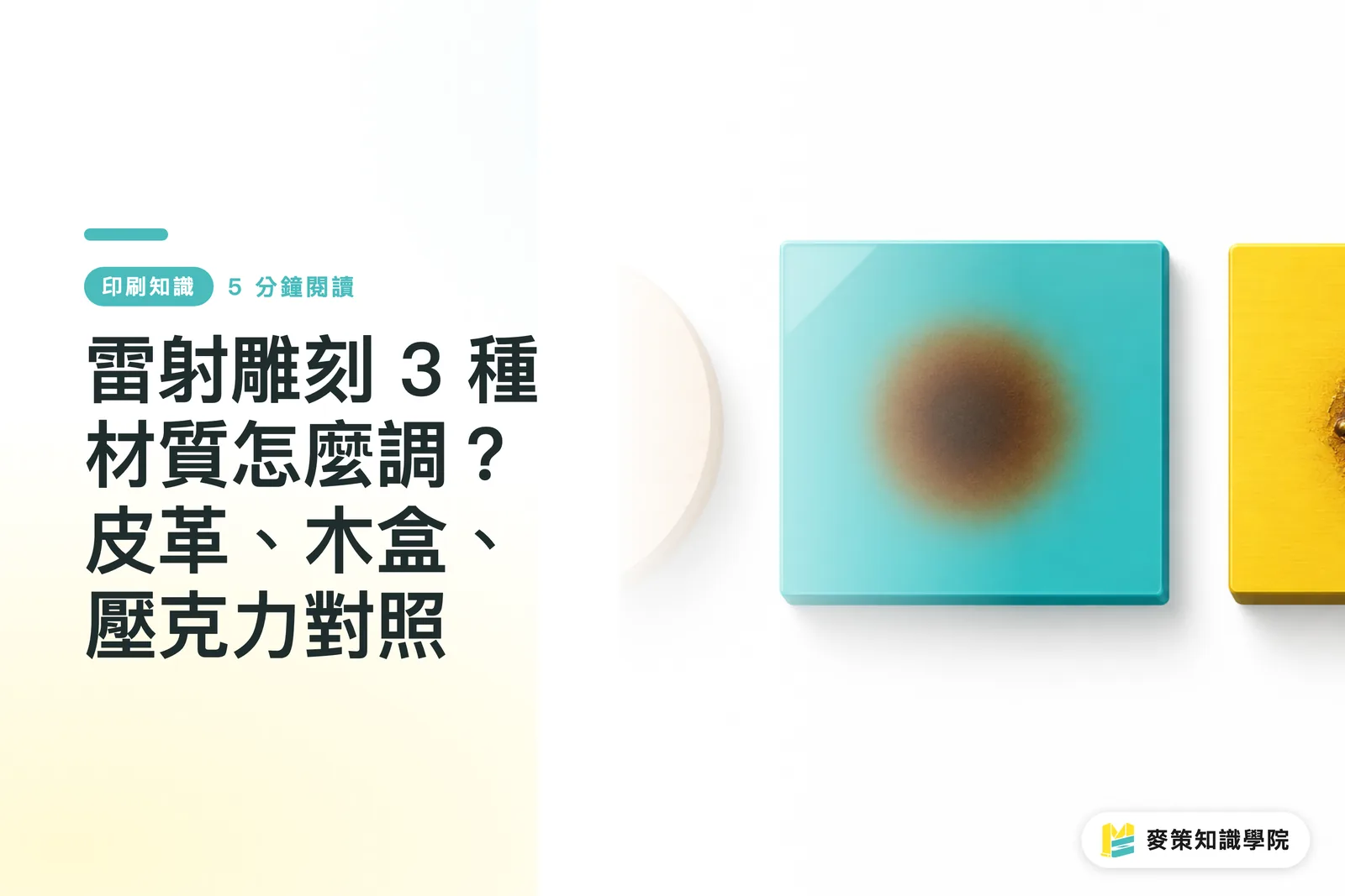
Why can't the same artwork use one set of settings across three materials?
The three materials absorb and conduct laser heat differently, so even the same machine and artwork file can produce different edges and engraving depths. Laser Engraving uses a focused laser to vaporize, carbonize, or melt the material's surface, forming text and graphics
DPI (dots per inch) is a resolution unit for raster images. It describes the density of image detail, but it does not replace the vector outline required for cut. In laser engraving artwork, black and white only indicate the processing areas. They do not define the final darkness or depth, so leather gift boxes, wooden business card boxes, and acrylic plaques all need separate testing
Start with a test grid in a corner of the same material. Keep the focal distance and artwork fixed, then adjust power, speed, DPI, or the number of passes one variable at a time. That is how you preserve conditions that can be reproduced. The rework I see most often is someone copying the same settings straight onto the next material

How do you prevent scorch marks from bleeding through leather?
Start leather with low power, high speed, and multiple passes. Add backing paper behind it so the color and depth build up gradually, reducing the chance of scorch marks penetrating the material. Leather thickness and surface treatments vary, and trying to engrave deeply in one pass often burns the front black while leaving dirty marks on the back
・Settings direction: Start with low power and high speed, then deepen the result through multiple passes. Change only one variable at a time
・Backing paper: Place it between the worktable and the back of the leather, and inspect both sides during proofing
・Detail testing: Test fine lettering and large solid black areas separately. For the lettering, check whether the strokes stay open. For the solid areas, check whether the heat collects into scorch spots
A leather gift box may look perfect on the front while the back is covered in burn marks. That is one of the hardest problems to fix in production. Include the backing paper in the settings validation instead of treating it as just padding
Should you look at the wood species first, or the grain direction?
Both. Grain direction affects edge sharpness, while wood density affects the amount of heat required. Walnut and pine cannot share the same starting settings. If a logo crosses visible grain on a box lid, fine lines can show different depths where hard and soft fibers meet
・Walnut: Its higher density calls for conservative settings at first. Test the depth and darkness, then gradually increase the number of passes or lower the speed
・Pine: Its looser fibers and more visible grain variation require careful heat control. Watch for charred edges, resin-related color shifts, and whether fine lettering stays open and legible
・Grain direction: Leave test areas for both with-grain and cross-grain engraving. The same letter can have different edges depending on its orientation
For wood-box proofing, use a lid from the same production batch whenever possible. A flat wood panel only shows the general direction. If the box face has seams, grooves, or curves, confirm first that the focal distance can stay consistent
Should acrylic use engrave or cut? How do you judge clear versus frosted surfaces?
With acrylic, first separate the purpose into engrave and cut. Engrave marks the surface with graphics or text, while cut follows a vector outline and cuts through the material. For clear and frosted acrylic, judge the result by the contrast in light transmission after processing. When both modes are mixed on one layer, the production team can easily mistake a cut line for an engraving line
・Engrave: Check filled areas, fine lines, and text. For clear pieces, first see whether the engraved area creates a frosted-white look or a clear difference in light transmission
・Cut: Provide a separate vector outline, label the cut lines and processing order, and usually engrave before cutting so the parts do not shift after being separated
・Clear acrylic: Focus on the difference in light transmission between the engraved and untouched areas. Do not judge it from the black-and-white appearance on screen alone
・Frosted acrylic: The surface already scatters light, so acceptance should focus on graphic and text contrast, fine-lettering completeness, and edge charring
If an acrylic plaque needs both lettering and an outer shape cut, separating the layers in the file matters far more than simply sending over the artwork. Otherwise, the production team has to guess the intended process all over again
What files should designers provide for laser engraving, and how should the finished piece be accepted?
At minimum, provide editable vector line art, a raster image with its DPI specified, finished dimensions, material, processing order, and clearly labeled engrave and cut layers. With small- and medium-run premium packaging, if every revision requires a fresh round of guessing, the design, procurement, and production sides will quickly form their own interpretations
For custom packaging projects at MINDS (MS), I use the "Mai Strategy Three-Gate Handoff" to organize the handoff
・① File gate: The vector line art, source file, and output preview must match. Label the engrave and cut layers separately, and add notes for fine lettering and large graphic areas
・② Proofing gate: Test with the same material and surface treatment used for production. Record the machine, power, speed, DPI, number of passes, and photos of the result
・③ Acceptance gate: Check edge charring, fine-lettering completeness, engraving-depth tolerance, and processing position. Turn leather over to inspect the back, check depth variation along the grain on wood boxes, and compare the light-transmission contrast of clear and frosted acrylic
For high-end fully customized commercial printing, when laser engraving, box construction, and printing all need to be scheduled together, send this brief before proofing at MINDS. That way, everyone is working from the same conditions when revisions come in
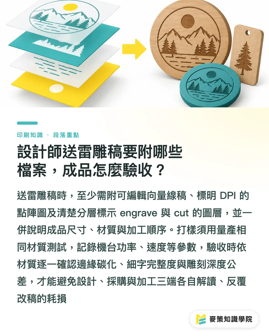
Key takeaways
・Test each material separately. The same artwork file does not mean the same settings
・For leather, combine low power, high speed, and multiple passes with backing paper and front-and-back inspection
・For wooden boxes, separate walnut from pine first, then check grain direction and focal distance across the box face
・For acrylic, separate engrave from cut, then verify clear and frosted pieces through the finished contrast
・State the vector requirements, DPI, processing order, and depth tolerance clearly so revisions can move cleanly into production
Further thoughts
I would turn the conditions for a laser-engraving project into a reusable brief instead of leaving the settings in one technician's memory. The design team should record the material, surface, engrave/cut setup, DPI, power, speed, number of passes, and test photos. The printing and manufacturing side should keep the approved sample and the criteria used to judge depth. AI or SaaS can check for missing fields, compare versions, and organize proofing photos, but it cannot replace testing the actual material from the same batch. For the next project, start with a three-material test sheet. Production will involve far less back-and-forth. If you need help sorting out the design, packaging, and processing conditions, contact the Mai Strategy Knowledge Academy consulting team
Further reading
・MINDS official website
FAQ
- Why should leather be engraved with low power, high speed, and multiple passes?
- Using low power, high speed, and multiple passes on leather builds up color and depth gradually, reducing front-side scorching and marks bleeding through the back from a single intense pass
- Can walnut and pine share the same laser-engraving settings?
- It is not recommended. Walnut and pine have different densities and fiber structures, so each should be tested separately for depth, darkness, edge charring, and fine-lettering performance
- Should acrylic use engrave or cut?
- Use engrave for surface graphics and text, and cut with a vector outline to cut through the material. If one acrylic piece needs both, separate the layers and label the processing order
- What should designers provide when submitting laser-engraving artwork?
- At minimum, provide editable vector line art, a raster image with its DPI specified, dimensions, material, separate engrave and cut layers, and the processing order. Include an output preview for checking
- How should a laser-engraved piece be accepted?
- Check edge charring, fine-lettering completeness, engraving-depth tolerance, and processing position. Inspect the back of leather, depth variation along the grain of wooden boxes, and the clear or frosted contrast of acrylic
Related articles

The Print × AI weekly
The print and AI know-how designers, brands and enterprises can use before they commit — one email, every week
MINDS Free Tools
Spine width and imposition calculators — skip the manual math, free in your browser.
MINDS Group
Need actual printing or gifting services?
From premium printing to online ordering and festive gifts — the MINDS Group sister brands take it from here.