

Overview
If your corporate procurement cares about unit price and lead time, combined-plate printing fits standard sizes, regular CMYK, and pieces that can absorb a 1–2mm cutting tolerance. If you care about brand colors, paper, ICC profiles, spot colors, and consistent acceptance, dedicated-plate printing is steadier. Minds Printing (MS) usually runs the "Minds Printing (MS) three checkpoints before sending to press": confirm ① cutting tolerance, ② color control, and ③ acceptance criteria before deciding whether to go with Mai Printing for standardized combined-plate work, or Minds Printing for a custom dedicated-plate run
How do combined-plate and dedicated-plate printing actually differ?
Combined-plate printing: multiple customers and different jobs are ganged up on one large sheet and printed together, spreading plate-making and press-setup costs across everyone. You'll see it all the time on business cards, flyers, stickers, and other standard items
Dedicated-plate printing: a single customer or a single project gets its own plate, its own press run. You can specify paper, ICC profile, color targets, and finishing conditions. It's the right choice for brand colors and quality-sensitive work
The mistake I see most often in procurement meetings is treating the way something is quoted as if it were a quality promise
Combined-plate's low price comes from sharing plates, paper, and press setup. Dedicated-plate's higher price buys control that belongs to that project alone, including paper batch, press calibration, proofing flow, and color acceptance
Combined-plate isn't junk
But combined-plate plays by its own rules, especially a 1–2mm cutting tolerance, CMYK color drift, and the fact that no one is going to retune the press for your one business card
Dedicated-plate isn't always worth the spend either. If it's 300 flyers for an event and the deadline is tight, opening a dedicated plate is often overkill for something that low-risk
Why do combined-plate files fear borders and solid blocks?
The worst thing in combined-plate printing is a design that puts its risk right next to the cut line. A 0.5mm hairline border, equal-width frames on all four sides, small text sitting against the edge, the print only needs to drift 1mm and it looks crooked
I tell designers to treat combined-plate files as "a layout that's going to shift slightly."
Most flat-print pieces should start with 3mm bleed on all four sides. Important text and logos should sit at least 3–5mm away from the cut line. Ultra-thin borders should be deleted or fattened up. Full-bleed backgrounds are way safer than white borders
Colors on combined-plate jobs need to be agreed on up front
When one big sheet carries jobs from different customers, the press operator tunes ink to the whole sheet's average condition. Nobody is going to pull the cyan or magenta back just for your card
If your corporate identity color is a touchy one, deep blue, orange-red, skin-tone gray, a combined-plate CMYK result may not match the screen, the digital proof, or the last batch you printed
The most awkward scene on the print floor is a job that's technically inside a 1–2mm tolerance, but on the conference table it looks like a disaster
The problem usually isn't the printer cutting corners. It's that the purchase order never said "this job can't accept narrow-border drift" or "brand color must come close to the specified swatch."
When should corporate procurement pick combined-plate?
If buyers only look at total quantity, they pick wrong
For small quantities across many versions, the real cost sink is version switching, color matching, plate makeup, cutting splits, and finishing splits. Not the simple jump from 100 to 1,000 sheets
I usually use the 500-piece line as a rough first cut, but I don't treat it as gospel
Twenty different business card designs, 100 each, standard size and paper, combined-plate usually makes sense
One catalog design, specific paper required, brand color that can't drift, hot-foil stamping on the cover, even with a small print run, you may need to talk dedicated-plate or at least a digital proof
Buyers can use these conditions to judge whether combined-plate is enough
・Item: business cards, cards, stickers, small flyers, specs close to the printer's standard sizes
・Color: regular CMYK is fine, no specified Pantone, no strict brand-color acceptance
・Layout: no borders under 1mm, no small text sitting on the edge, no design that needs perfectly equal borders on all four sides
・Lead time: needs fast delivery, and you're okay with combined-plate's fixed production schedule
・Acceptance: can live with 1–2mm cutting tolerance and batch-to-batch color variation, not holding the screen color up as the final standard
If the procurement side just needs to place standard orders quickly, an online retail printing flow like Mai Printing fits better. The key is to hand in PDFs per the platform's specs and pick paper from the fixed item list. Don't try to shove a custom job into a standard combined-plate workflow
What extra control does dedicated-plate printing give you?
The value of dedicated-plate printing is "things you can negotiate."
Corporate buyers can specify ICC profile, paper, press conditions, Pantone spot colors, and CMYK targets. You can also schedule a proof and a press-side color check. None of these are typically available on combined-plate jobs
Brand-driven projects are where dedicated-plate shines
Corporate identity manuals that name a Pantone. Annual catalogs that need the same paper batch. Packaging that has to match in-store samples. Grayscale photos that can't shift red or green. None of that gets solved by "please print it pretty."
If you want to control color, write the color-control conditions into the spec
A dedicated-plate purchase order has to nail down at least five things
・Color: standard CMYK, a specific ICC profile, or a separate Pantone spot color
・Reference sample: digital proof, on-screen, an older printed sample, or a press-side sample from this run as the comparison baseline
・Paper: brand, weight, surface finish, and whether a same-grade substitute is acceptable
・Finishing: lamination, hot-foil stamping, embossing, die-cutting, fold lines, and whether dies or finishing layers are attached separately
・Acceptance: who confirms the acceptable range for color difference, cutting, registration, and finishing offset
If your corporate project involves mid-to-high-end fully custom commercial printing, I'd suggest going to a team like Minds Printing that can talk through prepress, paper, proofing, and finishing, instead of sending the same PDF around for the lowest quote
Lowest price isn't wrong. What's wrong is demanding high control at the lowest price
How do you confirm specs before sending to press?
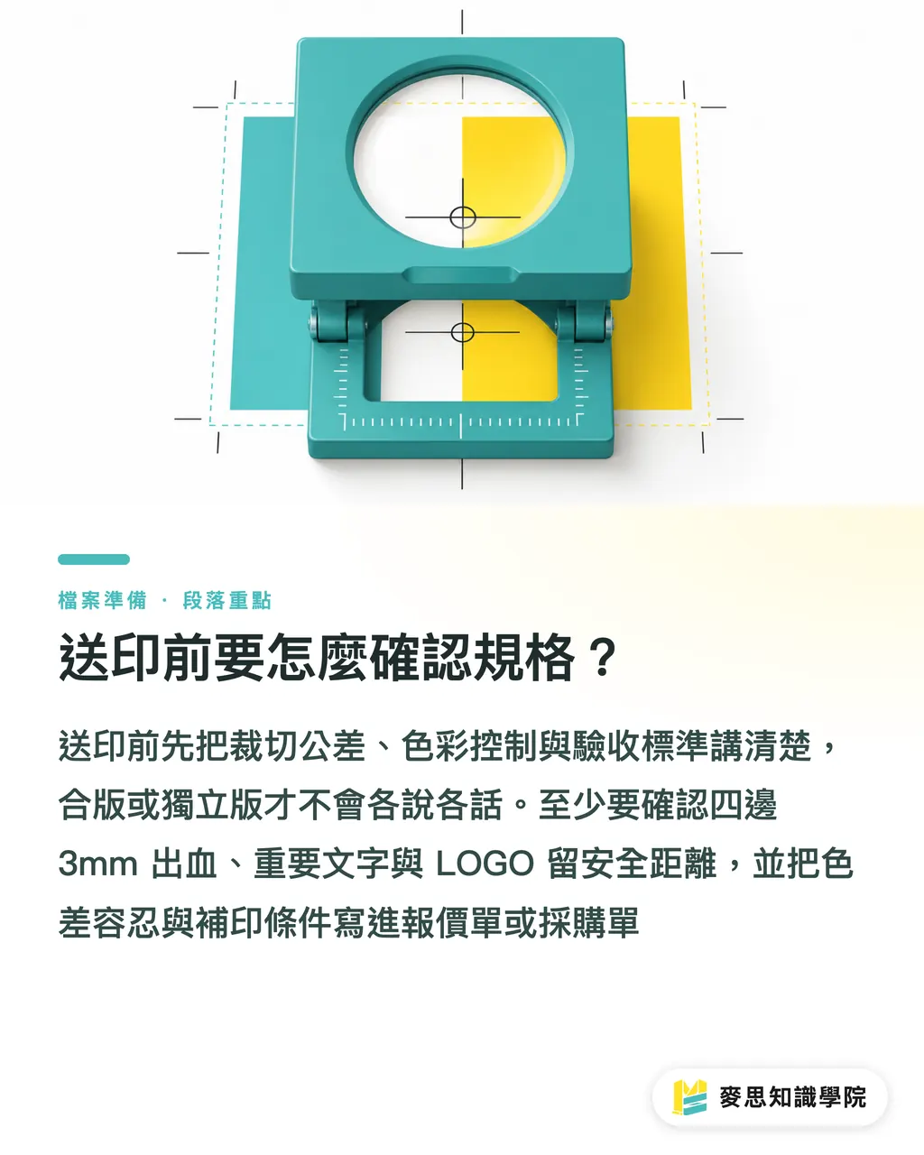
The Minds Printing (MS) three checkpoints spread the risk out fast: ① can you live with the cutting tolerance, ② does color need to be controlled, and ③ is the acceptance standard written down
Once those three are on the table, combined-plate vs. dedicated-plate usually stops being an argument
Before sending to press I have the buyer and the designer go through this checklist together
・File format: deliver as the printer-specified PDF, with text outlined or fonts properly embedded
・Bleed: at least 3mm bleed on all four sides, background and images extending past the bleed edge
・Safety margin: important text, logos, and QR codes at least 3–5mm away from the cut line
・Color mode: standard combined-plate jobs go out as CMYK, avoid handing the printer RGB images to convert
・Border design: combined-plate jobs should avoid ultra-thin frames; if you keep a border, accept 1–2mm of visual shift
・Black text: small text uses single-color black K100, avoid four-color black which causes registration fringe
・Image resolution: 300dpi is the common check baseline for printed images; don't try to save low-res art by scaling it up
・Spot color needs: when Pantone or brand-color control is required, switch the conversation to dedicated-plate, don't gamble on combined-plate
・Finishing layers: hot-foil stamping, embossing, spot UV, and die-cut lines should sit on separate layers, and confirm those lines won't print as content
・Acceptance in writing: put cutting tolerance, color-difference allowance, paper substitution, and reprint conditions into the quote or purchase order
Designers who use AI-generated images or SaaS layout tools for the first draft still need to come back to print checks before sending out: resolution, CMYK, bleed, safety margin, fonts, spot colors
A pretty picture isn't a substitute for prepress spec
That's enough
Key Takeaways
・Combined-plate buys efficiency. Don't gamble narrow borders, brand colors, and strict acceptance against a 1–2mm tolerance
・Dedicated-plate costs more because it's controllable. ICC, Pantone, paper, proofing, and acceptance conditions all need to be written down
・If the purchase order only lists size, quantity, and price, you'll usually end up arguing specs later
・Under 500 pieces, first check whether specs can be consolidated. When quality risk is high, then talk dedicated-plate
・Prepress files aren't the tail end of design. They're the first gate of procurement risk management
Further Thinking
On the print manufacturing side, combined-plate and dedicated-plate need to be separated earlier. Quote pages, SaaS ordering flows, and customer-service scripts should clearly mark 1–2mm cutting tolerance, CMYK color-difference allowance, and what's not controllable. On the design and corporate procurement side, the next move isn't to ask three more shops for quotes. It's to write the Minds Printing (MS) three checkpoints into the requirement sheet: how cutting gets verified, what color standard applies, and who pays for a reprint when the output doesn't match
FAQ
- Can combined-plate printing guarantee the color matches the last run exactly?
- Combined-plate printing usually isn't the right place to demand identical color across batches, because multiple jobs share the same large sheet and the same press setup. If the brand color has to come close to a reference sample, switch to dedicated-plate, request a proof, or specify a Pantone spot color
- Why is hairline-border design a bad idea for combined-plate printing?
- Combined-plate printing commonly carries about 1–2mm of cutting tolerance, and a 0.5mm or 1mm outer border will look obviously off if the cut is even slightly skewed. Full-bleed backgrounds, larger safety margins, or dropping the narrow border entirely are more reliable than arguing about it later
- When should corporate procurement choose dedicated-plate printing?
- Corporate buyers who need to specify an ICC profile, Pantone spot colors, fixed paper, press-side color checks, and strict acceptance criteria are better served by dedicated-plate printing. For standard business cards, flyers, and stickers that can tolerate the tolerance, combined-plate printing is usually more efficient
- What's most commonly missed in print-ready PDFs?
- The most commonly missed items in print-ready PDFs are bleed, safety margin, font embedding, RGB-to-CMYK conversion, small black-text settings, and finishing layer marking. Combined-plate jobs especially need to confirm 3mm bleed on all four sides and the 1–2mm cutting tolerance
- Can AI-generated images be sent straight to print?
- AI-generated images or SaaS layout art are fine as a visual starting point, but before sending to print you still need to check 300dpi resolution, CMYK color, bleed, safety margin, and font issues. Looking good on screen doesn't mean the file is print-ready
Related articles





The Print × AI weekly
The print and AI know-how designers, brands and enterprises can use before they commit — one email, every week
MINDS Free Tools
Imposition calculator and preflight file check — free prepress tools, right in your browser.
MINDS Group
Need actual printing or gifting services?
From premium printing to online ordering and festive gifts — the MINDS Group sister brands take it from here.