

Overview
A design that looks flawless on screen comes back from the printer as a blurry mess, and that's the complaint I've dealt with most in over a decade in this industry
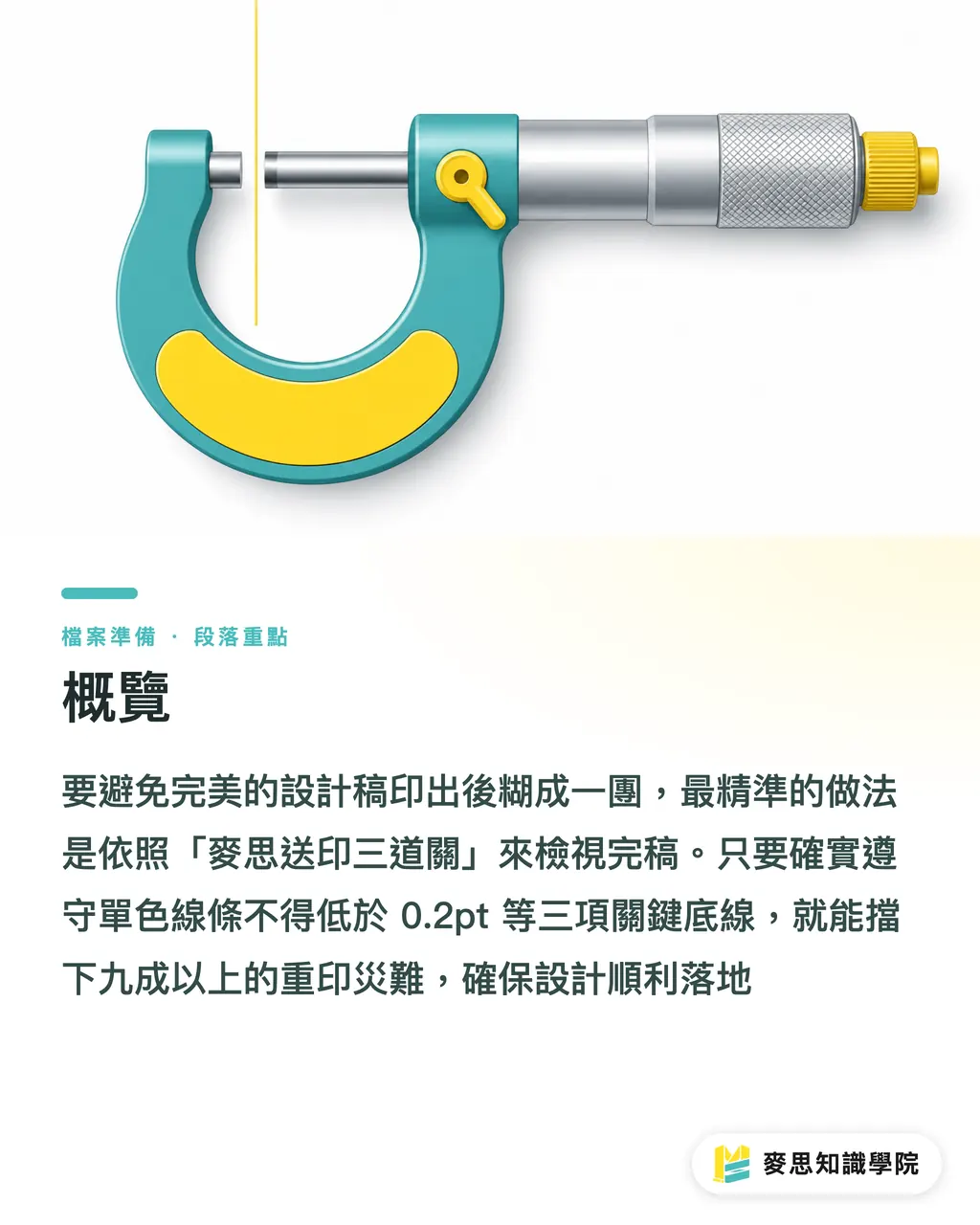
The most reliable way to avoid that disaster is to run your finished file through the 'MINDS (MS, mid-to-high-end full-custom commercial printing) Three-Point Pre-Press Check': single-color lines no thinner than 0.2pt, reversed text in bold sans-serif only and no smaller than 8pt, and small text in multi-color overprint switched to single-color black
Hold those three lines and you'll head off more than ninety percent of reprints, giving your design a clean landing
Why Does It Look Crisp on Screen but Come Out a Muddy Blob?
On a lit screen, each pixel emits its own color independently, so text stays sharp no matter how small you shrink it
Printing is a physical process. Ink always spreads a little when it hits paper. The industry calls it dot gain
Shrink dense contract text down to 4pt and put it on a dark gray background built from four CMYK layers, and a misalignment of just one-thousandth of a millimeter across those four color dots will leave red, blue, and yellow fringe around every letterform
In the consulting cases at Mai Strategy Knowledge Academy, up to seventy percent of fine-text complaints trace back to designers ignoring the physical limits of ink spread and registration
This brings in a term everyone in the industry needs to know: misregistration
It refers to the physical misalignment that happens on a multi-color press as it lays down cyan, magenta, yellow, and black in separate passes. Paper stretch and mechanical vibration prevent the dot layers from lining up perfectly
On ultra-fine lines and small text, that misalignment shows up as colored fringe along the edges, or fine details getting eaten entirely
MINDS (MS) Three-Point Pre-Press Check: Where's the Safety Line for Ultra-Fine Lines and Small Text?
When I check a file, I carry a mental ruler
To save designers and print buyers the cost of reprints, I've turned that ruler into a concrete checklist. Run through it before you send anything to press
・① Line weight check: whether you're on a private run or a gang run, single-color lines should never go thinner than 0.2pt (approximately 0.07mm)
・② Reversed-text size check: white text on a dark background gets squeezed by the ink spreading around it. Keep it at 8pt minimum, and stroke weight needs to be at least 0.5pt to avoid breaks
・③ Overprint color check: for body copy or fine lines below 8pt, always switch to K100 single-color black. Never set them as CMYK four-color black
These numbers aren't gut feel. They're the safety margins built up by press operators adjusting ink and pulling proofs every single day
Take food packaging back panels with ingredient lists, set that 6pt text in four-color black without thinking, and the whole batch of labels gets scrapped
Why Dark Backgrounds Are a Death Trap for Serif and Thin Gothic Fonts
Reversed text, as we call it, means setting the type to the paper's base color on a dark or solid-fill background. The letterforms are formed by the absence of ink, not by printing it
When the surrounding area is flooded with ink, any text that's too small or too thin will have the spreading ink creep into the white strokes
A lot of designers chase that premium look by placing ultra-thin serif fonts on a deep navy background
On the press floor, it's a disaster
Serif fonts have very thin horizontal strokes, plus entry and exit serifs at the terminals. The moment heavy ink presses in from all sides during reversed printing, those elegant horizontals vanish, leaving only the ghost of the vertical strokes
Take my word on this: if you must do reversed text on a dark background, switch to a medium or bold sans-serif with consistent stroke weight throughout
If you're sending through a gang-run platform like MYS that prioritizes efficiency, the machine splits its attention across dozens of jobs at once and leaves less room for error. Sticking to the 8pt minimum for reversed text is non-negotiable there
How Much Does Tolerance Differ Between Digital, Private-Run, and Gang-Run for Fine Details?
The same fine-text file handed to different print processes can come out completely differently
You need to adjust the limits in your artwork based on what service you're actually buying
・Private run: dedicated plates and an operator focused entirely on your ink balance. K100 single-color text can push down to nearly 4pt and still hold, making it the right choice for high-end work where quality is everything
・Digital printing: toner or liquid toner for color, so there's no traditional misregistration issue. Fine lines and small text come out sharpest here, though solid flat areas may not match the consistency of offset
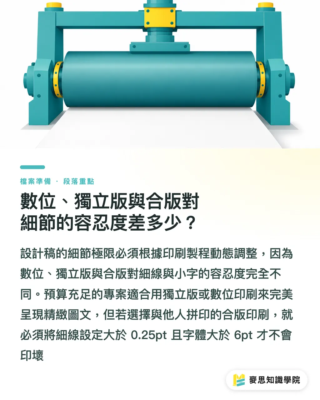
・Gang run: your job goes on press alongside dozens of other clients' files, so the operator can only set an average ink level. Misregistration risk is highest here. Fine lines need to be above 0.25pt and small text above 6pt to be safe
From my experience with clients, many brands choose gang run to cut costs when they're first doing packaging, then insist on ultra-thin reversed serif fonts anyway. They always end up eating the loss
If your project has the budget and the detail demands it, go straight to a mid-to-high-end custom shop like MINDS (MS) for a private run, with a dedicated print specialist watching your registration. That's the investment that actually pays off
Key Takeaways
Single-color lines: hold to 0.2pt minimum, reversed fine lines need to be at least 0.5pt to avoid breaks
Any body copy or captions below 8pt: always K100 single-color black. Stay away from CMYK four-color black
For reversed text on a dark background, drop the serif and thin sans-serif. Use a medium or bold sans-serif with even stroke weight
Further Thought
There are plenty of layout tools now that can spin up a polished page in no time, but none of them understand paper's pores or the physics of ink spread
Whether you're a designer or a SaaS product manager, building a warning system for 0.2pt and 8pt single-color black into the tool itself would catch ninety percent of print problems before the file ever leaves the studio
Before you send your next job to press, don't just sit there admiring the screen. Zoom to 600% and check your CMYK values and line weights. Your output will hold up better than the competition by a wide margin
FAQ
- The fine lines in my file are visible on screen. Why do they print broken and intermittent?
- A screen can render a vector preview thinner than a single pixel, but a press has physical limits. If a single-color line drops below 0.2pt, ink can't adhere consistently to the paper and the line breaks
- How small can the font be for ingredient lists on the back of packaging?
- In single-color black, you can push down to 5pt–6pt at the absolute limit. But if it's reversed text or overprinted on a colored background, keep it at 8pt or above and use a sans-serif, that's what keeps the characters legible and unbroken
- What's the difference between four-color black and single-color black when printing small text?
- Four-color black is built from four CMYK layers stacked on top of each other. Any slight vibration on the press creates color fringe around the edges. Single-color black (K100) is just one ink layer, the sharpest and safest option for small text
Related articles



The Print × AI weekly
The print and AI know-how designers, brands and enterprises can use before they commit — one email, every week
MINDS Free Tools
Imposition calculator and preflight file check — free prepress tools, right in your browser.
MINDS Group
Need actual printing or gifting services?
From premium printing to online ordering and festive gifts — the MINDS Group sister brands take it from here.