
Overview
After so many years in the industry, I've seen countless common misunderstandings between designers and printers. They are rarely about the creativity itself, but rather about the subtle settings in design software that no one warns you about. This is especially true in Typography. The pixel world on your screen and the physical world of printing ink operate by completely different rules. Understanding font size, leading, and various limit values is fundamental for a professional designer
Body Font Size and Leading—What Makes Text Readable?
A basic starting point: For body text intended for reading, I recommend a font size between 8pt and 11pt. This is the most balanced range I've seen in practice. Anything less than 8pt is strenuous for many readers, while anything over 11pt looks bulky and wastes layout space
But font size alone isn't enough. What truly determines reading comfort is Leading, the vertical distance between the baselines of text lines. If the leading is too tight, the lines of text will feel jammed together, visually claustrophobic. If it's too loose, the text paragraph loses cohesion, and the eye doesn't know where to rest
An industry-standard rule of thumb is to set the leading to approximately:
・1.2 to
・1.5 times the font size. For example:
・If your body text size is 10pt, setting the leading between 12pt and 15pt will usually provide the most comfortable reading experience
Finally, once the primary dimensions are set, fine-tuning the Kerning/Tracking is the key to going from "usable" to "refined." Especially in headings or logo design, taking a moment to handle the gaps between specific letter pairs (like A and V), or subtly adjusting the tightness of the lines, will raise the overall quality to another level
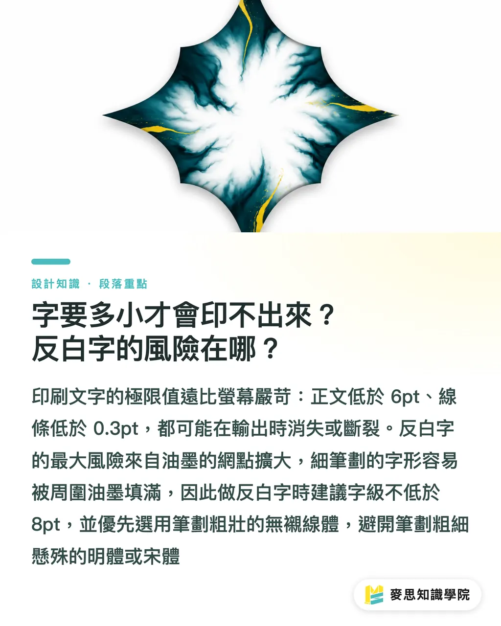
How Small Can Text Go Before It Won't Print? The Risks of Knockout Text
"How small can this be printed?" is one of the most common questions we get. There is no single answer; it depends on the printing method, paper stock, and the font itself. However, in my experience, any text below 6pt is like walking a tightrope—clarity can hardly be guaranteed
Another major pitfall is "Hairlines." Many design software settings for "hairlines" may only be:
・0.25pt or lower. On a printing press, any line below
・0.3pt is extremely dangerous. It is very likely to break or simply disappear during output, especially on uncoated paper with a coarser texture
Next, let's talk about Knockout Text. It isn't printed with white ink, but "cut out" from a color block to reveal the paper white underneath. The risk lies in the slight spreading of ink during printing (known as Dot Gain). If your knockout text is too small or the strokes are too thin (especially certain fine lines in Serif fonts), surrounding ink can easily bleed inward, filling in the holes in the letters, resulting in a blurry mess in the final product
A safe recommendation:
・When doing knockout text, try to keep the font size 8pt or larger
・Prioritize bold Gothic or Sans-serif fonts
・Avoid Serif fonts with high stroke contrast
How to Select Fonts and Prepare Files to Avoid Issues
When choosing a font, aside from aesthetics, you must keep two things in mind: application context and licensing
Generally speaking, Serif fonts (such as Ming or Song types) have extra decorations at the ends of strokes that guide the eye, making them considered more readable for long-form printed text. Sans-serif fonts (like Gothic types) look clean and modern, making them very suitable for headings, short copy, or digital screen display
More importantly, never use fonts directly from your computer system (like MingLiU or DFKai-sb) for commercial design. The licenses for these fonts are usually for personal, non-commercial use only. Once used on flyers, packaging, or any product with commercial activity, you might face heavy copyright infringement claims. Investing in legitimate commercial font licenses is a necessary cost for a professional
Finally, before sending files for print, you face a choice: Should fonts be "converted to outlines" or "embedded"?
・Create Outlines: This is the safest approach. It converts all text into non-editable vector graphics, ensuring that when opened on any computer, the font won't shift or display errors because the other party doesn't have the font
・Embed Fonts: This wraps the font file into the PDF. The advantage is that the text remains editable or copyable, but the downside is that occasional licensing restrictions or software version issues can cause embedding to fail or display abnormally
My advice is straightforward: Unless there's a specific requirement, always convert text to outlines before saving the final file for the printer. This can save countless hours of subsequent communication and risks of errors

Key Takeaways
・Body text basics: Font size recommended between 8-11pt, paired with:
・1.2 to
・1.5 times the font size for leading—this is the golden ratio for reading comfort
・Printing safety lines: Font should not be smaller than 6pt; line thickness should not be below 0.3pt to prevent blurring or disappearing in the final product
・Knockout text risks: Small or thin knockout text can easily become blurry due to ink spreading; prefer bold or sans-serif fonts and increase font size
・Font licensing: Do not use system-built-in fonts for commercial projects. Always purchase or use fonts with commercial licenses to avoid infringement
・Safest file prep: Converting all text to outlines for files delivered to the printer is the most reliable way to avoid font shifts or missing characters
Extended Reflections
For designers and printers, these rules aren't meant to restrict creativity, but to build a bridge so that digital creations on screen can transition smoothly into the physical world. Understanding and abiding by these constraints based on physical limits can significantly reduce the expensive costs of back-and-forth communication and reprinting. This is not just technical skill—it's the embodiment of professionalism
For teams working on AI applications and SaaS development, there lies a huge opportunity here. As AI becomes more adept at generating visuals, the pitfall of "looks good on screen but can't be printed" will only increase. An AI might generate a beautiful poster with 5pt fine-line knockout text, but that cannot be achieved in reality. The real value lies in building these "knowledge rulebases" from the printing side into software services—providing real-time preflight checks, automated correction suggestions, or even avoiding these dead ends while AI generates. This can upgrade a design tool into a truly professional, reliable productivity platform, which is exactly the direction MINDS is working toward: using intelligent services to bridge the gap between design and manufacturing
FAQ
- Why do fine lines I see clearly on screen disappear when printed?
- Printing presses have physical limits and usually cannot stably reproduce lines below 0.3pt. This leads to broken or completely disappeared lines, which is entirely different from the light-emitting pixel principle of screens
- Can I directly use system fonts like "DFKai-sb" for my company's business cards or flyers?
- Absolutely not recommended. Most fonts built into operating systems (like DFKai-sb or MingLiU) are licensed for personal, non-commercial use only. If used in commercial printed materials like business cards or flyers, there is a risk of infringement, and you should purchase fonts with commercial licenses separately
- Can I still correct typos after converting text to "Outlines"?
- No. Once text is converted to "Create Outlines," it changes from editable text attributes to vector graphics and cannot be modified. Therefore, this should be the final step after confirming all copy is finalized, and it's recommended to save a separate file to keep the editable original
- Is a Serif font always more readable than a Sans-serif font?
- Not necessarily. It depends on the application. In long-form printed matter, Serif fonts are considered better for guiding the eye and reducing reading fatigue. However, on digital screens, or for headings and posters that need to grab attention quickly, concise Sans-serif fonts usually perform better