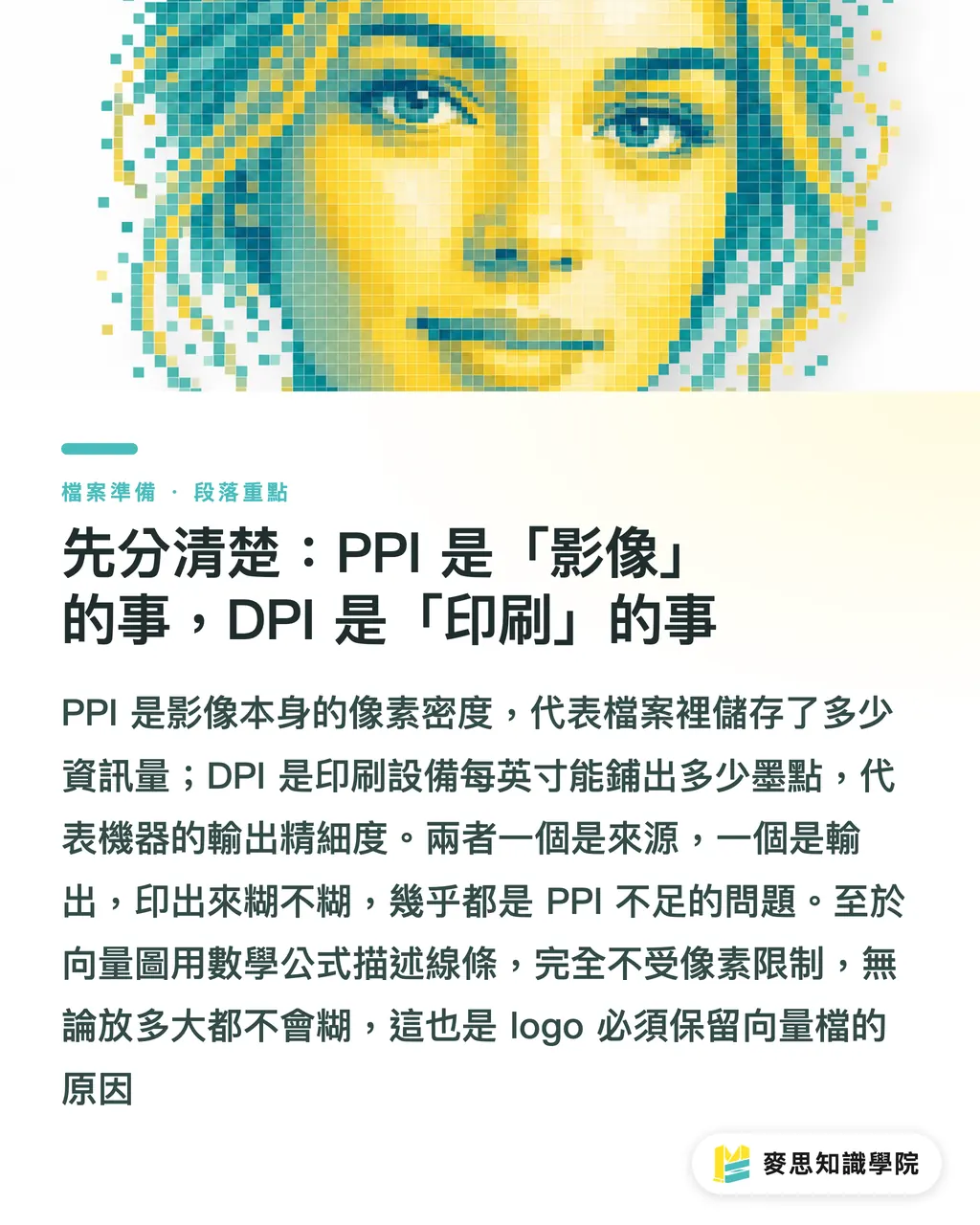
First, Let's Get This Straight: PPI Is About the Image; DPI Is About the Printer
The two terms look alike and are often used interchangeably — but they describe completely different ends of the production process
・PPI (Pixels Per Inch, pixel density): How many pixels are packed into each inch of a digital image. It is an intrinsic property of raster files (photos, JPG, PNG) and describes the amount of information the image contains
・DPI (Dots Per Inch, dot density): How many ink dots a printing device lays down per inch. It describes the output device's ability to reproduce detail
The key distinction: PPI is how much material your file contains; DPI is how finely the machine can lay that material down. One is the source; the other is the output. When a designer says 'my image needs to be 300 dpi,' what they really mean is 'my image needs 300 ppi — so when the press outputs at 300 dpi, there's enough source material to work with.' Industry shorthand blends the two, and that's fine in conversation — but you should understand the underlying truth: blurry prints are almost always a PPI problem (insufficient source data), not a DPI problem
Vector artwork (AI files, vector logos, text) operates outside these rules entirely. It uses mathematical formulas to describe lines and curves with no concept of 'pixels,' so it stays sharp at any size. This is exactly why logos and wordmarks always need to be supplied as vector files
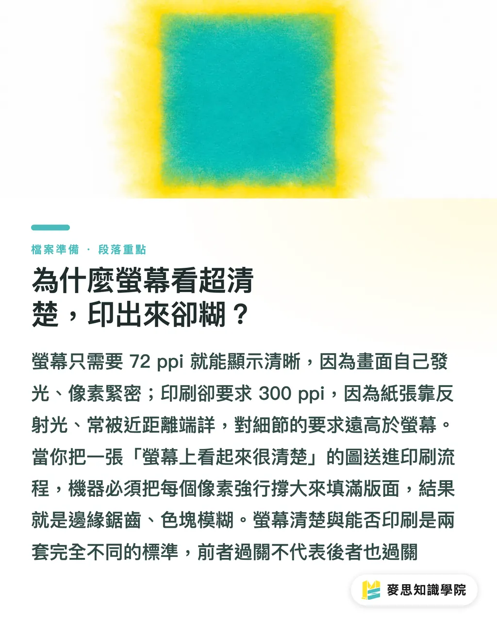
Why Does It Look Crystal Clear on Screen but Come Out Blurry When Printed?
This is the central pain point of the whole topic — and the answer lies in the resolution gap between viewing media
・The screen standard is 72–96 ppi (modern high-resolution displays go higher, but design software defaults to 72 as its baseline). Screens emit their own light, pixels sit tightly together, and you view them from a distance — so 72 ppi is more than enough to look sharp and beautiful
・Print requires image data at the 300 ppi level. Paper doesn't emit light; it reflects it. People hold printed pieces close and examine them carefully — so the tolerance for visible detail is several times higher than on a screen
Here's where the problem lives: an image pulled from the web looks perfectly sharp on screen, but it only carries enough pixel data for 72 ppi. When you feed it into a printing process that needs 300 ppi, you're asking the press to cover the same area with only a quarter of the required material — so it stretches every pixel to fill the gap. The result: jagged edges, muddy color blocks, and fuzzy text
One sentence to remember: 'Looks good on screen' is measured by the screen standard; 'ready to print' is measured by the print standard. They are completely different rulers — passing one does not mean passing the other
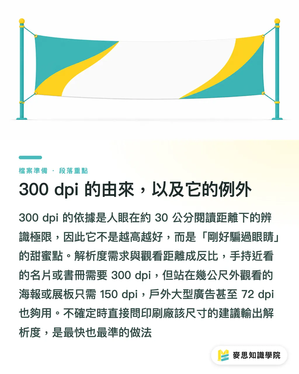
Where 300 dpi Comes From — and When You Can Go Lower
Many people treat '300 dpi' as an inviolable law. Understanding where it comes from tells you exactly when you can bend it
・300 dpi is grounded in human vision: at a typical reading distance (around 30 cm), normal eyesight can distinguish roughly 300 dots per inch. Beyond that density, the eye can't resolve any additional detail; below it, things start to look 'not quite sharp.' So 300 dpi is the sweet spot that just fools the eye — higher isn't automatically better
・The real variable is viewing distance: resolution requirements scale inversely with viewing distance. The farther away you stand, the less detail your eye can resolve, and the lower the density you need
This leads to important exceptions — large-format output can drop to 100–150 dpi or even lower:
・Business cards, flyers, booklets, packaging — pieces held close and examined → stick to 300 dpi
・Posters, foam board displays, freestanding signs (viewed from roughly 1–3 meters) → 150 dpi is usually sufficient
・Large banners, vehicle wraps, outdoor signage (viewed from 5+ meters) → 100 dpi or even 72 dpi is acceptable
The logic is simple: you don't press your face against a three-story billboard to look for jagged edges. Work backward from viewing distance to determine resolution — it saves file size and spares you from trying to stretch a small image to fit a large canvas. When in doubt, ask your printer what output resolution they recommend for that size. It's the fastest and most reliable answer
Pre-Submission Self-Check: One Division Problem Does It All
You don't need any specialized tools. One simple calculation tells you whether an image is large enough to print — before you ever submit the file
Core formula: Maximum printable size (inches) = pixel count ÷ target dpi
Examples (at 300 dpi):
・A photo at 3000 × 2000 pixels → 3000 ÷ 300 = 10 inches; 2000 ÷ 300 ≈ 6.7 inches → maximum printable size is roughly 25 × 17 cm (close to A4). Go larger and it will start to blur
・A typical web image at 800 × 600 pixels → 800 ÷ 300 ≈ 2.7 inches → maximum printable size is only about 6.7 × 5 cm — slightly bigger than a business card. Sending it to print at A4 size will definitely come out blurry
Steps:
1. Check the pixel dimensions: In Photoshop, go to Image > Image Size; or check the file's 'Width × Height in pixels' in your OS file browser or preview app
2. Decide on the target dpi for your use case: 300 for hand-held pieces, 150 for posters, 100 for large-format
3. Apply the formula: pixels ÷ dpi = maximum printable inches. Multiply by 2.54 to convert to centimeters
4. Compare to your layout size: if the calculated size is smaller than your design canvas, this image cannot be used. Ask for the original high-resolution file, reshoot, or redraw it. Scaling it up will only make it worse
Two final reminders about the most common fatal mistakes:
・Using a web image (72 ppi) directly for print: just because you can see it on screen does not mean it will print — this is the number-one cause of blurry prints
・'Enlarging' a raster image as a fix: scaling up a raster image only stretches existing pixels; it cannot invent new detail. It will look even worse. Only vector artwork can be scaled freely. Always keep logos, text, and icons as vector files
Key Takeaways
・PPI is 'how much material the image contains'; DPI is 'how finely the machine lays it down.' Blurry prints are nine times out of ten a PPI problem — insufficient source data, not a DPI issue
・Screens use a 72 ppi standard; print uses a 300 ppi standard. Looking sharp on screen never guarantees a clean print
・300 dpi isn't superstition — it's the sweet spot that just fools the human eye at a 30 cm reading distance
・The farther the viewing distance, the lower the required resolution: 150 dpi for posters, 100 dpi for large-format outdoor — don't force 300 dpi where it isn't needed
・Before submitting, run the division: pixels ÷ dpi = maximum printable inches. You can't rescue a raster image by enlarging it — always keep logos as vector files
Further Thoughts
For design and procurement teams, adding the 'pixels ÷ dpi' check to your file submission checklist can catch roughly 80% of blurry-print incidents before the job goes to press — saving the time and cost of reprints. Teams integrating AI-generated imagery into their workflows need to be especially careful: many AI images default to around 1024 px and are tagged at 72 ppi. They may look stunning on screen but don't contain enough data to print cleanly. After generating, always verify the pixel count and, for print applications, either upscale by re-generating at a higher resolution or vectorize the output — otherwise the press run will be blurry. Looking further ahead, building an asset management system that flags the maximum printable size at the point an asset is ingested is far more reliable than manually checking every file at submission time. If you're unsure what resolution, paper stock, or production method a particular job requires, the simplest approach is to ask your printer directly. MINDS Printing's integrated one-stop service handles exactly this kind of resolution and file specification review at the pre-press stage — ensuring that what you see on screen is what comes off the press
Further Reading
・[What's the Difference Between DPI and PPI? What Resolution Do Print Files Really Need?](#)
FAQ
- Why does an image that looks sharp on screen come out blurry when printed?
- Because screens use a 72 ppi standard while printing requires 300 ppi. Looking sharp on screen doesn't mean the image has enough pixel data for print — forcing it through the press stretches each pixel, causing blur
- Do print files always need to be 300 dpi?
- 300 dpi is the sweet spot for a 30 cm reading distance (business cards, booklets, and similar hand-held pieces). Posters work fine at 150 dpi, and large-format outdoor signage at 100 dpi. Resolution requirements scale inversely with viewing distance
- Can I use an image downloaded from the internet directly for printing?
- No. Web images are typically only 72 ppi — not enough pixel data for print. Looks sharp on screen ≠ ready to print. Using them directly will result in blurry output. You need the original high-resolution file or a new photograph
- How can I tell on my own how large an image can be printed?
- Use the formula: pixel count ÷ target dpi = maximum printable size in inches. For example, a 3000 × 2000 pixel image at 300 dpi can print no larger than A4 — go bigger and it will blur
- Can I enlarge an image to compensate for low pixel count?
- Not for raster images — enlarging only stretches existing pixels without creating new detail, making the result even worse. For logos and text, always keep vector files on hand; vector artwork scales to any size without loss of quality