

Why do ultra-thin reversed-out letters on dark backgrounds always print as a blur?
The main reason tiny reversed-out type becomes blurred is dot gain caused by offset press pressure and the capillary action of paper. Ink from the surrounding dark background creeps inward and fills the letter counters and strokes. Experienced prepress teams often use the "MINDS (MS, mid- to high-end fully custom commercial printing) three prepress checkpoints" to prevent errors: ① check type weight and reversed-out line-width limits ② match LPI to the paper stock ③ load the correct ICC profile for color and dot-gain compensation
Before rushing into production, we need to understand the physics behind it first
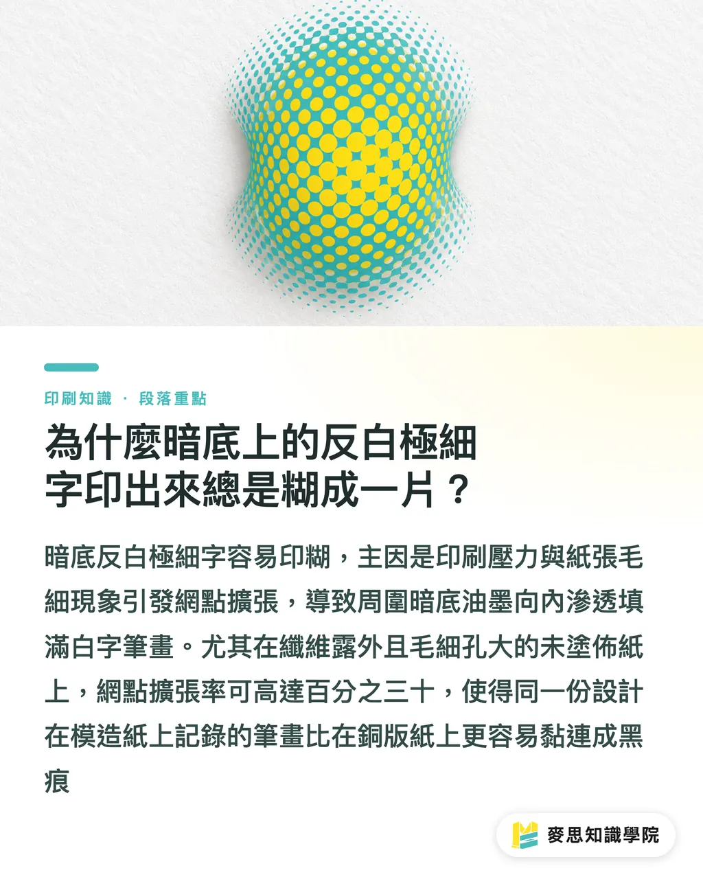
Dot Gain refers to the physical effect in offset printing where ink spreads under press pressure and paper absorption, making the printed dot area larger than the original artwork. When you place a high-density dark background above 80% in a design file, the metal plate and blanket on press apply pressure as they roll, so ink inevitably squeezes outward and spreads. If extremely fine reversed-out type or a dense barcode sits on top of that background, the ink-free white strokes get forced full of overflow ink, and the final print ends up as one dark, muddy mark
Different papers accept ink in very different ways
・Coated paper, such as art paper: the surface has a coating layer that limits ink absorption, so dot gain is usually controlled between 10% and 15%
・Uncoated paper, such as woodfree paper or newsprint: paper fibers are exposed and the pores are larger, so ink absorbs quickly, and dot gain often reaches 25% to 30%
That is why the same file can print with clear type on coated business-card stock, yet turn into stuck-together lettering on an uncoated catalog
Is a higher LPI always better? The physical limits of type weight and paper stock
LPI is the number of halftone screen lines per inch. A higher value can produce a finer printed image, but it also reduces tolerance for ink absorption and press pressure
It is simple. Many designers think that the higher the file resolution and LPI setting, the finer the printed text will be. That is a common misconception. When you use high LPI on a highly absorbent paper, the physical distance between halftone dots becomes very small. A little pressure from impression can make the ink dots touch and merge, which only speeds up the filling of reversed-out letter shapes
In practice, the best pairings are as follows
・Coated paper stock: 175 LPI to 200 LPI is recommended, which can show fine textures and very thin strokes well
・Uncoated paper stock: reduce to 133 LPI or 150 LPI to leave enough physical space for ink spread
・Minimum line width for very fine reversed-out lines: keep line width at least 0.5 pt, about 0.18 mm. Single-color fine lines should not be below 0.25 pt
・Point size and weight for reversed-out type: use at least 6 pt, and choose medium-heavy weights such as Medium or Bold first. Avoid ultra-thin stroke fonts such as Ultra Light or Fine
How can Photoshop and Illustrator help prevent ink spread during final artwork preparation?
On a computer, the artwork we see is perfect vector geometry. But before the file reaches production, if no dot-gain compensation is applied and the dark background is set to something like C80 M80 Y80 K100, with total ink as high as 320%, the stacked ink will spread and overflow badly after printing
Correct prepress software setup includes these steps
・Load the ICC profile for the target paper: in Illustrator and Photoshop, uncoated paper should be switched to Japan Color 2001 Uncoated or FOGRA29. The software will automatically compensate shadow gradation based on dot-gain presets of 20% to 30%
・Control total area coverage, TAC: keep total ink for dark backgrounds within 260% to 300% to avoid excessive four-color black buildup
・Set trapping and a single-color edge stroke: for reversed-out type on a dark four-color overprint background, add a 0.15 pt to 0.2 pt protective stroke around the letter edges to prevent white edges or squeezed-in strokes when color plates shift slightly
For complex fully custom commercial printing or difficult packaging structures, you can consult MINDS directly for strict prepress file review and physical dot-gain calibration
From prepress file to printing press: a standard workflow for avoiding final-artwork mistakes
To minimize the gap between artwork and final print, checks during final artwork preparation must become a repeatable standard process. Follow the steps below one by one, and you can stop more than 90% of complaints caused by physical dot expansion before the file goes to press
Four standard production checks
・Step 1: check stroke width. Single-color black fine lines should not be below 0.25 pt, and reversed-out lines or reversed-out letter strokes should not be below 0.5 pt
・Step 2: set LPI according to paper characteristics. Use 175 LPI for smooth coated paper, and force rough uncoated paper down to 133 LPI
・Step 3: check the dark-background color mix. Change extra-heavy four-color black to two-color black, or reduce the C M Y ratios outside the K plate, keeping total ink no higher than 280%
・Step 4: export a standard PDF/X-1a or PDF/X-4 file, and confirm that the file embeds the dot-gain compensation color profile for the corresponding paper stock
For fast online ordering, small-run retail printing, or standardized sticker and business-card production, you can use the Mai Printing online system for instant error-prevention prompts and a convenient purchasing flow
Key Takeaways
Blurring in tiny reversed-out type comes from dot gain caused by press pressure and capillary action, not from whether the design looks good
Dot gain on uncoated paper can reach 25% to 30%, so LPI must be actively lowered during final artwork preparation to leave room for ink spread
Reversed-out fine lines should never be below 0.5 pt. Type should be at least 6 pt and set in a medium-heavy weight to prevent ink from filling the letter shapes
During final artwork preparation, dark-background TAC should be kept below 280%, with dot-gain compensation applied in advance through an ICC profile
Further Thought
From what we have seen on production lines and with clients over the past few years, the gap between graphic designers and print manufacturers often is not about visual taste. It is about understanding the traits of physical media. As AI-assisted final artwork preparation and digital printing become more common, future prepress workflows will get smarter at automatically loading paper-specific dot-gain parameters and 0.2 pt trapping protection as files are generated. But no matter how the technology evolves, understanding the physical limits where ink meets paper fiber will always be an irreplaceable core skill for every designer and print professional
Further Reading
FAQ
- Why do tiny reversed-out letters that look clear on screen print with the strokes stuck together?
- Because in offset printing, ink spreads outward under mechanical impression pressure and the capillary action of paper. This dot gain lets the surrounding dark-background ink seep into the ink-free strokes of reversed-out type. If the strokes are below 0.5 pt, they are very likely to be filled by the spreading ink
- How should LPI be set when preparing final artwork for uncoated paper, such as woodfree paper?
- Because uncoated paper has looser fibers and absorbs ink aggressively, dot gain often reaches 25% to 30%. During final artwork preparation and publishing, it is recommended to lower the screen ruling to 133 LPI or 150 LPI, preventing high-density halftone dots from being squeezed together during impression
- Will a four-color black background, such as C90 M80 Y80 K100, make reversed-out type look better when printed?
- No. This setting has total ink as high as 350%, making the ink too thick to dry in time and causing severe ink spread and letter filling. It is recommended to keep dark-background TAC within 260% to 280%
- How can Illustrator help prevent dot gain in reversed-out type beforehand?
- First switch the document color profile to the ICC file for the corresponding paper stock, such as Japan Color 2001 Uncoated. Keep reversed-out fine lines above 0.5 pt, and set a 0.15 pt to 0.2 pt trapping stroke around reversed-out type on four-color dark backgrounds for protection
Related articles




The Print × AI weekly
The print and AI know-how designers, brands and enterprises can use before they commit — one email, every week
MINDS Free Tools
Imposition calculator and preflight file check — free prepress tools, right in your browser.
MINDS Group
Need actual printing or gifting services?
From premium printing to online ordering and festive gifts — the MINDS Group sister brands take it from here.