

Overview
If your die-cuts keep shifting out of alignment, first check whether your dieline, bleed, and safety margins are separated into clear layers. Then use the three-step prepress checklist from MINDS (MS): ① place the dieline on its own separate layer, ② ensure sufficient inner and outer bleed, and ③ pull all text and key artwork back into the safety zone. For complex custom shapes, never leave alignment to chance on the final cut
Die-cutting uses a custom cutting die to press-cut paper, stickers, or packaging materials into specified shapes. It is widely used for table tents, custom postcards, hang tags, stickers, and boxes. Precision depends on prepress artwork, printing, mounting, paper stock, and machine calibration working together
A dieline is the specialized vector blueprint that print shops and die-cutting operators use to read finishing positions. It should sit on an independent layer, use a dedicated spot color, be set to overprint, and clearly distinguish cut lines, fold lines, score lines, and safety margins
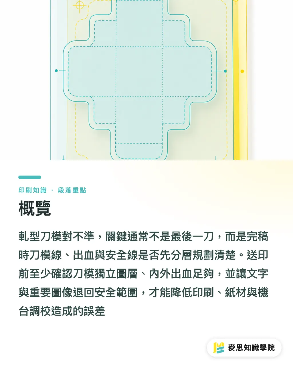
Why Do Die-Cuts Get Misaligned?
In most cases of die-cut misalignments I see, the operator isn't at fault. The file mistook visual design for production readiness. The artwork looks great, but the dieline fails to align with bleed, gang-run layout, paper grain, or nicks. Once the press runs, the flaws show up immediately
Take a table tent as an example. Front graphics, back fold lines, bottom slots, and outer dielines involve at least four spatial relationships. If one layer isn't locked in coordinates, or if the dieline was scaled along with the artwork during prepress, you end up with one side aligned and three sides off
The MINDS (MS) three-step prepress checklist verifies three things first: whether the dieline sits on a separate layer, whether bleed follows the outer contour, and whether safety lines clear all cut edges. If a file fails these, I don't recommend starting full production. One die-cutting error wastes paper, requires making a new die, forces a reprint, and delays delivery
・Dieline: Keep it on a separate layer named clearly, like Dieline or Cut
・Print Artwork: Keep CMYK graphics on the print layer and never mix them with the dieline layer
・Safety Margin: Inset a border marking where text, logos, and QR codes must not cross
・Fold and Score Lines: Use distinct stroke styles or spot colors so operators do not mistake them for cut lines
・Export File: Before sending the PDF to print, confirm the dieline was not converted into CMYK print content
How Much Bleed Is Safe for Complex Shapes?
Bleed for custom-shaped prints cannot simply follow the standard 3mm rule for rectangular prints. While 3mm is a good starting point, it isn't a one-size-fits-all solution. For slender sharp points, wavy edges, inner cutouts, and tight curves, outer bleed must extend outward along the shape, and inner bleed must prevent exposed white edges
When reviewing complex shapes with the MINDS (MS) three-step prepress checklist, I split bleed into two types. Outer bleed is the extra artwork outside the dieline to prevent white edges if the cut shifts. Inner bleed is the extension around holes, inner notches, windows, or slots to prevent raw paper stock from showing along inside cuts
Take a custom cloud-shaped postcard as an example. The artwork must extend outward along every curve, rather than just filling a large rectangular background box. For small notches under 5mm, if bleed doesn't follow the inner contour, even a slight shift leaves visible white gaps along the notch edges
・Standard Contours: Start with a 3mm bleed, then check with the print shop based on paper thickness and shape complexity
・Slender Protrusions: Extend bleed along the exact shape rather than filling a rectangular background
・Inner Cutouts: Apply inner bleed to slots, handle cutouts, and hang holes
・Key Text: Keep text at least 3mm away from the cut line, and be even more conservative with QR codes and fine print
・Full-Bleed Backgrounds: Extend background colors past the dieline instead of snapping flush to it
Too little bleed usually causes white borders. Incorrect bleed direction forces tedious file rework. I often remind designers that bleed isn't just enlarging artwork. It creates breathing room for natural cutting shifts

How to Hide Nicks and Bridges Gracefully
Nicks, often called bridges in pressrooms, are small connecting tabs that keep the cut shape attached to the paper sheet during processing. Though only present in a few spots, they dictate whether popped-out edges look clean, whether pieces fall off prematurely, and whether finishing machinery jams
Die-cut stickers, hang tags, and table tents all encounter nick placement issues. Put a nick right over key visual elements, and customers immediately notice rough burrs. Place it on a sharp corner, and separating the piece tears paper fibers. When checking bridge locations with the MINDS (MS) three-step prepress checklist, we look for two spots: visually subtle areas and structurally stable edges
On a custom postcard, hair points on character art, outer logo edges, and main headlines are poor places for nicks. Better placements include bottom edges, dark background zones, subtle areas on the back, or near fold lines where folding remains unaffected
・Avoid Key Visuals: Keep bridges away from logos, faces, and product photos
・Avoid Sharp Angles: Pointed corners are fragile, and nicks raise tearing risks
・Place on Stable Edges: Long straight edges, bottom margins, and dark areas are easier to trim neatly
・Confirm with the Printer First: Die-makers have different habits, so clarifying before prepress is far more practical than trimming edges later
・Inspect Proof Edges: When checking proofs, look beyond color accuracy and inspect nick marks
Here is a practical rule of thumb from the shop floor: if you instinctively pick at a rough burr while holding a sample, your customer will notice it too. Hiding bridges well gives the final product a clean, polished feel
Why Sharp Angles Cause Paper Tearing
Sharp angles are the most underestimated risk in complex die-cutting. Paper has grain direction, and cutting dies concentrate pressure at sharp points. Extremely tight angles cause fraying, cracking, and peeling, especially on heavy cardstock, mounted board, and laminated stocks
I often ask designers to picture sharp corners like tiny snips in fabric: the sharper the notch, the more easily it tears under stress. The same applies to printed pieces. For products handled, inserted, or folded repeatedly like table tents, cards, and hang tags, sharp angles ruin both appearance and durability
The MINDS (MS) three-step prepress checklist optimizes complex outlines with corner rounding. In many cases, adding a 0.5mm to 2mm corner radius preserves the design aesthetic to the naked eye while making die-cutting smoother, paper edges cleaner, and products far less prone to tearing at point tips
・Convex Sharp Corners: Round them whenever possible, especially on surfaces handled frequently
・Concave Sharp Corners: Avoid deep V-shaped notches and use small arcs instead for better structural stability
・Narrow Bridges: Thin connecting parts snap easily; check if the shape can be simplified
・Heavy Paper and Board: The thicker the stock, the more conservatively you should treat sharp corners
・Laminated Stocks: Gloss and matte laminations can lift at sharp tips, while rounded corners reduce peeling
Designers often fear rounded corners will spoil their shape. I believe seasoned die-cut design blends rounded corners naturally into the visual language, giving customers a comfortable feel rather than a sense of manufacturing compromise
Which Layers Must Designers Check Before Prepress Handoff?
Before handing off files for complex shape printing, treat your artwork file as a production blueprint rather than just a visual proof. When the consulting team at Mai Strategy Knowledge Academy helps clients inspect die-cut prepress artwork, we ask designers to deliver at least four clear sets of information: dielines, bleed lines, safety margins, and finishing notes
An ideal file allows a printer to understand production requirements within 30 seconds of opening. Cut lines, fold lines, punch holes, score lines, and prohibited nick areas should be obvious from layers and annotations. When high-end custom commercial printing is needed, MINDS also works backward from material, quantity, and finishing methods to specify prepress parameters
・Check 1: Confirm the dieline sits on an independent layer marked with a spot color
・Check 2: Ensure the dieline is set to overprint so it doesn't knock out print artwork during output
・Check 3: Verify outer bleed extends along the shape and inner bleed is applied to inner notches and holes
・Check 4: Confirm text, logos, and QR codes sit safely inside safety margins
・Check 5: Check that cut lines, fold lines, score lines, and perforation lines use distinct markings
・Check 6: Make sure nick placements avoid key visual elements and sharp corners
・Check 7: Ensure all images are linked or embedded properly, and fonts are outlined or correctly embedded
・Check 8: Reopen exported PDFs to verify dielines remain in their correct coordinates
The more complex a file, the more clearly your layers must communicate. Once paper is printed and dies are mounted, fixing mistakes takes far more than moving a line

Key Takeaways
・Die-cut shifts often start in prepress. Failing to separate dielines, bleed, and safety margins leaves post-press operators scrambling to fix errors
・Bleed for custom shapes must follow outer contours, leaving tolerance around borders, inner cutouts, and holes
・Nicks matter. Poorly placed bridges expose rough burrs right on first impression
・Sleek sharp angles stress production lines. Adding a 0.5mm to 2mm corner radius often yields far smoother mass production
・A well-prepared file lets print shops understand finishing specs within 30 seconds
Going Further
The single most effective place to introduce process management for custom-shaped printing is prepress inspection, rather than assigning blame after mistakes happen. Print manufacturers can turn dielines, bleed, safety margins, nicks, and corner rounding into a standardized checklist. Designers can reduce communication overhead by enforcing fixed layer-naming conventions before file handoff. If AI and SaaS tools are to add real value, they should flag risk zones, such as sharp points, inner cutouts, close text spacing, and unseparated dielines, before designers and print consultants make final calls. Here is a practical next step: take three recent die-cut projects, review their flaw points, and turn them into your own prepress checklist
FAQ
- Who is usually at fault when die-cuts are misaligned?
- Die-cut misalignment usually stems from a combination of prepress setup, printing, paper stock, mounting, and machine calibration. Designers can control three factors upfront: putting dielines on a separate layer, providing adequate bleed, and setting clear safety margins
- Does bleed for custom stickers or die-cut cards always have to be 3mm?
- While 3mm serves as a good baseline, complex shapes require adjustments based on contour, paper stock, and finishing methods. Slender points, inner cutouts, holes, and slots require specific checks for inner and outer bleed
- Can dielines be drawn directly as CMYK black lines?
- It is not recommended. Dielines should sit on an independent layer, be drawn in a dedicated spot color, and set to overprint so print artwork and production lines remain clearly separated during output
- Why should sharp corners be avoided on custom cutting dies?
- Sharp angles concentrate stress on paper fibers and lamination film, causing fraying, tearing, or peeling. Replacing sharp points with small rounded corners preserves design aesthetics while improving product stability
- What should designers check most carefully before submitting complex die-cut files?
- First, check that dielines, bleed lines, safety margins, and finishing notes are clearly separated across layers. Next, ensure text, logos, and QR codes are not too close to cut lines. Finally, export the PDF and reopen it to verify position accuracy
Related articles

The Print × AI weekly
The print and AI know-how designers, brands and enterprises can use before they commit — one email, every week
MINDS Free Tools
Spine width and imposition calculators — skip the manual math, free in your browser.
MINDS Group
Need actual printing or gifting services?
From premium printing to online ordering and festive gifts — the MINDS Group sister brands take it from here.