
What should you design first for jewelry packaging stickers?
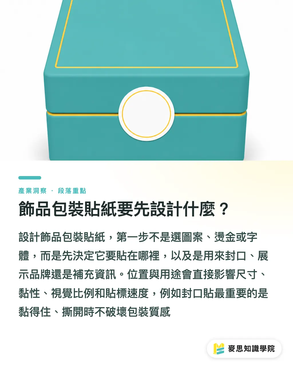
For jewelry packaging stickers, design "where it goes" before art, foil, or type. Placement directly decides size, adhesive, visual balance, and how fast you can apply them
Jewelry packaging stickers are small labels that go on earring cards, sealed bags, outer boxes, or hangtags. They carry brand identity, seal the package, signal tamper-evidence, list materials, and offer care reminders. The usual trap: the design looks great on screen, then dominates the clear bag or cardstock in real life
When I look at jewelry stickers, I split them into three uses first
・Seal stickers: sit on the opening of a clear bag, paper box, or envelope, must stick well and tear cleanly
・Brand stickers: go on earring cards, outer boxes, or paper bags, the LOGO needs to read clearly with comfortable spacing
・Info stickers: cover material, size, care, or SKU, text has to be legible and the layout reusable for reorders
Hold on
If you haven't decided whether the sticker is a seal, brand showcase, or info add-on, every material and finish choice that follows becomes a guessing game
How do you size earring stickers without covering the product?
Earring sticker size has to be judged against the earring card, the piece itself, and the sightline when the box opens. The sticker only supplements the look, it shouldn't hide pearls, metal findings, or handmade details
I usually ask clients to grab an actual earring card, place the product on it, then cut a few sticker positions out of masking tape and try them on. This step beats resizing a LOGO on screen, because earrings have depth, clear bags reflect light, and you only know if the composition feels cramped once it's physically applied
Small-batch, multi-SKU jewelry runs into a common cost trap: every style gets its own custom shape, and suddenly cutting dies, label application, and restocking all turn painful. MINDS' three checkpoints at submission usually suggest consolidating same-series stickers into one material and one set of die cuts, then using color or small icons to tell series apart
During design review, use the ISO 216 A4 size of 210 × 297 mm as a print-proof reference to eyeball visual proportions. Don't confuse that with actual production sizing, final imposition still goes to the printer, who arranges it based on equipment and die templates
Paper, matte film, or transparent, which sticker material should you pick?
Jewelry packaging sticker material depends on the surface it touches. Stickers on paper cards, clear bags, matte boxes, or metallic packaging each call for different paper and adhesive
・Coated paper stickers: smooth surface, clean color, works for brand stickers and standard seal stickers, budget-friendly
・Uncoated paper stickers: obvious paper feel, soft to the touch, suits handmade, natural, or vintage-style jewelry
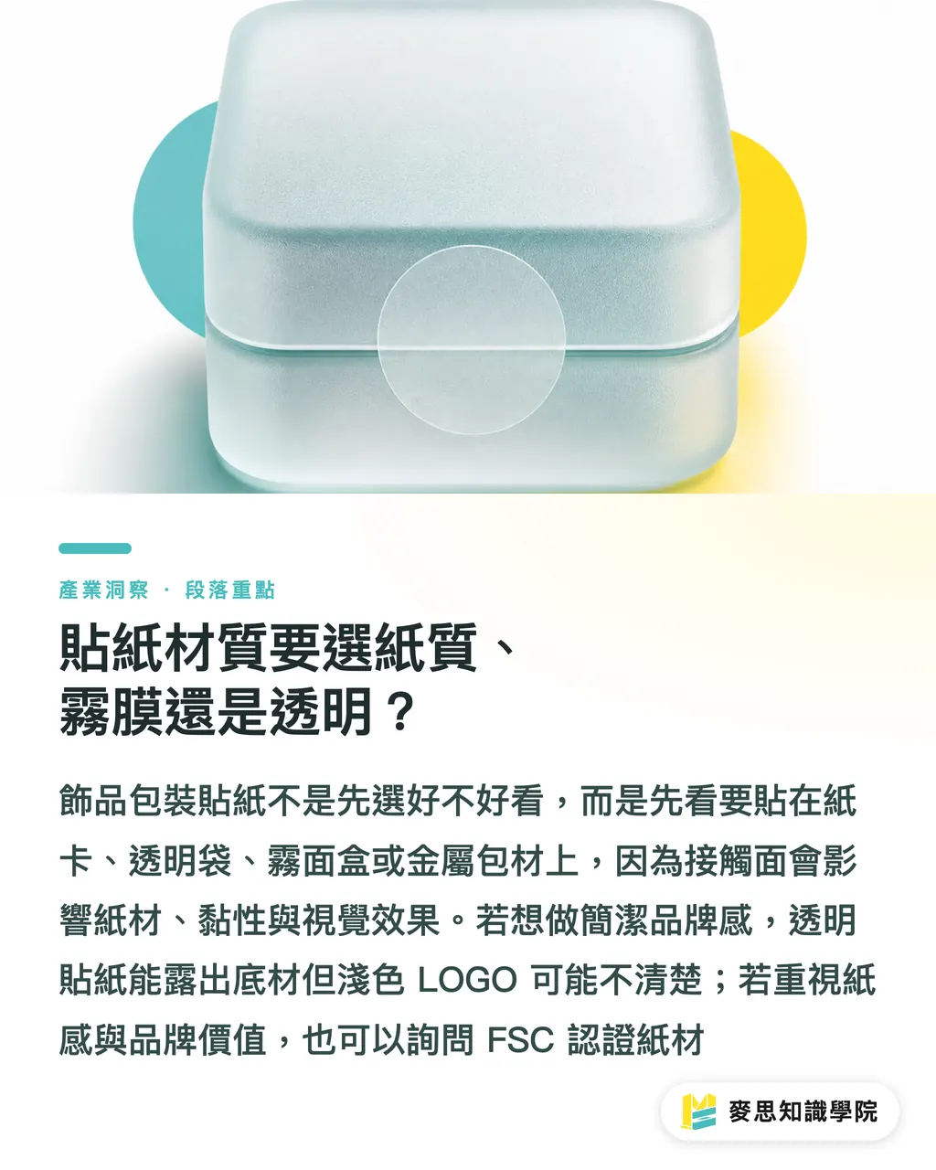
・Transparent stickers: let the base show through, good for clear bags and minimal branding, but light-colored LOGOs tend to vanish on the clear base
・PP stickers: Polypropylene film, better water resistance than paper, suited to packaging that's handled a lot or sits near bottles
・Matte film finish: a matte protective layer over the surface that cuts glare and slightly deepens the color tone
If the brand wants to push eco-friendly credentials, ask about FSC (Forest Stewardship Council) certified paper. FSC is the international system for marking wood and paper sourced from responsibly managed forests, a good fit for series packaging that cares about paper feel and brand values
How do you place brand identity so it actually looks refined?
Jewelry packaging sticker branding should use fewer elements in more precise spots. Let customers see the product first, then notice the brand has its act together
Newcomers often cram LOGO, IG handle, tagline, material, and care reminders onto one tiny sticker. Every word shrinks, and the printout ends up looking like a shredded instruction sheet. Jewelry packaging isn't a catalog. When sticker real estate is tight, the brand name and one identifying color are usually enough
CMYK (Cyan, Magenta, Yellow, Key black, the standard four-color process for commercial print) doesn't match on-screen RGB. Neon pink, bright purple, or lake green on screen often prints darker, and a matte film finish eats a bit more brightness on top. Accept this at the design stage
If you're stuck between brand color, sticker material, and overall packaging feel, bundle your earring cards, bags, existing LOGO, and target price range and send them to the Mai Strategy Knowledge Academy consulting team. They'll sort out whether you should go low-key paper, transparent minimal, or mid-to-high-end finishing, closer to what's actually happening on press than just asking "which one looks more premium."
What files do you need to prepare for print submission?
Jewelry packaging sticker submission needs artwork, die lines, material specs, finishing specs, and application position. Miss any one of these and the printer just calls you back with questions
Adobe Illustrator (the standard vector editing software) handles LOGO, die lines, and vector graphics well. If you built your visuals in Canva or with AI-assisted tools, you'll still need to confirm text, LOGO, and die lines can export as print-ready vector or high-resolution files
Run through this checklist before submitting
・Artwork: confirm brand name, LOGO, and text have no typos
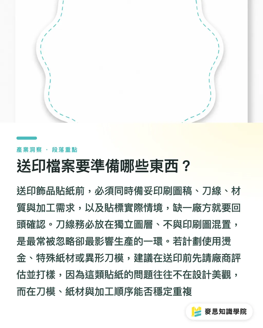
・Die lines: marked on a separate layer, not mixed with print art
・Material: clearly state paper, transparent, PP, or whether matte film is needed
・Finishing: if you want foil, spot UV, or custom shapes, ask about sampling first
・Application: snap a photo of the sticker actually placed on an earring card or outer bag so the printer sees the use context
・File format: ask if you can submit PDF/X-4 — the print-exchange PDF standard defined by ISO 15930-7, suited to preserving transparency and color info
If you've already decided on foil, specialty paper, or irregular die shapes, loop in MINDS early to evaluate the process and request samples. The problem with these stickers usually isn't whether the design looks good, it's whether the die, paper, and finishing sequence can repeat reliably
Key takeaways
・For jewelry packaging stickers, ask where it goes before asking if it looks pretty
・Small brands should cut specification complexity, not skip samples
・Same-series stickers sharing material and die lines save a lot of restock pain
・Transparent stickers look clean, but light-colored LOGOs disappear fast
・Send files with die lines, material specs, and application photos, print communication moves much faster
Further thinking
For print manufacturing, the value of jewelry stickers lies in stable mass production, not single-piece mockups. For designers, sorting brand stickers, seal stickers, and info stickers first makes the layout far cleaner. For AI application and SaaS teams, the first thing worth building is management for SKU, material, die line, restock version, and sample records, these small fields directly cut the cost of reprints, missed edits, and wrong-style applications
Further reading
FAQ
- Are transparent stickers a good fit for jewelry packaging?
- Yes, transparent stickers work for jewelry packaging, suited to clear bags, matte boxes, and minimal branding. Light-colored LOGOs can get swallowed by the base, so test on actual packaging before submitting
- Should earring stickers show the LOGO or care information?
- If the earring sticker goes on the front, prioritize the LOGO or brand name. Care info fits better on the back, a small card, or an outer info sticker, too much text on the front pulls focus from the product
- What's the most cost-effective approach for small-batch, multi-SKU jewelry stickers?
- Small-batch, multi-SKU jewelry stickers should share material and die lines, then use color, text, or small icons to tell series apart. This makes sampling, imposition, restocking, and application far easier to manage
- Do jewelry packaging stickers need foil stamping?
- Not necessarily. Foil makes sense for metal jewelry, gift-box editions, or higher-priced series. For everyday handmade pieces, getting the material, whitespace, and placement right usually looks better longer than forcing extra finishing
- Can Canva or AI-generated sticker artwork go straight to print?
- Not always. Canva or AI-generated jewelry sticker artwork still needs to be checked for resolution, fonts, LOGO, die lines, and export format. Have the printer review the file before going into production
Related articles


The Print × AI weekly
The print and AI know-how designers, brands and enterprises can use before they commit — one email, every week
MINDS Free Tools
Imposition calculator and preflight file check — free prepress tools, right in your browser.
MINDS Group
Need actual printing or gifting services?
From premium printing to online ordering and festive gifts — the MINDS Group sister brands take it from here.