
Overview
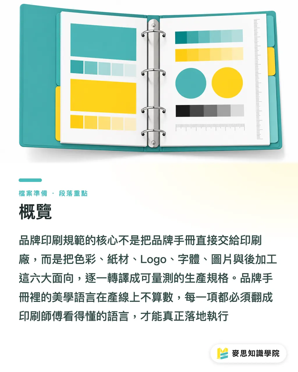
At its core, a Brand Print Guidelines document that a printer can actually execute translates colors, paper stock, logo usage, typography, imagery, and finishing options into six measurable specifications. It is not just dumping a brand manual onto the press floor. When MINDS (MS, mid-to-high-end fully custom commercial printing) helps companies structure their brand print guidelines, we use these six areas as our baseline. Every single detail needs to be translated into language press operators understand. The aesthetic concepts in a brand manual do not count on the production line
Why Handing a Brand Manual to a Printer Causes Problems
A Brand Manual is written for marketers, designers, and ad agencies. Its language is visual: logo rationale, color mood, layout proportions. Production lines at a print shop do not read that language. They need measurable numbers: paper weight in grams, acceptable color deviation in ΔE, specific finishing machinery, and die-cut safety margins
These two documents serve entirely different audiences. Using the former directly as the latter is the root cause of print failures for many companies
From my years of observing both pressrooms and client workflows, problems explode most frequently at three key points:
・ The printer receives RGB or HEX values for standard brand colors. With no CMYK baseline, every plant runs its own conversion, producing color variations clearly visible to the naked eye
・ A vector AI file is provided for the logo, but without a minimum print size restriction. Shrunk down to the corner of a business card, fine details blur out completely
・ The font in the brand manual looks great, but print licensing scope is unspecified. Designers outline the text to move on, leaving no way to locate the original font files for the next update
None of these three problems are the printer's fault, nor are they the designer's fault. The issue is a missing translation document between them
What Six Essential Items Must Brand Print Guidelines Include?
Based on real projects, a brand print guidelines document that a printer can execute should cover at least the following six areas:
Paper Specification Methods
・ Define the weight range for commonly used brand paper stock, such as using 350gsm or heavier coated art card for business cards
・ Specify surface treatments (gloss both sides, single side gloss, matte, special texture)
・ List forbidden paper types for the brand, such as avoiding recycled paper (where color variation easily exceeds tolerance)
CMYK and Spot Color Matching Rules
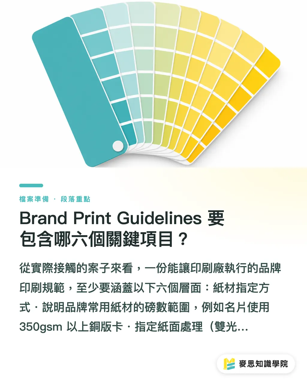
・ Provide Pantone Solid Coated (or Uncoated) numbers, suggested CMYK values, and fallback RGB values for every brand color
・ Clarify which print collateral uses Spot Color and which stays CMYK: high-volume catalogs over 5,000 copies go CMYK, while low-volume luxury packaging specifies two Pantone spot colors
・ Set color tolerance standards: four-color CMYK printing is typically kept within ΔE Within 3.0, while spot colors should stay within ΔE Within 2.0
Logo Clear Space and Minimum Size
・ Define minimum logo sizes for print in millimeters, not pixels: a horizontal logo often has a minimum print width of 20mm, below which details break down
・ Explain Clear Space based on multiples of logo height, prohibiting other elements from intruding
・ List corresponding logo versions for dark vs. light backgrounds and prohibited distortions
Font Print Licensing Scope
・ List required brand fonts, version numbers, and licensing sources one by one
・ Specify whether PDF embedding is permitted and whether outlined text can be used for commercial printing
・ Record the authorized scope for commercial print, including copy limits and collateral types, so future reprints or designer handoffs have a verifiable record
Image Resolution Standards
・ Minimum resolution for print images: 300 DPI for standard commercial print (measured at final actual print size), while 100-150 DPI is acceptable for large displays or billboards
・ Color mode must strictly be CMYK, submissions in RGB mode are forbidden
・ Clearly state delivery requirements for Embedded images versus Linked assets
Finishing Constraints
・ List standard brand finishing options: Spot UV, foil stamping, embossing, soft-touch lamination
・ Clarify which brand elements must use finishing and which are forbidden. For example, logos can use Spot UV, but foil colors outside the brand palette are prohibited
・ If die-cuts use fixed templates, attach die-line vector files in AI format
How to Write Each Item So Printers Actually Understand It
A common flaw in brand guideline documents is that they are written for designers rather than press operators. The language gap between them is wider than most think
Write color specs like this: "Primary brand color Pantone 485 C, recommended CMYK C0 M95 Y100 K0, actual print tolerance ΔE ≤ 3.0 based on Coated stock. Uncoated stock uses Pantone 485 U for separate color matching." Simply writing "vibrant red" or listing a HEX code means nothing on a production line
Write minimum sizes like this: "Horizontal main logo minimum print width 20mm (including margins). Below this size, switch to the simplified logo (Appendix A)." Attaching a physical size test print is the fastest approach, allowing printers to verify specs before outputting proofs instead of guessing
Write finishing specs like this: "Business card standard spec: 350gsm C2S art card, matte lamination, Spot UV on logo area, 3mm rounded corners. Die-line drawing in Appendix B. No altering corner radius or scaling die lines." Translate "design feel" into "equipment parameters" so printers can quote and set up jobs immediately
For font licensing, record at least four items: font name, version, purchase account, and license type, keeping them in the same document as other specs. Outlining text fixes missing font errors on press, but it does not solve commercial licensing obligations. Keep the two issues separate. When switching designers or print vendors, this record saves hours of searching
Template Structure for Brand Print Guidelines Ready for Direct Hand-off
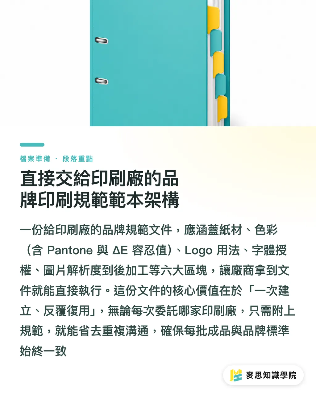
Below is a recommended document outline. Companies can follow this structure and fill in brand manual contents item by item to produce print-ready guidelines:
Cover Page
・ Brand name, version number, update date, document owner contact info
Section 1: Paper Specifications
・ Grouped by item (business cards, catalogs, packaging, posters)
・ Corresponding paper weights, surface finishes, and forbidden materials per item
Section 2: Color Specifications
・ Primary and secondary brand colors listed with Pantone, CMYK, RGB, and HEX
・ Color tolerance standards (ΔE values) per print scenario
・ Color mode rules per item (four-color vs. spot color)
Section 3: Logo Guidelines
・ Intended usage for each logo version (horizontal, vertical, monochrome, reversed)
・ Minimum print sizes (in mm)
・ Clear Space rules (illustrated with diagrams)
・ Examples of prohibited distortions
Section 4: Font Specifications
・ Font name, version, license source, permitted print scope
・ Text outline rules (when outlines are required vs. when raw font files are retained)
Section 5: Image Specifications
・ Minimum resolution requirements (grouped by item)
・ Color mode, file format, Embedded vs. Linked rules
Section 6: Finishing Specifications
・ Descriptions of standard brand finishing items
・ Die-line drawing index (appendix list)
・ Prohibited finishing combinations
Appendix List
・ Vector files for all logo versions
・ Die-line drawings (AI format)
・ Color swatch proofing sheets (printed standard samples recommended)
Once this document is established, every print procurement, whether through custom commercial printers like MINDS or via online ordering on Mai Print, can include these guidelines directly. It eliminates repeated back-and-forth communication and keeps every batch aligned with brand standards
Key Takeaways
・ Brand manuals are written for designers; Brand Print Guidelines are written for press operators. The two documents serve different audiences with different languages and cannot replace each other
・ Brand colors must include Pantone codes, recommended CMYK values, and ΔE tolerances. Providing only HEX codes gives screen colors, which mean nothing on a print line
・ Minimum logo print sizes must be defined in millimeters, not pixels or gut feel. This single rule prevents most blurred logo issues
・ Outlining text only solves missing font errors at printing. Commercial licensing liabilities require separate documentation. Neither step can be skipped
・ Finishing specs must translate into actionable machine parameters (weight, film type, finishing method, die size). Writing "exquisite feel" gives printers no way to quote jobs
Further Considerations
Once established, the value of this document compounds over time. Every time you switch designers, change print vendors, or launch new product lines, you have a baseline to reference instead of explaining from scratch what the brand colors feel like or whether the logo can be shrunk a bit more
AI tools can now help automatically extract color lists and typography specs from existing brand manuals into structured formats, saving time during initial organization. Keep in mind, though: deciding acceptable color tolerances or defining essential finishing options still requires alignment between design and procurement teams. Tools cannot make those calls for you
If your brand manual is thorough but has never been converted into a press-ready version, start with the Color Specifications section. Priority should go to filling in Pantone numbers and recommended CMYK values for each brand color. This step yields the fastest results and is most often overlooked. If you need assistance, the consulting team at Mai Strategy Knowledge Academy is available for an initial assessment
FAQ
- What is the difference between a Brand Manual and Brand Print Guidelines?
- A Brand Manual is a visual direction document for designers and marketers. Brand Print Guidelines are actionable technical documents for the pressroom, containing measurable figures like paper weights, recommended CMYK values, minimum logo sizes in mm, and finishing specs. They serve different audiences and cannot substitute for one another
- Our brand color only has a Pantone number without CMYK values. Can the printer convert it themselves?
- They can, but conversion methods vary across print shops. Combined with differences in paper, ink, and presses, CMYK conversions from the same Pantone number can vary noticeably. Brand owners should establish recommended CMYK values under a unified proofing setup before sending files to printers to keep color drift under control
- How do you set a minimum print size for a logo?
- It is usually based on the width of the horizontal logo. For standard commercial printing, staying above 20mm is recommended. Logos with intricate details (like small text or fine lines) require larger minimum sizes. The most reliable method is running a physical test print at various sizes, establishing the smallest acceptable size, and recording that exact figure in the guidelines
- Does outlining text before file submission resolve all typography issues?
- Outlining resolves missing font errors on press, but it does not address commercial licensing compliance. Outlined text cannot be edited directly, so future text edits require locating original font files and license records. If license records are lost, switching designers or reprinting may lead to unintentional infringement. Outlining is a print tech fix; licensing records are corporate legal compliance. Both must be managed
- How long does it take to create this document?
- Extracting a baseline Brand Print Guidelines document from an existing brand manual takes an experienced designer or procurement buyer about half a day to a full day. Once the six core sections are filled out, each subsequent print job saves over 30 minutes of routine back-and-forth, typically paying back the effort before your third print order
Related articles



The Print × AI weekly
The print and AI know-how designers, brands and enterprises can use before they commit — one email, every week
MINDS Free Tools
AI background removal, a LINE sticker maker, spine & imposition calculators — all free, right in your browser, no upload.
MINDS Group
Need actual printing or gifting services?
From premium printing to online ordering and festive gifts — the MINDS Group sister brands take it from here.