Why AI images that look great on screen are often a disaster when printed
Based on my experience handling thousands of print projects, the number of clients bringing AI-generated artwork for printing has surged in the last six months
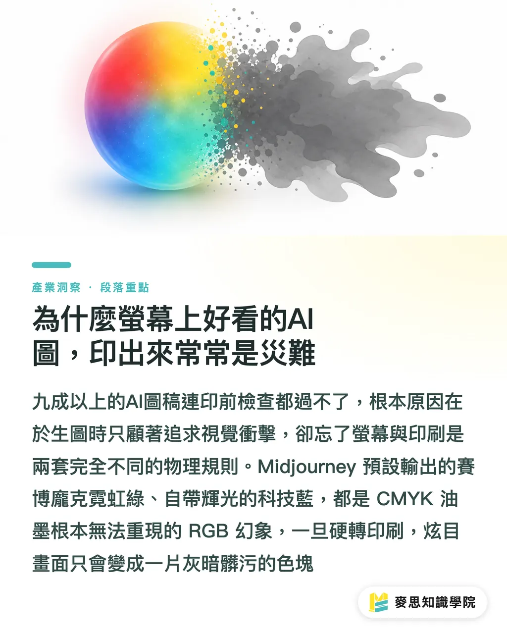
The cruel reality is that over ninety percent of these files fail the initial pre-press inspection
The biggest pain point is that people write prompts focused only on how cool the visual is, completely ignoring the limitations of physical media
Images generated by models like Midjourney default to a strong screen-emitted glow and oversaturated RGB colors
High-contrast cyberpunk neon greens or self-glowing tech blues are colors that CMYK printing inks simply cannot reproduce
If you don't 'apply the brakes' at the source of your prompt, the final output after conversion will just be a dull, muddy block of color
How to write AI prompts to precisely control the outcome
I often tell clients that prompts aren't a wishing well, but a 'specification document' for your contract with the AI
To produce stable, distinct, and print-ready images, stop writing prose or long essays; switch to a tag array separated by commas
A well-structured prompt should contain these four layers:
・Subject Description: Clearly specify the main character, action, and background (e.g., A girl drinking coffee in a cafe)
・Media and Style: This is the key to controlling print texture; specify watercolor, vector, or printmaking (e.g., vector illustration, flat color)
・Lighting and Angle: Determines the depth and composition of the image (e.g., studio lighting, front view)
・Rendering and Quality: Require the AI to provide the sharpest details (e.g., 8k resolution, clean lines)
Lock these conditions in, and the AI won't randomly add unnecessary details and noise that drive pre-press staff crazy
Which style keywords are best for hassle-free conversion to print
Choosing the right style keywords can cut your pre-press editing time in half
Here are the keyword sets I have found in practice to be the most stable when translated into print
・Vector Illustration Style: Add 'vector illustration, flat design, minimalist'. Such patterns have sharp edges and clean color blocks, which work flawlessly when using Image Trace in Illustrator later
・Vintage Printmaking Style: Use 'linocut, woodblock print, halftone'. The image comes with a heavy ink and halftone dot effect, which looks incredibly powerful when printed with monochrome black on textured kraft or grey cardstock
・3D Rendering Style: Mark with 'claymation, isometric, 3D render'. Unlike realistic photos, this 3D style with clay-like textures has sharper edges, suitable for supplementary graphics in packaging design
・Watercolor Hand-drawn Style: Use 'watercolor, ink wash, white background'. Paired with textured ivory cardstock printing, it perfectly restores the warmth of hand-crafted work, and the white background makes it easy for designers to remove backgrounds for compositing later
What hurdles remain from prompt to printed product
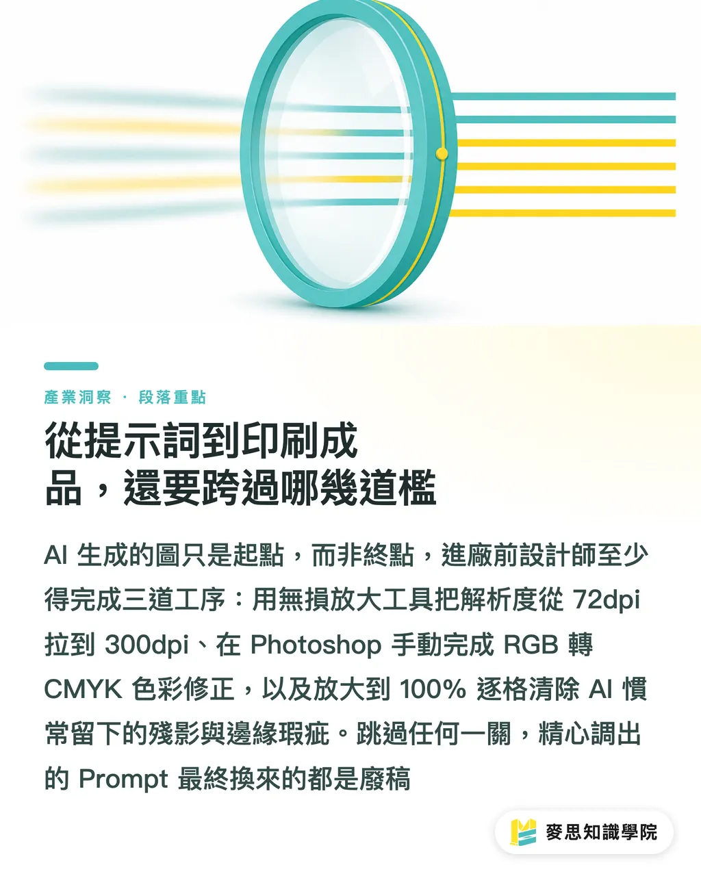
Even if your prompt is perfect, the image generated by AI is still just a 'semi-finished product'
To meet the printing standards at Mind Printing, designers must complete these three tasks:
・Lossless Upscaling: Most AI tools output at only 72dpi to 96dpi. Before entering the production line, you must use tools like Topaz Gigapixel or Magnific AI to upscale it losslessly to the physical size requirement of 300dpi
・Color Conversion: You must convert the file from RGB to CMYK in Photoshop and manually remedy the washed-out fluorescent areas; never leave this job to the printer's automatic conversion
・Edge Debugging: AI often leaves eerie shadows on backgrounds or characters' fingers. Before printing, zoom in to 100% and carefully inspect to clean up these illogical artifacts
Key Takeaways
・Prompts are not conversational wishes, but contract specifications for AI; the more rigorous the structure, the more stable the output
・Choosing style keywords with 'clean edges' and 'clear color blocks' can drastically reduce the pain of pre-press editing
・On-screen RGB fluorescent colors are the fatal flaw of printing; avoid describing such glowing materials when writing prompts
・AI image generation is just an early-stage resource; the final mile of quality is determined by post-generation lossless upscaling and manual CMYK color correction
Reflections
AI tools are not meant to replace designers, but to phase out those who don't know how to issue precise specifications
For print professionals and planners, mastering prompts is like mastering a brand-new vocabulary of materials
Treat AI as a powerful sketch generator, and invest the saved time in illustration communication into paper selection and post-processing planning
This is the smart posture for creating the highest added value for clients when facing new technologies
FAQ
- Why is the image I generated with AI always blurry when placed on a print layout?
- Because the default resolution output by AI tools is usually low and cannot meet the 300dpi threshold required for physical printing. You must use AI upscaling software to process it before layout
- Can I ask AI to generate CMYK color mode directly when writing a prompt?
- No. Current AI image models are trained based on the RGB screen display environment. You must manually convert the color mode in graphics software after generating the image
- How should I write my prompt to make it easier to remove the background for layout?
- It is recommended to add 'white background' or 'isolated on white' to your prompt. This will make the edges of the generated pattern subject very clear, making one-click background removal the cleanest
- Is there a difference in image quality between writing prompts in Chinese versus English?
- Absolutely. Mainstream models like Midjourney are primarily trained on English datasets. Using English for prompts provides significantly higher precision in controlling details and styles than Chinese