
Overview
If you want to turn AI-generated imagery into exhibition graphics several meters long, the first step is to let go of the old "no print unless it's 300 PPI" rule. Set a practical range of 72 to 100 PPI based on the real distance between viewers and the backdrop. Then run it through the "MINDS (MS, mid- to high-end fully customized commercial printing) three prepress checks" to confirm size ratio, color mode, and material ink absorption. That alone cuts the risk of a failed print by a lot
How Far Away Will People Stand? That Decides Your Image Resolution
Resolution, or PPI, means the number of pixels per inch. It determines how much detail an image can show at a given physical size. The higher the number, the finer the image, but the file size also grows in step, adding load to processing and file transfer
This is the sticking point I run into most often when advising clients. Many designers are used to print catalog standards, so they push every image to 300 PPI no matter what it is. Then a five-meter-wide exhibition board becomes so huge that even Photoshop can barely move. Large-format output follows a completely different logic. The real decision point is viewing distance
Imagine standing two meters away from an exhibition backdrop. Your eyes simply cannot tell the difference between 300 PPI and 100 PPI. From what I've seen over years on production lines and on site, 72 to 100 PPI is more than enough for most indoor exhibition backdrops or banners. If it's a giant banner hanging on the outside wall of a third floor, even 30 to 50 PPI can be fine. Instead of forcing the computer to calculate an ultra-high-resolution monster file no one actually needs, put that effort into generating better details
What If the AI Image Ratio Is Wrong for an Extra-Wide Backdrop?
Large exhibition graphics are often extreme horizontal strips, such as a 300x600 cm banner. But most mainstream AI image tools still struggle to create high-quality images at 1:2 or even wider ratios in one go. Stretching the image is guaranteed trouble, and sending it straight to the print shop usually just gives you a full-size pixelated mess
In real projects, we usually solve this with two main strategies
・Inpainting: First, have the AI generate a main image you're happy with at a normal ratio. Then expand the edges outward and let the software grow a believable background based on the surrounding pixels
・Seamless Tiling: For repeating textures, such as wrapping paper or geometric backgrounds, instruct the model at the prompt stage to generate a seamless pattern. In layout software, you can extend it like laying tiles, with no obvious joins
If you get stuck organizing these files, the consultant team at Mai Strategy Knowledge Academy can help you build a standard workflow from image generation to final artwork
Why Does a Bright AI Image on Screen Look Dull in Print?
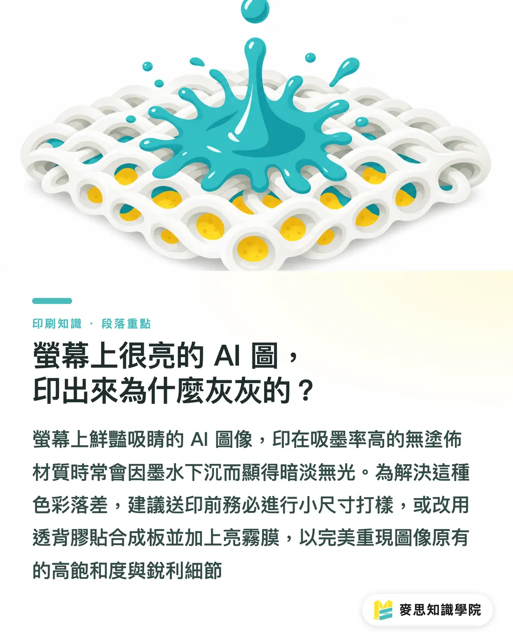
This has everything to do with how much ink the material absorbs. AI images are usually made to grab attention, so the colors tend to be extra vivid and the contrast is pushed high. But once those pixels land on a real substrate, the situation changes completely
For example, if you choose uncoated canvas or non-woven fabric, these materials have larger pores and absorb a lot of ink. The moment the ink is sprayed on, it spreads and sinks in. Fluorescent pink or bright blue that looked striking on screen will print noticeably darker and flatter. To close that gap, the final step in the "MINDS (MS) three prepress checks" is always a small-size proofing test on the exact material. If the budget allows and you want high saturation, large-format output can instead use back-adhesive film mounted on synthetic board, finished with gloss or matte lamination. That keeps AI image sharpness and color performance as intact as possible
Key Takeaways
・Resolution for large-format output is decided by viewing distance. For indoor exhibition boards, 72 to 100 PPI is enough. There is no need to chase 300 PPI blindly
・For files with extreme aspect ratios, use inpainting to expand outward, or generate seamless tiles from the start and stitch them together
・Material ink absorption will eat into the vividness of AI images. Before sending a large-format job out, always run a partial proof on the selected material
Further Thoughts
Making large-format graphics with AI is not as simple as throwing in a prompt. It is a relay from algorithm to physical material. For designers, factoring output limits such as size, resolution, and material into the prompt early can save a huge amount of retouching later. For developers, building these physical print parameters directly into tool presets would be a highly valuable business opening
FAQ
- Can AI-generated images be sent straight to large-format printing without any processing?
- Almost never. Original AI files are usually too small and do not match the proportions needed for large-format output. Printing them directly will create obvious pixelation, so they need to be enlarged or tiled first
- I'm making a large outdoor banner. What resolution should I set for the AI image?
- Because the viewing distance is long, 30 to 50 PPI is enough for a giant outdoor banner. Setting the resolution too high only makes the file too large to work with
- How can I keep AI image colors from going wrong in print?
- Color shifts usually happen because material ink absorption was ignored. Before ordering a large-format print, it is strongly recommended to run a small partial proof on the actual material to check the result
Related articles
The Print × AI weekly
The print and AI know-how designers, brands and enterprises can use before they commit — one email, every week
MINDS Free Tools
AI background removal, brand stamping, and a LINE sticker maker — free design tools, right in your browser, no upload.
MINDS Group
Need actual printing or gifting services?
From premium printing to online ordering and festive gifts — the MINDS Group sister brands take it from here.