COMPLETE GUIDE
A Complete Guide to Booklet and Catalog Production: Binding Methods and Paper Selection All in One Place, So Your Final Product Feels Exactly as Intended
When producing booklets or catalogs, many clients focus solely on the design — only to receive the finished product and find the pages won't lie flat, the cover feels flimsy, or the pages start falling out after a few turns. Almost all of these issues can be avoided before you even place an order. Here's a complete decision framework with concrete numbers covering how to choose a binding method and how to pair body paper and cover stock — follow this and you'll sidestep the most common pitfalls
Ask Three Questions Before Choosing a Binding Method
When I take on a booklet project, I always confirm three things first: page count (including covers), intended use (trade show giveaway, long-term keepsake, or short-term promotional), and budget range. These three answers nearly determine the binding method outright — for anything under 64 pages that's meant to be used and discarded, saddle stitching is almost always the most sensible choice; once you're over 80 pages and need text printed on the spine, perfect binding deserves serious consideration; for annual reports, high-end catalogs, and anything that needs to be referenced repeatedly while lying completely flat, sewn binding is worth the extra cost
Pay close attention to how pages are counted: the 'P count' of a booklet refers to the number of pages, and the actual sheet count is that number divided by 2. Saddle stitching requires the total page count to be a multiple of 4 (each folded sheet produces 4 pages), so if a layout comes in at 36 pages, you'll need to either add pages to reach 40 or trim down to 36. This detail trips up many designers — they don't catch it until the job is ready to go to press, wasting both time and money in last-minute revisions
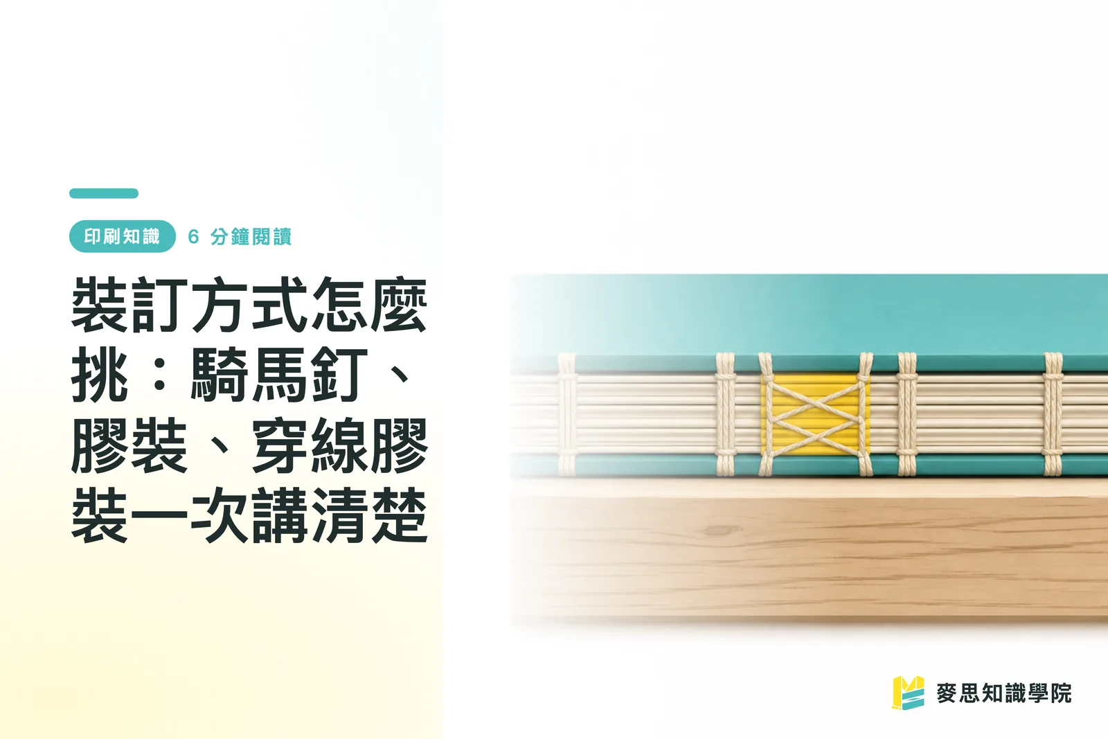
DEEP DIVEHow to Choose a Binding Method: Saddle Stitch, Perfect Binding, and Smyth Sewn — All in One GuideSaddle Stitching: The Go-To for Thin Booklets, with Hard Limits
The advantages of saddle stitching are straightforward: low cost, excellent lay-flat quality, and the ability to run full-bleed spreads without anything disappearing into the spine. In my experience, event programs, quarterly journals, and quick-turnaround promotional catalogs — items that will soon be replaced — default to saddle stitching almost every time. The sweet spot is 8 to 64 pages; beyond 64, the spine starts to bow outward, creating a noticeable arc when the stack sits on a table, which hurts the display presentation
Paper weight is more critical for saddle-stitched work. If the body pages are 157 gsm coated stock and the count is near the upper limit, spine bulge becomes a real problem. My usual recommendation: for saddle-stitched books over 48 pages, keep body stock at 128 gsm or lighter. The cover can be 250 gsm coated with spot UV or matte lamination to elevate the feel — no need to rely on heavier stock to make it look premium
DEEP DIVEHow to Choose a Binding Method: Saddle Stitch, Perfect Binding, and Smyth Sewn — All in One GuidePerfect Binding: A Printable Spine, but PUR and EVA Are Not the Same
Perfect binding gives the book a spine where you can print the company name, catalog year, and other identifiers — making it easy to locate on a shelf at a glance. It works well for pieces over 80 pages printed on lighter stock (105 gsm or below). Here's the critical fork in the road: standard perfect binding uses EVA hot-melt adhesive — fast, affordable, but prone to cracking in cold temperatures or when the book is forced back on itself, causing pages to detach. If the catalog needs to last long-term, or if the cover is getting a soft-touch lamination, I recommend upgrading to PUR glue. PUR's flexibility and bond strength are significantly better, especially on cover stocks with specialty film coatings that EVA simply won't adhere to
Lay-flat ability is perfect binding's inherent weakness — pages can't open completely flat, and the 10–15 mm zone closest to the spine gets obscured when reading. For spreads, images and text need extra inset margin toward the gutter. My rule of thumb: pull spread content at least 5 mm from the gutter centerline, and add another 3 mm buffer for anything critical. If this isn't communicated to the designer upfront, you'll almost certainly receive finished books where content disappears into the spine
DEEP DIVEBleed and Safe Zone: How Much Margin Does Your Print File Actually Need?Sewn Binding: The Right Answer for High-End Catalogs
Sewn binding stitches the signatures together with thread before gluing on the cover — a full step above standard perfect binding in both lay-flat quality and durability. It's ideal for high page counts, heavier stock weights, and pieces that will be consulted repeatedly over time: annual reports, luxury brand catalogs, designer portfolios. Pages lie completely flat, spread designs don't get eaten by the gutter, and the overall presentation is exceptionally clean for photography or display
Cost is the main barrier. The additional steps and labor make sewn binding 30–60% more expensive than standard perfect binding, with the per-unit premium growing more pronounced at lower print quantities. My decision rule: if this book will be in use for more than a year, or if it represents the brand at the first point of contact with potential clients, the added cost of sewn binding is absolutely justified. If it's a seasonal promotion that will be revised within six months, EVA perfect binding is good enough
Body Paper: Coating and Weight Define the Feel of Every Page Turn
Body paper selection largely sets the tactile character of the entire book. Coated paper (art paper) has a smooth surface with high color fidelity, making it ideal for image-heavy catalogs where color accuracy matters. Uncoated paper (offset or bond stock) has a slight texture after ink absorption — easier on the eyes for extended reading and receptive to writing, making it a better fit for text-heavy reports or yearbooks. The three most common body weights are 105 gsm, 128 gsm, and 157 gsm: 105 gsm is light and pages flip easily, 128 gsm strikes the balance between quality and cost, and 157 gsm has a noticeably substantial feel but adds weight quickly as page counts climb
There's another detail that often gets overlooked: the paper's grain direction must run parallel to the binding edge, or the pages will resist bending along the fiber direction, causing warping — and in perfect-bound books, the spine is far more likely to crack. Many clients aren't aware of this, but a printer should confirm it proactively before imposition. If your vendor never raises this issue, treat it as a warning sign
DEEP DIVEPaper Weight GSM Explained: How Many GSM for Business Cards, Flyers, and Posters?Cover Weight and Finishing: The First Impression That Holds the Whole Book Together
The cover should be at least two weight classes heavier than the body pages: if the body is 128 gsm, the cover should be 250–300 gsm; if the body is 157 gsm, consider 300–350 gsm for the cover. A cover that's too light makes the whole book feel limp and fails to support the spine; one that's too heavy will crack at the fold — especially with full-bleed dark-ink coverage on the cover, where cracking after folding is nearly inevitable. In that case, a spine crease score or a paper with better fiber toughness is needed to address the problem
The choice of cover finishing has a significant impact on perceived quality: matte lamination looks understated and refined but shows fingerprints easily; gloss lamination boosts color saturation and is more durable; soft-touch lamination feels close to suede and has become a popular choice for premium catalogs in recent years, though it's the most expensive option and the most susceptible to scuffing. My advice: finishing should align with the brand's tone — don't add spot UV or foil stamping just to 'look luxurious.' These techniques only add value when applied in the right context; used incorrectly, they simply inflate costs
DEEP DIVEPaper Weight GSM Explained: How Many GSM for Business Cards, Flyers, and Posters?Press Proofing: Don't Skip This Step
No matter how thoroughly the binding method and paper have been discussed, I strongly recommend producing a blank dummy mock-up or a formal press proof before committing to a full print run. A dummy is a blank booklet made with the actual specified paper and binding method, used to verify thickness, lay-flat quality, cover rigidity, and page-turning feel against expectations. This step costs almost nothing but can prevent a reprint bill worth tens of thousands. It's especially important when working with a new vendor for the first time, or when using a paper specification you haven't worked with before — a dummy is non-negotiable
During proof review, check three things specifically: first, whether any spread content is obscured by the binding; second, whether the cover film shows any cracking at the spine fold; and third, whether the adhesive on a perfect-bound spine is applied evenly with no bulging or pull-back. Once these issues surface after a full print run, the remediation cost is enormous — but at the proofing stage, each one takes nothing more than a phone call to fix
DEEP DIVEBleed and Safe Zone: How Much Margin Does Your Print File Actually Need?Related articles
How to Choose a Binding Method: Saddle Stitch, Perfect Binding, and Smyth Sewn — All in One Guide
The same file with the wrong binding choice ruins both the feel and durability of the final product — this is the stage where I've had to pump the brakes for clients most often over the years. This article gives you a decision framework you can apply directly, organized by page count and use case, covering everything from gutter margins to budget trade-offs
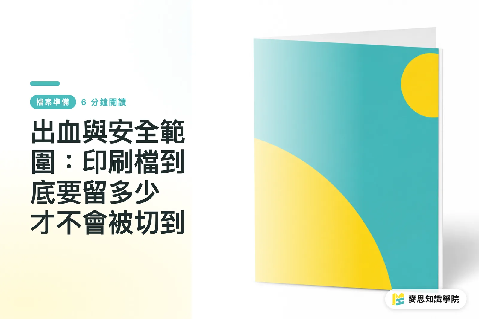
Bleed and Safe Zone: How Much Margin Does Your Print File Actually Need?
Every designer who's been in the game long enough has had a job come back with white edges — the only difference is how many times it took to learn the lesson. This article breaks down bleed and safe zone in full, with a pre-submission self-check routine to make sure your files go to press without any nasty surprises

Paper Weight GSM Explained: How Many GSM for Business Cards, Flyers, and Posters?
Higher isn't always better, and more expensive isn't always right — the key is working backward from the use case Drawing on years of hands-on experience in production and client work, this guide helps you understand gsm, stiffness, and how to choose the right weight for business cards, flyers, and posters
Your printing × AI industry advisor
More than a print shop — we act as an industry advisor, helping brands and companies connect print manufacturing with AI: from prepress, paper and finishing choices to cost optimization, and bringing AI into design and print workflows, automation and digital transformation
Book a free consultation