Why 99% of AI-generated images look like a disaster when printed
In my experience handling thousands of printing projects, over the last six months, I've seen more and more clients asking for quotes using AI-generated images, but almost none of them are directly usable
Where is the problem? Most people get stuck on a fundamental misunderstanding: thinking that 'looking good on screen' means 'ready to be printed'
These two things are fundamentally different from the very beginning
The training base for AI models (whether Midjourney, Stable Diffusion, or others) is massive amounts of internet images, which are inherently born for digital screens (RGB color space, 72dpi resolution)
Printing, on the other hand, follows completely different physical rules: the CMYK color space of ink mixing and a physical halftone resolution of at least 300dpi
If you take an RGB file designed for a light-emitting screen and try to reproduce it on paper with ink, color inaccuracy and blurred details are inevitable
Many designer friends try to fix it later with software, but this is often twice the effort for half the result, or even a total waste of time, because the fundamental DNA of the file is wrong
The real key is to embed the 'print-oriented' mindset in the very first second of generating the image, which is when you write the prompt

How to decide on print size and resolution in the prompt
Since the source is the key, let's start working on the prompt
You can't just tell AI 'give me a 300dpi image'; it doesn't understand physical units, but you can guide it to generate a 'large-pixel image' with high-resolution potential
The first step is to lock in the final print specifications using the Aspect Ratio parameter; this is a hundred times more important than cropping later
I suggest using these sets as your go-to templates:
・- Business cards or loyalty cards (90x54mm): Use --ar 9:5 or a close --ar 16:9, then fine-tune for bleed before printing
・- A series paper (A4, A3, A5): The golden ratio of paper is 1:1.414, so using --ar 1:1.41 or --ar 2:3 is the closest choice, which can reduce cutting waste
・- B series posters (B2, B3): Also suitable for --ar 1:1.41 or --ar 5:7
・- Square format commonly used for social posts: Just use --ar 1:1, this is the simplest
The second step is to add keywords that boost the 'intention' for high resolution in the prompt
Although you cannot specify dpi directly, you can use words like 4K, 8K, ultra-high resolution, highly detailed, sharp focus to drive the model to generate more detailed results with larger pixel dimensions
It's like telling a chef 'we're hosting a banquet today, use the best ingredients'; they will naturally bring out their best assets rather than making a simple stir-fry
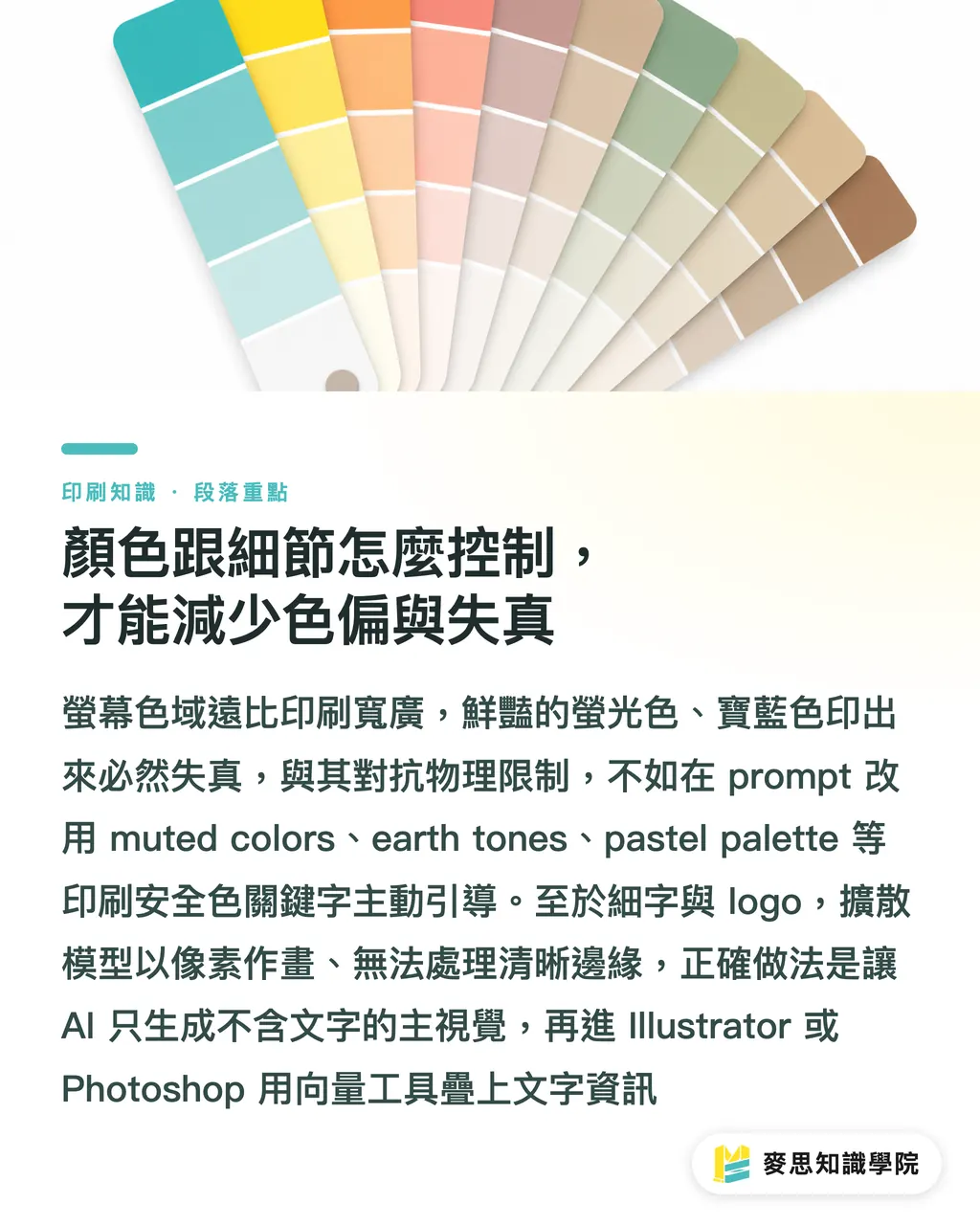
How to control color and details to reduce color shift and distortion
Color is another huge pitfall; the RGB color gamut is far wider than CMYK. The vibrant fluorescent greens and royal blues on the screen will absolutely turn into a dead, dull color when printed
The smart approach isn't to fight physical limitations, but to comply with them
Instead of chasing those unprintable colors, guide the AI to use 'print-safe colors' in the prompt
In your prompt, use these keywords to guide the tone:
・- muted colors
・- earth tones
・- pastel palette
・- monochrome
・- warm color palette or cool color palette
Conversely, absolutely avoid these 'color shift-prone' keywords:
・- vibrant colors
・- neon, luminous, glowing
・- RGB (unless you really only want to make a digital file)
As for the small text and small logos in the image file, my advice is: give up on letting AI generate them
Current diffusion models draw in pixel blocks, not vector paths, so they are inherently incapable of handling small text and fine lines that require sharp edges
The best workflow is:
1. Use AI to generate a clean background or main visual without any text or logos
2. Drag the satisfactory image into Photoshop or Illustrator
3. In the design software, use vector tools or font tools to add your logo and text information
This is the only way to ensure the most important information is clearly readable after printing
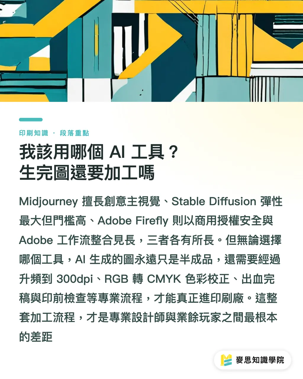
Which AI tool should I use? Is post-processing needed after generating?
Many clients ask me, which is better: Midjourney, Stable Diffusion, or Adobe Firefly?
From a print professional's perspective, they each have suitable scenarios:
・- Midjourney: The quality and artistry are currently top-notch, with the most diverse styles, making it very suitable for projects requiring creativity and visual impact. I personally use it most to brainstorm main visuals
・- Stable Diffusion: Open-source, with the most flexibility. You can train your own models to produce specific styles, but the technical barrier is the highest, suitable for design teams with full-time engineers to invest in long-term
・- Adobe Firefly: Its biggest advantage is 'commercial safety' and 'integration with the Adobe suite'. It boasts training on legal stock libraries, has no copyright concerns, and can smoothly generate or modify images within Photoshop. It is the top choice for corporate clients and designers who value a smooth workflow
But no matter which one you use, remember one thing: AI-generated images are always just a semi-finished product
It's an excellent creative starting point, a super-assistant, but definitely not the final product
For an AI image to enter a printing factory, it must at least go through these professional processes:
1. Upscaling: Use Topaz Gigapixel AI or Photoshop's built-in Super Resolution to bring the pixel dimensions generated by AI to the 300dpi standard required for printing
2. Color correction and conversion: Convert the file from RGB to CMYK in Photoshop, and carefully check color changes, manually adjusting areas with severe distortion
3. Finishing: Add bleed, crop marks, and integrate the text and vector logos mentioned earlier
4. Final check: Use Adobe Acrobat Pro's preflight function to confirm that all settings meet the printing factory's requirements
This entire process is the fundamental difference between professional designers and amateur players
Key takeaways
・Good-looking on screen doesn't mean printable; the root of the problem is that AI defaults to digital RGB output
・Using the --ar aspect ratio parameter to lock in print specifications is the first step in saving costs at the source
・Using muted colors or earth tones in prompts can significantly reduce the risk of color shift when converting to CMYK
・Never let AI force-generate fine text and logos; leave them to be processed in professional design software
・AI images are always just semi-finished products; professional upscaling, color conversion, and finishing are the indispensable last mile
Extended thoughts
AI-generated imagery is not a threat to the printing industry, but a brand new opportunity point and skill requirement
For printing factories, they can think about launching 'AI image optimization and finishing' services to assist clients who want to try AI but don't understand the prepress workflow to land their creativity
For graphic designers, this means your value is no longer just 'drawing well', but knowing how to harness the tool of AI and integrate it into a professional, stable, and predictable printing production process; this is the new core competitiveness
For companies adopting AI, the point is not to disband the design team, but to give them new tools and methodologies, freeing them from repetitive basic drawing so they can focus on higher-level brand strategy and creative integration
In the future, designers who know how to write 'print-oriented prompts' and master the 'AI image post-processing workflow' will be the most sought-after talent in the market
FAQ
- Can I directly write '300dpi' or 'CMYK' in the prompt?
- You can write it, but the effect is indirect. AI models mainly understand pixel dimensions rather than physical DPI. Writing 'CMYK' helps guide the color tone towards a more settled/subdued feel, but the file it generates is essentially still RGB. You must manually convert and proofread in professional software like Photoshop
- Do AI-generated images have copyright issues? Can they be used for commercial printing?
- This depends on the tool you use. Adobe Firefly boasts training on legally licensed stock libraries, making commercial use relatively safer. The copyright specifications for Midjourney and Stable Diffusion are more complex and still changing. It is recommended to read their latest terms of service thoroughly before use, especially regarding commercial licensing
- Why are AI-generated text or small logos always blurry?
- Because the current mainstream image generation AI draws in 'pixels' rather than using 'vector' paths like Illustrator. It is inherently not good at text and graphics that require sharp edges. The best approach is to generate a background image without text, and then add text and logos in design software
- Can AI Upscaling really achieve the 300dpi quality required for printing?
- Yes, but there are limits. Modern AI upscaling software (such as Topaz Gigapixel AI) already has outstanding effects. For most artistic images generated by AI, upscaling is sufficient to meet general printing needs. But if the quality of the original AI image is too poor with too few details, upscaling is just magnifying the blur, so generating a high-quality image at the source remains important