

Why Does Standard CMYK Printing Fail on Transparent Materials?
When printed on transparent stickers or packaging, colors often appear faded because standard CMYK printing inks are semi-transparent and rely on the white background of paper to reflect color properly. To solve this, at MINDS, we usually recommend clients use the "white ink base" technique
A white ink base is a prepress technique where a layer of opaque white ink is printed onto transparent or dark stocks before printing the colored artwork. This white base blocks the substrate from showing through, ensuring that the CMYK colors printed on top retain their original saturation and accuracy
Working with many startups in recent years, I often see designers submit beautiful files for transparent stickers, only to have the design completely disappear once applied to dark glass bottles. By understanding ink properties and mastering the logic of white ink choking and overprinting from the start, you can avoid 90% of printing disasters on the production line
How to Set Up White Ink and Overprint for Transparent Stickers to Avoid Printing Errors?
You cannot just fill a layer with white for the white ink plate; printing presses and RIP systems won't recognize it as white ink. You must create a separate layer in Illustrator and set the color to a "Spot Color," which is commonly named "White" in the swatches panel
After creating the spot color, make sure to check "Overprint Fill" in the Attributes panel. If overprint is not enabled, the software will automatically knock out the colors underneath the white ink layer, causing the substrate color to show through at the edges or leading to unwanted white borders from misregistration
When handling mid-to-high-end fully customized commercial print projects, we often find that designers forget to set up trapping. Typically, the white ink plate should be choked (shrunk inward) relative to the colored design by 0.1 to 0.15 mm. This ensures that even if the printing press shifts slightly, a distracting white line won't show along the edges of your design
Why Can't AI-Generated Box Dielines Be Sent Straight to Print?
Recently, more and more clients have been bringing packaging layouts generated by Midjourney or other generative AI tools for pricing. However, those images are just raster pixel art and completely lack actual structural mechanics and die-cutting viability
A single misplaced dieline can ruin an entire batch of paper boxes and packaging. A production-ready dieline file must clearly define physical boundaries and processing methods:
・Cut lines: Usually represented by solid black lines, determining the final physical boundaries and outline of the packaging
・Fold and crease lines: Usually indicated by dashed or red lines, precisely showing where the cardboard needs to be folded
・Bleed area: Colored artwork must extend beyond the cut line by at least 3 mm to prevent white edges caused by cutting tolerances
Dielines must also be placed on a separate layer, set as a spot color, and marked with "Overprint Stroke"; otherwise, the artwork underneath the dielines will be knocked out. Among the file-correction requests we receive online at MINDS, failing to enable dieline overprint ranks in the top three most common mistakes
How Should You Layer and Organize Packaging Files for the Print Shop?
To make plate-making smooth, an Illustrator source file must have layers organized so that anyone taking over can immediately distinguish between what is to be printed, what requires post-processing, and what is for reference only. Crowding all elements onto a single layer only increases the time and cost spent on back-and-forth communication
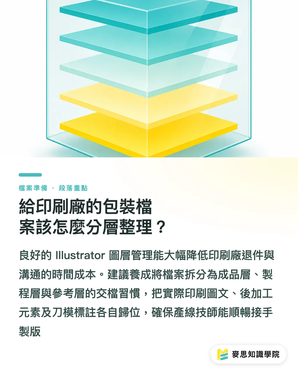
I recommend adopting the "MINDS 3-Layer Delivery Method" to organize your artwork, putting complex prepress elements into their proper places
・Artwork Layer: Contains all CMYK colored graphics, text, and background images that will actually be printed
・Processing Layer: Houses post-processing elements like the white ink plate, foil stamping, and embossing, all set to spot colors and overprint
・Reference Layer: Contains dielines, dimensions, and structural notes for the press technicians' alignment reference. This layer is hidden when producing the printing plates
Establishing this structured file management habit allows production technicians to take over your file seamlessly, whether you are dealing with a structural packaging factory or a traditional print shop, drastically reducing the likelihood of file rejection
Key Takeaways
・Transparent materials and dark paper must have a white ink base; otherwise, the semi-transparent nature of CMYK inks will cause severe color distortion
・White ink and post-processing plates must be set as "Spot Colors" and have "Overprint" enabled to prevent the software from automatically knocking out the underlying layers
・AI-generated packaging layouts lack structural integrity and must be redrawn as standard vector dieline files with cut lines and bleeds
・Applying the MINDS 3-layer delivery method to separate your artwork, processing, and reference layers is the fastest way to cut down communication costs and rework
Further Thoughts
As the volume of artwork produced at the front end skyrockets, the pressure of prepress checking at the back end doubles. Future printing SaaS and automated file inspection tools will inevitably need built-in proofing mechanisms for spot colors and overprints. As a designer or print buyer, internalizing the 3-layer delivery method into your standard operating procedures early on will make your files the most welcomed "Grade-A" inputs at any print shop
FAQ
- When do I need to set up a white ink layer?
- Whenever you print on transparent stickers, transparent plastic bags, silver foil paper, or dark paper stocks, you need a white ink base layer. Otherwise, the printed colored graphics will be directly absorbed or overpowered by the color of the substrate
- What exactly does "Overprint" do in Illustrator?
- Overprint forces the top ink layer to print directly over the bottom ink layer instead of knocking out the color underneath. This is absolutely essential for dielines or white ink plates to prevent unnatural white gaps along the edges of your design
- Why can't dielines be placed on the same layer as the colored artwork?
- During plate-making, dielines serve only as non-printing references. Separating them onto a different layer allows prepress technicians to hide the dielines with a single click to output the printing plates directly, rather than manually selecting and deleting lines, which risks accidentally deleting text or graphics
Related articles





The Print × AI weekly
The print and AI know-how designers, brands and enterprises can use before they commit — one email, every week
MINDS Free Tools
Imposition calculator and preflight file check — free prepress tools, right in your browser.
MINDS Group
Need actual printing or gifting services?
From premium printing to online ordering and festive gifts — the MINDS Group sister brands take it from here.