

Why Clients Are Terrified of Designs That "Look Like AI"
Clients are not afraid of AI. They are afraid their brand will look like a cheap, throwaway template. The software world has been talking about this a lot lately: while instantly generated interfaces are fast to produce, that stiff, cookie-cutter look ruins user trust and hurts conversion rates
From what I have seen on the production floor and in client conversations, this anxiety is already spilling into print orders. Plenty of designers never even touched a generative tool, yet clients reject their work for looking cheap just because of over-processed stock photos or harsh synthetic lighting. For print shops, this means proofing rounds explode. Jobs ready for the press get stuck in limbo over visual distrust, delaying quote turnarounds and press scheduling
Do not panic. This is actually the perfect moment for physical print to pull ahead of the competition. When the cost of generating on-screen visuals drops to near zero, real physical texture becomes a brand's most reliable defense

How Physical Print Strips Away Machine Coldness
You break the stiffness of flat surfaces with weight and tactile feel. The fastest way to win back trust in original work is to extend design thinking all the way to finishing techniques and substrate choices
Whenever I run into artwork that feels too slick or plasticky, I usually advise clients to make deliberate moves with their paper
・Fine art papers: Switch to textured watercolor paper or handmade stocks. Let the natural fibers and tooth of the paper soften overly sharp digital edges
・Post-press finishing: Add spot UV or embossing to focal points. Embossing uses male and female dies to press paper from the back, creating a raised, three-dimensional relief on the surface. That dynamic play of light and shadow shifting with every viewing angle is something no screen or AI render can ever replicate
To execute these finishes cleanly, designers must deliver properly separated vector layers. We usually ask clients to follow the MINDS prepress guidelines by keeping finishing spot plates, dielines, and base artwork on distinct layers. This proves the logic behind the production and cuts down on missing prepress assets. Sometimes just seeing a crisp, clean K100 finishing plate from a client tells me the job will run without a hitch
How Small and Mid-Sized Print Shops Should Handle Incoming Orders
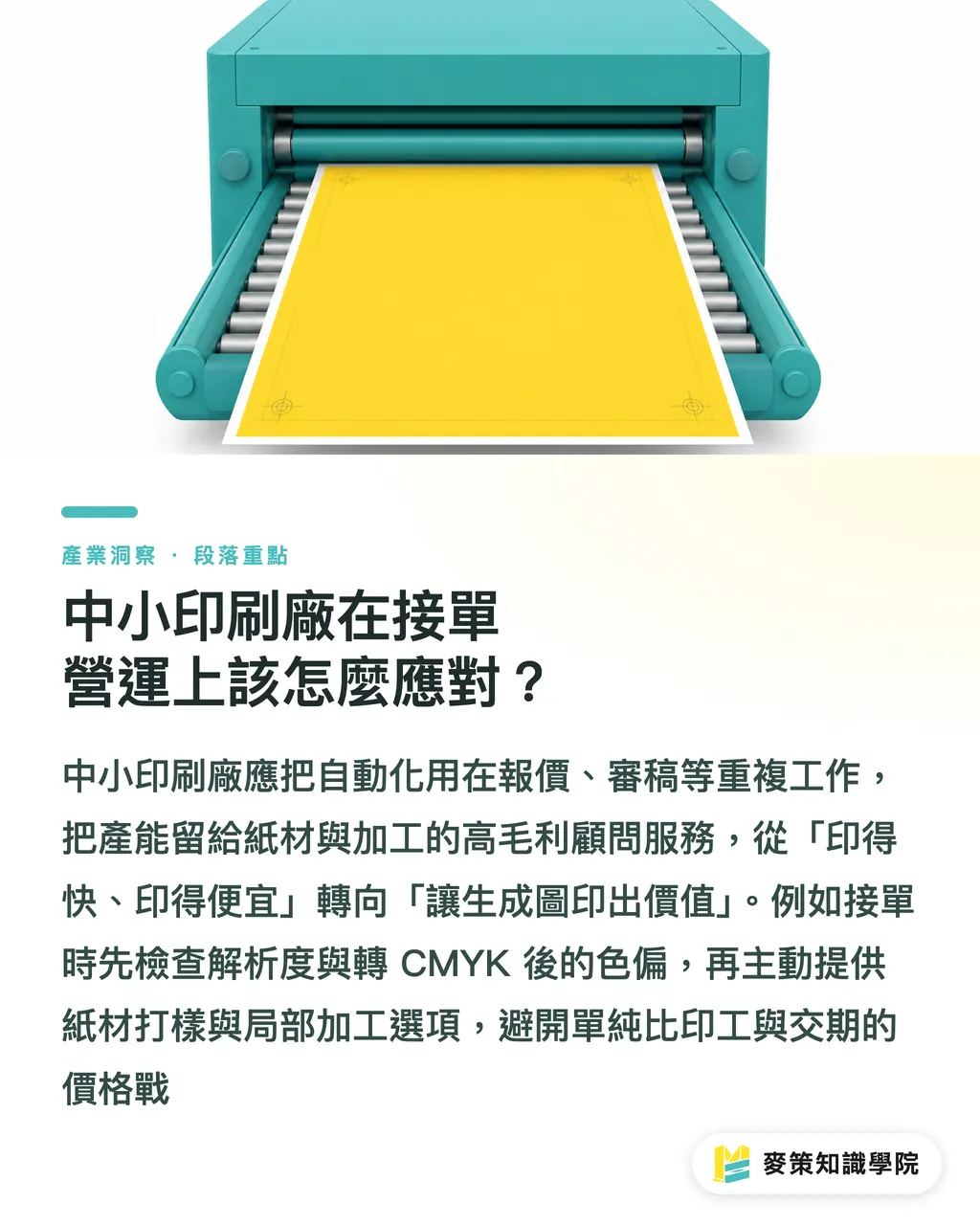
Put automation to work on repetitive grunt work, and save production capacity for high-margin specialty finishing. There is no need to join the chorus protesting AI visuals. What needs to change is our sales pitch and our profit model
When a client brings in an AI-rendered image asking for quick turnaround, competing purely on press time and speed just triggers a race to the bottom. In practice, shops should set up a review system similar to the Mai Strategy three-stage print checks:
1. Resolution and color mode checks: Ensure color shifts stay within acceptable limits after converting AI art to CMYK
2. Stock matching recommendations: Proactively offer proof comparisons across two or three paper stocks
3. Finishing upgrade options: List optional specialty finishes as line items right on the quote
It comes down to this: we are no longer just putting ink on paper. We are offering consulting that makes the final piece feel valuable. By standardizing everyday quotes and file reviews with clear folder structures and job tracking, production reps can spend their time discussing paper stocks and finishing details with clients. That is the real key to driving up press utilization and margins
Key Takeaways
・Clients do not reject the tools themselves. They reject undifferentiated, cookie-cutter templates
・Tactile paper textures and specialty finishes like embossing effectively counter the stiff, synthetic feel of digital artwork
・Enforcing clean vector layers and strict prepress standards protects print quality while rebuilding trust in design work
・Print shops should move away from price wars based purely on speed and start offering consultative value around paper and finishing upgrades
Food for Thought
When generated visuals cost next to nothing, tactile experiences you can hold in your hands become far more valuable. For print shops and designers, now is the time to audit paper swatch libraries and trade finishing partners. Instead of worrying about technology taking away design jobs, focus on automating tedious quoting and file prep so you can invest your energy into physical proofs and finishing concepts that machines cannot duplicate
Further Reading
FAQ
- Why does my client think my design looks cheap?
- It usually comes down to over-edited stock assets, harsh synthetic lighting, or a lack of refined typography and human touches. These elements make the visual feel flat and stripped of distinct brand personality
- How can I fix plasticky AI artwork during printing?
- Switch to textured fine art paper with visible fibers to soften digital sharpness, or apply finishes like spot UV and embossing to add real dimensional lighting effects
- How can print shops handle the influx of AI artwork without falling into price wars?
- Standardize routine prepress checks and quote calculations. This frees up production staff to focus on high-margin paper and finishing consultations, driving up overall order value
Related articles





The Print × AI weekly
The print and AI know-how designers, brands and enterprises can use before they commit — one email, every week
MINDS Free Tools
AI background removal, brand stamping, and a LINE sticker maker — free design tools, right in your browser, no upload.
MINDS Group
Need actual printing or gifting services?
From premium printing to online ordering and festive gifts — the MINDS Group sister brands take it from here.