Introduction: Why Paper Weight Deserves to Be Redefined
Paper weight seems like a simple number, but it is actually the single parameter with the widest impact on printing specification decisions. This section first defines the problem, then outlines the contributions of this article and its relevance to the industry in Taiwan
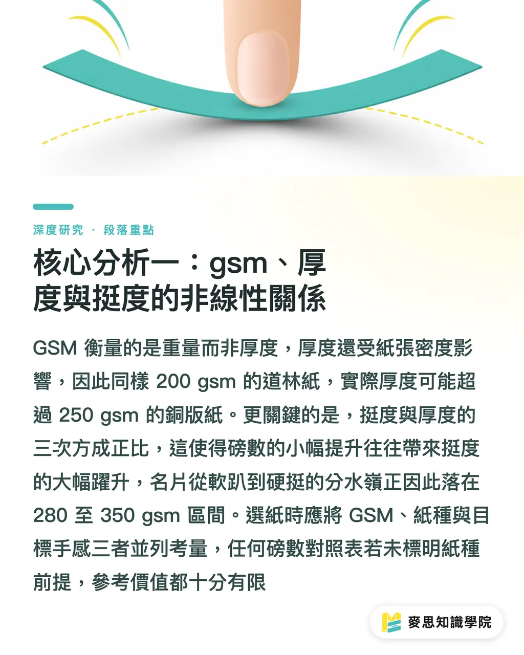
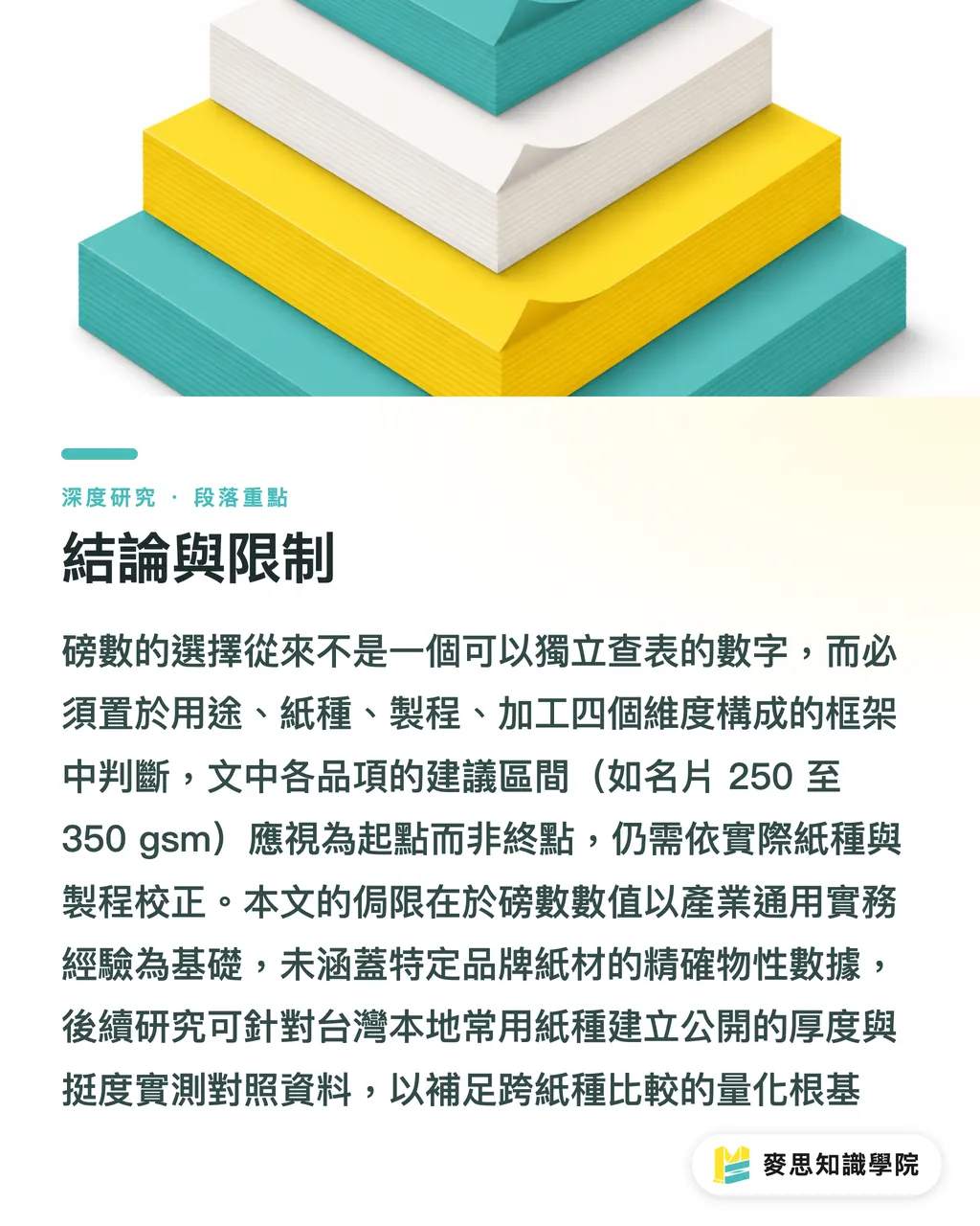
In Chinese printing practice, the term 'poundage' (weight) has long been used to describe the thickness and stiffness of paper. However, its metric basis is actually gsm (grams per square metre), which is the mass of a one-square-meter sheet of paper. This article argues that this definition itself conceals the most common source of misunderstanding in practice: gsm measures 'weight per unit area,' whereas users actually care about 'thickness' and 'stiffness'—two tactile sensations. While weight, thickness, and stiffness are highly correlated, they are not equivalent, and this discrepancy is the root cause of paper selection pitfalls
The problem statement can be boiled down to three aspects:
・First, the same gsm value presents completely different tactile feel and visual thickness on different types of paper
・Second, a higher weight is not always better; exceeding a specific threshold will lead to finishing failures such as fold cracking
・Third, digital and offset printing have different tolerances for paper weight, meaning specifications cannot be directly transferred between processes. Together, these three aspects form the core question this article aims to answer: how to systematically select paper weight across the entire spectrum of applications, from business cards to packaging
The contribution of this article lies in restructuring the fragmented practical knowledge of paper weight across various product categories into a searchable and referable framework, rather than just providing a static lookup table of numbers. For Taiwan's design and printing industries, this topic is of practical importance: the local market consists primarily of small-to-medium print shops and freelance designers. Communication of specifications relies heavily on verbal, experience-based sharing and lacks a structured, common language, leading to frequent reprinting, returns, and cost disputes. Establishing a clear set of weight selection criteria helps reduce these communication costs
Literature and Current Status Review: Three Main Lines of Discussion and the Gap
Existing discussions on paper weight can be broadly categorized into three main lines of thought, which complement each other but are rarely integrated. This section reviews these three lines before defining the focus of this article
The first line is the 'product-matching' approach. Beginning with the final application, these discussions suggest suitable weight ranges for various printed products. For instance, office documents and flyers fall between 80 and 120 gsm; brochures and brochure inner pages range from 157 to 200 gsm; business cards and covers fall between 250 and 350 gsm; and luxury packaging and sticker substrates are often 400 gsm or higher. This article notes that while this approach is highly actionable and quick to consult, its weakness is that it treats paper weight as an independent variable, overlooking the interactions between paper type, printing process, and post-press finishing
The second line is the 'material properties' approach. Starting from the physical structure of paper, these discussions emphasize that coated paper (such as art paper), due to calendering, has its fibers compressed by fillers and coatings. Consequently, at the same gsm, it feels smooth and appears thinner yet stiffer. Uncoated paper (such as woodfree paper), on the other hand, features looser, uncompressed fibers, making it appear thicker and absorb more ink at the same gsm. This perspective addresses the blind spot of the first line by identifying the root mechanism of 'same weight, different feel'—namely, the difference in paper bulk
The third line is the 'process compatibility' approach, which focuses on the physical limitations that printing and finishing equipment impose on paper weight. Examples include digital printing's sensitivity to thick paper due to its feeding and fusing mechanisms, offset printing's higher tolerance for heavy-weight stocks, and the correlation between fold cracking risks in ultra-thick paper and grain direction. This article argues that while this line is the most critical in practice, it is the one most commonly omitted in introductory materials written for designers
Taken together, while these three lines of thought are valid individually, they are rarely woven into a coherent decision-making process. The unresolved gap in current discussions is the lack of an integrated standard that simultaneously incorporates application, paper type, and printing process. As a result, users struggle to reason through concrete questions like, 'Why do quotes and tactile feels differ so much between two suppliers for the same 300 gsm paper?' This integration gap is precisely the entry point for this article
Core Analysis 1: The Non-Linear Relationship Between GSM, Thickness, and Stiffness
The first step in understanding paper selection is to demystify gsm, shifting it from a synonym for 'thickness' back to a 'measure of weight.' This section breaks down the relationships and mechanisms among these three factors
gsm measures mass per unit area, whereas thickness (measured in µm or mm) is determined by the combined effect of gsm and paper density. Within a single paper type, a higher gsm typically yields greater thickness, showing a positive correlation. Thus, estimating thickness using gsm is generally reliable when choosing within one paper type. The issue arises when comparing across different paper types: coated paper has high density and occupies less volume per unit weight, making it thinner at the same gsm. Conversely, uncoated paper has low density and high bulk, making it thicker at the same gsm. This means a 200 gsm woodfree paper can have a physical thickness close to or even exceeding that of a 250 gsm art paper
Stiffness is another independent dimension. It is roughly proportional to the cube of thickness, which is an extension of the bending stiffness principle of beams in mechanics of materials applied to paper. This article argues that this non-linear relationship explains a frequently overlooked phenomenon: a slight increase in paper weight often leads to a dramatic leap in stiffness. Going from 250 gsm to 300 gsm seems like a mere 20% increase in weight, but the increase in stiffness can be much larger. This is the physical reason why the sensory watershed for business cards, transitioning from 'floppy' to 'firm and stiff,' usually falls within the 280 to 350 gsm range
From this, we derive the first criterion: paper selection must evaluate gsm, paper type, and target sensory experience together, rather than comparing gsm directly across different paper types. When a client requests a 'thicker business card,' increasing the gsm is only one option. Switching to an uncoated paper with higher bulk, or opting for a custom duplex-laminated structure, can yield a similar level of stiffness at different price points
The conclusion of this section is foundational to subsequent analyses: paper weight is not an isolated variable, and any comparison table is only meaningful under the premise of a specific paper type
Core Analysis 2: The Perceptual Mechanism of Tactile Feel and Coating Variables
Tactile feel is the most subjective dimension in paper selection, yet it is also the most frequently used standard for quality acceptance. This section analyzes how tactile feel is composed of controllable physical variables
Tactile feel is not a single sensation, but comprises at least three distinct perceptual channels: surface texture (smooth or rough), perceived weight (heft in the hand), and perceived stiffness (rebound when bent). Whether paper is coated primarily affects the first channel. Coated paper's coating fills the pores between fibers, creating a smooth surface with uniform reflection; hence, art paper feels smooth, prints sharp dots, and offers saturated colors. Uncoated paper retains its fibrous texture, offering a warm and slightly textured feel, but because ink sinks into the fibers, it yields lower color saturation and muted, grayish dark tones. This explains why photos or high-saturation visuals printed on uncoated paper often look 'dull or grayish.'
In practice, these three channels can be adjusted independently, which gives design decisions more breathing room. This article suggests that a heavy-weight uncoated business card can deliver both a 'solid sense of weight' and a 'warm surface texture'—a combination hard to replicate with art paper of the same weight. Conversely, if a brand demands refined and sharp visuals, coated paper is superior in both surface feel and printing performance. The choice of tactile feel is therefore fundamentally a physical translation of brand positioning, rather than a simplistic formula of 'thicker equals more premium.'
From a procurement and verification perspective, the subjectivity of tactile feel makes 'requesting physical paper samples' an indispensable step. Screens cannot convey weight or stiffness, and gsm values fail to communicate surface texture. This article emphasizes that a correct proofing workflow should require suppliers to provide physical samples of the 'specified paper type and specified weight,' which should be manually inspected to confirm that all three perceptual channels meet expectations before final sign-off. If post-press finishing (such as lamination or die-cutting) is involved, it is best to get samples with those treatments applied, as lamination alters both surface texture and stiffness
This section points to the second criterion: tactile feel cannot be fully described by numbers; verifying physical samples is a mandatory step in specification decisions, not an optional one
Core Analysis 3: Printing Process Boundaries and the Cracking Threshold of Ultra-Thick Paper
The upper limit of paper weight selection is not determined by aesthetic preference, but by the physical limits of printing and finishing processes. This section analyzes these often-underestimated hard constraints
The first boundary comes from the printing process. Digital printing, which uses toner or liquid toner and relies on precise roller transport and heat/pressure in the fuser unit, is highly sensitive to paper thickness and rigidity; paper that exceeds equipment specs can easily jam or result in poor fusing. Offset printing transfers ink via cylinders and has a much higher tolerance for heavy stocks, commonly printing on cardboards of 400 gsm or more. This article highlights a practical consequence of this difference: if a project is proofed using a short-run digital press and then mass-produced on an offset press, the designer must verify that the weight tolerances of both processes align, otherwise the tactile feel of the proof may not match the mass-produced run
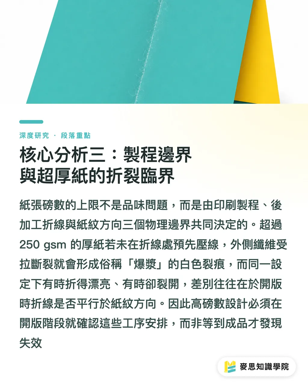
The second boundary arises from finishing, where fold cracking is the most typical failure mode. When paper weight exceeds a certain threshold (usually 250 gsm or higher requires caution), folding it directly will stretch the outer fibers beyond their tensile limit, causing them to break and create white cracks along the fold line (commonly referred to as 'bursting' or 'cracking'). The solution is to 'crease' (or score) the fold line beforehand, using a blunt rule to press a groove that coaxes fibers inward and reduces tension on the outer edge. This article notes that understanding this mechanism is valuable because it transforms 'whether thick paper can be folded' from a taboo based on trial-and-error into a preventable process problem
The third boundary is closely tied to grain direction, which is also the most frequently overlooked variable. During the paper-making process, fibers align in the direction of the machine's movement, creating a distinction between along-the-grain (grain long) and against-the-grain (grain short). Folding along the grain direction is smoother and carries a lower risk of cracking, whereas folding perpendicular to the grain snaps fibers horizontally, significantly increasing the likelihood of cracking. This article argues that this explains why, with the same paper weight and crease settings, results are sometimes perfect and other times cracked: the difference is often the relative orientation of the fold to the paper grain during imposition. Therefore, for products involving folds (such as brochures, book covers, and packaging boxes), arranging the fold lines to run parallel to the paper grain during the imposition stage is an early decision that both design and production teams must incorporate
Combining these three boundaries yields the third criterion: the upper limit of paper weight is dictated jointly by the printing process and finishing methods. Heavy-weight designs must have their printing method, creasing arrangements, and grain direction confirmed before plate imposition, rather than discovering failures only after the final product is printed
Implications for Taiwan's Design and Printing Industry
For the aforementioned criteria to take root, they must be translated into actionable steps tailored to different industry roles. This section provides practical recommendations for small-to-medium print shops, designers, and brands
For small-to-medium print shops, structuring knowledge about paper weight serves as a lever to reduce returns and disputes. A viable approach is to build a physical sample wall organized by 'paper type × weight,' annotated with common applications, compatible printing processes, and creasing recommendations for each combination. This gives sales reps and clients a shared material reference during communication, rather than relying on vague verbal descriptions like 'this one is thicker.' Making grain direction and creasing requirements standard confirmation items in the quoting process can intercept the vast majority of cracking complaints at the source. In terms of cost and schedule, such upfront checks add virtually zero cost while preventing the substantial material and labor losses of reprinting
For designers, the key is to advance weight decisions to the design stage rather than treating specifications as an afterthought post-delivery. Practical steps include: confirming final application, printing process, and finishing methods before layouts are finalized, and using those constraints to work backward to determine paper type and weight; for items requiring folding, proactively aligning fold lines parallel to the grain during imposition; and for projects requiring a specific touch, proactively requesting physical paper samples from the printer rather than ordering blindly based on numbers. This article suggests that if designers think in the sequence of 'application determines finishing, finishing determines weight, and weight pairs with paper type,' they can dramatically reduce back-and-forth edits with the printer, thereby shortening delivery times
For brand owners, paper weight is the physical carrier of brand texture and quality, and deserves to be included in brand guidelines. Brand owners can specify the exact paper types and weight ranges for core items (such as business cards, catalogs, and packaging) in their brand identity guidelines. This ensures a consistent tactile experience across different suppliers and production runs, avoiding discrepancies where the same business card feels different depending on the printer. In terms of cost management, this also enables brands to make informed trade-offs between 'maintaining quality' and 'controlling unit costs,' rather than renegotiating specifications with every reprint
The shared implication across all roles is that communicating about paper weight requires a common language. This article argues that the current communication model in Taiwan's industry, which relies heavily on verbal and experience-based descriptions, is a structural cause of specification disputes. Promoting a standardized specification description using four key elements—'paper type + gsm + printing process + finishing'—is a viable direction for reducing overall transaction costs
Conclusion and Limitations
This article responds to the core questions raised in the introduction and transparently outlines the boundaries of its conclusions
In response to the question 'how to systematically select paper weight from business cards to packaging,' this article posits that paper weight should not be treated as a standalone variable for lookups. Instead, it must be evaluated within a decision-making framework comprising four axes: application, paper type, printing process, and finishing. The three progressive criteria are: first, gsm must be paired with paper type to estimate sensory experience; second, tactile feel must be verified using physical samples rather than numbers; and third, the upper limit of weight is jointly determined by process and cracking thresholds, and is highly sensitive to grain direction. Suggested weight ranges for individual applications (e.g., 250 to 350 gsm for business cards, 157 to 200 gsm for inner pages, and 400 gsm or higher for luxury packaging) should be understood as starting points rather than end goals, with final specifications adjusted for paper type and printing process
The limitations of this article must be clearly stated:
・First, the weight ranges and cracking thresholds discussed herein are based on common industry experience. Actual values will vary depending on mill specifications, equipment conditions, and specific paper formulations; this article does not cover precise physical properties of specific brand-name stocks
・Second, this article focuses on standard paper-based commercial printing and does not delve into specialized fields such as specialty papers, synthetic papers, corrugated structures, or multi-ply laminations, whose weight logic may diverge from the framework proposed here
・Third, the perception of tactile feel is subject to cultural and individual variations. While this article provides an analytical breakdown using a three-channel model, it has not conducted systematic user perception measurements
Three directions for future research are identified:
・First, a public database matching 'gsm to thickness and stiffness' could be established for paper types commonly used in Taiwan, providing a quantitative baseline for cross-paper comparison
・Second, controlled experiments could be conducted on cracking thresholds and grain directions to make the experience-based 'caution zones' more precise
・Third, digital communication tools for paper specifications could be explored, such as embedding the four-element specifications into standardized proofing workflow fields, to verify their actual efficacy in reducing reprint rates. It is hoped that the proposed framework can serve as a common starting point for these future endeavors
Key Takeaways
・gsm measures weight per unit area and is not equivalent to thickness or stiffness. Comparing weights across different paper types only makes sense when the paper type is specified
・At the same gsm, coated paper (art paper) feels smooth and looks thinner due to calendering, whereas uncoated paper (woodfree paper) feels thicker and absorbs more ink due to high bulk. The difference in feel stems from density and coatings
・Stiffness is roughly proportional to the cube of thickness. Thus, a minor increase in weight often yields a significant leap in stiffness. The sensory threshold for business card firmness lies mostly between 280 and 350 gsm
・Directly folding paper over roughly 250 gsm is highly prone to cracking; pre-creasing is required, and fold lines should run parallel to the grain direction to minimize cracking risks
・Digital printing is sensitive to thick paper, whereas offset printing has a higher tolerance. Before cross-process production of the same project, verify that the compatible weights are consistent, and always request physical paper samples to verify the tactile feel
Further Reflections
The implication for the industry is that paper weight disputes stem not from a lack of technical expertise, but from the absence of a shared language for specifications. For print manufacturers, establishing physical samples of 'paper type × weight' and standard confirmation checklists forms a low-cost, high-return defense against customer complaints. For designers, pushing the weight decision earlier to the imposition stage and considering grain direction can significantly shorten turnaround times. For SaaS and AI integration, the most promising path is embedding the four-element specifications—'application + gsm + printing process + finishing'—into online proofing and quoting workflows. This allows systems to automatically detect fold cracking risks, process incompatibilities, and grain alignment conflicts before orders are placed, transforming the tacit knowledge of experienced print production professionals into scalable front-end checks. The remaining hurdle is the lack of public empirical thickness and stiffness data for local paper stocks, which means any automated judgment still relies on physical sample calibration. This represents a foundational infrastructure that the industry should collaborate to build
FAQ
- What gsm should I choose for business cards?
- The typical recommendation is between 250 and 350 gsm, with the threshold for firmness usually at 280 gsm or higher. However, the actual feel also depends on the paper type—uncoated paper will feel thicker and sturdier at the same weight. Ultimately, you should verify with a physical paper sample
- Why do two papers of the same 300 gsm feel different in thickness?
- Because gsm measures weight, not thickness. Coated paper has a higher density and is thinner yet stiffer at the same weight, whereas uncoated paper has a higher bulk and is thicker at the same weight. Consequently, their perceived thickness will differ significantly
- Why does thick paper crack when folded, and how can it be avoided?
- When paper exceeding roughly 250 gsm is folded directly, the outer fibers break, resulting in white hairline cracks. The solution is to pre-crease (score) the fold lines and align them parallel to the paper grain, which significantly reduces cracking
- Are the compatible paper weights the same for digital and offset printing?
- No. Digital printing is more sensitive to thick paper and has a lower weight limit, whereas offset printing has a much higher tolerance for heavy stocks. If a project uses different processes for proofing and mass production, you must confirm that both processes support the selected paper weight
- What should I pay attention to during procurement and proofing?
- Always request physical paper samples of the 'specified paper type and weight,' as screens and numbers cannot convey weight, stiffness, or surface texture. If the product involves post-press treatments like lamination or die-cutting, it is best to get samples with those treatments applied
Related articles
- The New Direction of 2026 Packaging Design: How Coca-Cola Ignited Curiosity with a Single Sticker
- A Study on Spot Color Application and Brand Color Consistency: A Guide to the Pantone System for Design and Print Procurement
- Mastering English Terminology for Paper Boxes: A Guide for Packaging Design and Printing Procurement