

Overview
You have probably seen this before: a designer fills a business card file with Spot UV, expecting the finished piece to look brilliantly glossy. Then the proof arrives, the varnish is off by 0.5mm, fine text turns muddy, and the whole card looks cheap and chaotic. The client's first instinct is to blame the machine, but once the file is opened, the problems are almost always in prepress: the mask is not separated, the Spot Color is named incorrectly, or the coverage area is pushed too far
The premium feel of Spot UV does not come from "adding more gloss to make it look more expensive." In fact, it is the opposite. It depends on contrast: glossy areas look glossy because enough dark, matte space sits beside them. The core question this article answers is this: how should a file be prepared, how should tolerance be handled, and how should effects be paired so Spot UV actually delivers the intended result?
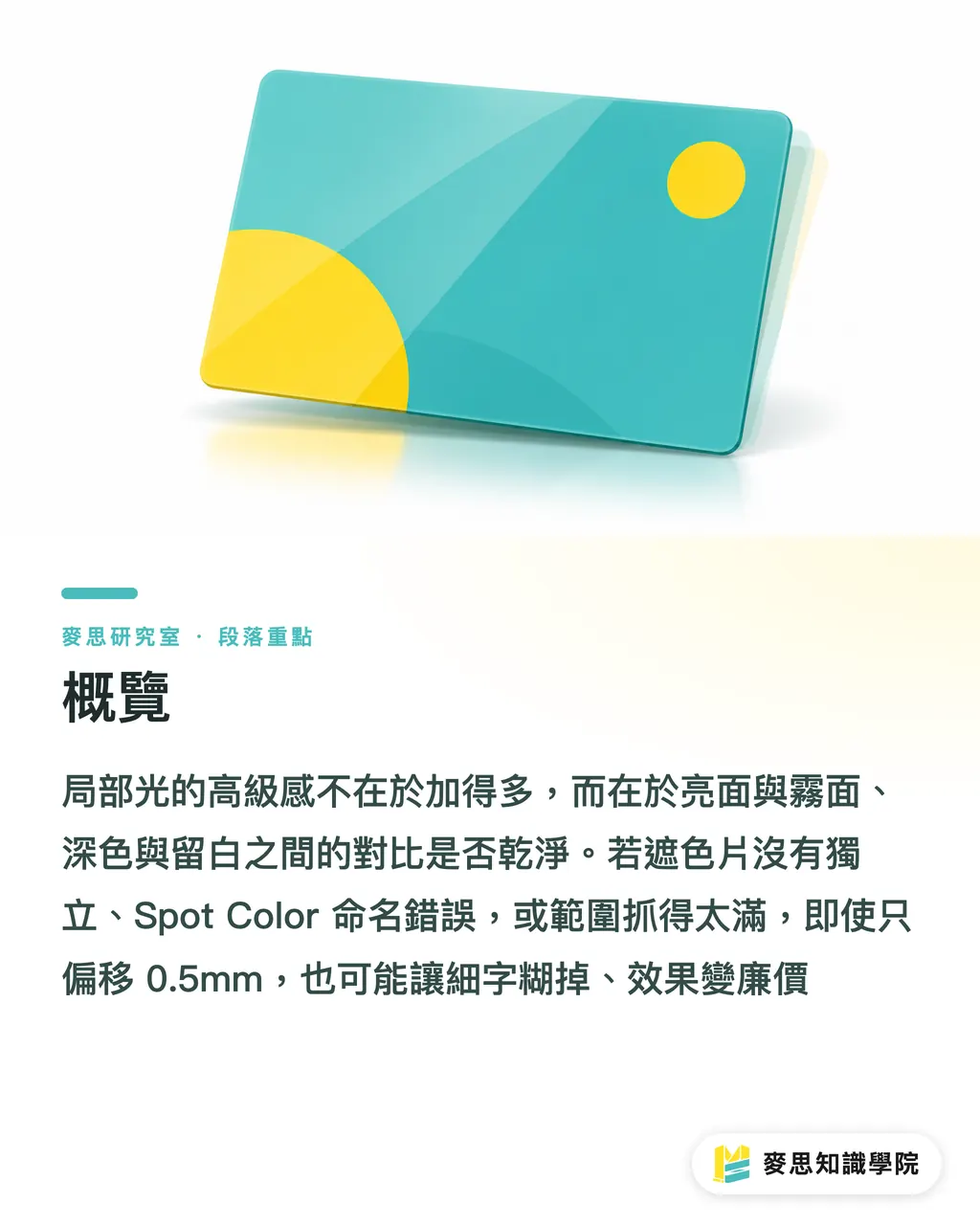
Where Does the Premium Feel of Spot UV Really Come From?
The answer is straightforward: it comes from the contrast between matte and gloss, not from the surface area of the glossy finish itself
There is physics behind this. A transparent varnish layer over a printed surface changes how light is reflected and scattered, which in turn changes the color depth and brightness we perceive. The film layer itself is an optical interface that can "shift color," and this is a measurable phenomenon in color science[2]. The same ink tone looks deeper, more saturated, and more dimensional under gloss varnish; a matte coating, by contrast, scatters light through its surface microstructure, creating a clearly different perceived color texture[4]
In other words, when you apply gloss UV selectively on top of a matte film, you are not just creating "an area that reflects light." You are creating a side-by-side optical comparison: one side scatters light, the other pulls light back into focus. That contrast is where the premium feel comes from. Research also shows that matte finishing systematically affects how people perceive "color quality"[3], which explains why "dark matte film plus selective gloss" is such a reliable combination. The darker and more matte the base, the more the glossy areas pop
Conversely, if the entire layout is covered with Spot UV, you remove the control group. The eye has no reference point, so the gloss loses meaning, and the final piece looks flat and visually dirty. This is the first misconception I see most often: treating Spot UV as decoration where "more means more luxurious," instead of using it as a contrast lever
How Should the Mask Be Built So the Print Vendor Does Not Misread It?
The core rule: the main print layer and the Spot UV mask must be separated into two independent layers, and the mask must use a dedicated Spot Color name with a 100% solid fill
In practical terms, your production file contains two pieces of information stacked together: the CMYK artwork that will actually be printed, and the mask that tells the printer which areas should receive varnish. That mask must:
・be placed on its own layer, not mixed into the main artwork layer;
・use a named Spot Color, such as "UV Varnish" or "Spot Gloss," so the vendor can instantly identify it as a varnish plate rather than a printable color;
・be filled with 100% solid black or a 100% solid spot color. Do not use grayscale or transparency. Varnishing is binary: it is either on or off. There is no such thing as "70% varnish."
Why does naming matter so much? Because at the vendor's end, the varnish plate is identified and separated by that Spot Color name. If the name is wrong, or if the designer draws the mask on the K plate as ordinary black, it will be treated as print content during output, and the entire varnish plate may disappear or shift out of position. That is not the machine's fault. The file gave the wrong instruction at the source
My advice: before submitting the file, always run a separation preview yourself. Confirm that the Spot Color plate contains only the shapes you want varnished, and that the main print plates are clean with no leftover mask color. This takes less than a minute and can prevent the most expensive kind of reprint

How Much Registration Tolerance Do You Need? Why Do Fine Characters Get Blurry Edges?
First, the number: once the Spot UV position shifts by more than 0.5mm, the misregistration becomes visible to the naked eye; so for any graphic with fine text or thin lines along the edge, the mask area should be inset by 0.2–0.3mm, leaving physical room for registration tolerance
The key point is that Spot UV is a "second pass." It is applied after the main artwork has already been printed, so registration error between the two passes is inevitable. You can zoom in to 800% on screen and align everything perfectly, but that does not change the physical limits of real production equipment. A designer's perfect alignment has to coexist with that tolerance once the job reaches the line
So "insetting" is not cutting corners. It is error-proofing. If the gloss plate is exactly flush with the edge of text, even a tiny shift of a few tenths of a millimeter will push varnish outside the letters or leave an unvarnished rim along the edge. From a normal viewing distance, that reads as blurry and dirty. Pull the mask inward by 0.2–0.3mm, and you are proactively creating tolerance space. Even if the registration shifts slightly, the gloss still lands safely inside the artwork, making the result look cleaner
The same logic applies to ultra-fine lines and very small type. They are simply not good candidates for Spot UV. If the line width is smaller than the registration tolerance, you are asking the machine to achieve precision it cannot physically deliver. In those cases, I usually advise clients to either enlarge the element or turn it into a solid block for varnishing. Do not fight physics
What Is the Difference Between Spot Matte, 3D UV, and Sand UV, and When Are They Worth the Extra Cost?
In one sentence: they differ in how the surface handles light, not simply in how expensive they are. Which one you choose depends on whether you want visual contrast, tactile dimensionality, or a matte-grain texture
・Spot Matte: applies a matte area selectively over a glossy base, creating "reverse contrast." It does not make an area glossier; it makes that area more matte. It works well for designs that want an overall glossy look while subtly calling attention to a specific area. Matte surfaces scatter light and change color perception in that area[4], and this delicate difference is most noticeable up close and through touch
・3D UV: stacks thicker UV resin to create a raised, tactile surface and visible thickness. It emphasizes touch, not just reflection. Unit cost is usually the highest, so it suits focal elements that should genuinely be felt, such as logos or brand marks with a foil-stamping level of presence
・Sand UV: a coating with a grainy surface feel, sitting between matte and gloss while adding a distinctive tactile texture
Whether it is worth paying more comes back to the same old question: can this effect be seen or felt? The value density of Spot UV depends on whether the contrast works. Instead of piling all three effects on top of one another and making them compete, choose one main lever and execute it properly. My test is simple: ask, "If this finish is removed, will the final piece look worse?" If yes, keep it. If no, spend that money on paper or print quality instead
Here is a practical closing judgment: for Spot UV to look premium, the order should be "define the contrast first, prepare the file second, then discuss effect types last." A dark matte base with selective gloss is a reliable starting point. Keep the mask on its own layer, name it correctly, and inset fine text edges by 0.2–0.3mm, and you can prevent 90% of failures
Scope note: this logic is built around a visual strategy of matte-gloss contrast. If your design is meant to follow an all-gloss luxury direction, or a large-area foil approach that wins through volume, then the contrast rule needs to be recalibrated. In that case, Spot UV may not be the best answer. Step back first and ask what visual purpose the finish is supposed to serve

Key Takeaways
・The premium feel of Spot UV comes from the contrast between matte and gloss, not from the surface area of the glossy finish. Covering the whole layout can make the effect disappear
・The main print layer and the Spot UV mask must be separated into two independent layers. The mask should use a dedicated Spot Color name and a 100% solid fill, otherwise the vendor may misread it or fail to print it
・Once the Spot UV position shifts by more than 0.5mm, the misregistration is visible to the naked eye; for graphics with fine text, the mask area should be inset by 0.2–0.3mm to allow registration tolerance
・Spot Matte, 3D UV, and Sand UV differ in how the surface handles light. Choosing one main lever and executing it well beats stacking every effect together and making them compete
・Run a separation preview before submission to confirm that the varnish plate contains only the target artwork and that the main print plates contain no leftover mask color
Further Thinking
The implication for the industry is this: the quality bottleneck for Spot UV sits almost entirely in prepress, not on the machine. That means the most important investment for print manufacturers may not be more expensive varnishing equipment, but automated "file gatekeeping." A preflight tool that detects "mask not separated, incorrect Spot Color name, fine text not inset" as soon as a file is received is far cheaper than a reprint after the fact. For designers, the value lies in internalizing "matte-gloss contrast as a design lever" as part of file-prep instinct, instead of adding Spot UV randomly as decoration. For AI adoption and SaaS, there is a clear opportunity here: varnish-plate error patterns are highly rule-based, including layer count, color-plate naming, and the ratio between line width and registration tolerance, making them well suited for automatic flagging by rule engines or visual models. The unsolved issue is that the relationship between registration tolerance, paper, equipment, and film type still relies heavily on veteran pressroom experience. Public, quantifiable datasets are still missing. Whoever turns "prepress varnish checking" into a stable automated gate will hold the lever for reducing reprint rates
References
[1] Matte color chips. Metal Finishing. DOI: 10.1016/s0026-0576(97)94315-4
[2] Simonot L., Elias M. (2004). Color change due to a varnish layer. Color Research & Application. DOI: 10.1002/col.20008
[3] Kato T. (2026). Influence of Matte Finish in Car Exterior Design on Perceived Color Quality. DOI: 10.2139/ssrn.6508919
[4] Rogers G. (2025). Random Walk Model Comparing Color of an Uncoated, a Glossy Coated, and a Matte Coated Surface. Color Research & Application. DOI: 10.1002/col.70001
[5] Saito Y. (1995). Varnish rating of piston skirt by color image processing. JSAE Review. DOI: 10.1016/0389-4304(95)95190-6
FAQ
- How should a Spot UV mask file be set up correctly?
- The mask should be placed on its own layer, named with a dedicated Spot Color such as "UV Varnish," and filled with 100% solid black or a 100% solid spot color. Varnishing is binary, so do not use grayscale or transparency to indicate different levels. Otherwise, the vendor may misread the file during separation
- Why does Spot UV print out of position? Is it a machine problem?
- Usually it is not the machine. The file often fails to leave enough registration tolerance. Spot UV is applied as a varnish pass after the main artwork is printed, so some registration error is inevitable, and shifts above 0.5mm are visible to the naked eye. Edges with fine text should have the mask inset by 0.2 to 0.3mm to prevent blurry edges
- Does adding more Spot UV make a piece look more premium?
- No. The premium feel of Spot UV comes from the contrast between matte and gloss. Glossy areas stand out because darker, matte areas support them. If the entire layout is covered with Spot UV, the contrast disappears, and the finished piece can look flat and dirty instead
- Why does matte-gloss contrast create a premium feel?
- Because a film layer changes how light reflects and scatters on the surface. Transparent gloss varnish makes ink look deeper and more dimensional, while a matte coating scatters light and changes color perception. A dark matte film with selective gloss creates the strongest visual and tactile contrast
- How should I choose between Spot Matte, 3D UV, and Sand UV?
- Spot Matte creates reverse contrast by adding matte areas on a glossy base. 3D UV builds thicker resin for a raised tactile effect and usually costs the most. Sand UV adds a grainy hand feel that sits between the two. Choose one main effect based on whether you need visual contrast, tactile dimensionality, or texture. Do not stack everything together
Related articles





The Print × AI weekly
The print and AI know-how designers, brands and enterprises can use before they commit — one email, every week
MINDS Free Tools
Spine width and imposition calculators — skip the manual math, free in your browser.
MINDS Group
Need actual printing or gifting services?
From premium printing to online ordering and festive gifts — the MINDS Group sister brands take it from here.