

What exactly should you check before sending fonts to print?
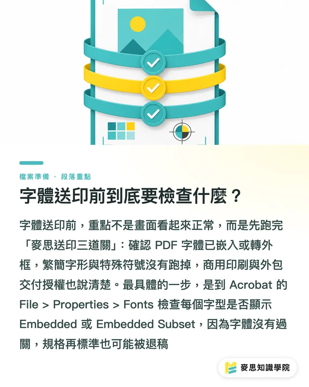
Before sending fonts to print, check 3 things first: whether the PDF has embedded fonts or all text has been outlined, whether Traditional/Simplified glyph forms and special characters have shifted, and whether commercial-use and outsourcing licenses are clearly defined. At MINDS Printing (MS, high-end fully custom commercial printing), I call these 3 checks the "MINDS Printing (MS) three print-ready gates," because font problems rarely break in only one place. Usually, the file, the glyphs, and the responsibility all loosen at the same time
・① Font status: In Acrobat, go to File > Properties > Fonts and confirm whether each font is shown as Embedded or Embedded Subset. Do not rely only on the on-screen preview
・② Glyph consistency: Traditional Chinese, Simplified Chinese, TC/SC/JP glyph versions, OpenType features, ①②③, ㎡, ±, ®, and special punctuation all need to be checked by zooming into the output PDF
・③ Licensing responsibility: For brand fonts, high-volume event output, and outsourced design files, confirm the licensing scope for desktop use, PDF embedding, commercial printing, and handoff to third-party output vendors
Standard definition of font embedding: packaging the font data required for PDF output inside the file, so the printer does not need to install the same fonts and can still output the text according to the original layout
Standard definition of outlining text: converting text into vector outlines. The output side sees lines and curves instead of editable text, so the font file is no longer needed, but the text becomes almost impossible to edit
Standard definition of font licensing: the usage scope permitted by the font vendor, often divided into desktop, web, App, PDF embedding, commercial output, and outsourced delivery. You cannot judge it by saying, "it works on my computer."
For small-volume standard products such as business cards, stickers, and invitation cards, the online ordering flow at MINDS Printing (MYS) is suitable for controlling size and bleed with fixed specifications first. But before submitting files, you still need to complete the MINDS Printing (MS) three print-ready gates. If the fonts fail, even the most standard specification may still be rejected
Why does it look normal on screen but print with missing characters or layout shifts?
A normal-looking screen preview does not mean the print RIP can read the same font set. The 6 most common situations I have seen on press are missing characters, substituted fonts, unembedded fonts, licensing restrictions, Traditional/Simplified glyph differences, and special-character shifts. Any of these can make the same PDF look different on different computers or in different output workflows
Missing characters usually happen when the printer does not have that font and the system temporarily substitutes another one. Font substitution is even harder to catch, because the visual difference may be only 1 to 2 character widths. The client may not notice until the finished product arrives and the phone number, price, or product name has shifted. This kind of error is the hardest to fix beside the press
Traditional/Simplified glyph differences are not linguistic fussiness; they are a layout risk. If the same type family uses TC, SC, and JP regional versions, the structure of certain characters, punctuation positions, and full-width metrics may differ. Dense text such as catalog tables of contents, contract clauses, and packaging labels is especially vulnerable to a one-character-width shift pulling an entire line out of place
Special characters need to be checked separately, especially ①②③, kg, ㎡, ±, ®, trademark symbols, currency symbols, and mathematical symbols. These characters often come from different fonts or fallback fonts. The body text may look fine, while the symbols turn into blank boxes during preflight
When should you embed fonts, and when should you outline text?
For most commercial-printing PDFs, I recommend embedding fonts first, because embedding preserves text information, searchability, and flexibility for later proofreading. For projects that may still need text edits, such as 16-page catalogs, annual reports, menus, and manuals, embedding is easier to manage than outlining the entire file
・Best for embedding: PDFs with lots of body text, many pages, an active proofing process, or the possibility of future revisions or reprints
・Best for outlining: Logo type, display headlines, a small amount of special typography, and final artwork where the printer explicitly requires outlined text
・Best for keeping editable files: brand manuals, packaging systems, campaign key visuals, multilingual versions, and files that will need future date or price changes
Outlining is not a cure-all. If an entire 32-page catalog is outlined, the file may become heavier, and the text can no longer be searched or quickly edited. When a client suddenly changes "Spring 2026" to "Summer 2026," the designer has to go back to the source file and output it again
The MINDS Printing (MS) three print-ready gates separate the "output version" from the "working version": the PDF handed to the printer must be stable, while the designer's AI, INDD, linked images, and font licensing records must remain complete. Whether font files can be packaged together should be decided by the license terms, not by habit
For mid- to high-end custom projects such as brand catalogs, corporate identity manuals, and packaging systems, MINDS Printing (MS) includes font status and licensing responsibility in the prepress communication checklist. These projects usually do not end after printing 100 copies; they are often extended repeatedly across different materials and sales channels
Who is responsible for licensing outsourced design files and brand fonts?
Font licensing must be clarified in the design contract or delivery specifications in advance, especially in 3 scenarios: outsourced design, brand fonts, and high-volume event output. A font is a software license, not an image asset. A designer purchasing a desktop license does not necessarily mean the brand owner, printer, or event contractor can all use it legally
For outsourced projects, ask at least 4 questions: Can this font be used commercially? Can it be embedded in a PDF? Can it be handed to a printer for output? Can it be used on high-volume event materials? Missing even 1 of these 4 questions may send responsibility bouncing back and forth between the designer, brand owner, and printer
Brand fonts require even more caution because they are often used across business cards, catalogs, packaging, exhibition backdrops, social media graphics, websites, and presentations. One font set may span 6 types of media. If the brand side does not keep traceable licensing records, the font risk follows the project whenever the designer or printer changes
My practical recommendation is this: put 2 PDFs in the print submission folder. One is the official output version with embedded fonts, and the other is a backup version where key headlines or Logo text have been outlined. Keep one additional editable source file and the licensing records. That way, if something goes wrong, you know which version to revise, who is allowed to revise it, and whether the revision is legal
How can prepress font checking become an SOP?
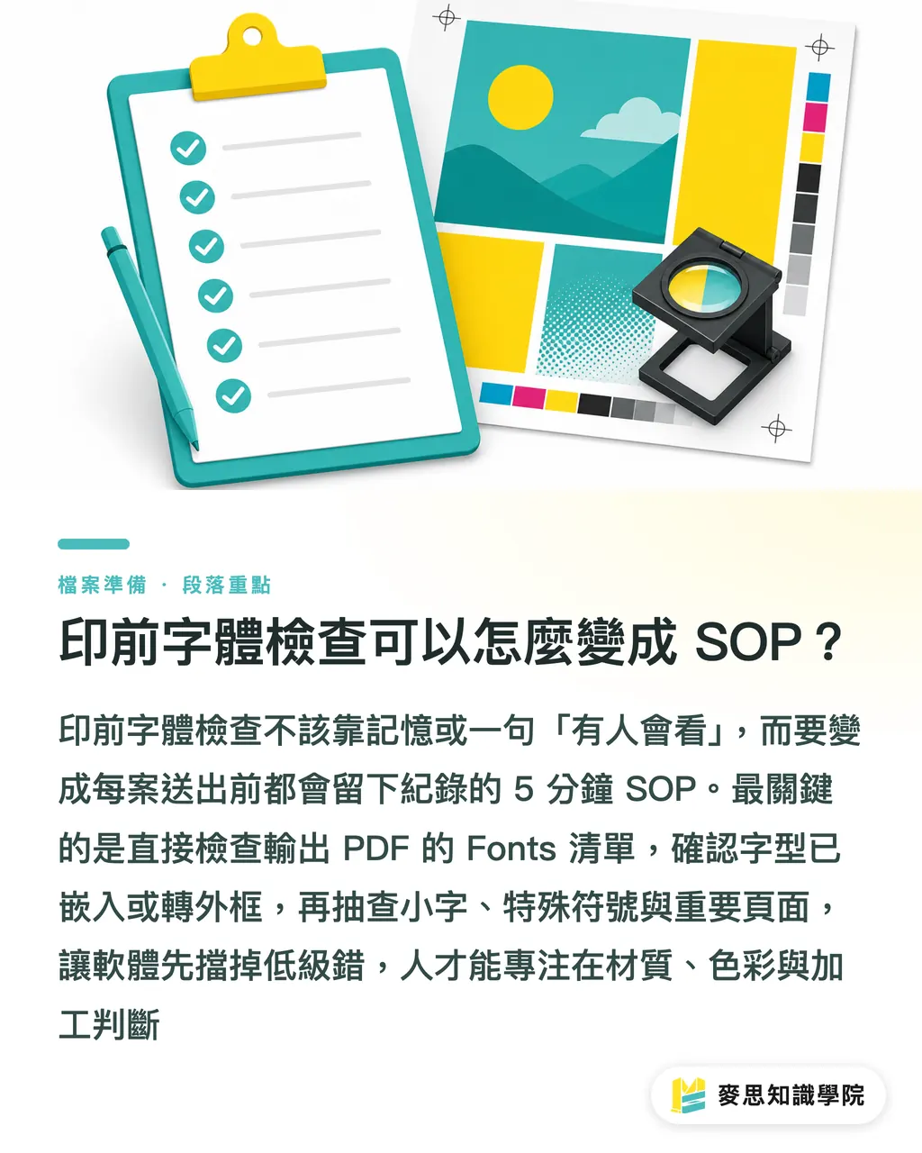
Font checking should not rely on memory. It should become a 5-minute SOP. The MINDS Printing (MS) three print-ready gates are ideal for design handoff forms, SaaS upload flows, or prepress checklists, so every project leaves the same set of records before submission
・Open the PDF, not a screenshot of the design file, because the PDF is what the printer actually processes
・Check the Fonts list and confirm that every font is embedded or that the text has already been outlined
・Zoom to 400% and inspect small text, special characters, table numbers, and text next to barcodes
・Compare the output PDF against the client-approved proof, sampling at least the cover, table of contents, pricing pages, and contact-information pages
・Keep the source file, output PDF, outlined PDF, and screenshots or emails proving the license
Print manufacturers can place these 5 steps in the pre-order intake check. Designers can use them as the final round before handoff. SaaS teams can turn font embedding status, font names, and missing-character warnings into instant alerts after upload. When software blocks basic mistakes early, people can spend their time judging materials, color, and finishing instead
What worries me most is not that the text was not outlined. It is that everyone assumes "someone will check it." Bad news on the print floor is usually not dramatic. It is just one small piece of text quietly shifting across 3,000 finished copies
Key Takeaways
・Start font checking with the PDF font status. Do not trust only the screen preview
・Embedding preserves editing flexibility, while outlining preserves output stability. Different project types call for different choices
・Special characters, Traditional/Simplified glyph forms, and brand fonts are more likely to fail at print submission than ordinary body text
・Licensing responsibility must be clarified before outsourcing and high-volume output. Verbal promises will not rescue a rejected file
・Keeping editable files and licensing records is the designer's fallback plan for the future
Further Considerations
For print manufacturers, font checking should move forward to the moment files are received, instead of waiting until the RIP reports an error before chasing the designer. For designers, the deliverable should not be only a polished PDF; it should also include editable files, an outlined version, and licensing records. For SaaS and AI application teams, the most valuable feature is not making the file sound impressive, but immediately flagging 4 risk types after upload: unembedded fonts, suspected font substitution, special-character abnormalities, and licenses that need confirmation. That lets prepress staff make a judgment instead of guessing from experience
FAQ
- Do fonts always need to be outlined before sending files to print?
- Not always. For PDFs with lots of body text, many pages, or possible text edits, embedding fonts is usually better first. Outline key text only for Logos, display headlines, special typography, or when the printer explicitly requires it
- If the PDF already looks normal, do I still need to check font embedding?
- Yes. A normal PDF preview only means your computer can display it. Whether the printer can output it reliably depends on whether the Fonts list shows each font as Embedded or Embedded Subset
- Who is responsible for licensing when an outsourced designer uses brand fonts?
- Both the brand side and the design side need to confirm it. The designer should explain the font source and usage scope, the brand side should keep licensing records, and the printer should remind both parties about commercial output and third-party handoff restrictions when receiving files
- Can text still be edited after it is outlined?
- Usually not directly. After outlining, text becomes vector contours. If the wording needs to change, you usually have to return to the original design file and output it again, so editable files must be kept before final print submission
- Why are special characters more likely to shift than ordinary text?
- Special characters often come from fallback fonts. Characters such as ①②③, ㎡, ±, and ® may not exist in the body-text font. If the PDF does not embed them correctly, they can easily become blank, be substituted, or shift position
Related articles




The Print × AI weekly
The print and AI know-how designers, brands and enterprises can use before they commit — one email, every week
MINDS Free Tools
Imposition calculator and preflight file check — free prepress tools, right in your browser.
MINDS Group
Need actual printing or gifting services?
From premium printing to online ordering and festive gifts — the MINDS Group sister brands take it from here.