
Overview
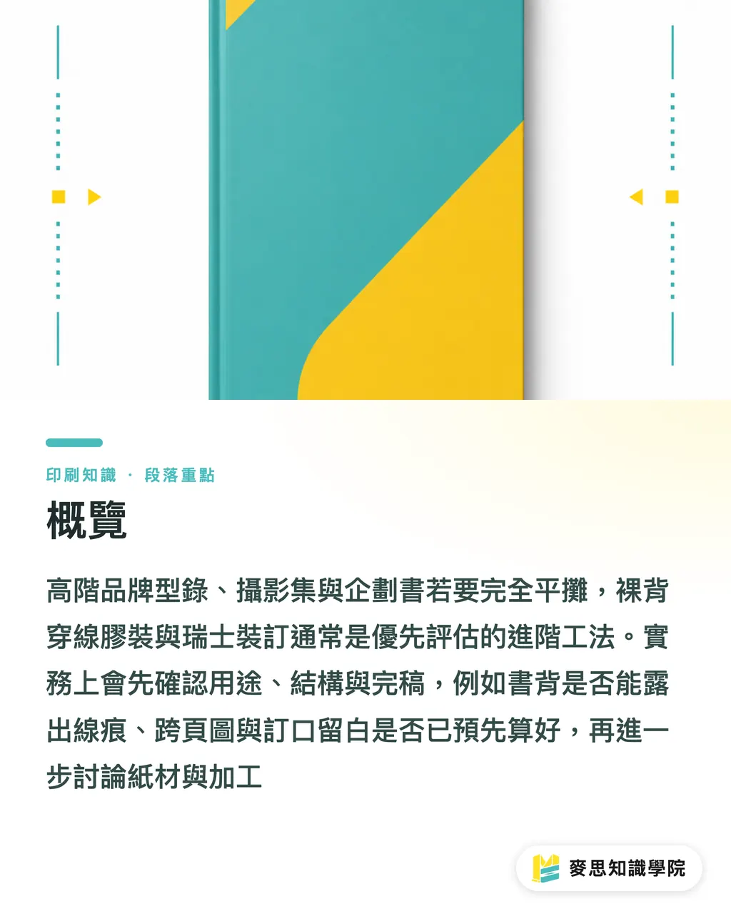
If a high-end brand catalogue, photo book, or pitch deck needs to open fully flat, the first thing to look at is one of two advanced techniques: exposed-spine sewn binding or Swiss binding. When I handle this kind of project at MINDS (MS, mid-to-high-end fully custom commercial printing), I usually run through what I call the MINDS (MS) three gates for lay-flat binding to lock down purpose, structure, and finished files before talking about paper and finishing
・Gate 1, Purpose: Is this book for showcasing work, selling a proposal, or a long-life brand reference
・Gate 2, Structure: Does the cover wrap the spine, is the spine allowed to show stitching marks, and how far does it need to open
・Gate 3, Finished files: Have spread images, gutter margins, cover dimensions, and finishing lead times all been planned together
Why won't a brand catalogue lay flat?
When a brand catalogue won't open properly, it's almost never a printing failure, it's a binding choice made too early. Standard perfect binding holds pages with a glue layer on the spine; once the page count gets thick or the paper gets stiff, the middle of the book lifts, and spread photography plus large colour fields get swallowed by the gutter
I've seen plenty of design files where the cover, paper stock, and foil work all looked great, only to lose on the feel in the hand. Take a ~200-page brand catalogue with heavier art paper and traditional glue binding: the reader has to hold the page down with one hand while trying to look at it with the other, and that brand quality takes a direct hit
In Taiwan, "lay-flat binding" usually means the book can open to close to 180° so the reader can see spread images, charts, and layout detail without forcing the spine. It's the go-to for photo books, catalogues, menus, and proposal documents
If the catalogue is heavy on full-spread photos, colour swatches, architectural drawings, or fashion lookbooks, MINDS (MS) usually suggests discussing binding at the start of the design phase, not asking the printer after the PDF is exported whether it can lie flat
How are exposed-spine sewn binding and Swiss binding different?
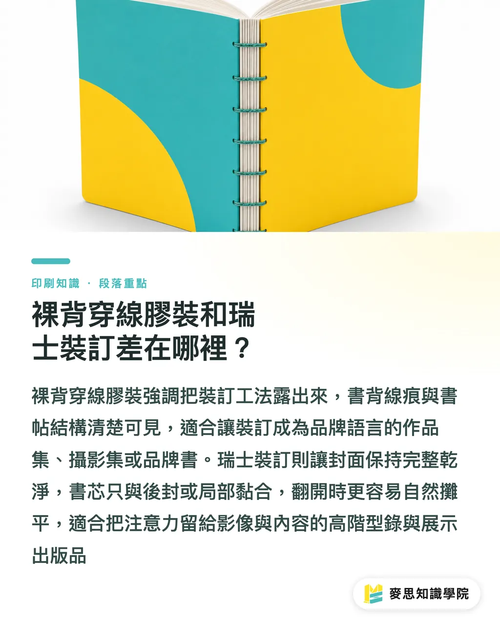
Exposed-spine sewn binding splits the text block into multiple signatures, sews them, then glues them onto the spine. The stitching and signature structure stay visible on the spine, the book opens wide, and the look carries a crafted feel, good for photo books, portfolios, and brand books
Swiss binding connects the text block to the cover only at the back cover or in limited spots, so the spine isn't fully glued to the cover. When opened, the cover and text block feel separated; the pages spread more naturally, the look is cleaner than exposed-spine sewing, and it carries that exhibition-publication quality
・Exposed-spine sewn binding: the spine stitching is clearly visible and the technique is part of the look. Right for brands that want the binding itself to be seen
・Swiss binding: the cover stays whole and the spine stays clean; once opened, the text block has more room to move. Right for premium catalogues, photography proposals, and display manuals
・Standard perfect binding: cheaper and faster at volume, but lay-flat behaviour depends heavily on page count, paper weight, glue layer, and trim size, not the right pick when every spread needs to read across the gutter
My own call is pretty direct: if you want the binding to become part of the brand language, exposed-spine sewn binding has more flavour. If you want the cover to stay quiet and let the images and content lead, Swiss binding usually wins
What needs to change on the cover design first?
Special binding trips people up on the cover, because the cover is no longer just front + spine + back added together. Exposed-spine sewn binding may not have a traditional wrap-around spine at all, and Swiss binding has to account for where the cover meets the text block and the structural lines that show when the book opens
If the cover has full-bleed colour, an image crossing the spine, foil, deboss, or spot UV, the designer should ask the printer four things upfront: is the spine exposed, does the cover wrap the spine, where is the adhesion zone, and can finishing cross the fold or adhesion line
・Cover for exposed-spine sewn binding: thread and glue may show on the spine, so cover artwork shouldn't assume it can cross the spine cleanly
・Cover for Swiss binding: the connection between text block and cover is unusual, back cover or partial adhesion zones need to be kept clear, and important type shouldn't sit on the moving edges
・With foil or deboss: finishing positions need to avoid the fold, adhesion line, and high-friction zones, or the flaw shows after a few openings
・With a belly band or slipcase: paper thickness, opening angle, and cover rebound all have to be accounted for, you can't just wrap a flat-size package around the book
At the cover stage, the MINDS (MS) three gates for lay-flat binding insist on a real binding-structure diagram first. What the designer sees on screen is a flat image; what the printer has to make is an object that bends, pulls, and springs back
How do you lay out inner pages without losing the gutter?
When laying out inner pages, treat the spread as a binding test, not just two pages pushed together. Exposed-spine sewn binding and Swiss binding both lay flat well, but the gutter still has thread, glue, fold, and paper thickness. Fine type, logos, faces, and product outlines shouldn't sit right on the centre line
I ask designers to check at least five page types: spread key visuals, full-bleed photography, product spec tables, brand timelines, and continuous lines running across both pages. Those five are where the gutter causes the most trouble, and where clients most often say "why doesn't this match the screen"
・Spread photos: faces, product bodies, and architectural verticals shouldn't land right on the gutter
・Spec tables and charts: column lines, numbers, and notes should sit further from the gutter so shadow doesn't get in the way when the page turns
・Full-bleed colour: left/right colour blocks have to account for printing and binding tolerance, don't force hairline registration across the two pages
・Page numbers and running heads: keep the inside position conservative; the outside can breathe more
・Paper weight: thicker paper makes the catalogue stiffer, but the spine stack also gets more visible, the more pages, the earlier a white sample needs to be checked
If the job involves thick paper, tight deadlines, and spread photography, I'd suggest asking MINDS (MS) for a binding white sample or a short run first. It looks like one extra confirmation step, but it often saves the time of redoing the whole layout later
How do you talk to the printer about special binding?
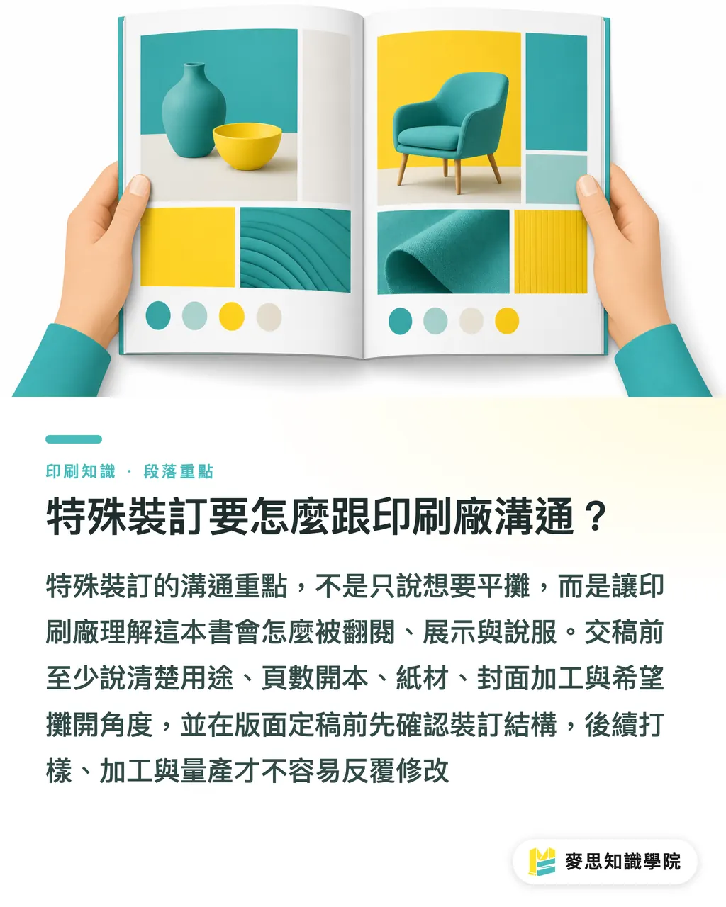
On a special-binding job, don't just say "I want it to lay flat", that line isn't useful on the production floor. The better way is to hand over the end use, page count, trim size, paper, cover structure, finishing items, and the opening angle you want, all in one go
・End use: brand catalogue, photo book, proposal, menu, or display manual
・Page count and trim size: e.g. 96 pages A4 portrait, or 160 pages square
・Paper direction: text block on coated, woodfree, or art paper, weight and stiffness both affect how the book opens
・Binding preference: exposed-spine sewn binding, Swiss binding, or let the printer recommend based on lay-flat needs
・Cover finishing: foil, deboss, lamination, spot UV, belly band, slipcase, all need to be flagged early
・Schedule: special binding usually adds proofing, finishing wait time, and manual checking on top of a standard glue-bound schedule
I split special binding into three confirmation checkpoints: lock the structure before layout is finalised, confirm the white sample or binding method before printing, and confirm finishing positions before production runs. Those three checkpoints done, the back-and-forth cost drops a lot
When the Mai Strategy Knowledge Academy advisory team looks at this kind of project, they don't just ask "how many copies, how many pages, how fast." They ask how the book is meant to be flipped through, displayed, and used to persuade, get the binding right and the content actually has a chance of being read properly
Key Takeaways
・If a catalogue has to lay flat, the binding choice has to happen at the start of design, it can't be rescued after the file is done
・Exposed-spine sewn binding suits a visible, craft-led look; Swiss binding suits content that should open quietly
・The cover isn't a flat diagram, special binding changes the spine, adhesion zones, and finishing positions
・Spread designs need to avoid gutter risk: faces, logos, fine lines, and spec numbers need the most protection
・When talking to the printer, bring page count, paper, trim size, finishing, and lay-flat needs into the same conversation
Further Thought
For the print manufacturing side, exposed-spine sewing and Swiss binding test early judgement, not last-minute craftsmanship. For the design side, a lay-flat requirement rewrites the layout logic directly. For SaaS and AI application teams, this kind of project is a natural fit for turning the "binding requirements questionnaire, finished-file checklist, spread-risk reminder" into a standard workflow, so designers, procurement, and the printer all work off the same information and stop patching holes over the phone
FAQ
- Does a brand catalogue need special binding to lay flat?
- Not always, but for a premium brand catalogue with heavy spread photography, thick paper, or long-life reading, exposed-spine sewn binding and Swiss binding get much closer to a flat-reading experience than standard glue binding
- What kind of catalogue is exposed-spine sewn binding good for?
- Portfolios, photo books, brand books, and catalogues that lean into a crafted look, the visible spine stitching becomes part of the design, so the exposed spine has to be accepted up front
- What's the biggest difference between Swiss binding and standard glue binding?
- Swiss binding usually connects the text block and cover only at limited points, so the text block has more room to move when opened. The lay-flat result and display feel both beat standard glue binding
- What should be checked first in the finished file for a lay-flat catalogue?
- Check spread photos, gutter margins, cover adhesion zones, and finishing positions first. Faces, logos, fine type, and product outlines shouldn't land on the centre line
- Does special binding make the lead time longer?
- Usually yes, special binding often adds structure confirmation, proofing, manual binding, or extra finishing checks. Procurement should leave room in the schedule for those confirmations
Related articles
The Print × AI weekly
The print and AI know-how designers, brands and enterprises can use before they commit — one email, every week
MINDS Free Tools
Spine width and imposition calculators — skip the manual math, free in your browser.
MINDS Group
Need actual printing or gifting services?
From premium printing to online ordering and festive gifts — the MINDS Group sister brands take it from here.